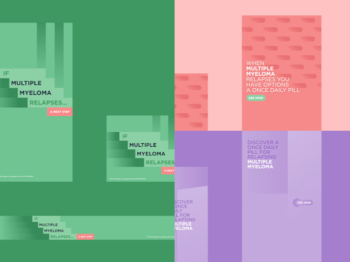
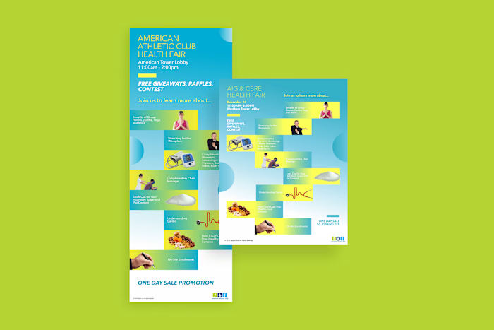
Nautilus Labs: Brand Expansion
Nautilus Labs is a maritime technology company that focuses on navigation optimization for shipping companies in an effort to reduce costs and emissions.
Mission
They wanted to expand their brand and increase media presence. One of the key goals was to move away from using their primary brand colors for everything and toward a more handcrafted look.
Outcome
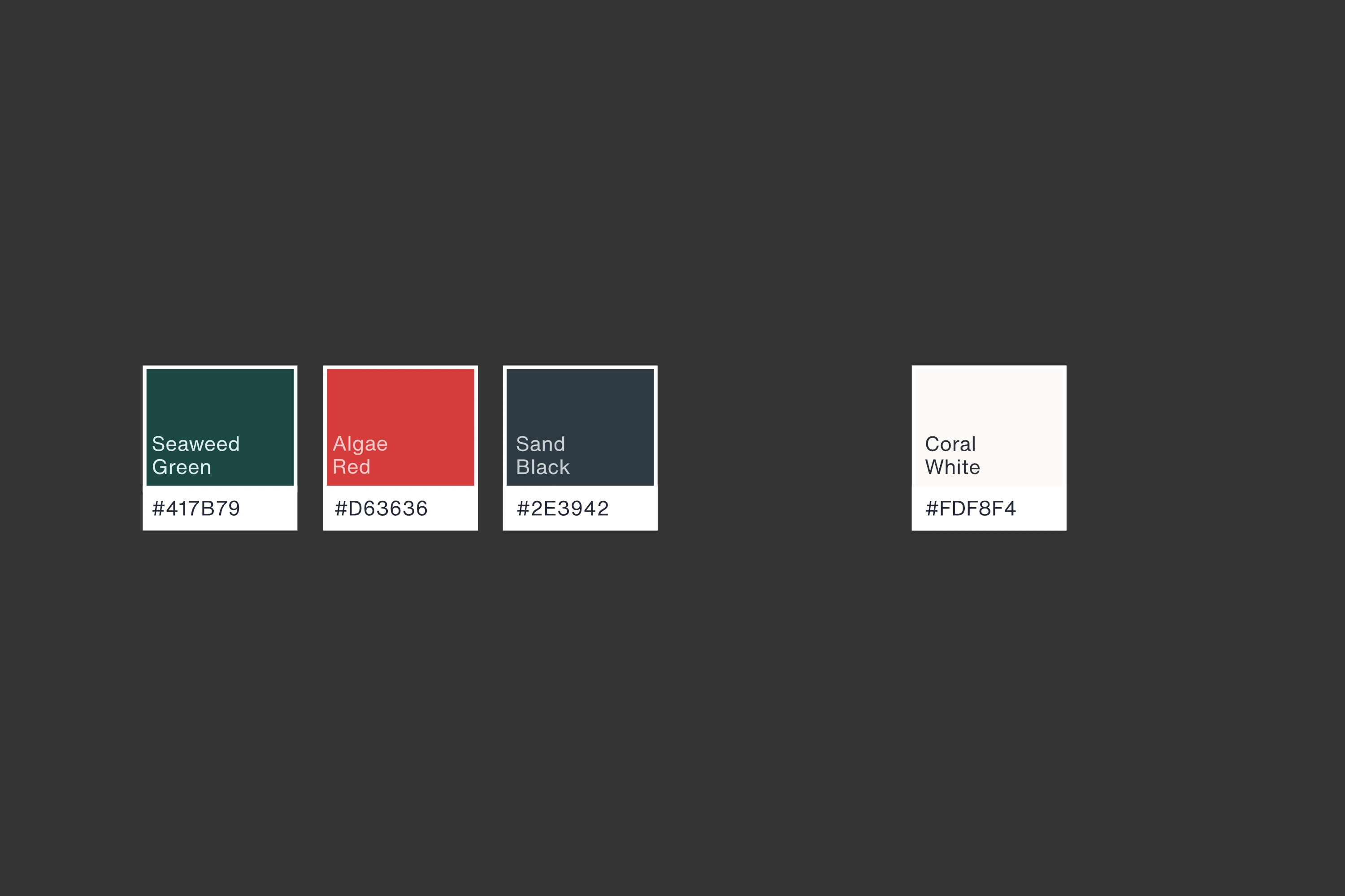
I extended the color palette that drew inspiration from the shipping medium: the ocean, then worked with the marketing team to flesh out the art direction for future advertising campaigns.
GETTING INSPIRED
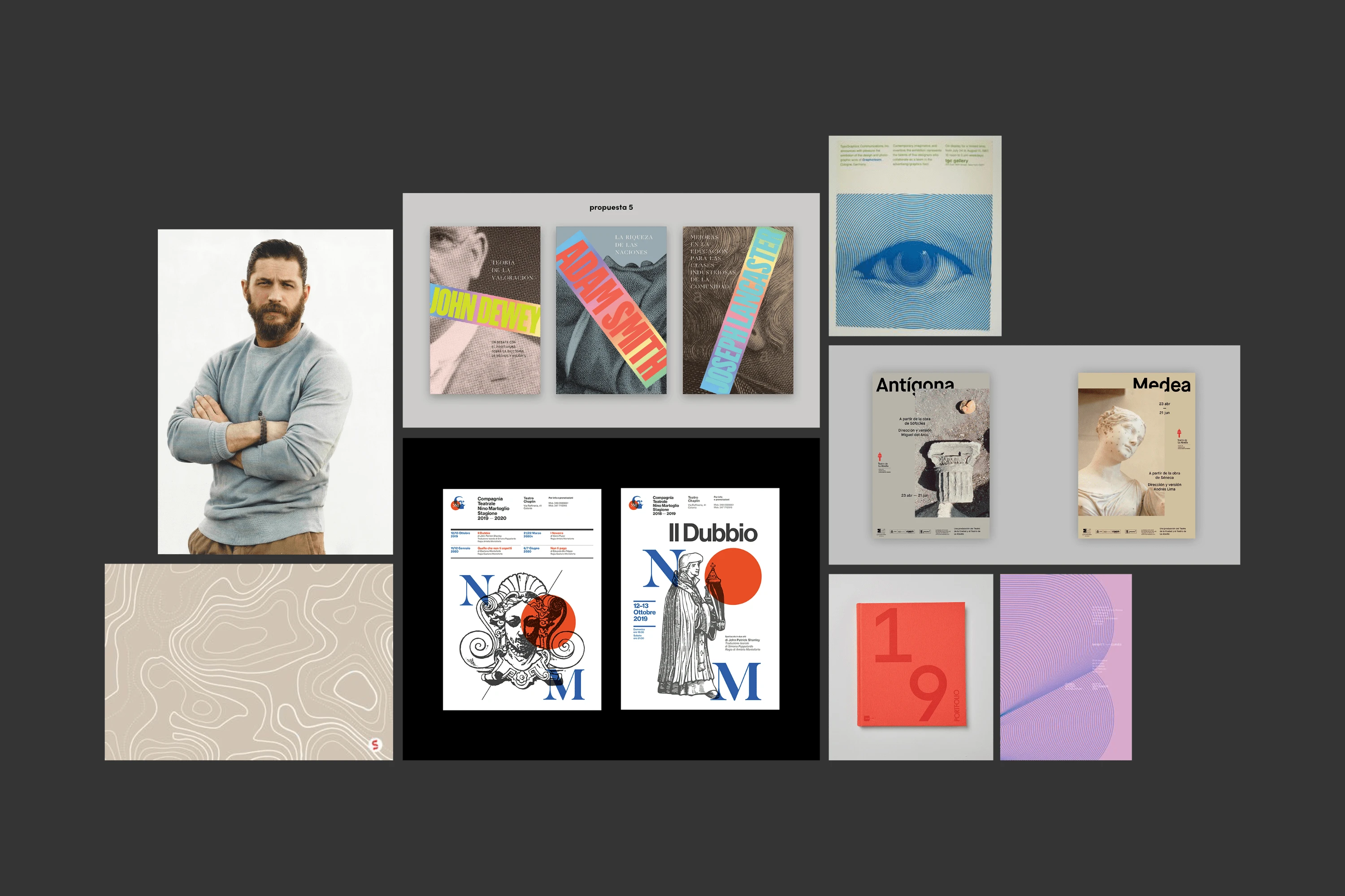
We started with a moodboard pulling inspiration from the ocean's colors and organisms, as well as cartographic representations, and vintage nautical ads.
EXPANDING THE PALETTE
The original color palette consisted of five colors mainly along the blue spectrum. So the extension added five more colors it they could be paired with.
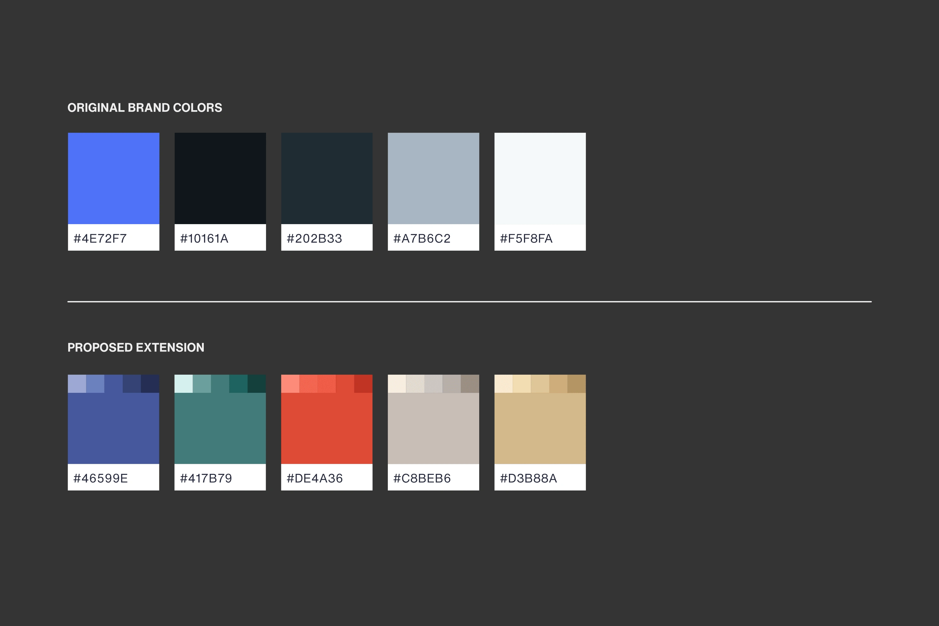
Eventually it was narrowed down to be three accents and a background color.
UPDATING THE SUITE
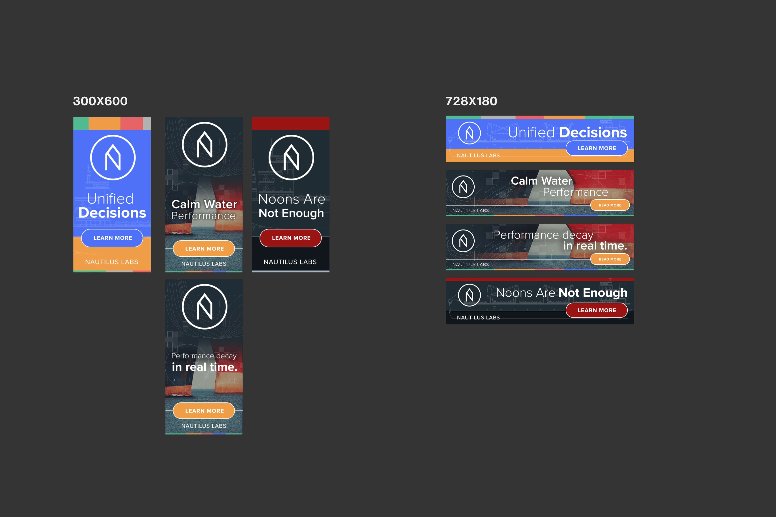
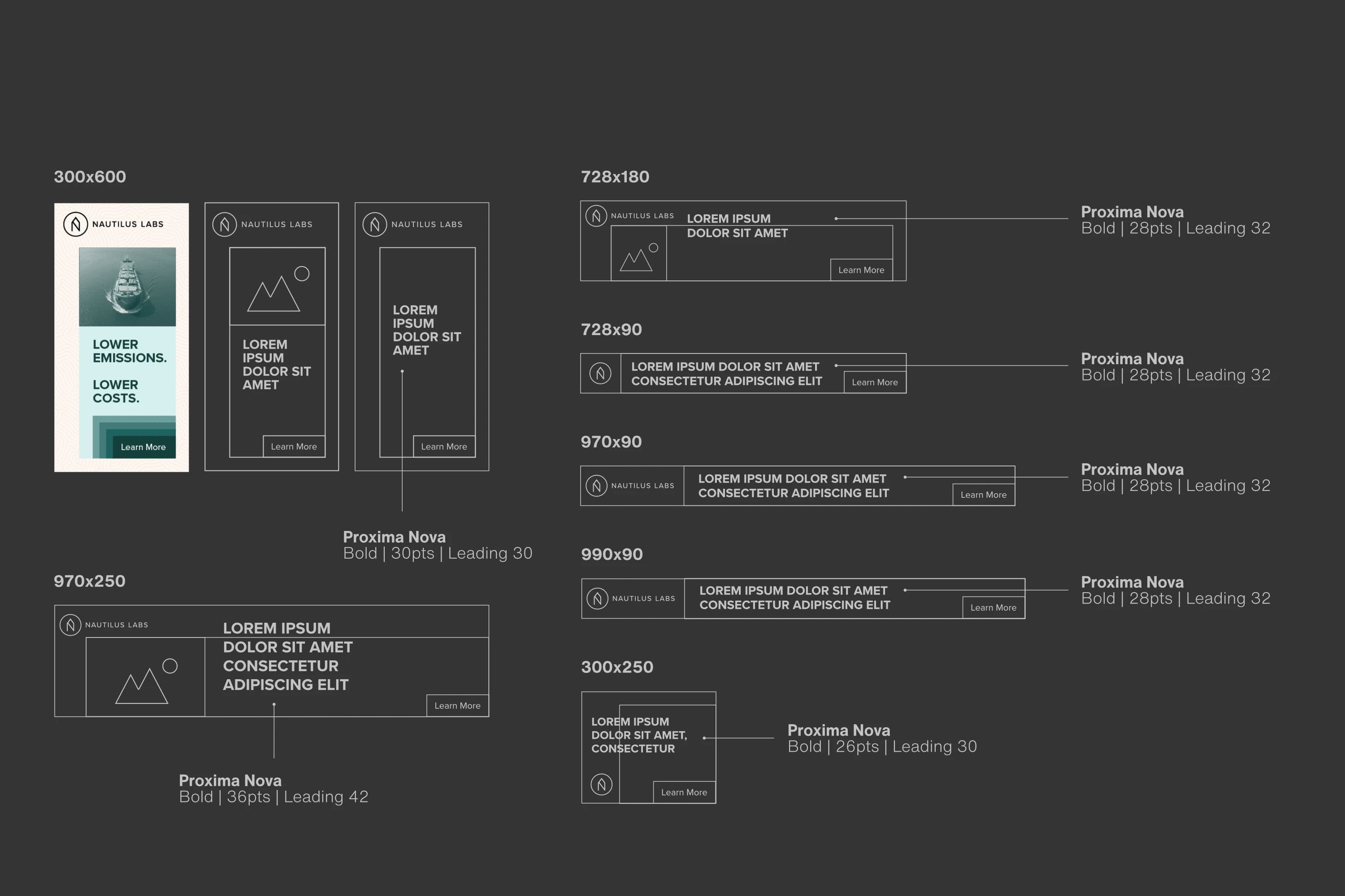
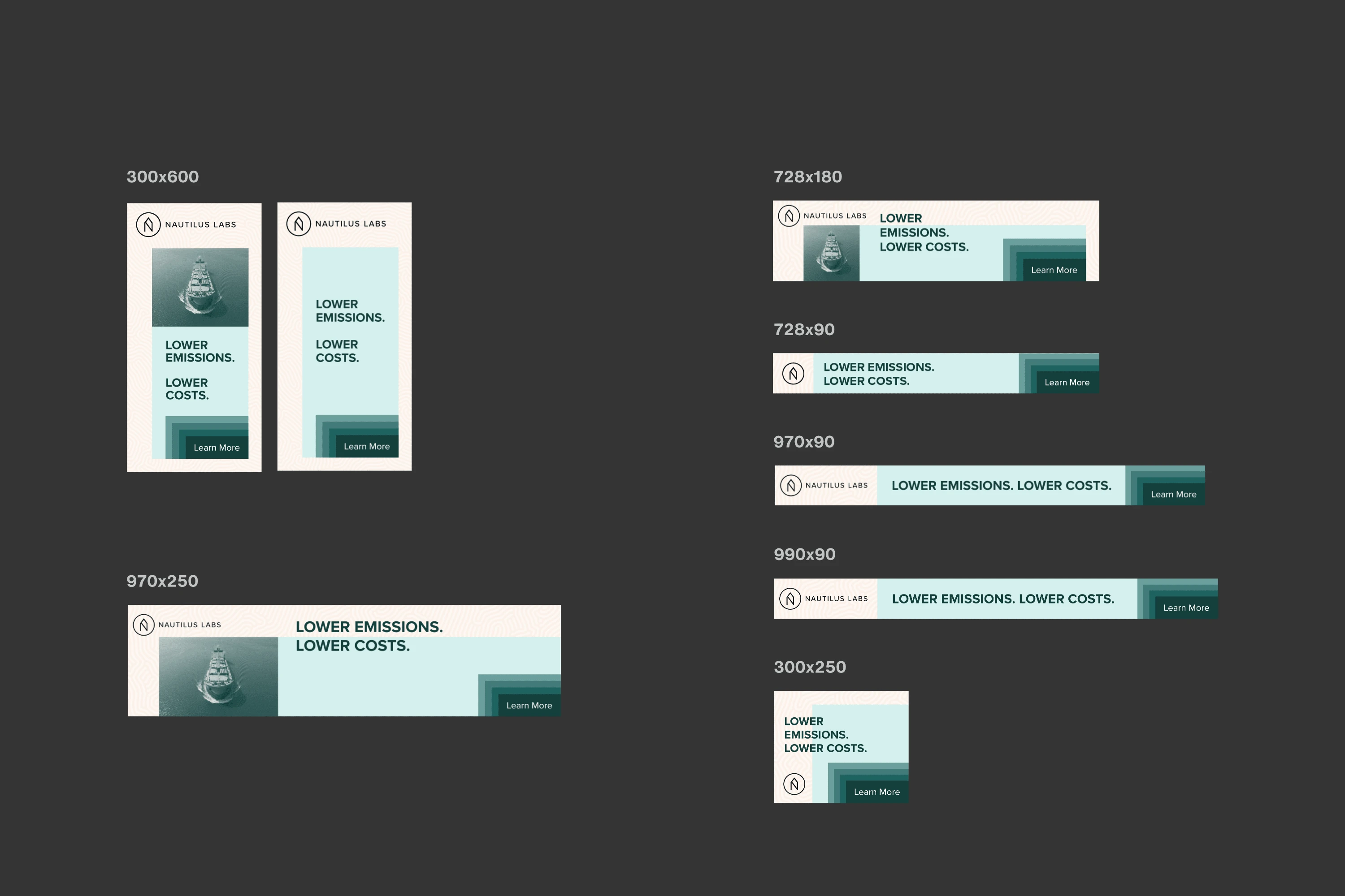
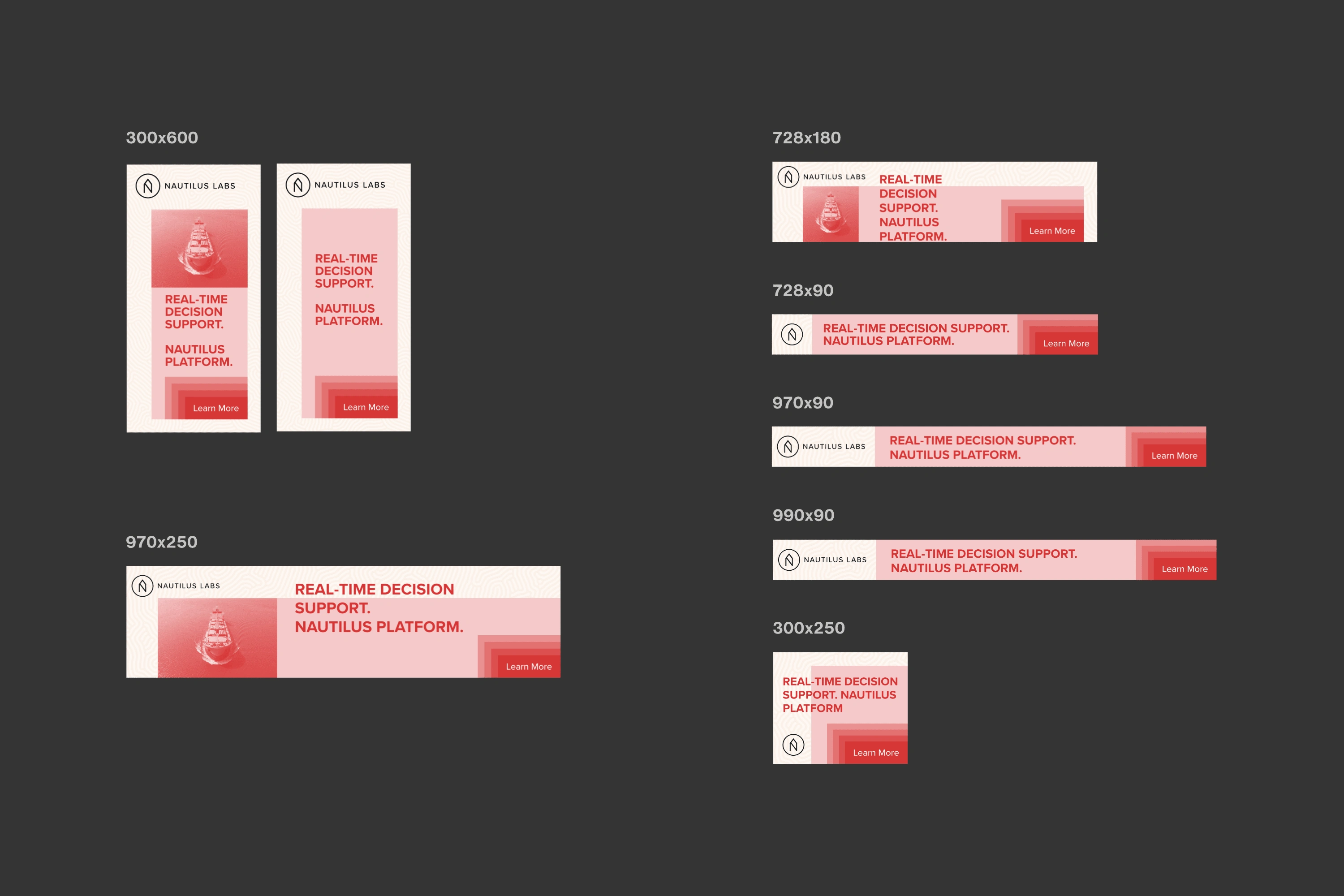
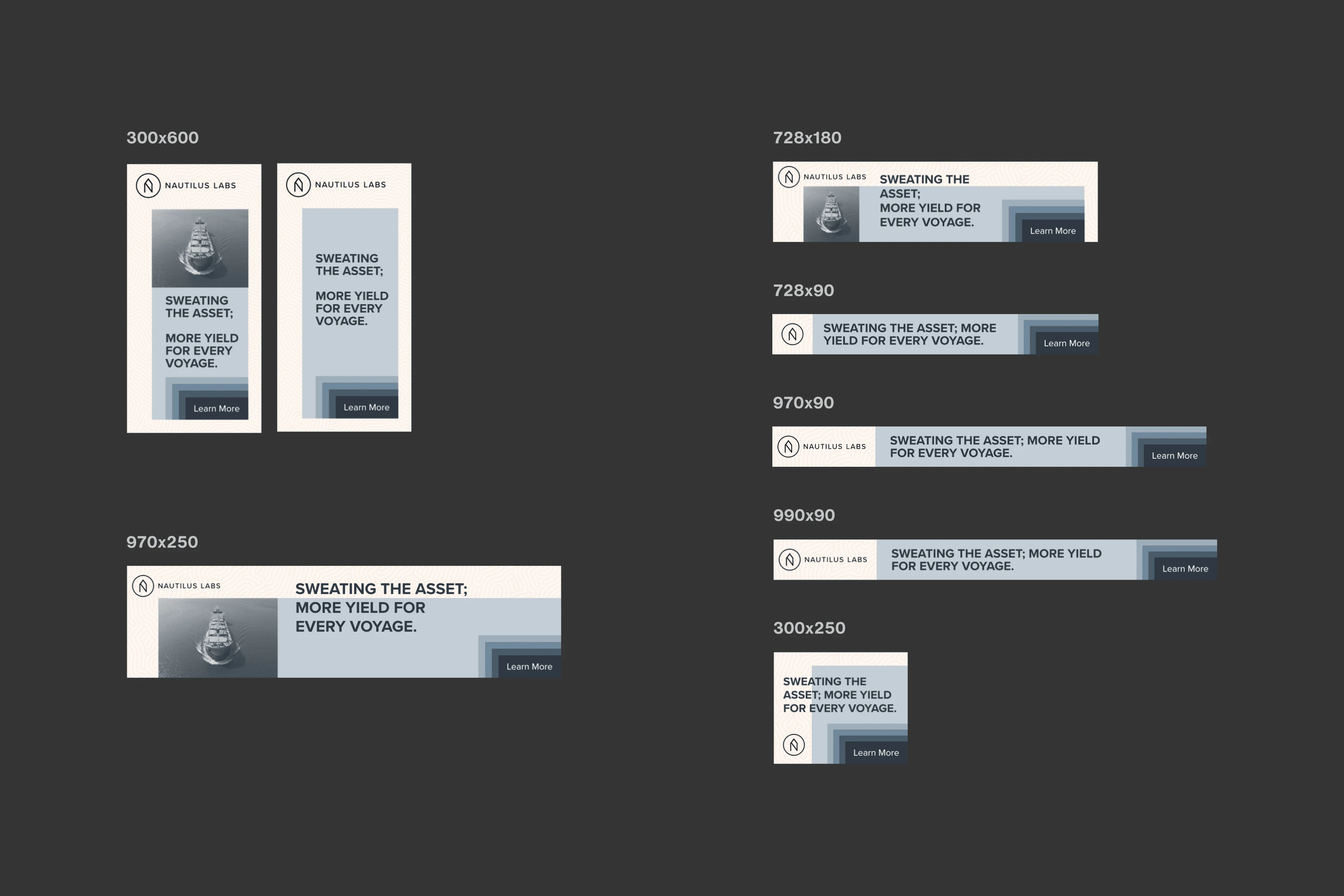
One of the first pieces of collateral to be updated were the banner ads. They wanted to remove some of the chrome & simplify the design.
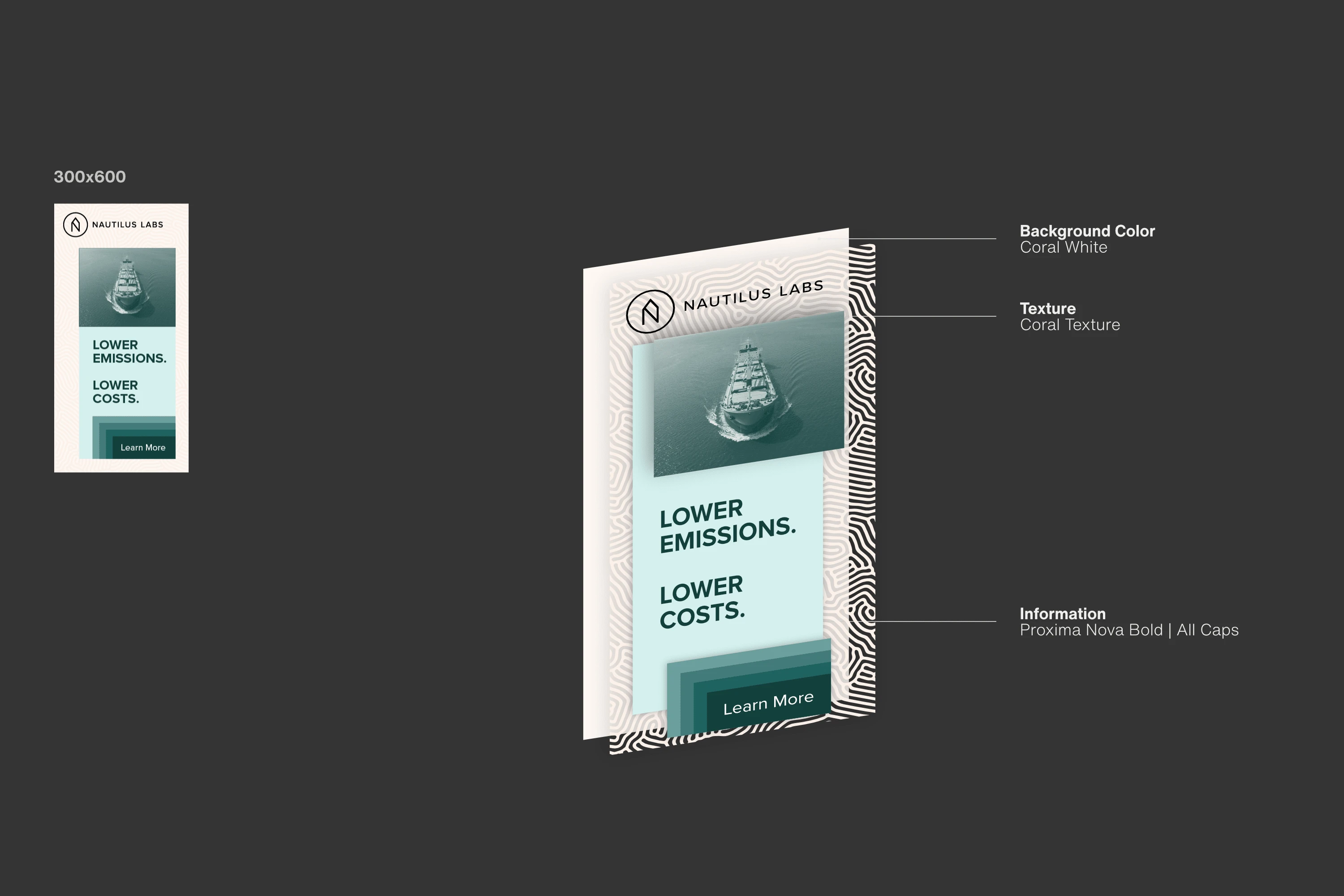
The solution was one texture, one background color in Coral White, and a coral texture representative of the sea floor ships sailed over, and the shores they docked in.
Layered on top of that (as opposed to in the background) would be the image. Information and CTA used tints and shades of the chosen accent color.
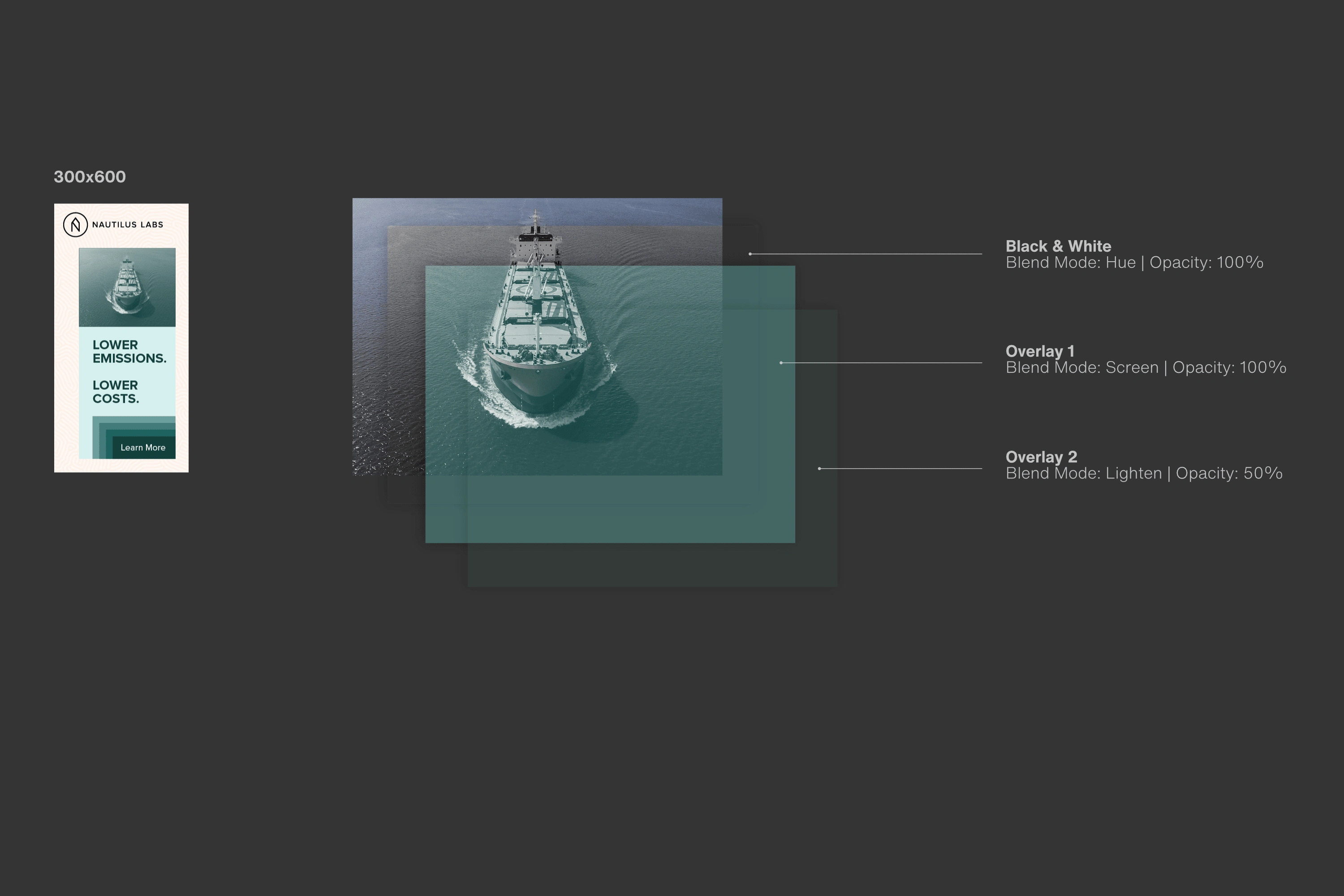
The image was modified with overlays to desaturate then tint it to the selected accent color. This maintained consistency regardless of which image was used.
Remaining banner banner sizes were created along with a template for each.
Like this project
Posted Aug 15, 2023
I provided Art Direction to Marketing team, extended the color palette and redesigned their banner ads.
Likes
0
Views
5
Clients
Nautilus Labs

