Built for visibility, identifiability, and sustainability

Dan Barber



Building on the new Saracen brand identity, the project expanded into the complete redesign of over 60 product SKUs.
Overview
A large-scale packaging system designed to bring clarity, consistency, and standout across a complex portfolio of equine nutrition products.
The Challenge
Translating Saracen’s newly defined brand identity into a functional packaging system across multiple product types, audiences, and contexts, from retail shelves to professional yards. With over 60 products and no categorisation system, confusion existed across the business, with retailers and customers alike.
The Approach
I developed a new categorisation system – the Product Range Navigator to help the business, retailers, and customers navigate the full range. A structured, icon and colour-led design system was crafted to create immediate product recognition across categories, using consistency, hierarchy, and clarity rather than heavy differentiation or category clichés.
I introduced two distinct pack formats to define audience segments while maintaining a unified brand presence:
White packs for the Olympian, competition, and leisure markets
Natural kraft packs for thoroughbred racing and breeding
The Outcome
The result is a scalable packaging system that strengthens shelf presence, improves usability, and reinforces Saracen’s position across all levels of equestrian sport and care. I also delivered material and production efficiencies, significantly reducing ink usage and achieving 100% recyclable packaging, extending the brand into an everyday system where clarity, performance, and sustainability work together.
One cohesive system, designed for every product, every audience, and every context.
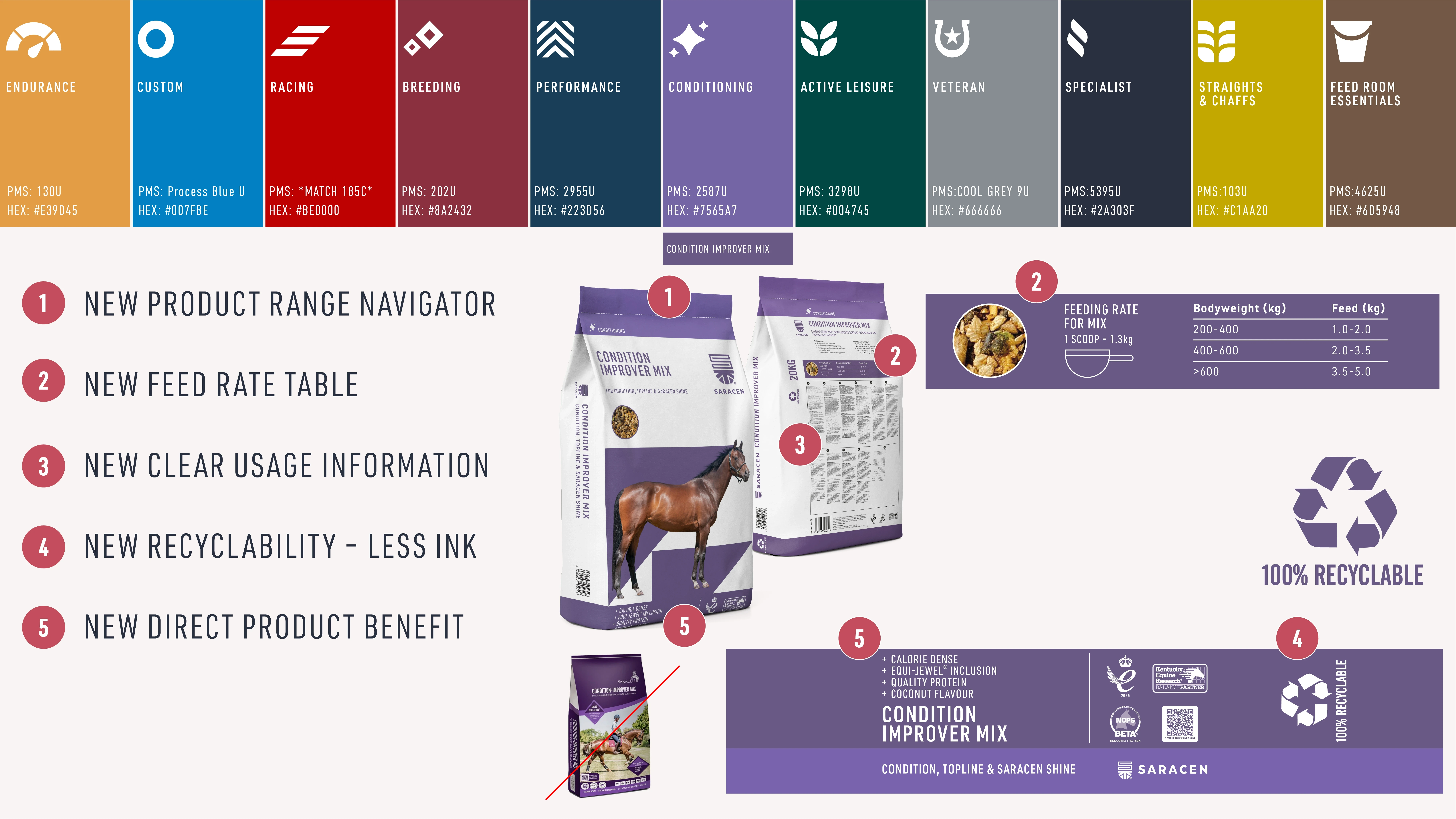
Redesign considerations
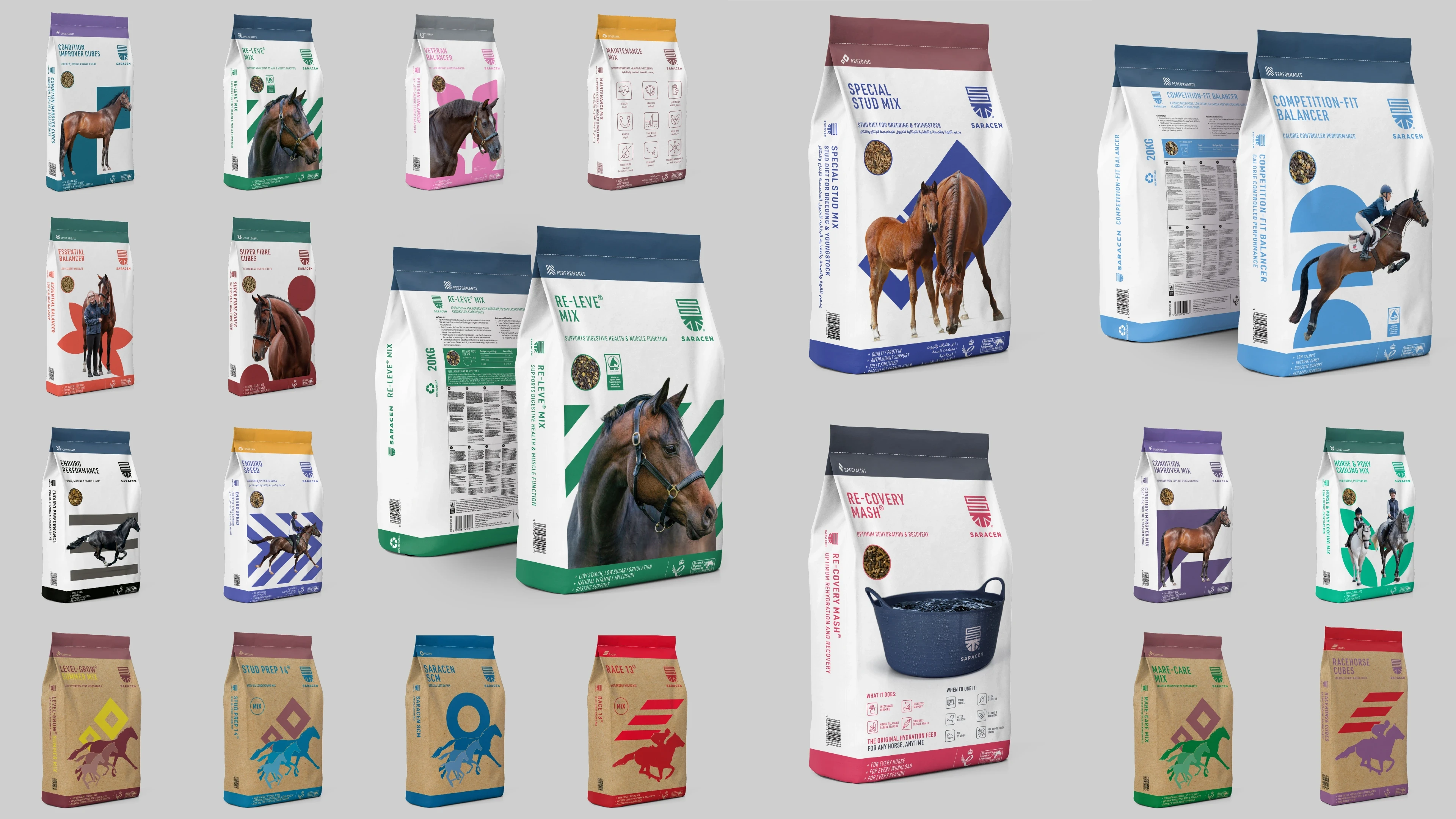
A selection of over 60 SKU's created
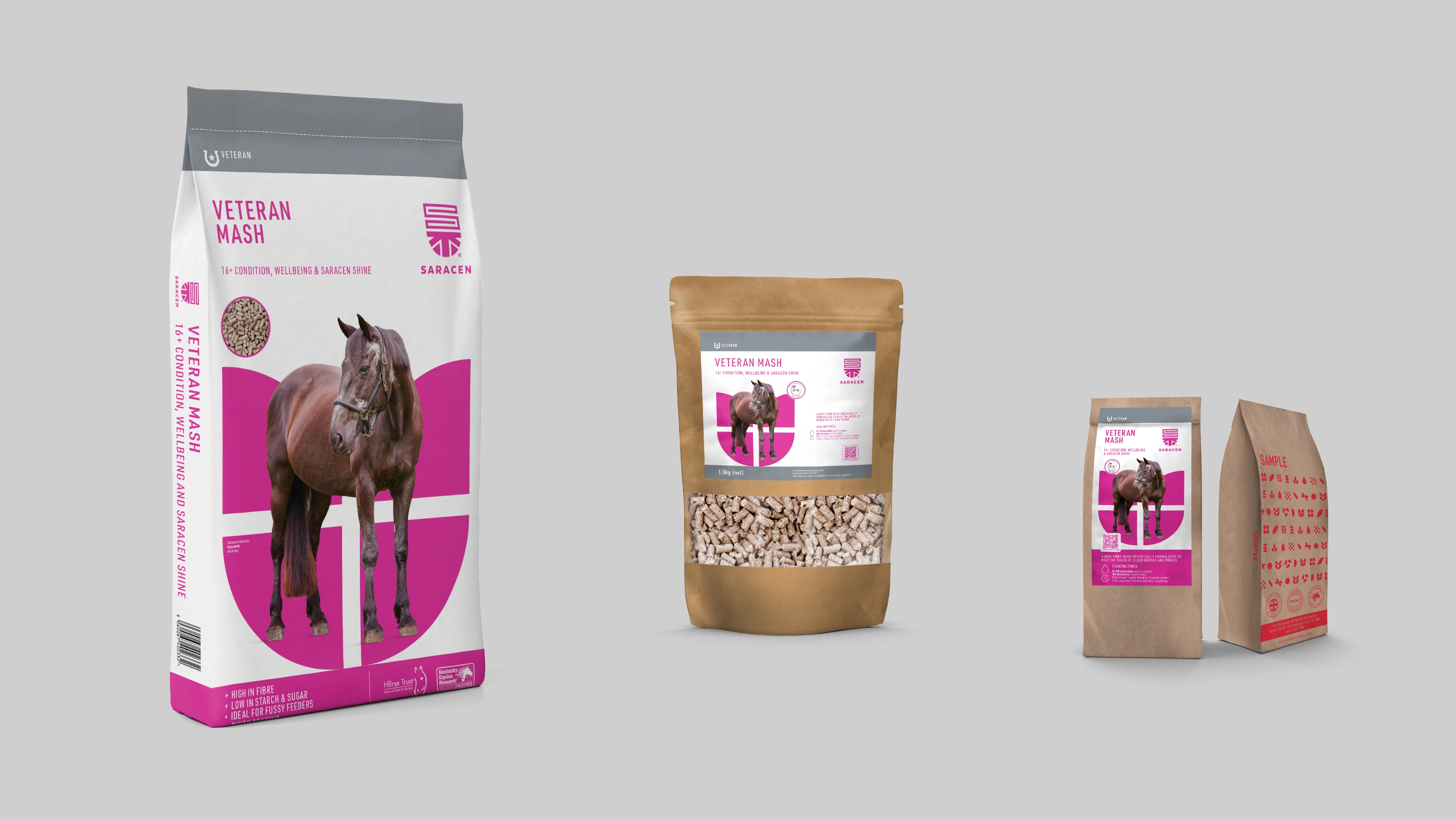
Scalable design across different formats
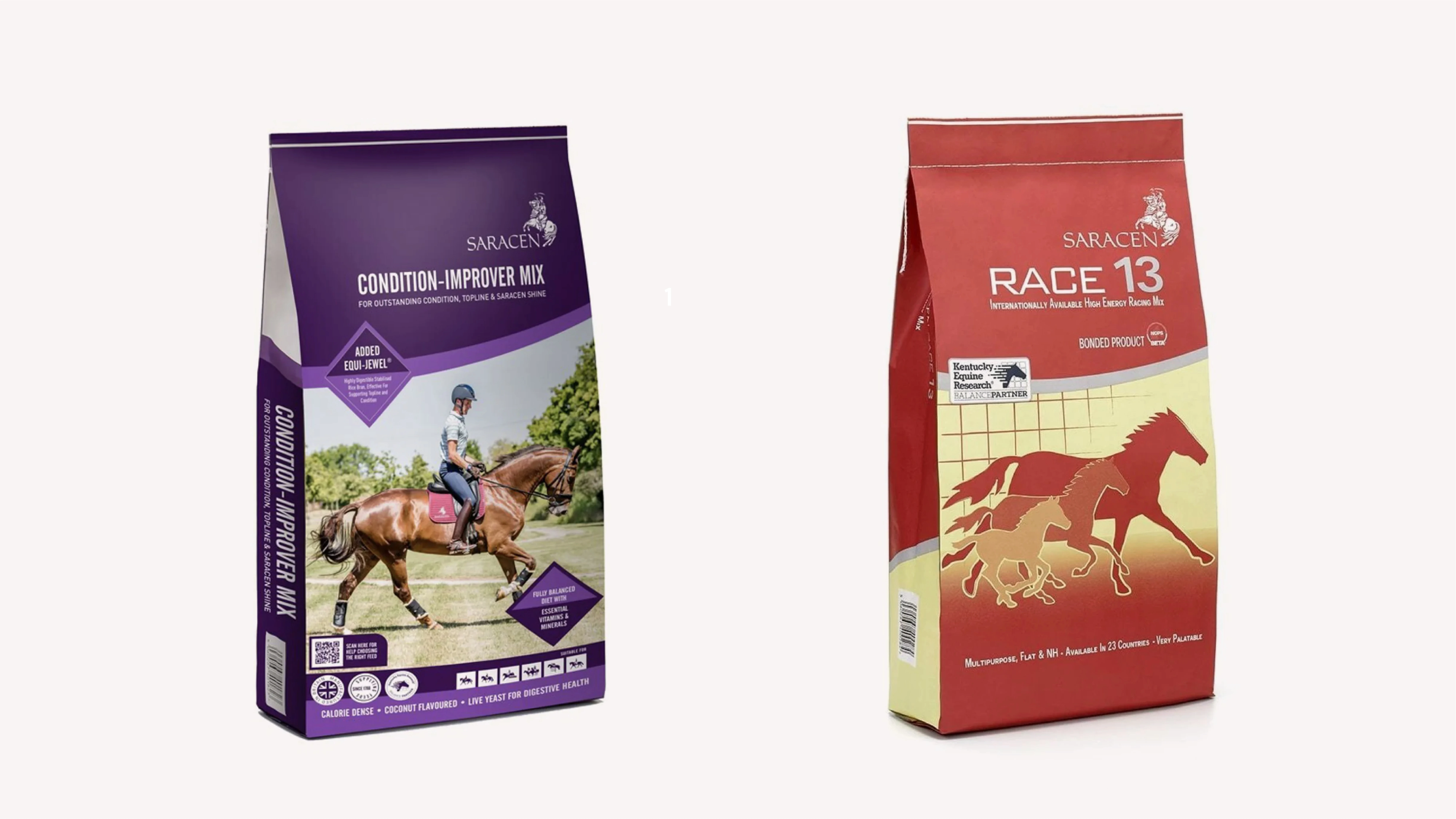
Old packaging designs
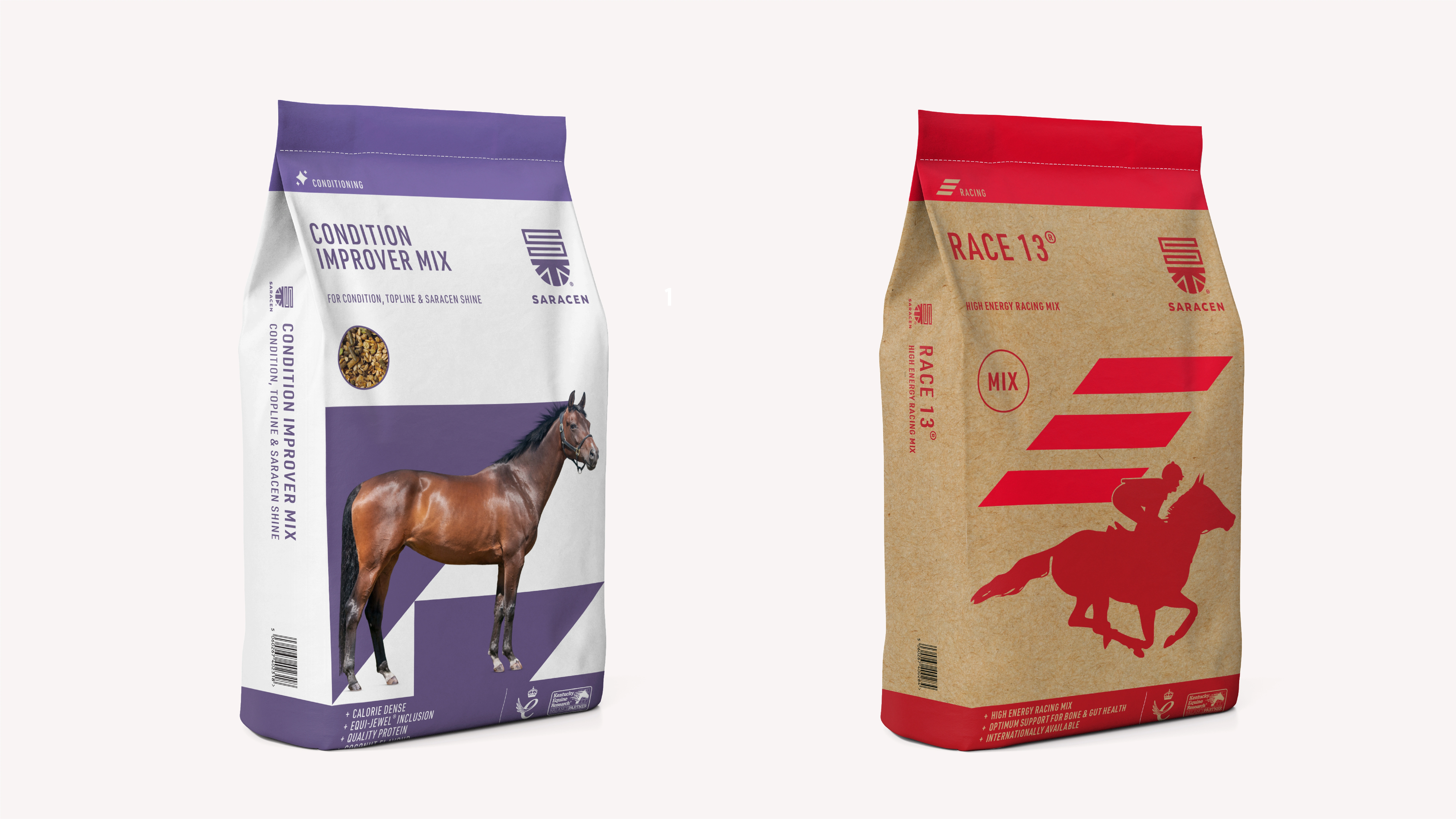
Redesigned packaging
Artwork on press
Like this project
Posted Sep 22, 2026
A large-scale packaging system designed to bring clarity, consistency, and standout across a complex portfolio of equine nutrition products.
Likes
0
Views
2
Timeline
Jun 1, 2025 - Feb 1, 2026
Clients
Saracen Horse Feeds