Select Website Redesign for Enhanced UX and SEO
Zach Clemmer
The Problem
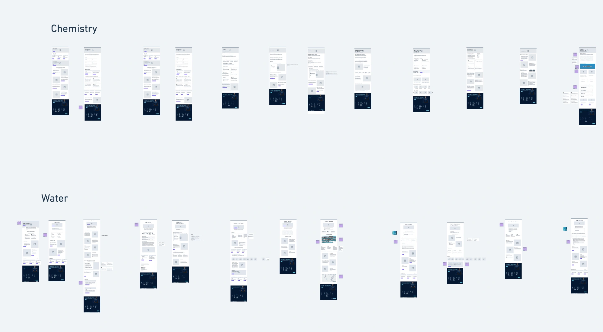
Select’s original website struggled with poor UX, scattered content, and confusing user journeys that made it difficult for visitors to understand the company’s full range of solutions. Navigation paths were disjointed, and important product or service information was buried or inconsistent, leading to frustration for users and missed opportunities for the business. The visual below captures the scale of the challenge—showcasing the many wireframes I mapped out to untangle and reorganize the site’s content into a clearer, more cohesive experience.
The Solution
We rebuilt Select’s website with a focus on clarity and usability, simplifying complex navigation paths and creating product pages that are both informative and intuitive. The visual below shows how users can move through the streamlined navigation to reach key product details, reflecting thoughtful UX and content design that makes Select’s broad offerings easier to explore and understand. It’s a digital experience crafted to help customers find solutions faster and connect more easily with Select’s expertise.
SEO
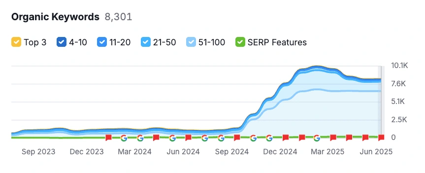
As part of the redesign, we overhauled Select’s SEO strategy—restructuring site architecture, sharpening keyword targeting, and creating content aligned with what users are searching for. The impact was clear; significant growth in organic rankings across thousands of keywords, including moving from unranked to the #1 spot for the key term “water transfer.” The chart below highlights how thoughtful content and UX not only boosts visibility but also attracts high-intent visitors ready to engage.
Recap
The Select website project was a chance to turn a complex, fragmented experience into a clear, modern platform that truly reflects the company’s breadth and expertise. From simplifying navigation to elevating product storytelling and driving measurable SEO gains, the new site empowers users to explore solutions with confidence and strengthens Select’s presence in a competitive market.
Like this project
Posted Jul 15, 2025
Rebuilt Select's website for better UX and SEO, boosting rankings and user engagement.
Likes
0
Views
2
Timeline
Jun 15, 2024 - Nov 15, 2024
Clients
Select