
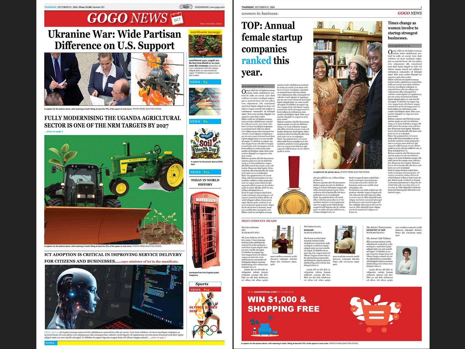
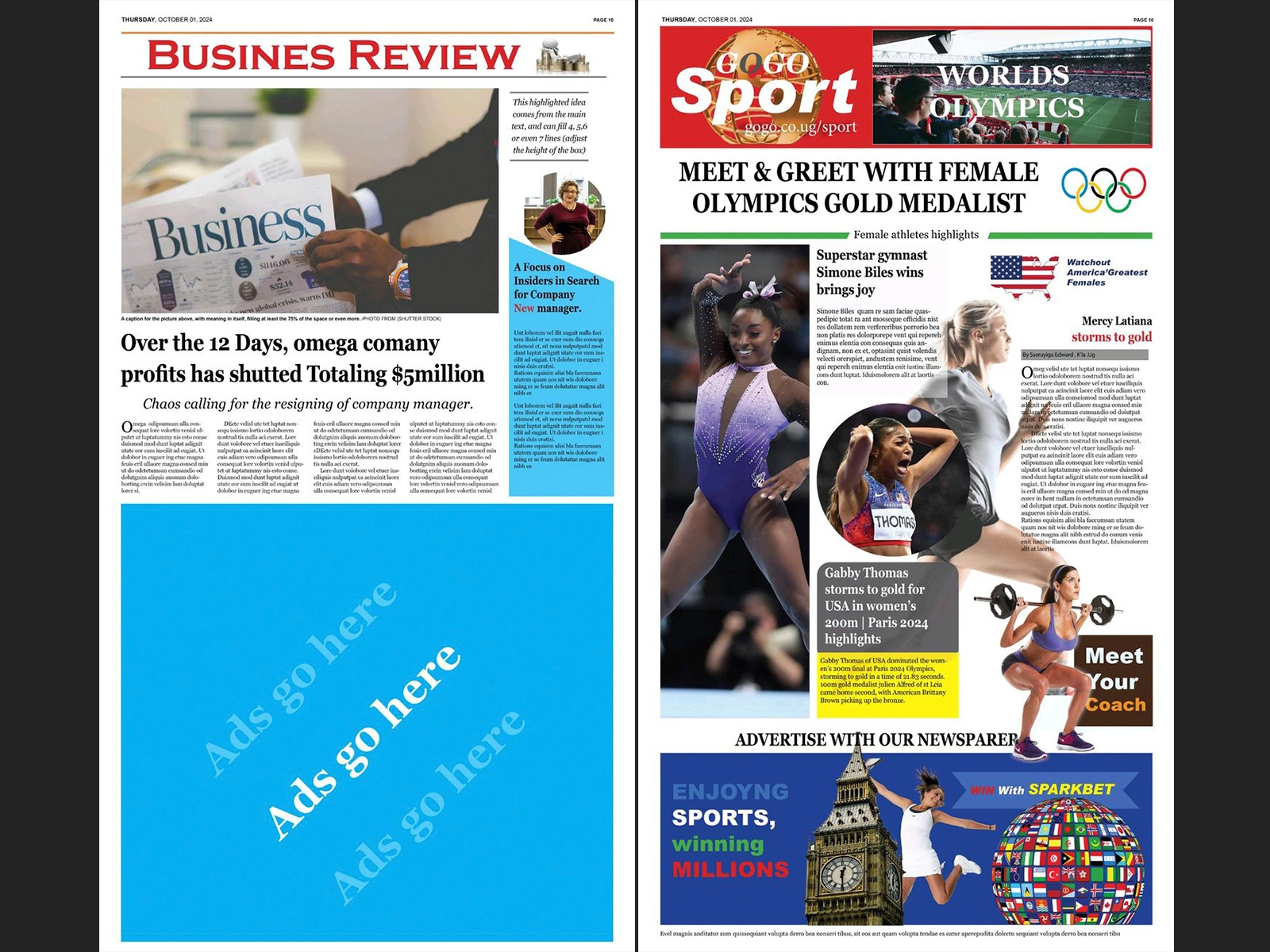
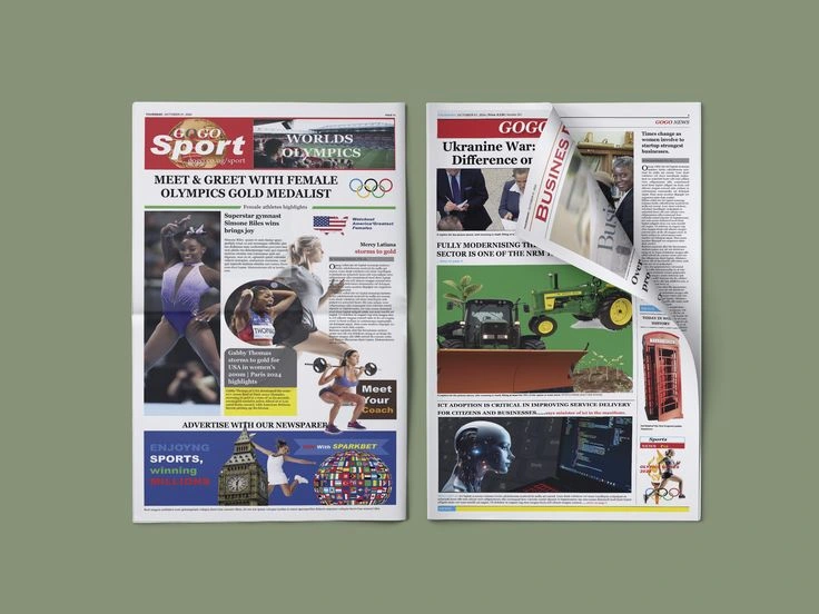
Turning heavy text and images into a clean, easy-to-read newspaper page. The goal was to make a busy layout look organized, balanced, and effortless for readers to scan.
What I Did
Clean Page Structure: Used a multi-column grid in Adobe Indesign so every article, headline, and photo lines up neatly.
Easy-to-Read Text: Adjusted font styles, line spacing, and letter spacing so the text flows smoothly without feeling cramped.
Clear Reading Order: Used bold headlines, subheadings, and pull quotes to naturally guide the reader's eye from the main story to the smaller details.
Consistent Colors & Neat Files: Kept colors uniform across the page and organized all layers and styles so the file is ready for easy updates or printing.
0 likes · 17 views · Jun 17, 2026
Turning heavy text and images into a clean, easy-to-read newspaper page.
