
AeroFit Fitness Brand Landing Page Case Study
Overview
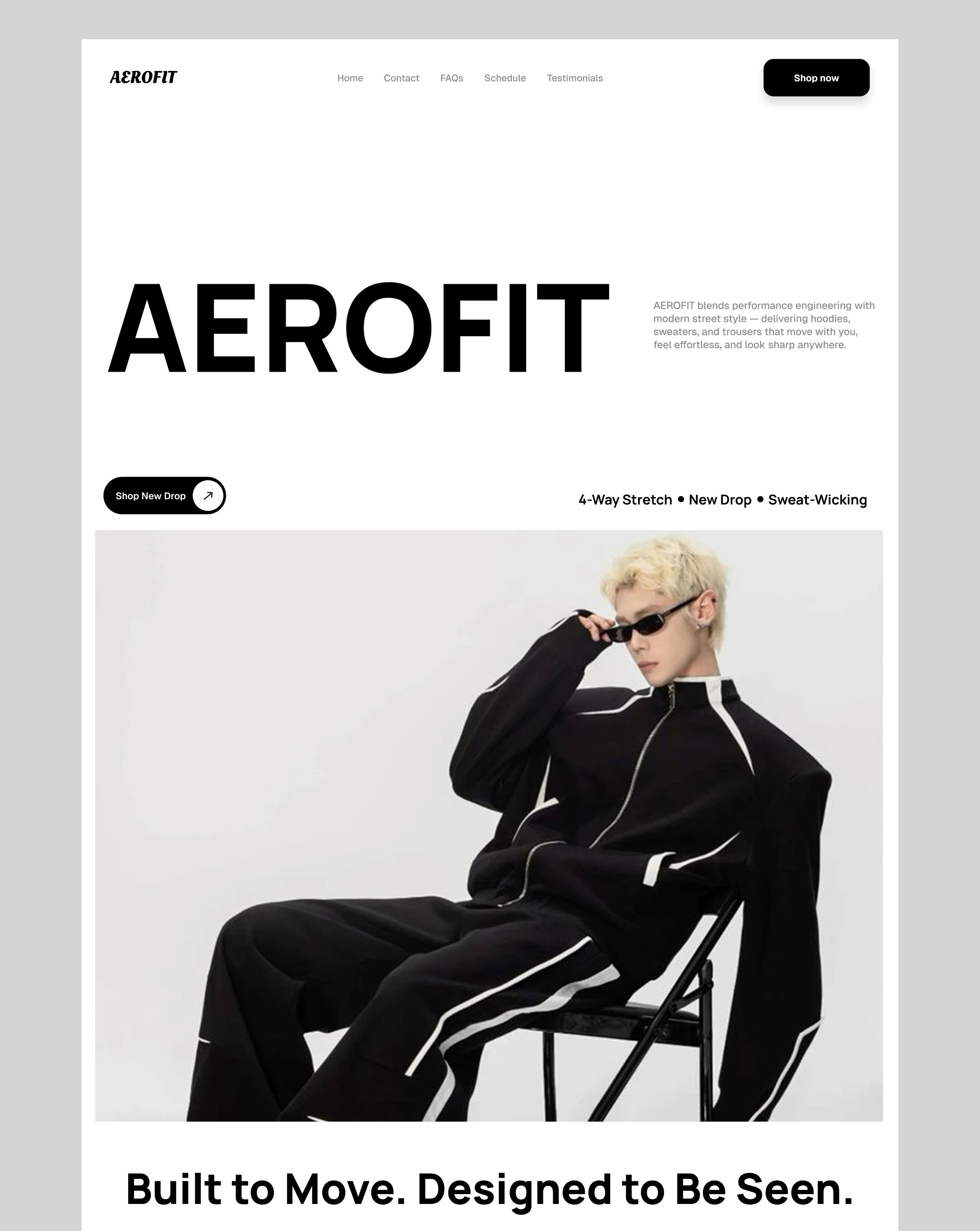
The goal of this project was to design a landing page for a modern fitness and active wear brand focused on performance that communicates energy, confidence and a strong brand identity while maintaining a modern and visually engaging experience.
Approach
The design process focused on creating a bold and structured interface that immediately captures attention. I started with a strong hero section built around impactful typography, clean composition, and clear call-to-action elements to establish the brand’s identity from the first interaction.
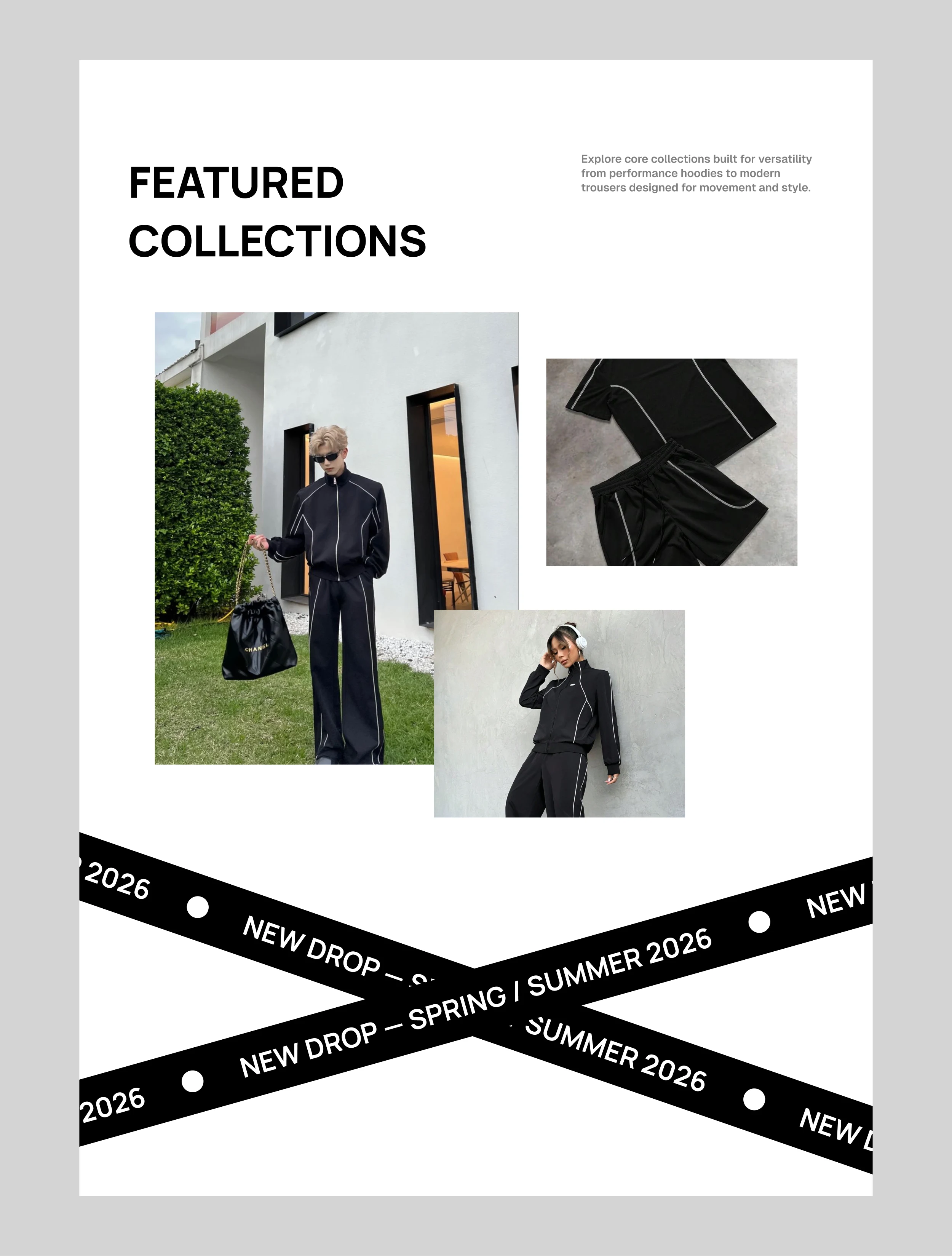
The page was then structured into organized sections highlighting products, brand values, and overall experience while maintaining smooth content flow and strong visual hierarchy.
Visual Direction
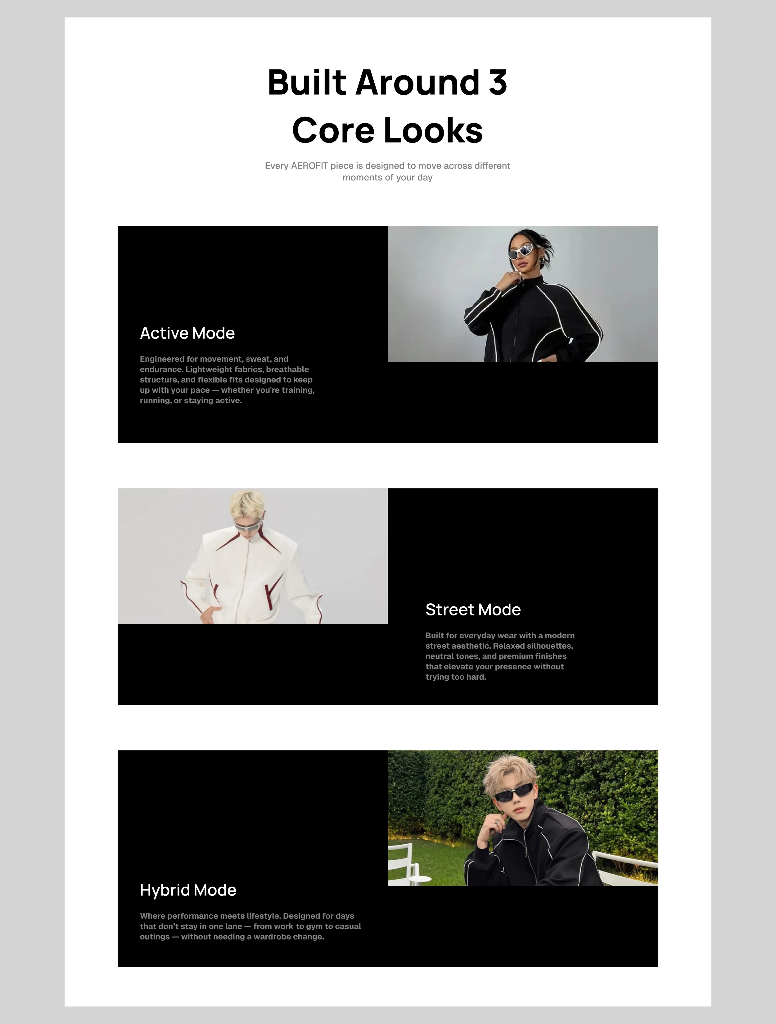
The visual style combines modern minimalism with a performance-driven aesthetic. Bold typography, clean layouts, balanced spacing and high-contrast visuals were used to create an interface that feels energetic, modern and aligned with a contemporary fitness brand.
Outcome
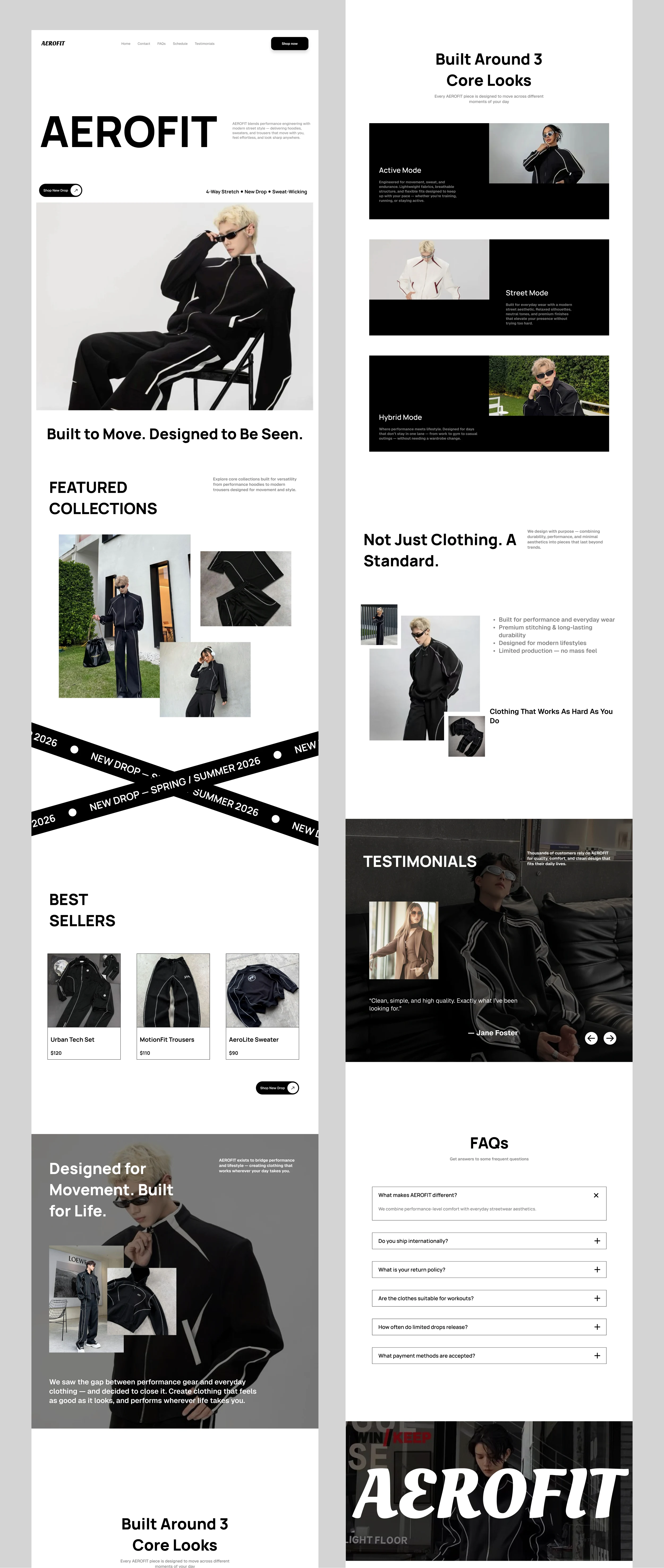
The final landing page delivers a clean and engaging digital experience that strengthens AeroFit’s brand presence while clearly presenting its products and overall identity in a modern and visually impactful way.
FULL LANDING PAGE
Conclusion
This project demonstrates how strong branding, structured layouts and modern visual hierarchy can create a bold and memorable experience for a fitness-focused digital product.
2 likes · 12 views · May 26, 2026
Landing page design for a fitness brand focused on performance, movement, and clean branding.

