Natunatu Visual Identity and Website Design

Jakub Čapliar


Project Overview
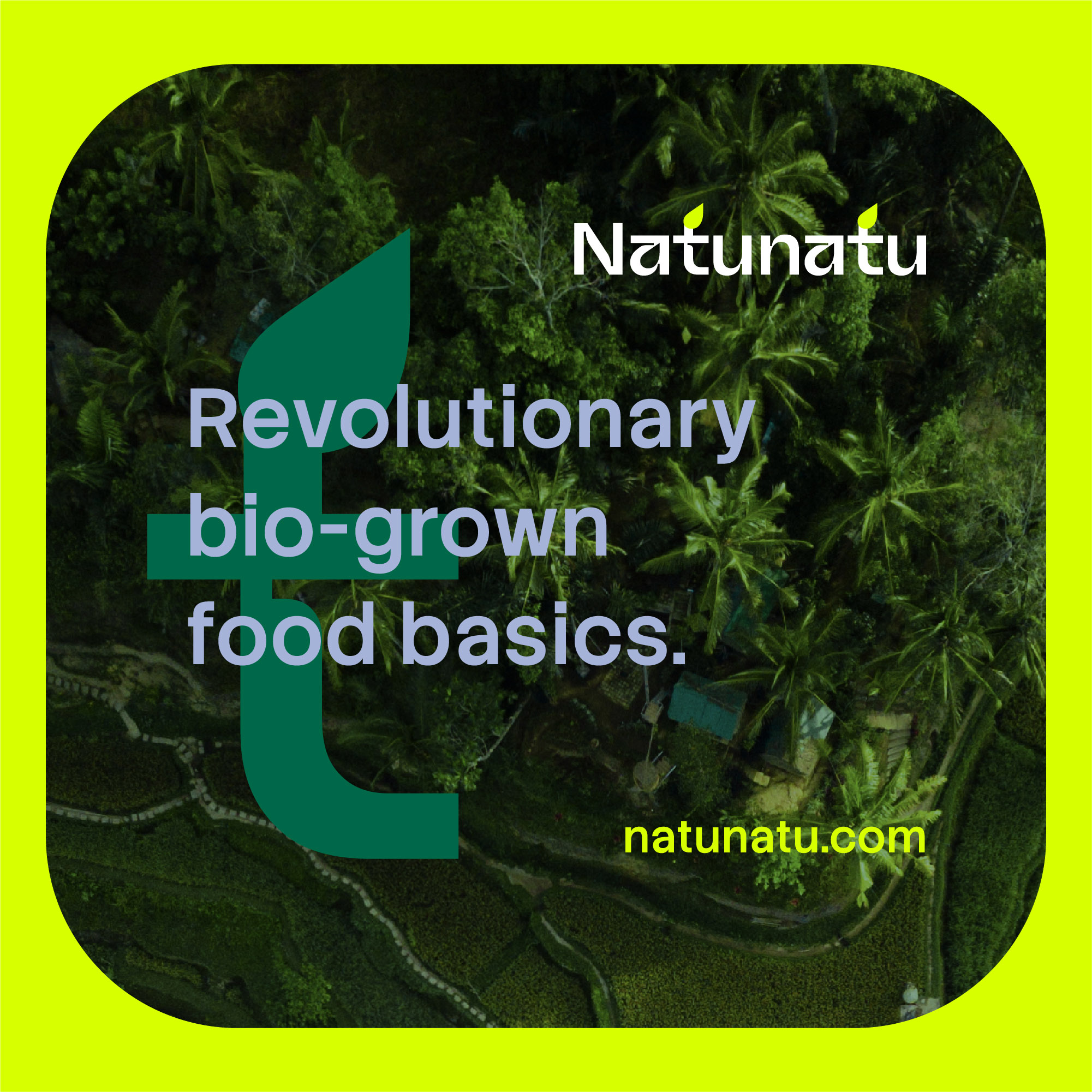
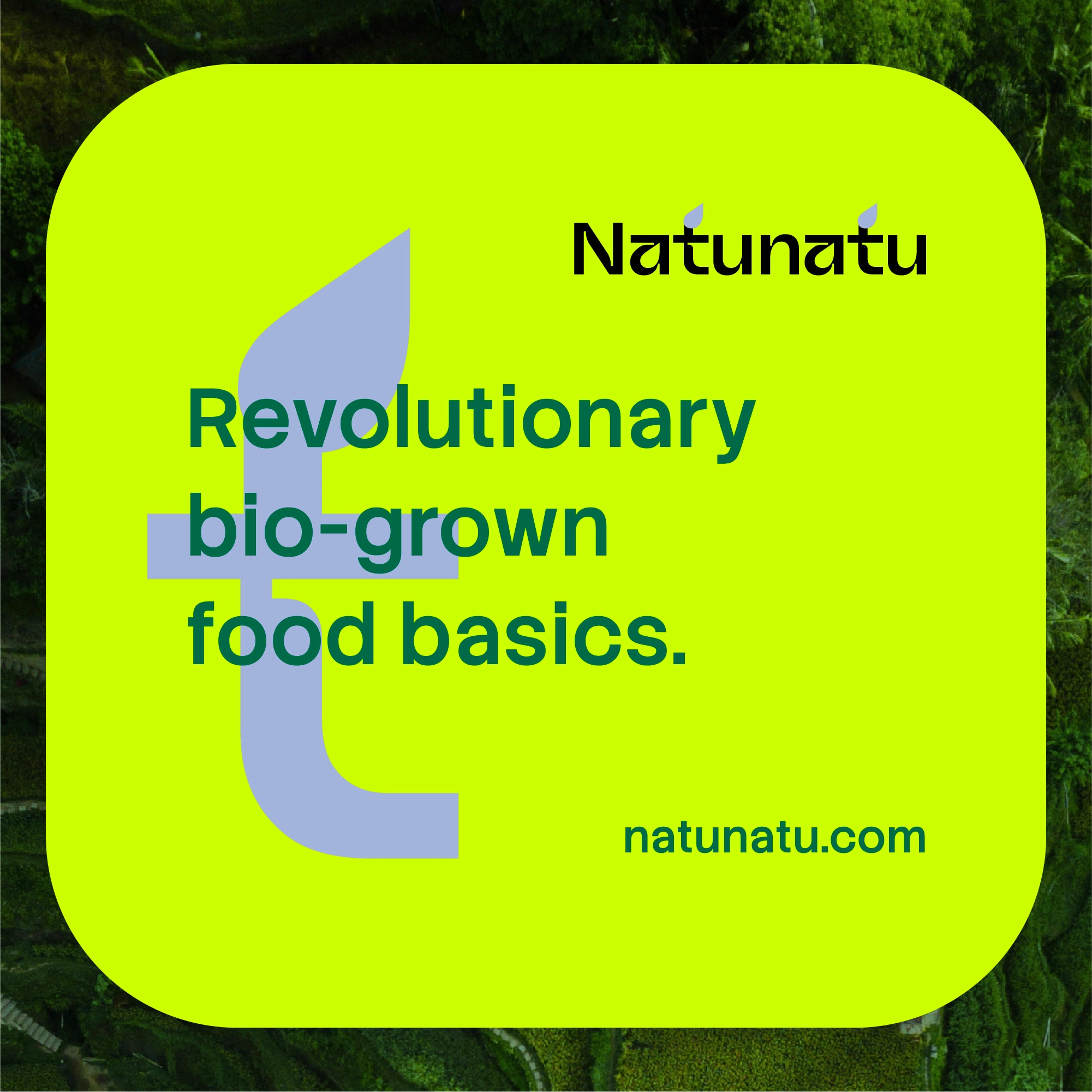
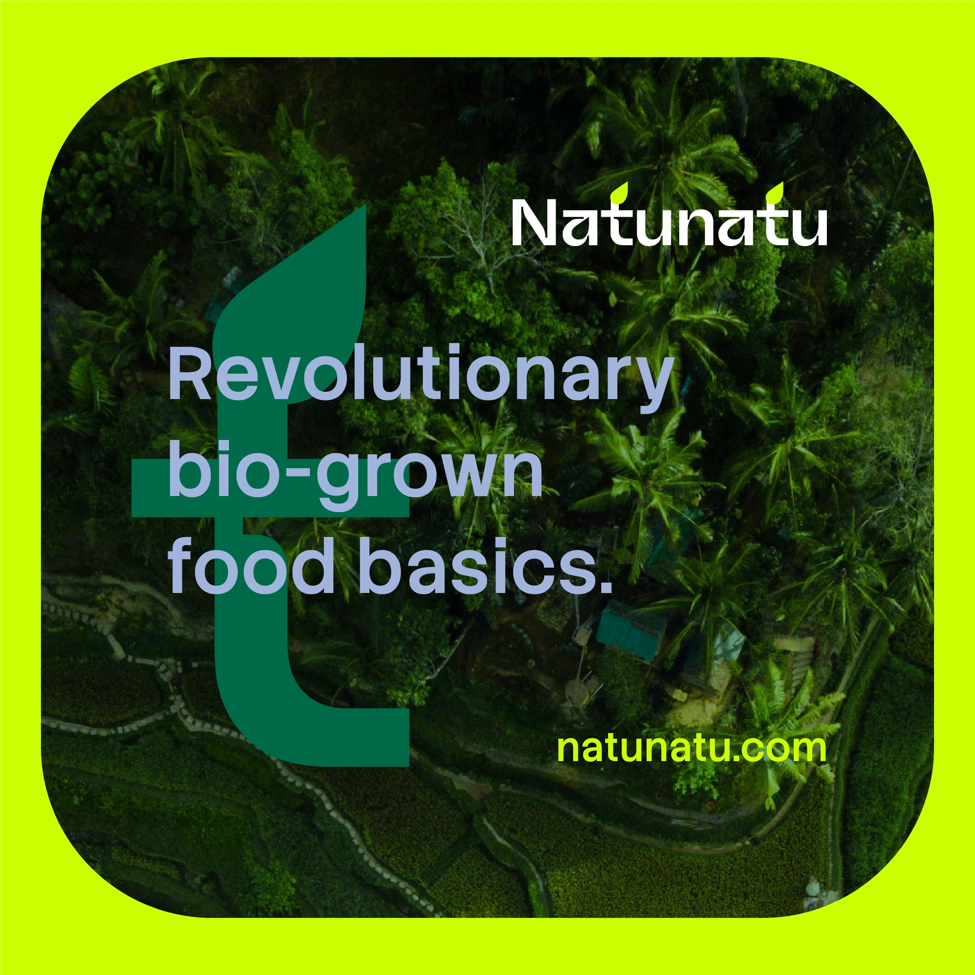
Natunatu is a “bio grown food basics” concept focused on freshness, simplicity, and strong shelf impact in digital space. The goal was to build a visual identity and a mobile-first website direction that feels natural and alive - but still structured, usable, and consistent.
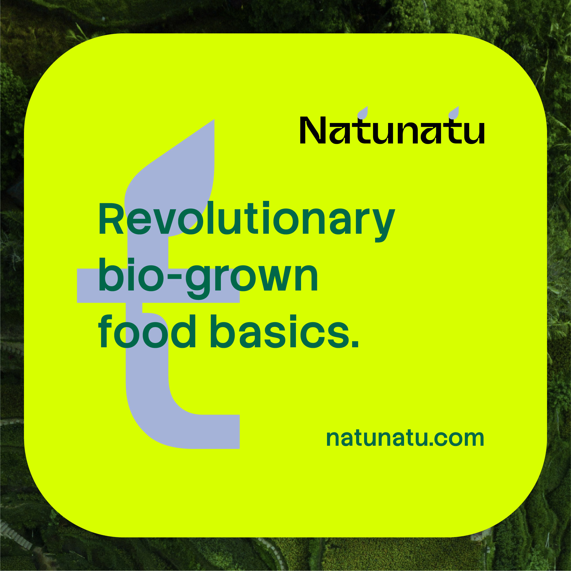
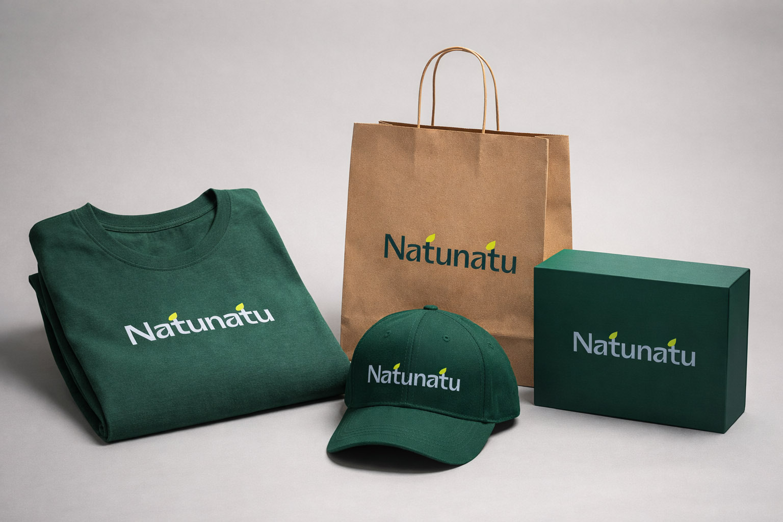
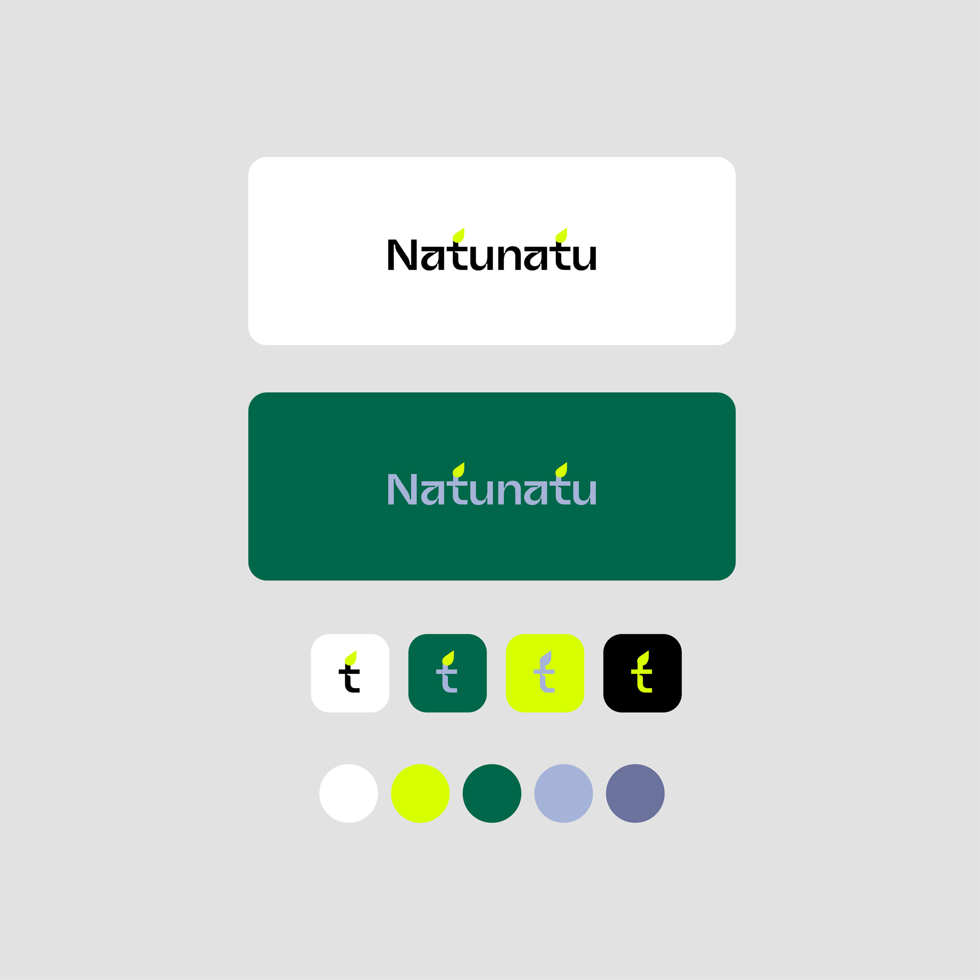
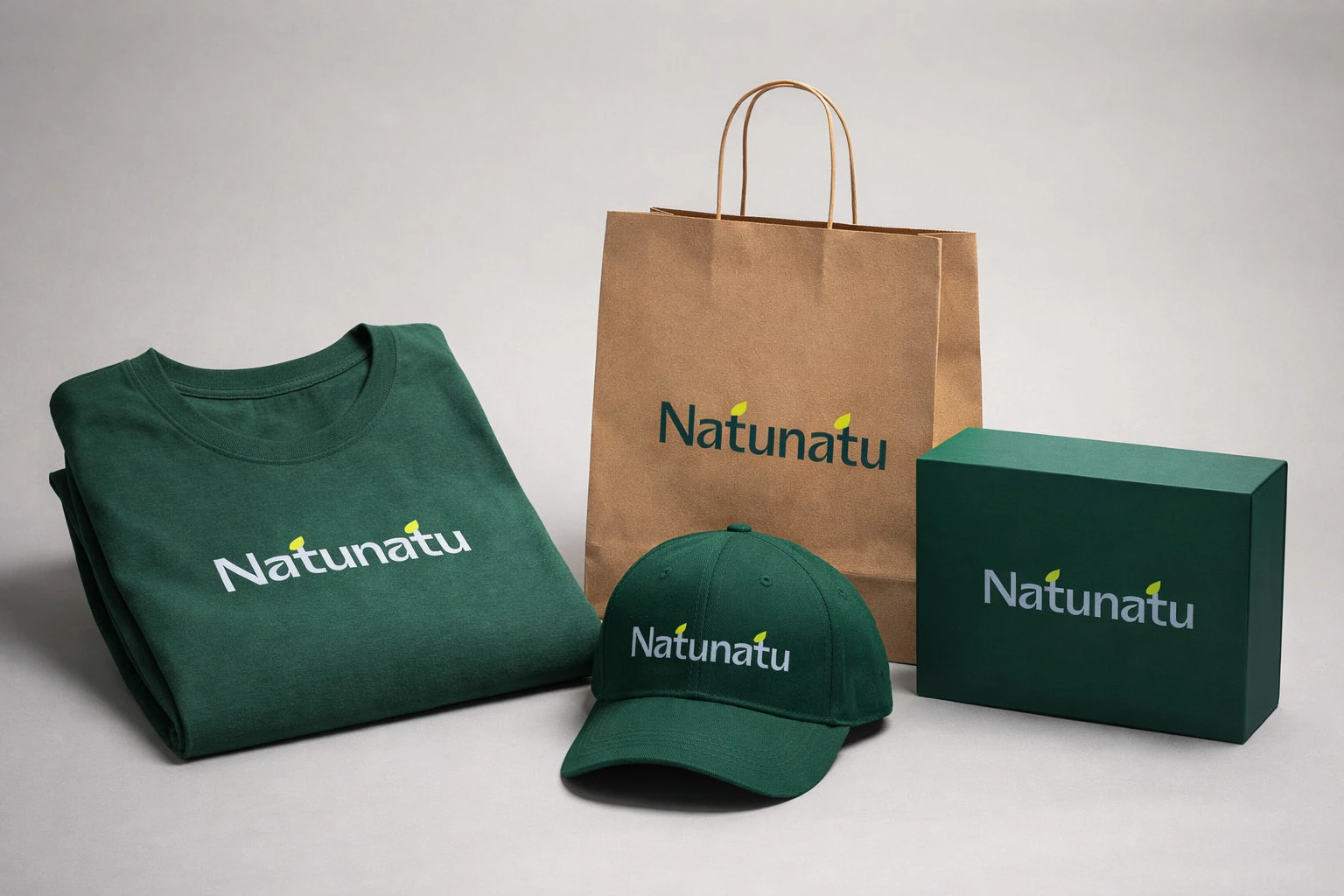
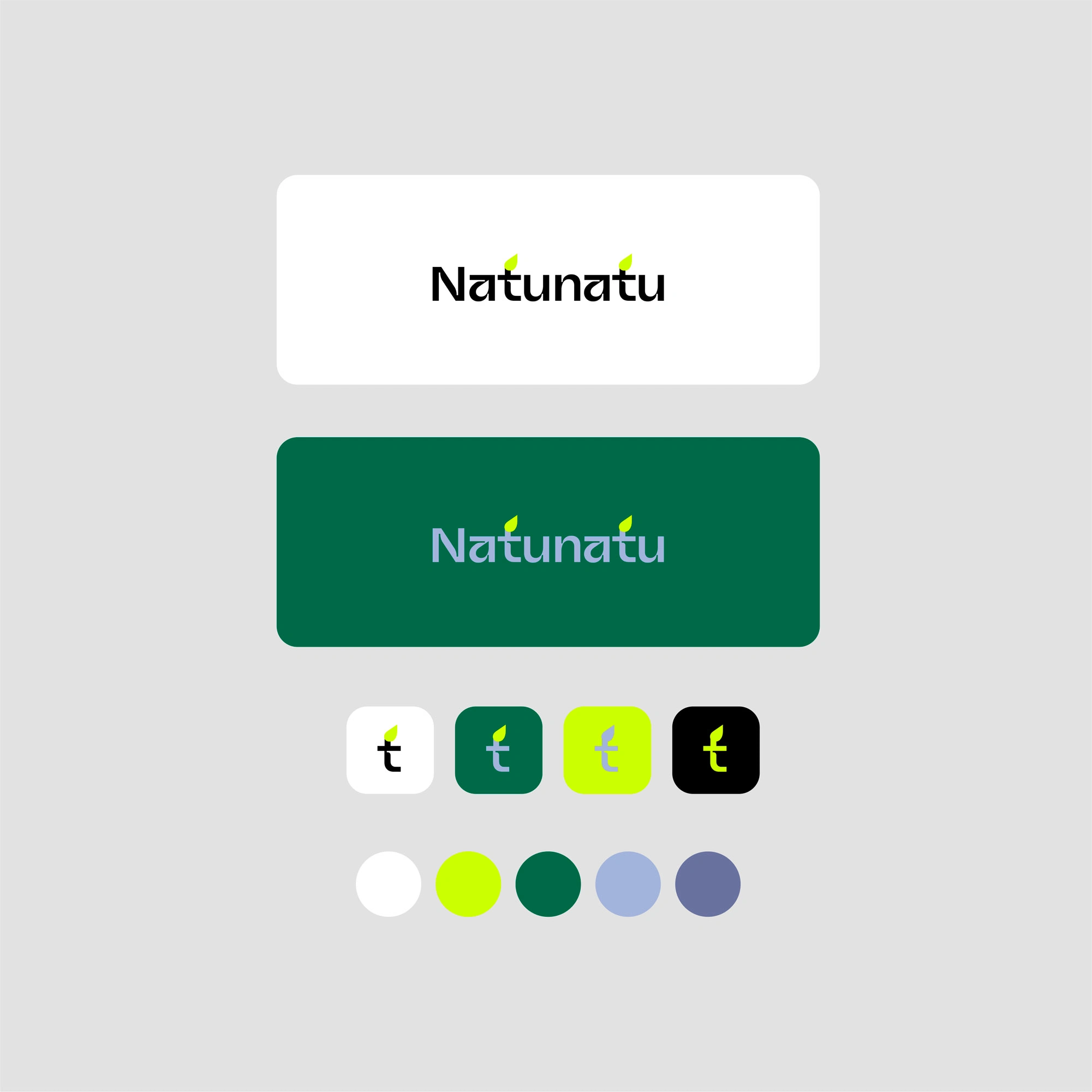
The logo works with a clear freshness signal: leaf shapes integrated directly into the mark. It’s a small detail, but it instantly communicates “fresh / bio” even before you read any copy.
We built the palette around a shining, loud green that evokes something fresh and organic. To keep it from feeling too aggressive, the system uses structured color blocks and calmer neutrals to support typography, spacing, and hierarchy.
“The idea was: brave energy first, then clarity.”
Mobile Website Design - Natural Backgrounds + Field Blurring
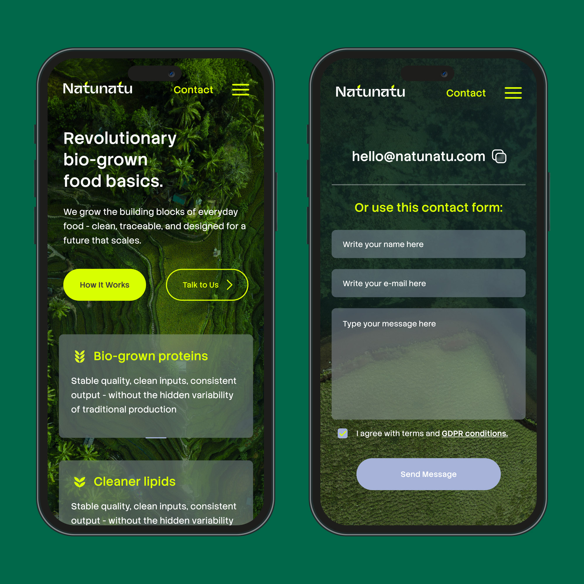
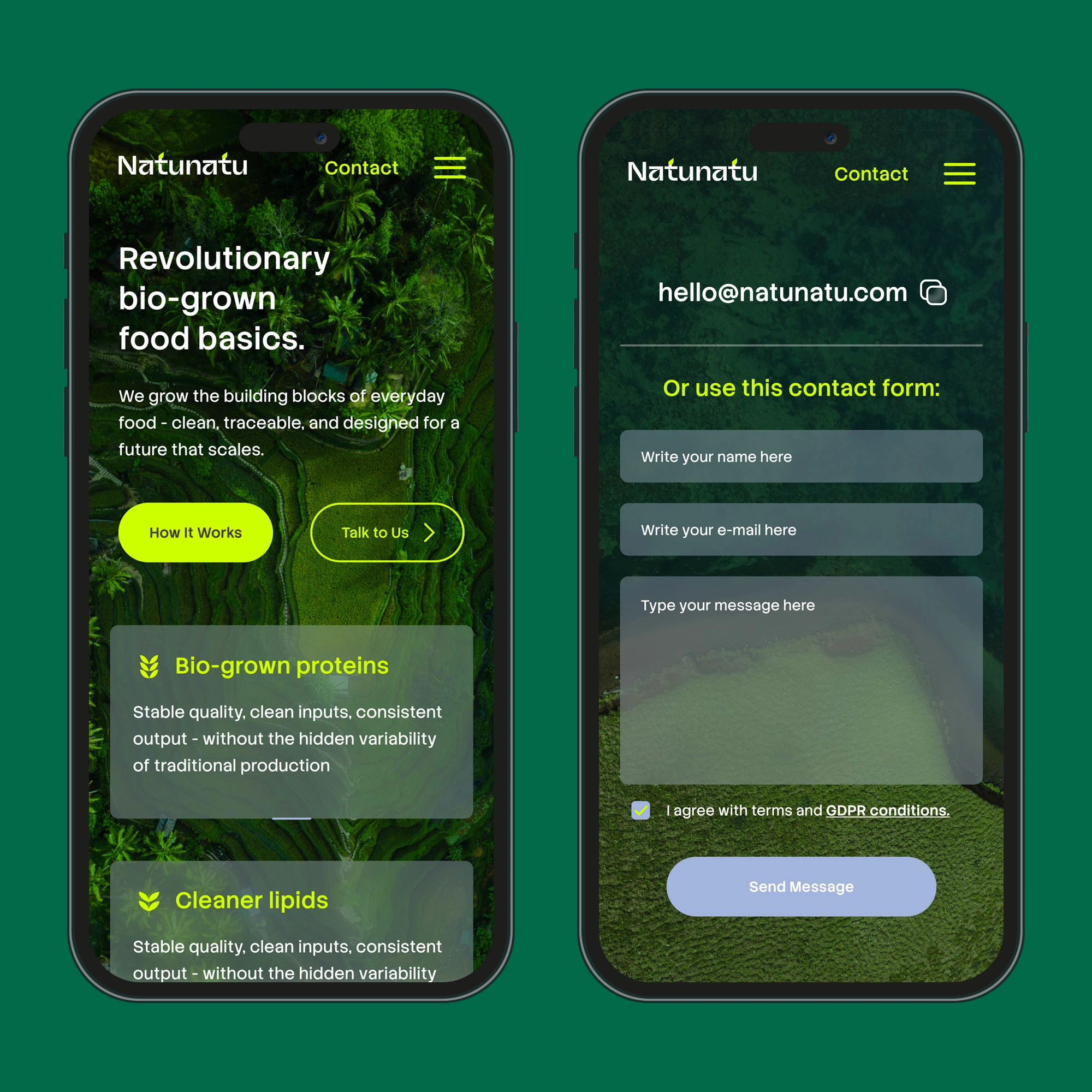
On mobile, we experimented with natural photo backgrounds instead of the usual modern pattern of solid, “decent” colors where everything starts to look the same.
To keep desired contrast and readability, we used subtle field blurring in areas behind text and UI elements — so the interface stays clear even on busy imagery.
Standards Still Matter
Even with brave backgrounds, the UX must keep standards: call-to-action buttons in the right place, consistent icons, predictable form field order, and repeatable spacing rules. The result is a website direction that feels different and alive, but behaves like a reliable product.
Like this project
Posted Mar 23, 2026
Developed visual identity and mobile-first website for Natunatu's fresh food concept.