Vibecoder — Brand Design & Animation
Yunis Mikayilov
Verified
Challenge & Solution
Vibecoder is an AI-powered no-code platform designed to simplify the way websites are built. By combining intelligent automation with an intuitive interface, it empowers creators to launch professional websites without technical barriers. Its vision is to make web development faster, more accessible, and open to anyone with an idea.
Our challenge was to translate Vibecoder’s powerful product idea into a clear and memorable identity. The brand needed to look modern and trustworthy, but without becoming overly complex or cold. At the same time, it had to express speed and innovation while staying simple enough to connect with a broad audience. The absence of a consistent brand and motion language risked leaving the product without a strong visual anchor.
We delivered a complete system across Brand Design and Motion Design. The approach was to create a minimal yet confident visual identity and support it with motion that communicates Vibecoder’s straightforward process. Together, these two pillars brought structure, rhythm, and focus to the brand, making its value proposition clear and impactful.
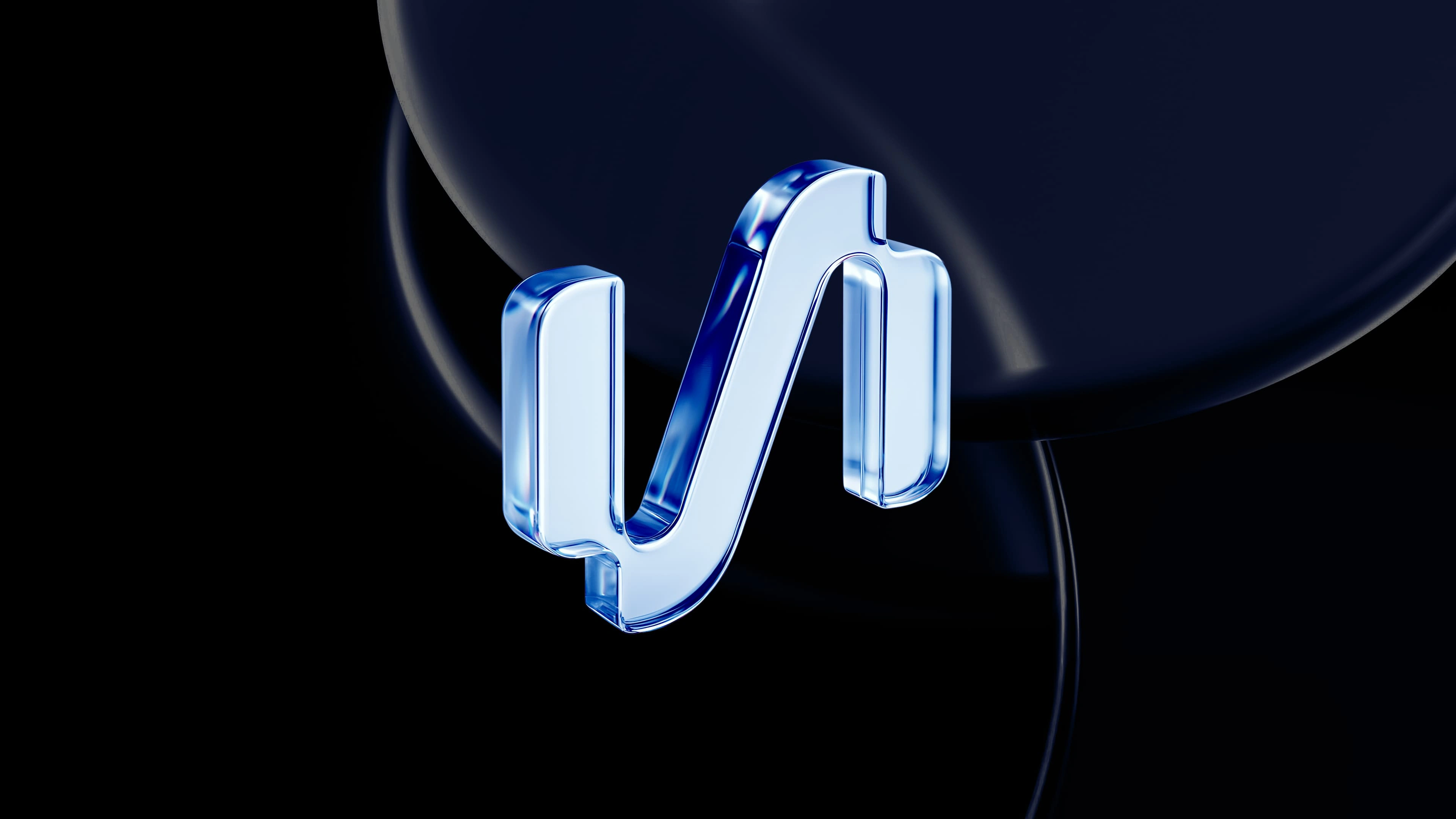
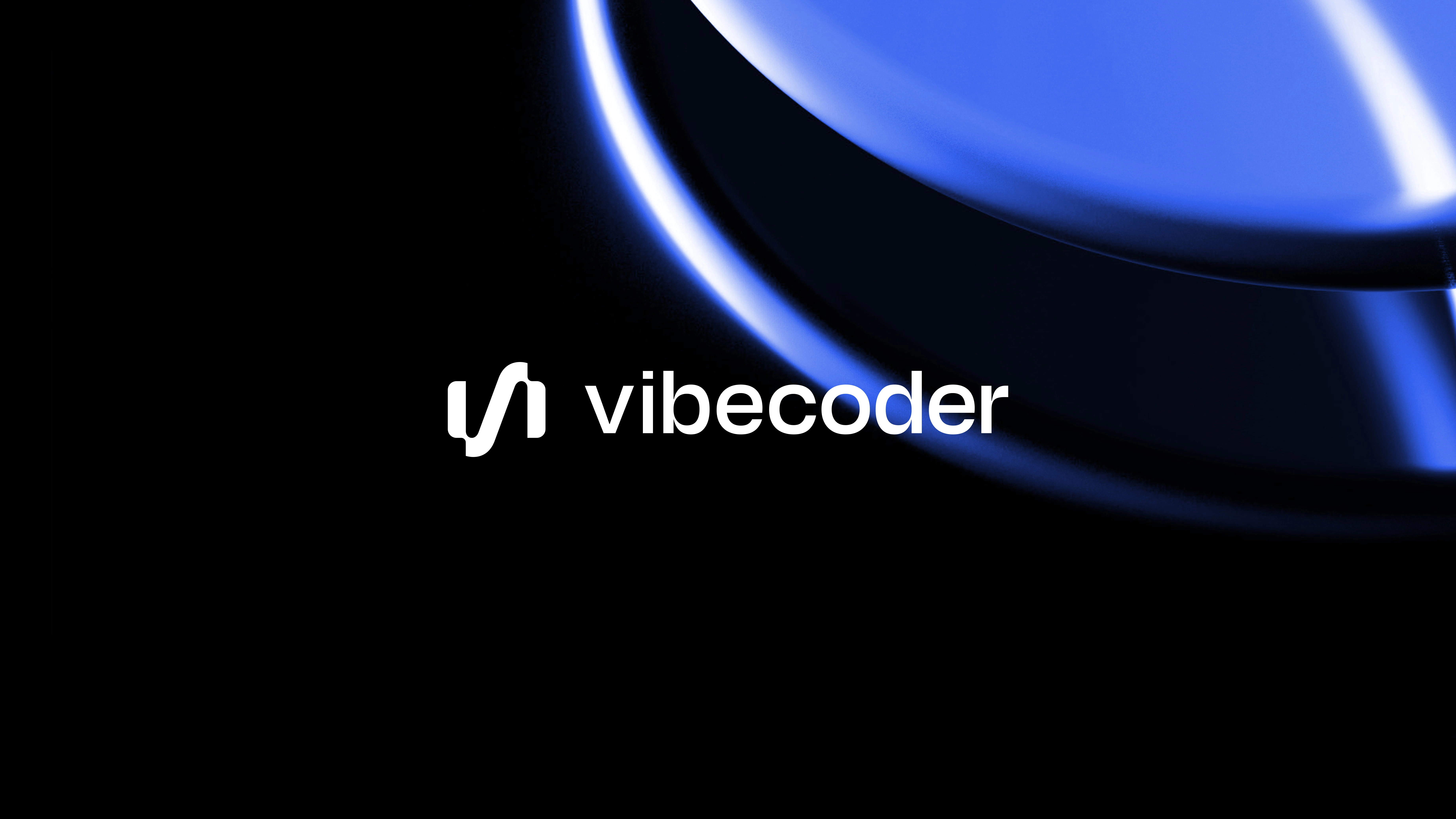
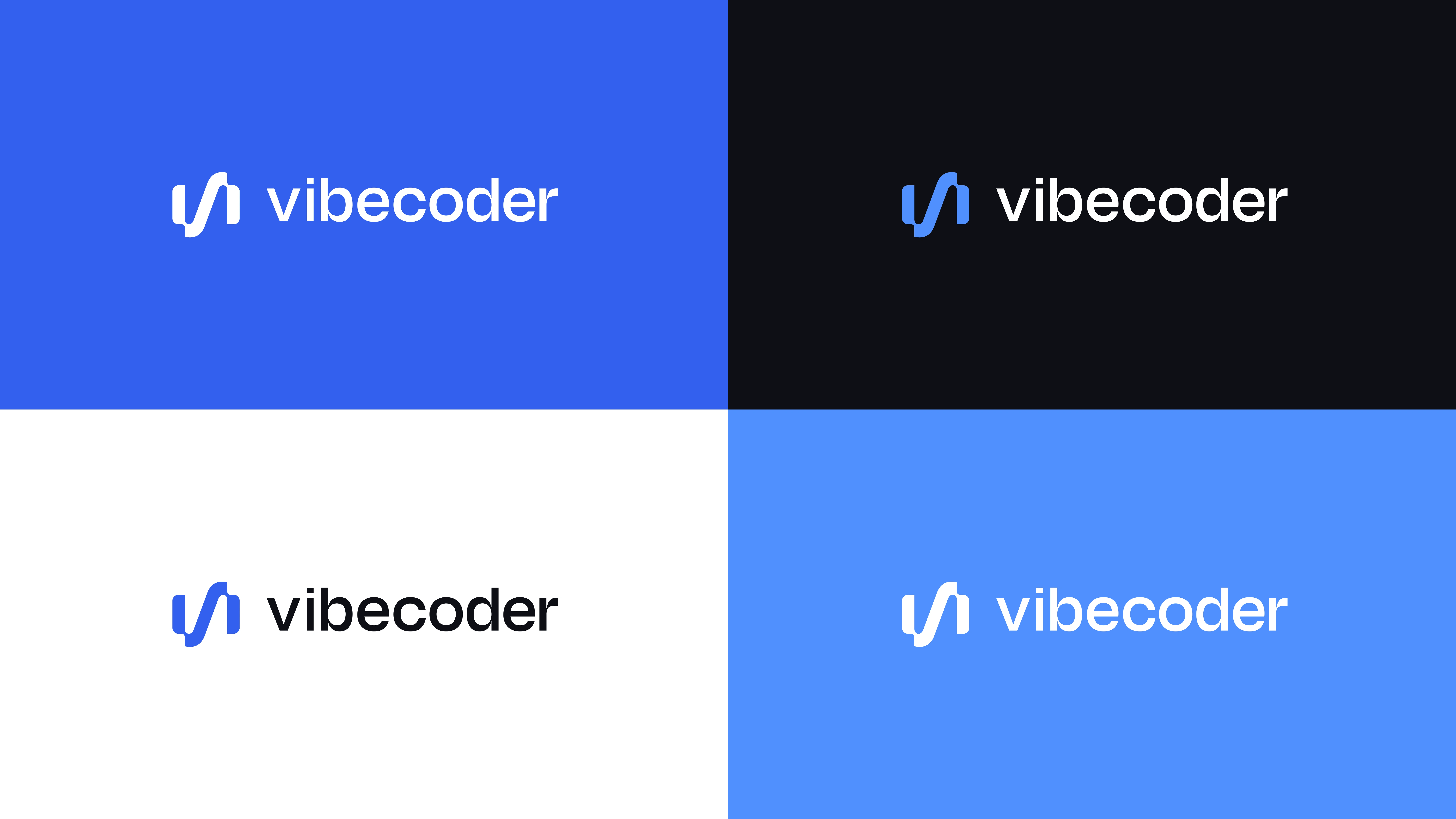
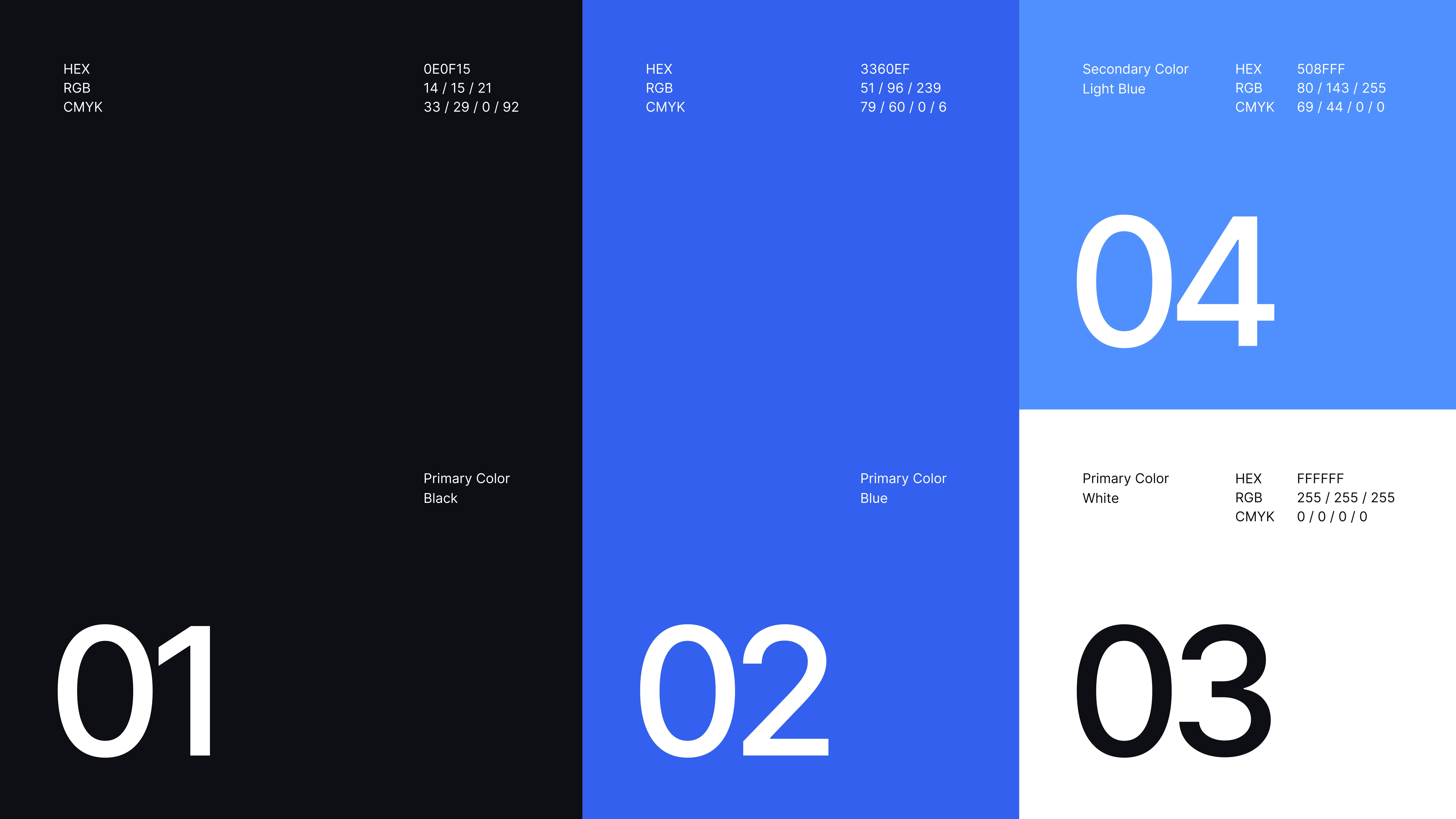
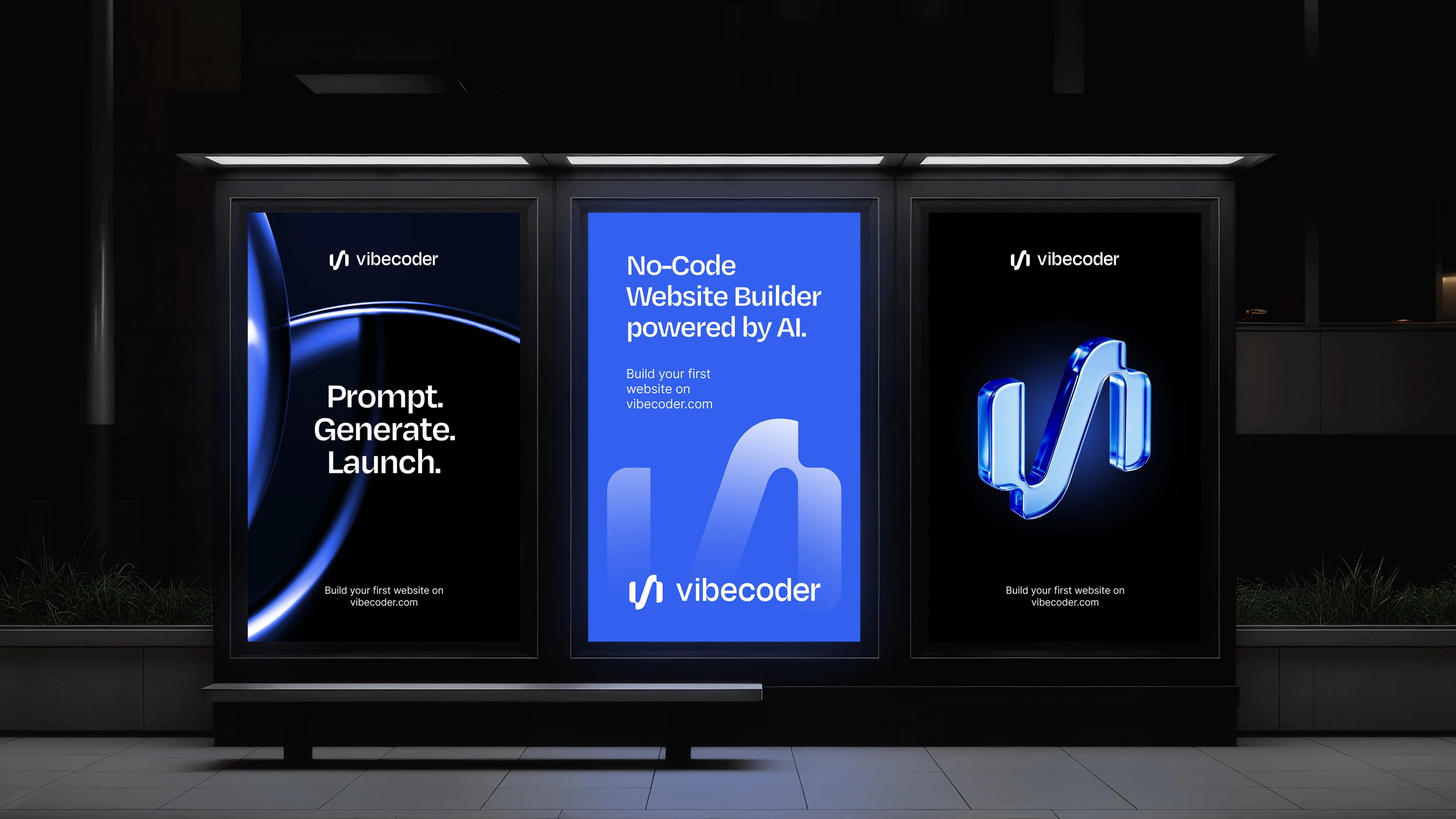
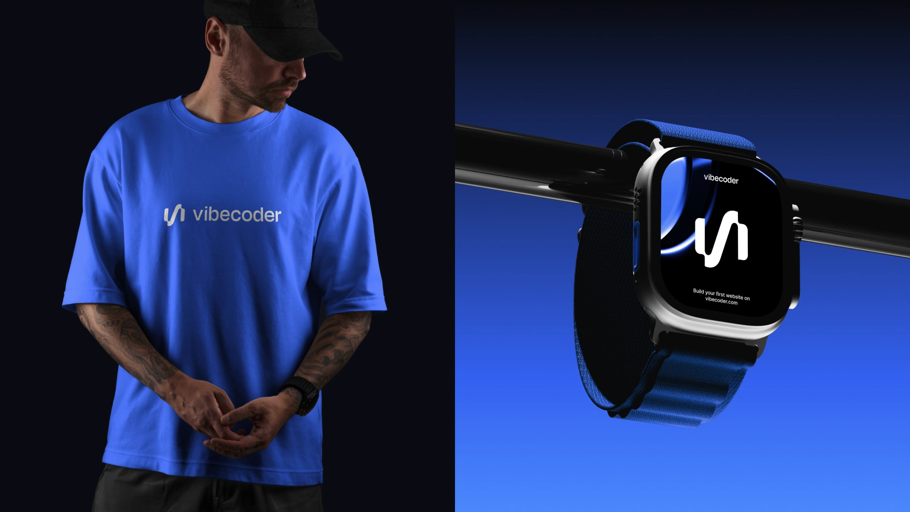
The visual identity was built on a focused palette of black, blue, and white. Black adds strength and authority, blue conveys innovation and trust, and white provides balance and breathing space. This combination creates clarity and confidence, helping Vibecoder stand out in a crowded market while keeping the experience clean and user-friendly.
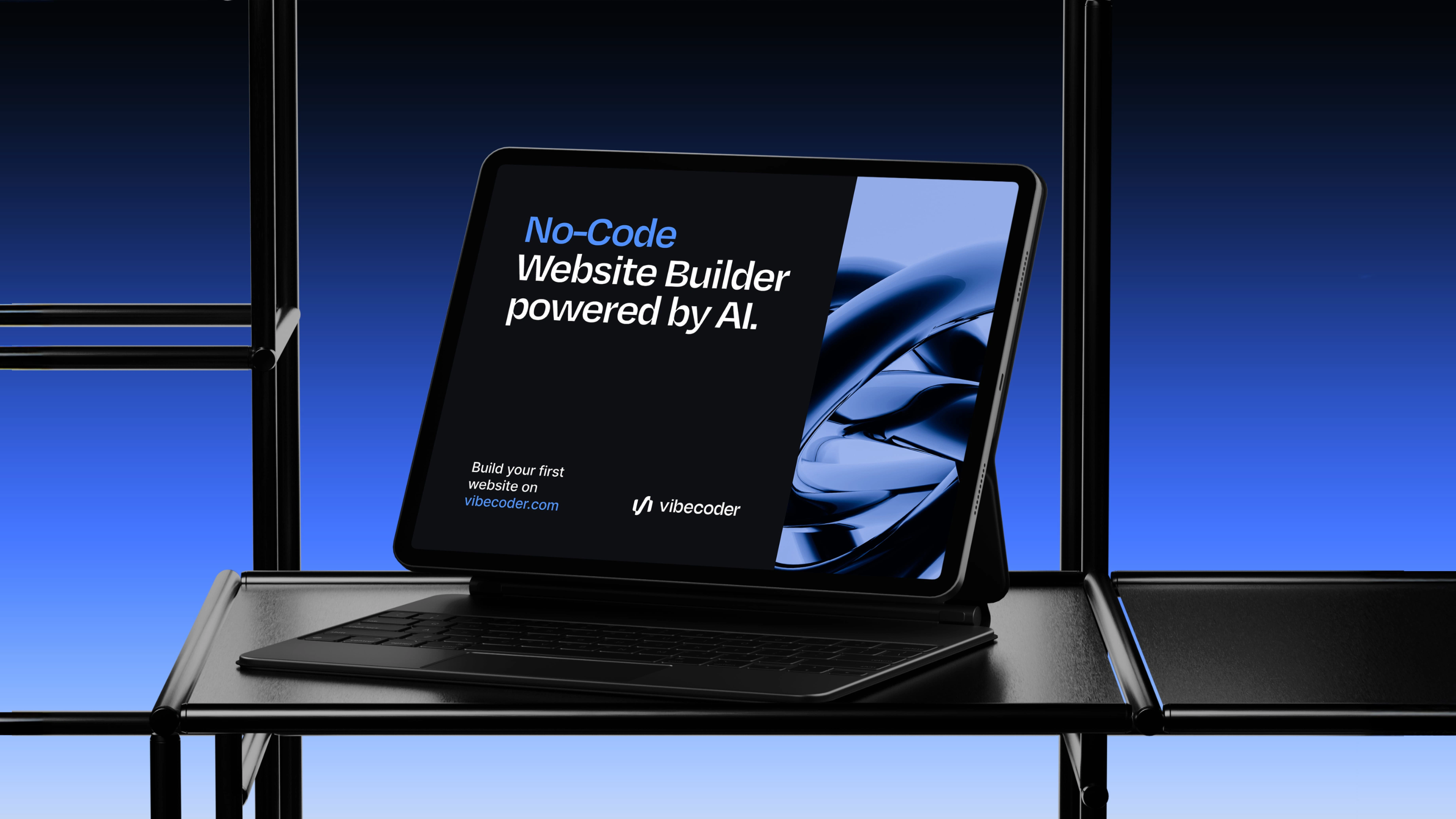
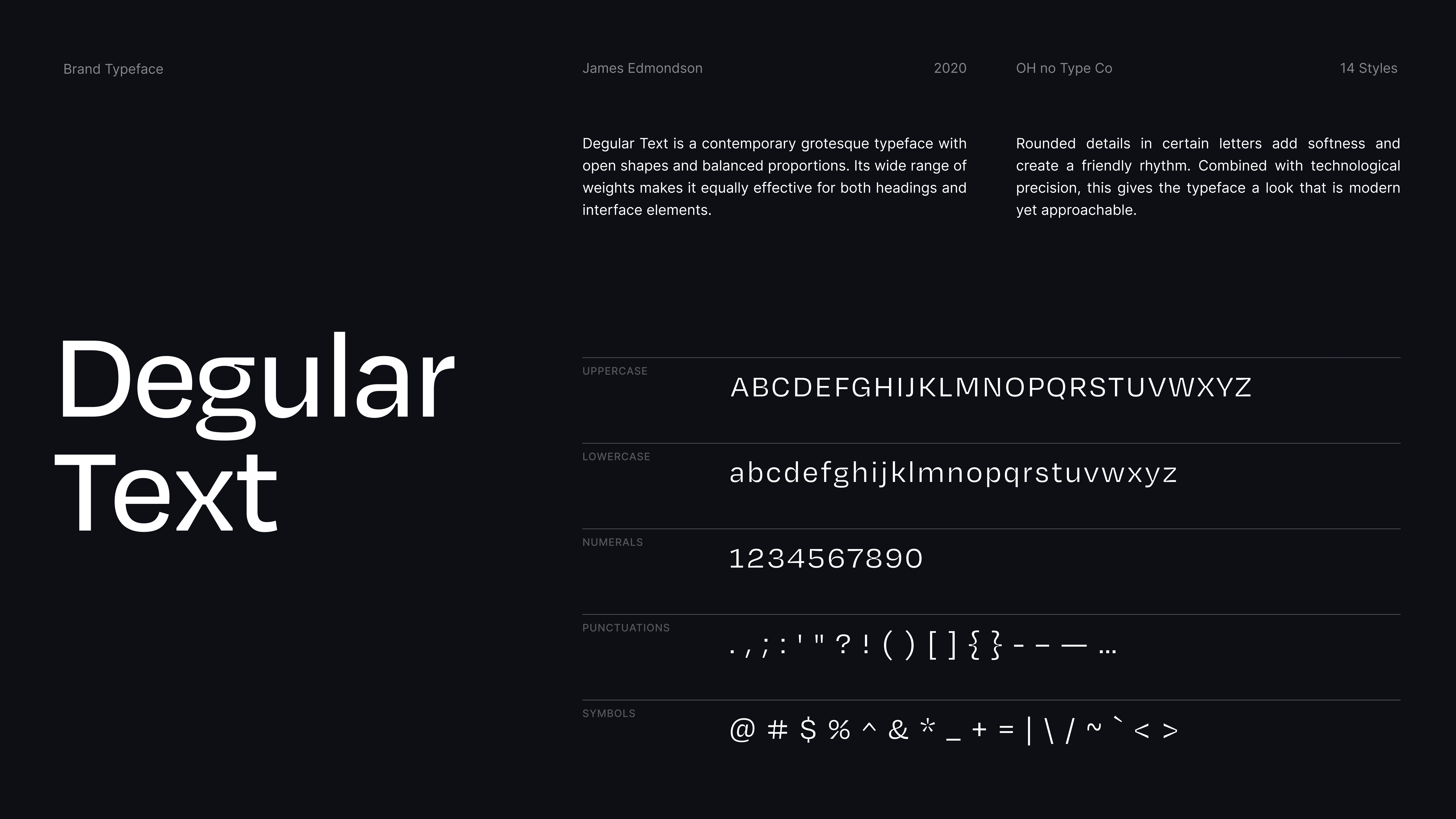
We chose Degular as the main typeface. Its open forms, balanced proportions, and rounded details strike a balance between precision and friendliness. This makes it effective in both large headings and small interface elements. Degular reinforces the dual personality of Vibecoder: technologically advanced but accessible to everyone.
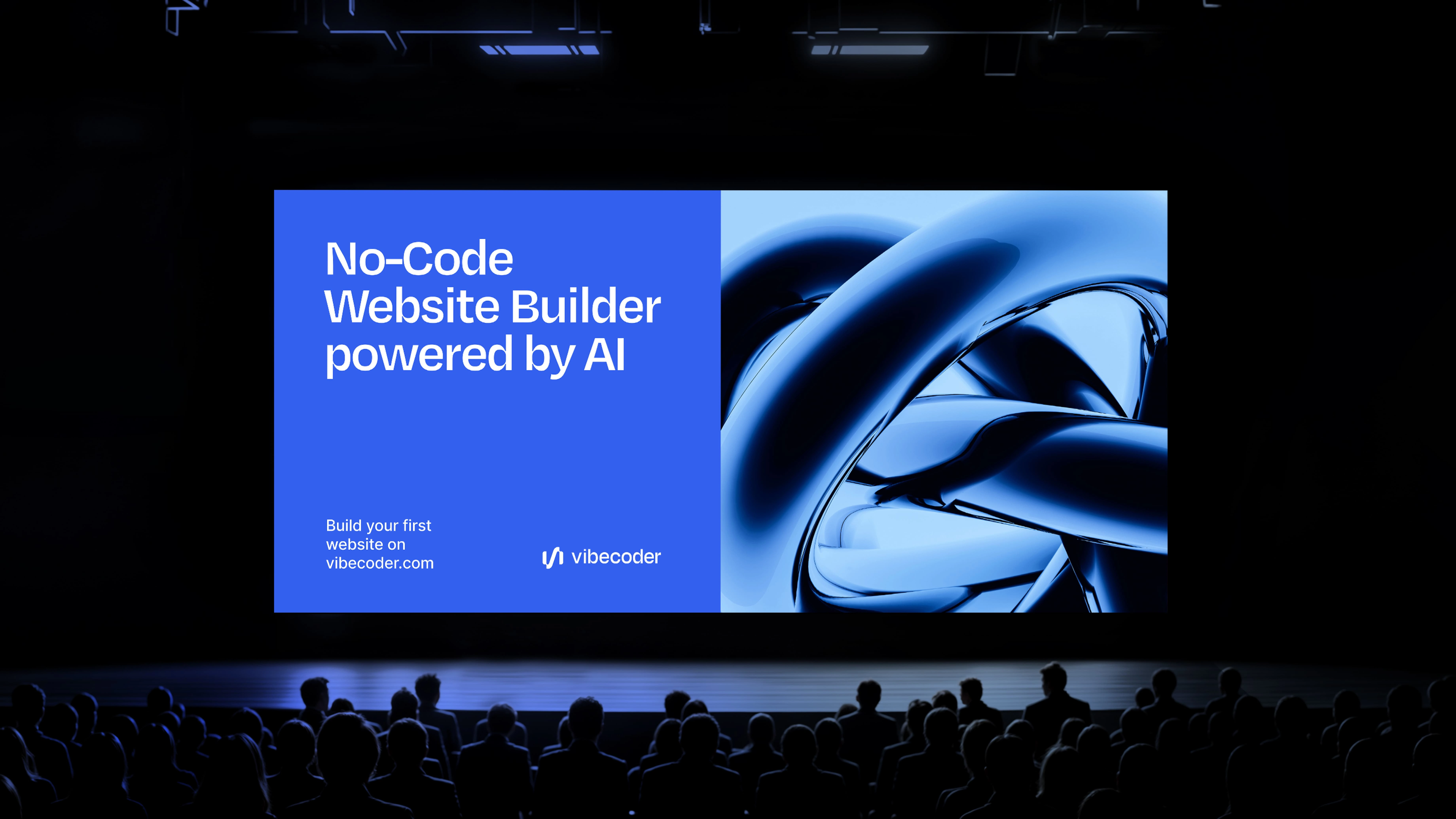
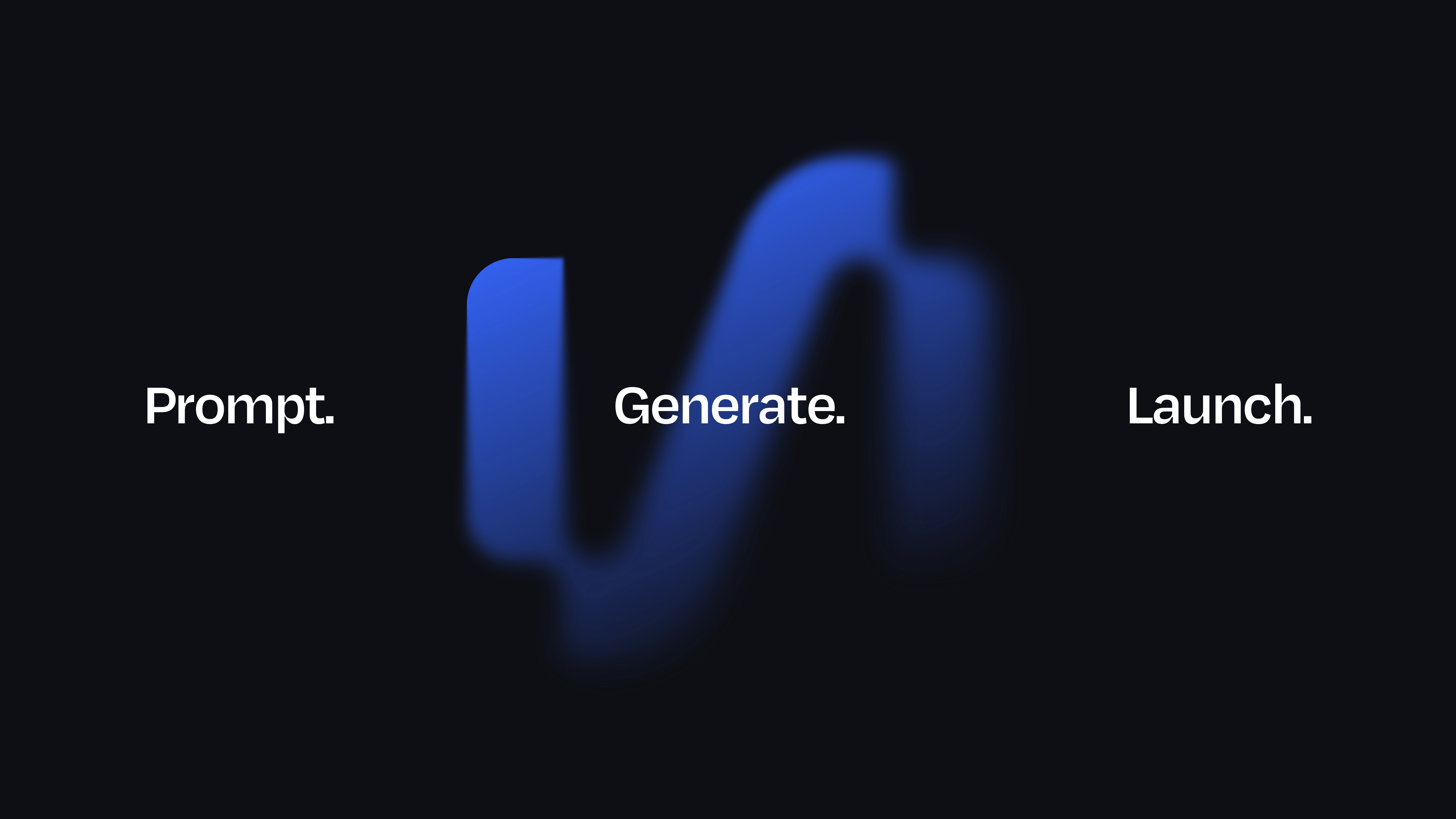
Motion design was centered around the brand’s core message: “Prompt. Generate. Launch.” Each stage of this mantra was animated with deliberate pacing and bold typography, so the viewer could feel the flow of the product itself. The clean, type-driven approach made the communication direct, reflecting Vibecoder’s simplicity and speed.
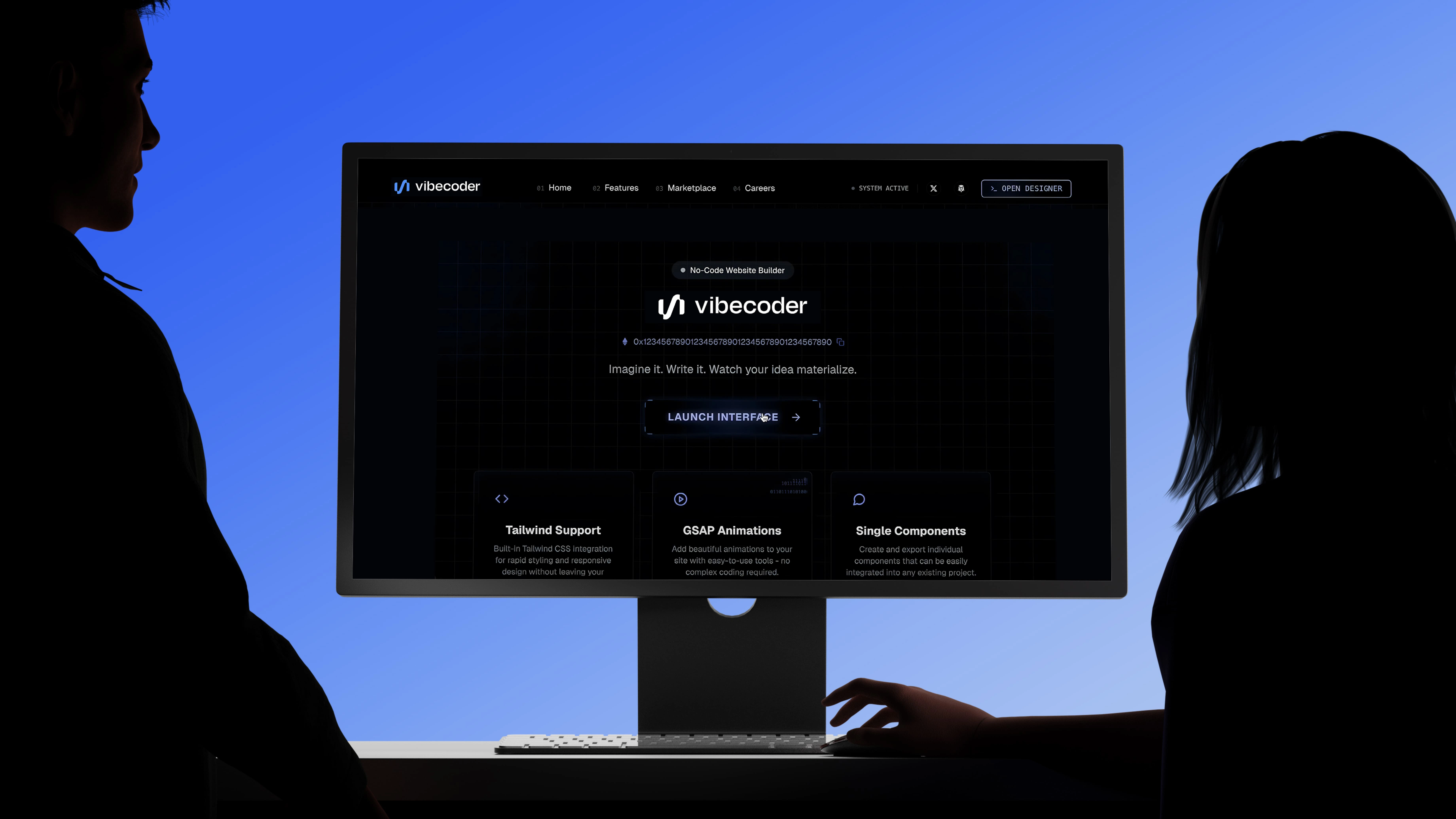
Transitions were smooth and purposeful, echoing the frictionless product experience. The animations highlighted energy and momentum without overwhelming the viewer. This made motion not just a decorative element, but a functional tool to explain how Vibecoder works and why it feels effortless to use.
With its new identity, Vibecoder now communicates exactly what it offers: a modern, AI-powered tool that makes building websites fast and intuitive. The combination of brand and motion design created a unified system that is both visually striking and easy to understand, ensuring Vibecoder stands out with clarity, confidence, and simplicity.
Like this project
Posted Dec 7, 2025
A minimal and rhythmic visual identity for Vibecoder supported by clean UI, subtle motion, and a modern design system crafted for digital creators.
Likes
2
Views
67
Timeline
Feb 21, 2025 - Feb 22, 2025