Nazaare - Photography & Filmmaking Club Rebrand
The official photography and filmmaking club of JSS college requires a rebranding to update its image and appeal to a modern audience. The current branding is old-fashioned and outdated, lacking the sleek, modern, and elegant aesthetic that would attract new members and reflect the club's values of creativity, collaboration, and professionalism. The rebranding should aim to create a cohesive and memorable visual identity that conveys the club's innovative and contemporary approach to photography and filmmaking.

NAZAARE - Photography & Filmmaking Club
This could involve a new logo design, typography, color scheme, and overall brand messaging that captures the essence of the club's values and resonates with its target audience. The new branding should be adaptable, versatile, and scalable to accommodate future growth and development of the club.
With that, I was able to give the brand it's new keywords :
ELEGANT • EXPRESSIVE • MINIMAL
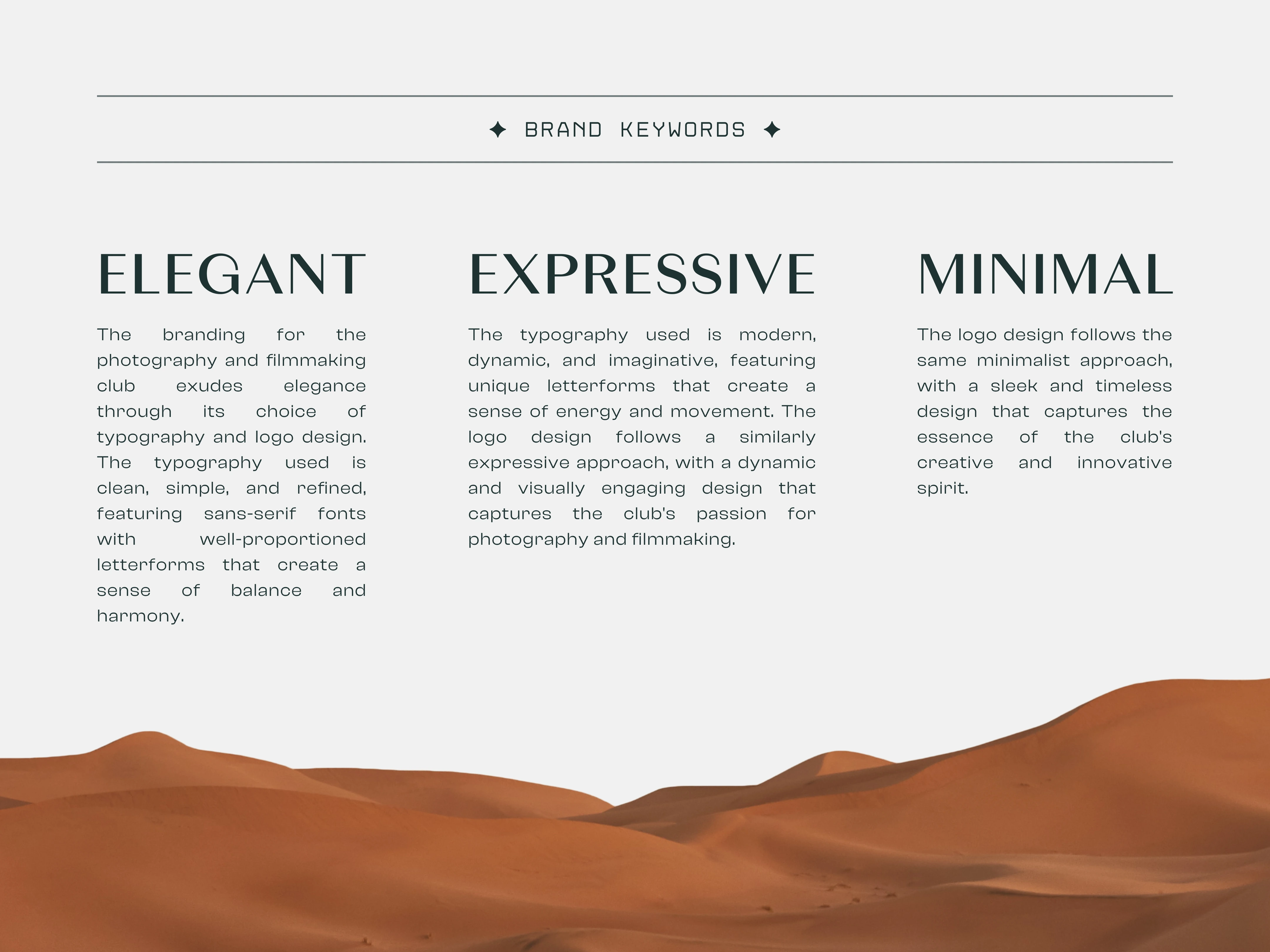
BRAND KEYWORDS
Brand values are the foundation of a brand's identity, shaping every aspect of its design and messaging to create a unique and cohesive visual identity that resonates with its target audience.
It was important that during this rebrand, we follow the same values that has been followed by the team throughout the years
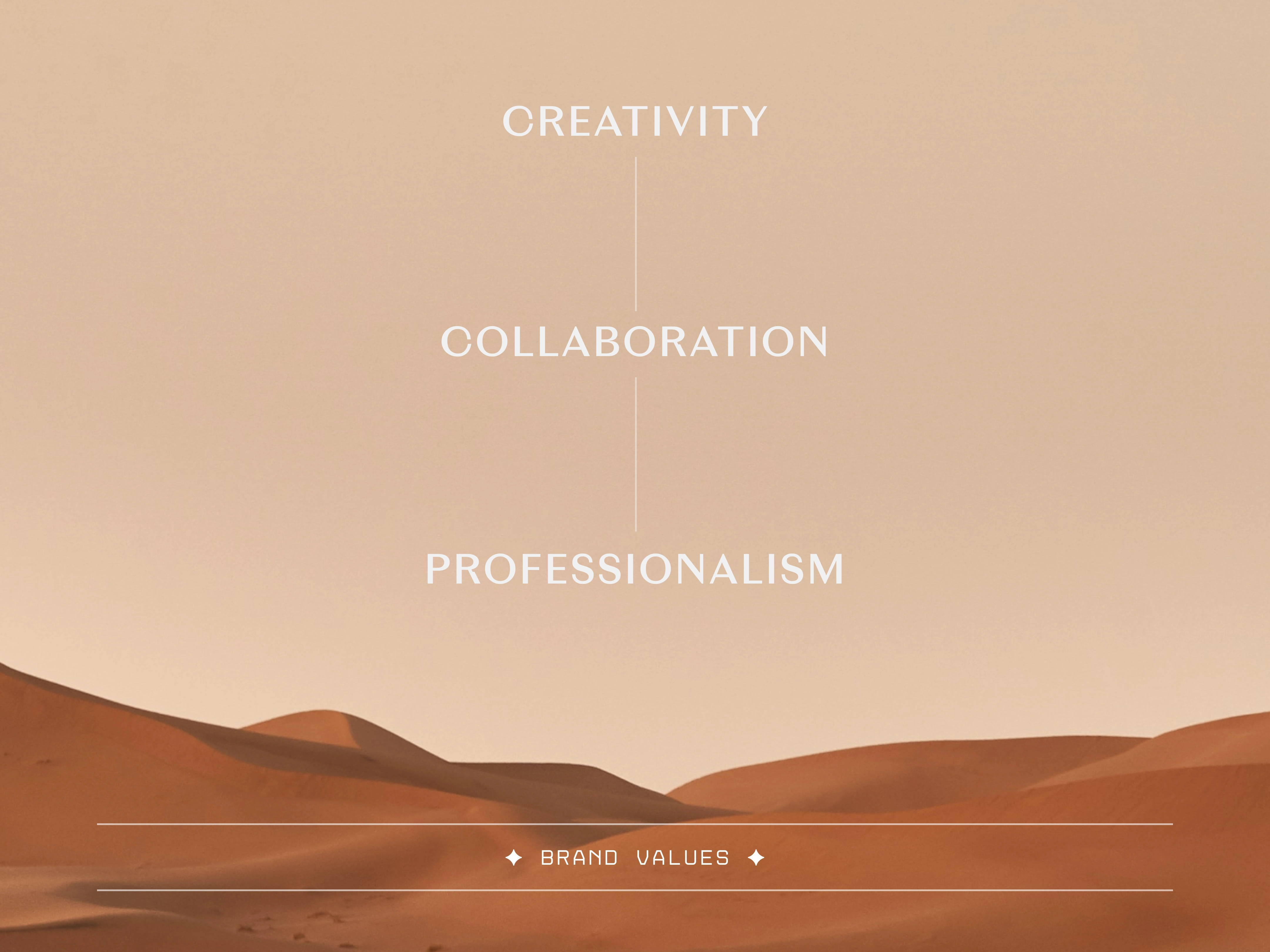
Typography
In a rebranding effort, typography can breathe new life into an outdated or ineffective brand image, helping to convey a new direction or messaging strategy. Typography choices, such as font selection, kerning, and letter spacing, can convey a brand's tone, voice, and style, while also ensuring that the typography is readable, legible, and accessible across a variety of platforms and media.
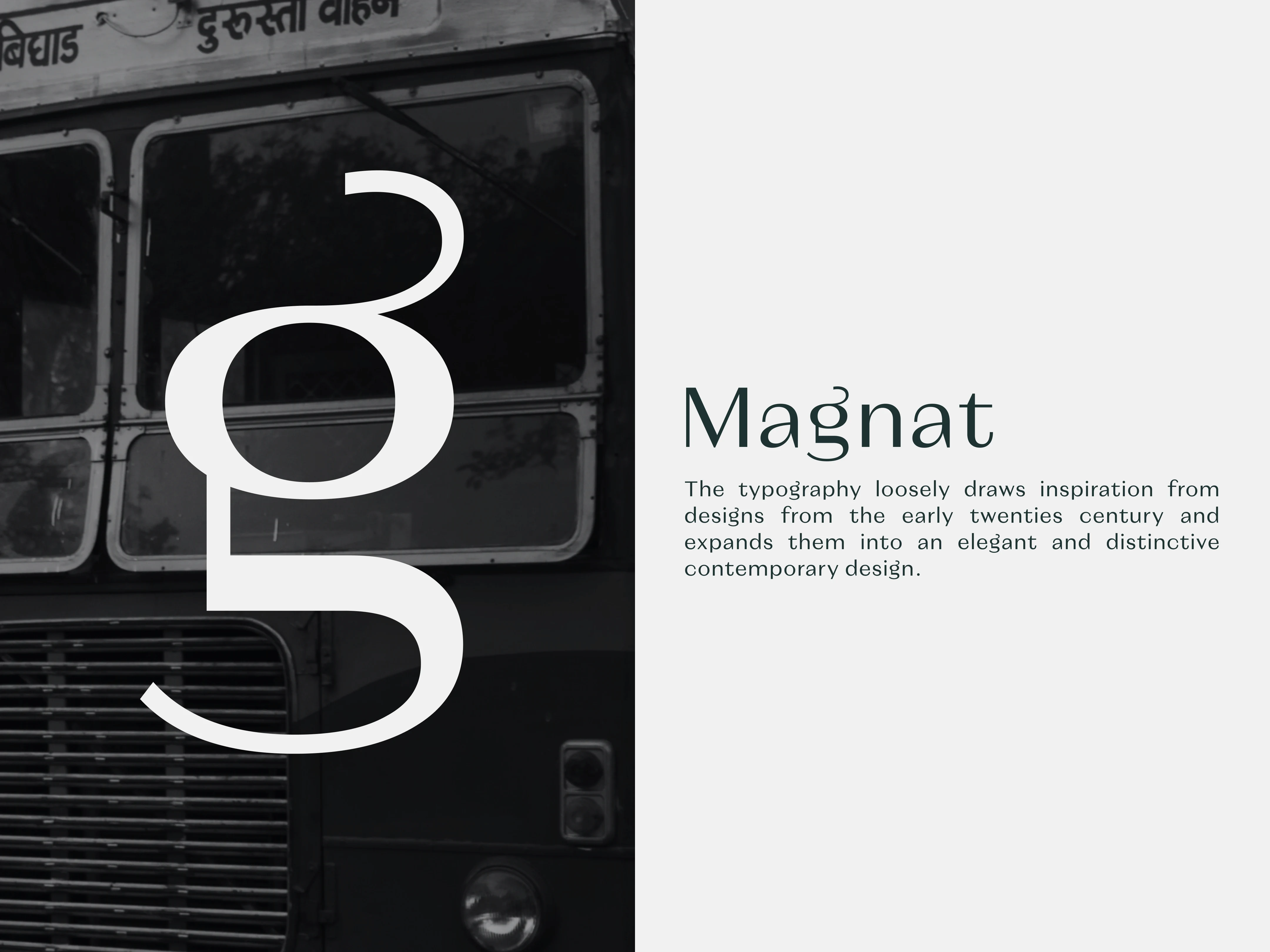
TYPOGRAPHY
Logo Mark & Type Manipulation
A well-designed logo mark should be simple yet distinctive, conveying the essence of a brand's identity in a way that resonates with its target audience.
In this case, somehow we wanted to showcase that it is a photography & filmmaking club while keeping the modern aesthetics that we decided to follow so what's a better way to showcase that with the help of a camera lens.
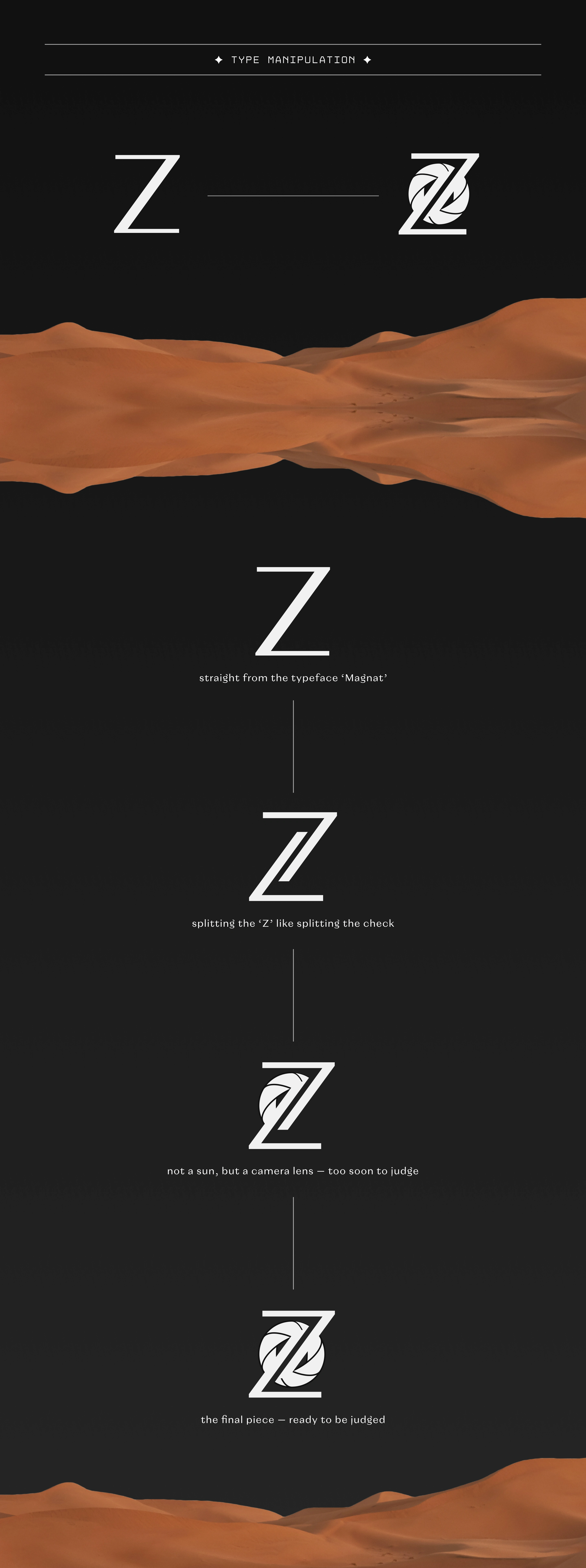
LOGO MARK & TYPE MANIPULATION
Word Mark
The final constructed word mark for the photography club represents the culmination of a thoughtful and deliberate brand design process. It embodies the club's values of minimalism, elegance, and creativity, using typography to convey a distinctive and memorable visual identity.
Going into more details,

WORD MARK EXPLAINED
Mockups & Implementation
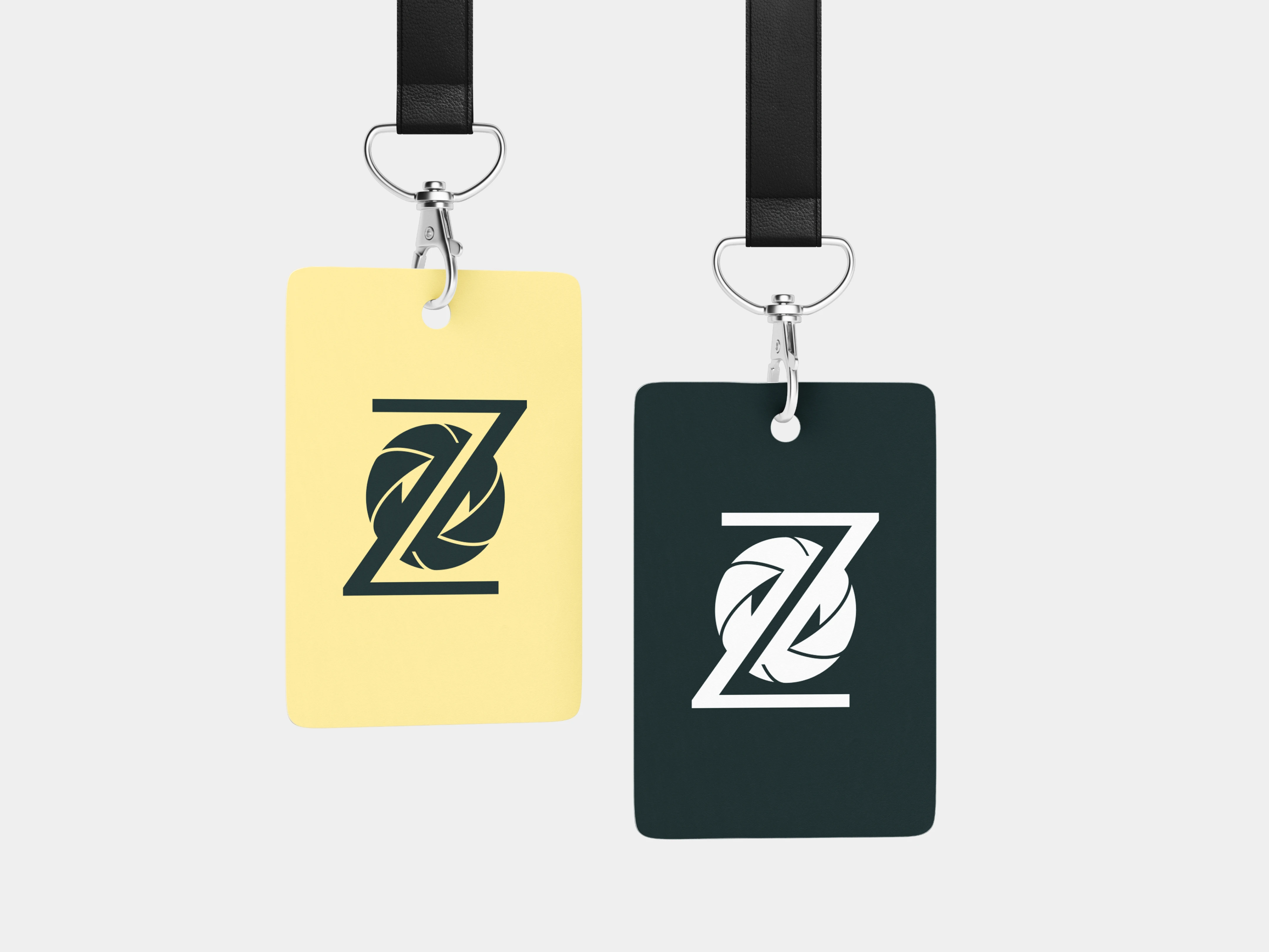
The mockups and real-life implementation of a brand design are critical components in the overall branding process. Mockups are essential in presenting how the brand will look in various scenarios, including on websites, business cards, signage, and other promotional materials.
Real-life implementation, on the other hand, is when the brand design is put into practice, and the brand begins to be seen by the public. This is where the design comes to life, and stakeholders can see how the brand will be perceived by its target audience.


Like this project
Posted May 5, 2023
The official photography and filmmaking club of JSS college requires a rebranding to update its image and appeal to a modern audience.


