Modern Travel Agency Landing Page Design
Olufemi Tofunmi
Modern Travel Agency Landing Page — Case Study
A clean and contemporary travel agency landing page created to make trip planning simple, visual, and trustworthy. The design focuses on strong hierarchy, emotional imagery, and a warm color palette that reflects the excitement of travel — all while keeping the booking process effortless and clear.
Project Overview
Goal
Design a one-page landing experience that:
Presents top destinations in a visually engaging way
Builds instant trust with new visitors
Makes starting a booking extremely easy with clear, consistent CTAs
Role
UI / Visual Design
Layout & Composition
Basic UX Decisions (hierarchy, flow, CTAs)
Tools
Figma
Problem
Planning trips online is often stressful. Many travel websites feel cluttered — too many elements competing for attention, unclear navigation, and no obvious place to start. New users often hesitate, get overwhelmed, and leave before taking any action.
Key issues identified:
No clear focus on the primary action (start planning/booking)
Heavy text usage with weak visual storytelling
Disorganized layout mixing destinations, offers, and steps
Lack of emotional appeal to inspire users
Solution
I designed a structured, warm, and visually guided landing page that solves these issues by:
Putting a clear hero message upfront: A bold headline and concise subtext immediately communicate the value of the service.
Using strong travel imagery and card layouts: Top destinations appear in clean cards with pricing and trip duration.
Introducing a simple 3-step booking process: A friendly walkthrough reassures users and reduces decision anxiety.
Applying a soft, emotional gradient background: Light peach-to-pink tones add warmth without distracting from content.
Repeating a consistent CTA across sections: Buttons like “Plan a Trip” or “Get Started” stay visible throughout the page.
Target Audience
Young adults and working professionals (18–35) who want:
A stress-free way to book trips
Inspiring visuals first, text second
A mobile-friendly, clean interface
Design Process
Inspiration & Direction
I analyzed:
Existing travel landing page
Strong UI patterns for heroes, cards, and pricing
Soft color palette inspired by sunsets, beaches, and sky tones
Visual goals:
Blend the feeling of a travel poster with a modern app
Keep the layout minimal but visually rich
Layout & Structure
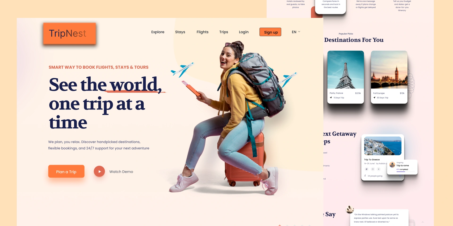
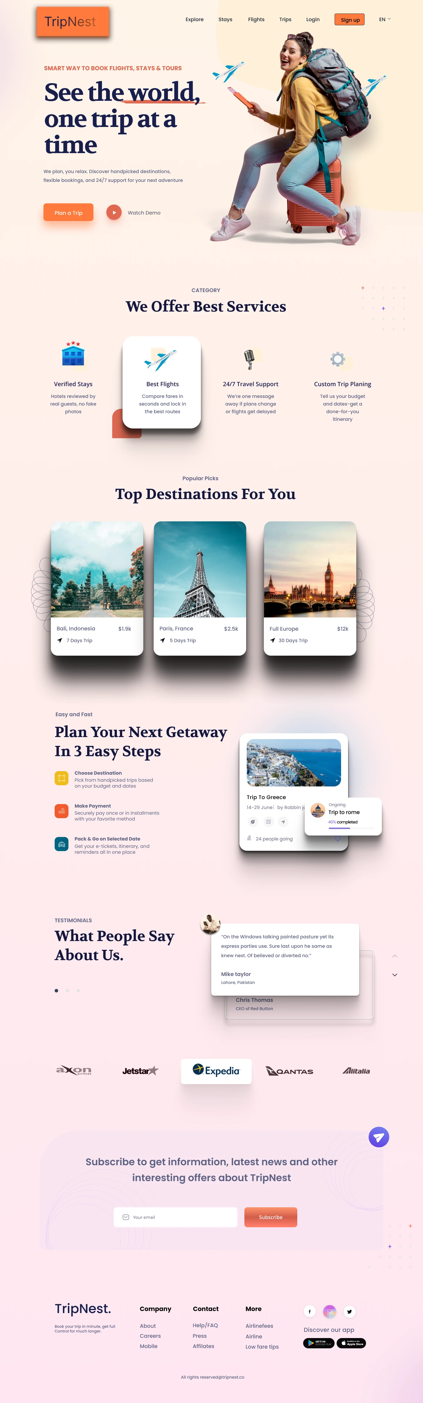
A. Navbar
Simple links: Home, Destinations, Services, Contact
Primary CTA: Plan a Trip
B. Hero Section
Headline example: “See the world, one trip at a time.”
Short supporting text
Primary button: Plan a Trip
Secondary button: View Destinations
Hero image showing a traveler or vacation scene
C. Top Destinations
Cards include:
Destination name (Bali, Paris, Cape Town…)
Trip duration (e.g., “7 Days”)
Price (e.g., “$1.9k”)
Visual hierarchy: image → name → info → price
D. 3 Easy Steps
Choose Destination
Make Payment
Pack & Go
Each step includes a simple icon and short description.
E. Final CTA Section
A closing banner encouraging users to start their trip, with a repeated Start Your Trip button.
Color & Typography
Background
Soft gradient for warmth and emotional appeal:
Top: #FFF4E8
Bottom: #FFE6F1
Cards & Content
Clean white cards (#FFFFFF) for clarity
Soft shadows for a modern, minimalistic feel
Time spent: ~8 hours
Type: Personal concept / UI Exploration
Full Site Design
Like this project
Posted Dec 9, 2025
Designed a user-friendly travel agency landing page with clear CTAs and emotional appeal.
Likes
1
Views
1