Whatsnot Automation

Harsh Prajapati


Business communication has long been stuck between manual texting and complex enterprise APIs. Order confirmations, payment receipts, appointment reminders: the critical updates that keep customer trust high. But for most businesses, setting up WhatsApp automation meant wrestling with confusing cloud infrastructure. The technology was a black box. The setup felt like a developer’s weekend project rather than a stable business tool.
Make enterprise-grade WhatsApp automation finally look like a calm, guided system.
The infrastructure gap
Whatsnot targets businesses that need reliable customer updates, and it had a massive problem to solve: the infrastructure barrier. Connecting Meta APIs, configuring webhooks, and provisioning cloud servers is fundamentally intimidating. Buyers couldn't see the value because they were blinded by the technical requirements. The technology was lagging the use-case, and for business owners, that complexity shows up as abandoned setups and manual copying-and-pasting.
The move: architecture before pixels
We didn't start with just another messaging dashboard. We started with the single promise the entire product needed to deliver: Your business updates. Delivered automatically. From there, the core philosophy: a clear path, not a black box. And the promise underneath it: WhatsApp automation without confusing infrastructure.
Positioning only counts if the interface obeys it. The application now leads with real business goals—orders, appointments, payments—not API endpoints.
Whatsnot homepage hero
The core promise first, the specific business goals second, and a transparent look at the automated notification journey underneath.
One platform, built to lock together
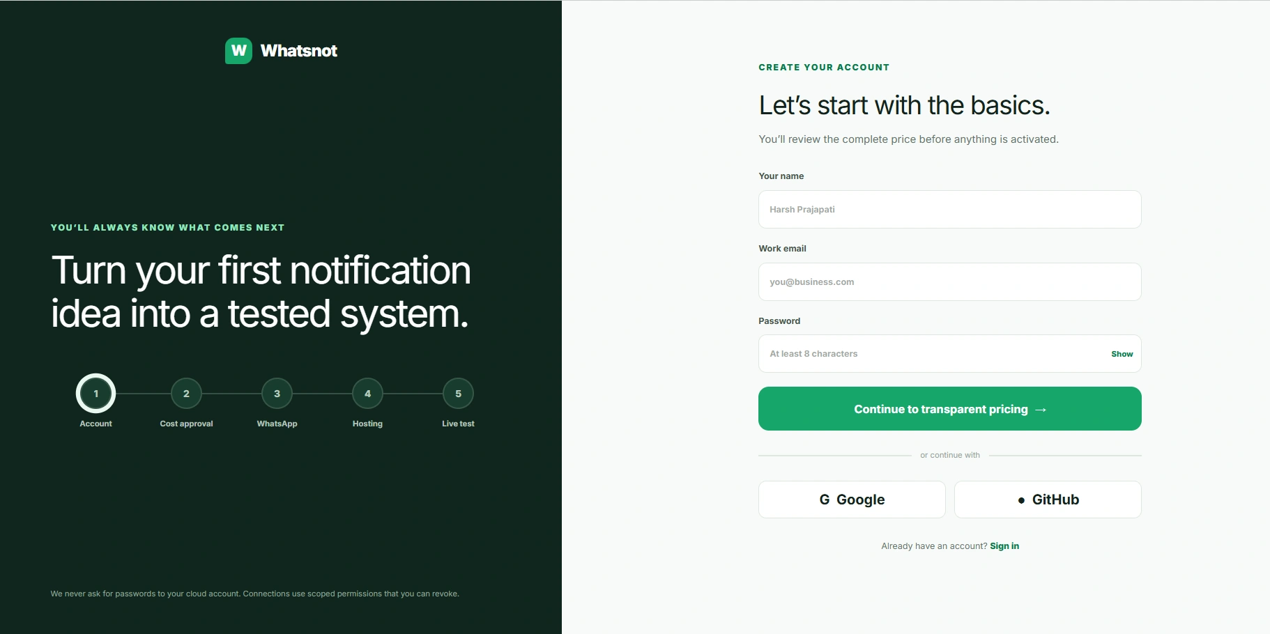
Whatsnot setup journey
A five-step progress tracker. An environment that reads as a guided system clicking into place, with distinct stages for account creation, WhatsApp connection, and hosting.
The system holds because it's disciplined
Transparency is the cornerstone: clear steps, visible costs, and zero markup on messages. A signature calm green is the primary element allowed to guide the eye. The secondary UI elements stay on a short leash, earning their place in cost breakdowns, connection states, and plain-language explanations rather than competing for attention. The user experience carries a voice that is reassuring, not technical. The restraint is the strategy. A platform that explains cloud hosting costs upfront reads as a trustworthy partner instead of a hidden trap.
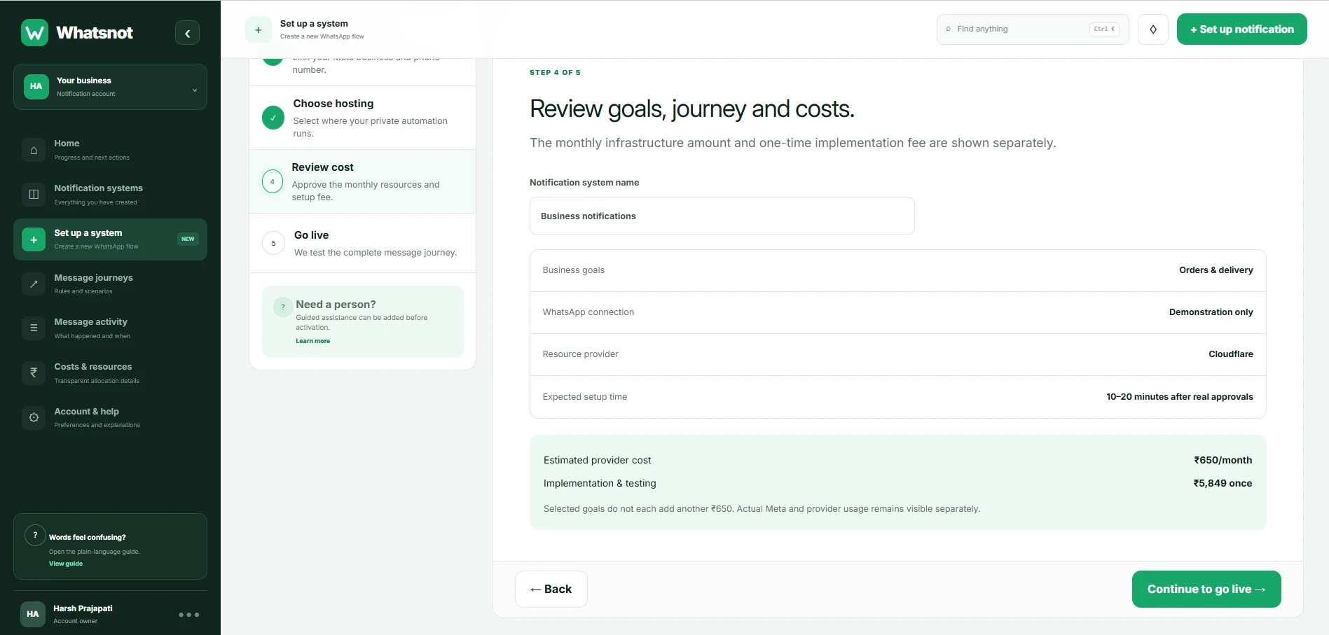
Whatsnot cost approval engine
A sensible starting size selector gives instant visibility into monthly infrastructure estimates before any billing or complex setup is activated.
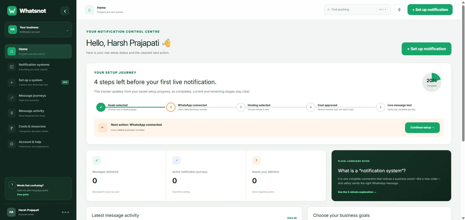
Whatsnot control centre
The central dashboard carries the system: clear delivery metrics, simple goal routing, and total operational confidence.
What it changes
Whatsnot now acts like the seamless bridge it is. Every setup step ladders up to one automated journey instead of a tangle of code. Business owners log in with a clear view of their messaging goals. Customers get instant, reliable updates without the business needing a developer on call. The application stopped looking like a developer tool and started looking inevitable.
The takeaway
Most messaging platforms are built to sell you marked-up texts. The real work is removing the friction between a business action and a delivered notification. Whatsnot was built to be transparent infrastructure. The job was making it impossible to manage business updates any other way.
Like this project
Posted Jul 27, 2026
Redesigned Whatsnot for easy WhatsApp automation
Likes
7
Views
8