This spread showcases the editorial
Abhishek Sharma
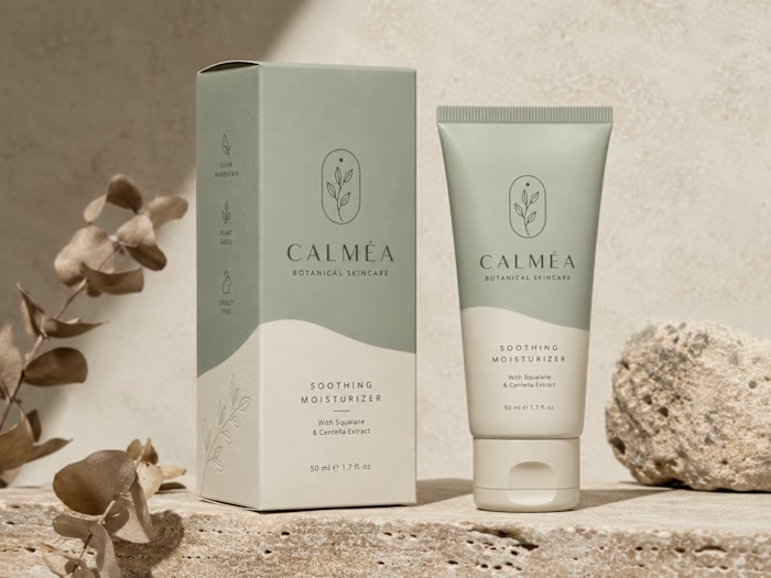
This spread showcases the editorial layout of the CALMÉA Botanical Skincare Brand Style Guide. Designed to serve as the definitive blueprint for the brand's visual identity, the layout maintains a high-end, editorial feel with a focus on generous negative space and clear information hierarchy.
Spread Layout & Specifications
Left Page (Logo Systems & Usage): Dedicated to the structural core of the brand. It outlines the primary arched botanical logo mark, alternative circular sub-marks, and the precise clear-space grid construction. The lower section demonstrates icon versatility across dark, light, and inverted color blocks.
Right Page (Color & Typography): Focuses on the core design systems. The top half displays the refined, earthy color palette blocks (charcoal, dusty rose, warm taupe, soft cream, and crisp white). The midsection dictates the typographic hierarchy, contrasting a bold serif display typeface with a clean, light serif/sans-serif body pairing. The bottom row highlights custom brand iconography for packaging use.
Art Direction: Styled in a flat lay format featuring raw tactile fabric swatches, a minimalist matte pen, and delicate dried florals to reflect the organic essence of the brand.
Like this project
Posted Jun 16, 2026
This spread showcases the editorial layout of the CALMÉA Botanical Skincare Brand Style Guide. Designed to serve as the definitive blueprint for the brand's ...
Likes
0
Views
2