🎧 Product design for audiobooks mobile app | Hyperactive

Oleksandra Marchenko


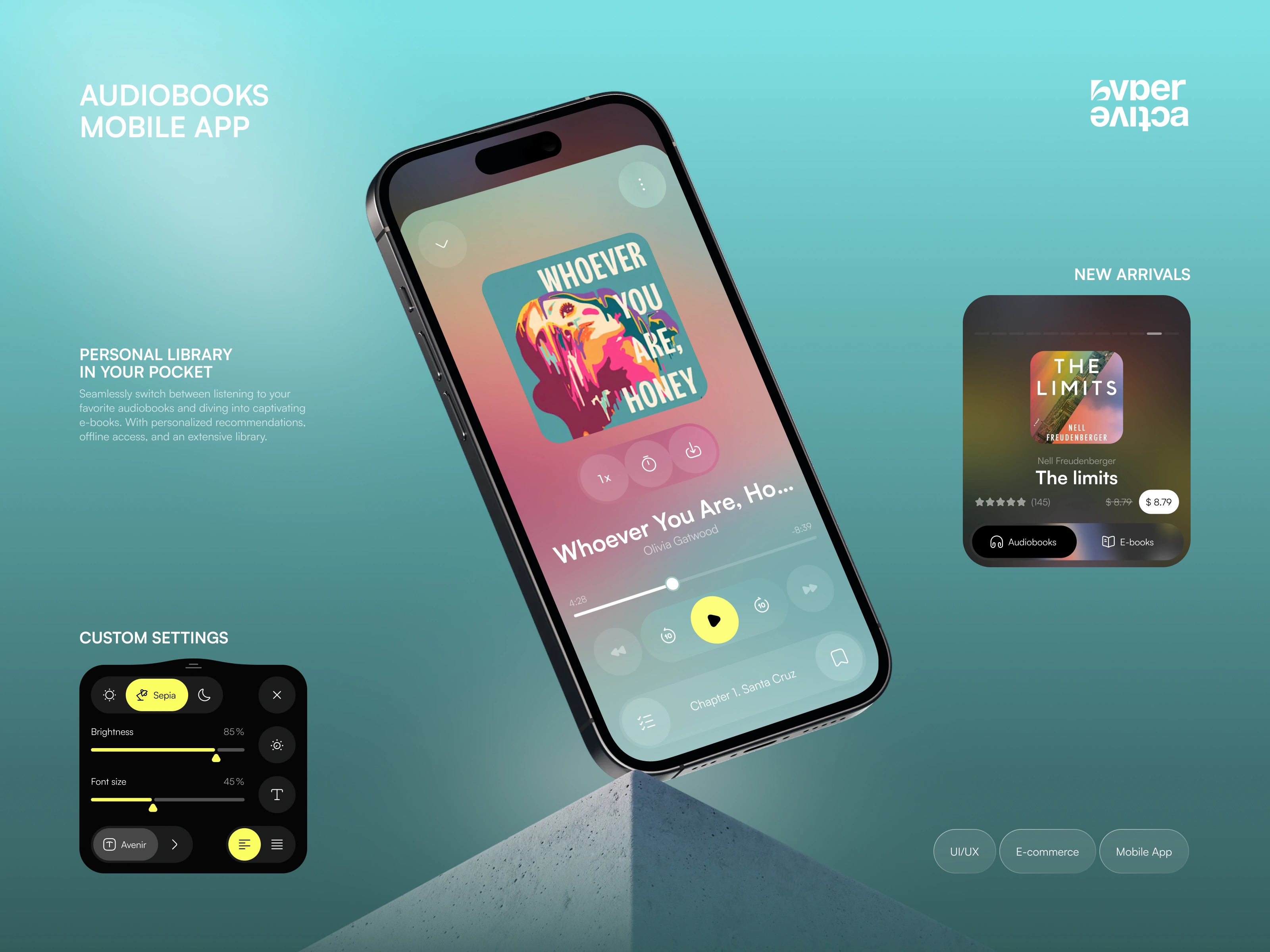
This audiobook mobile app was designed as a modern platform for people who enjoy both listening and reading. The concept combines an immersive audio player, e-book functionality, personal library management, and content discovery within one connected experience. The main goal was to make switching between formats simple and intuitive while keeping the interface visually expressive. Soft gradients, dark backgrounds, bold typography, and colorful book covers create a distinctive atmosphere that feels contemporary and engaging. The product is built around comfort, personalization, and easy access to stories wherever users are.
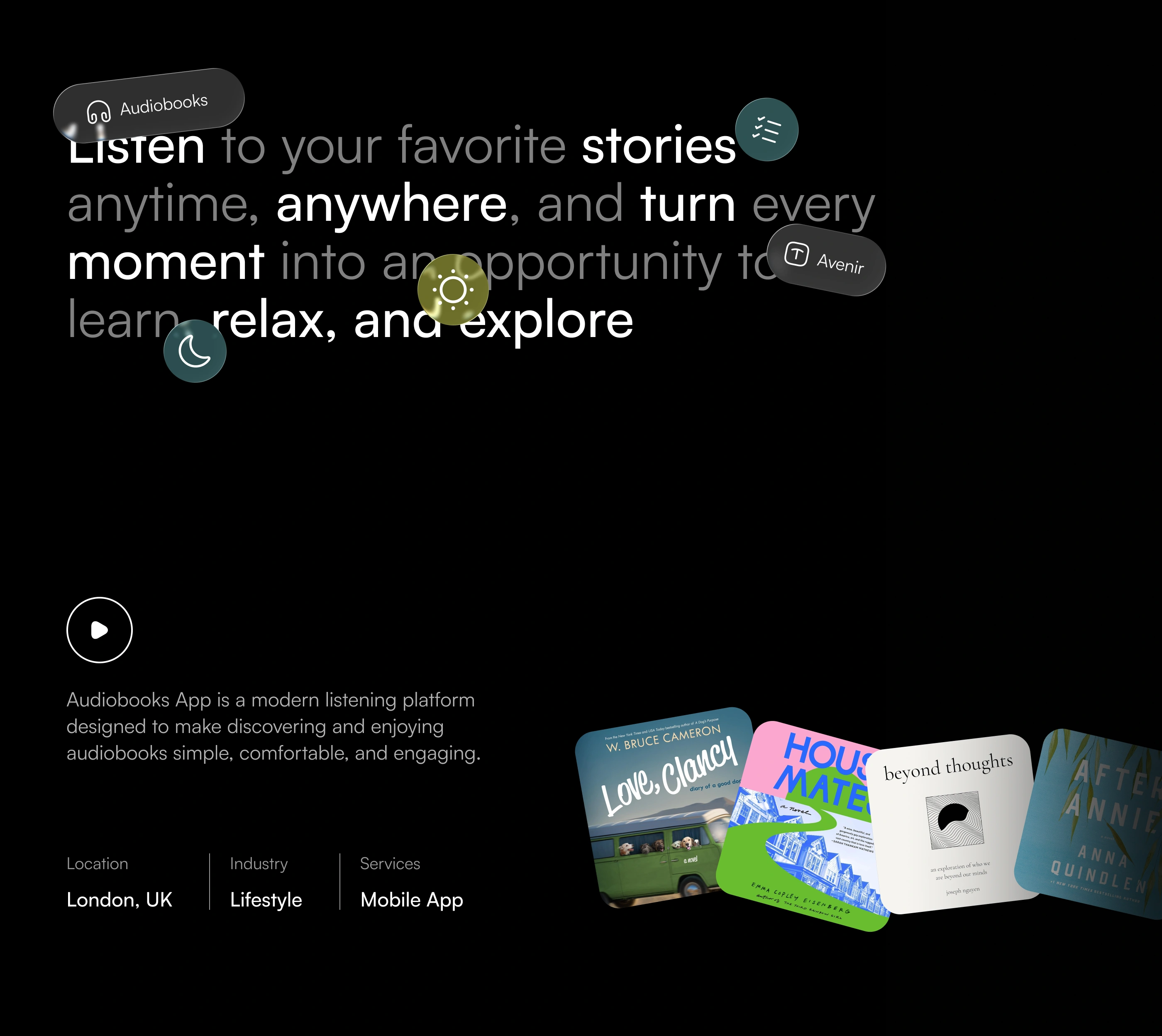
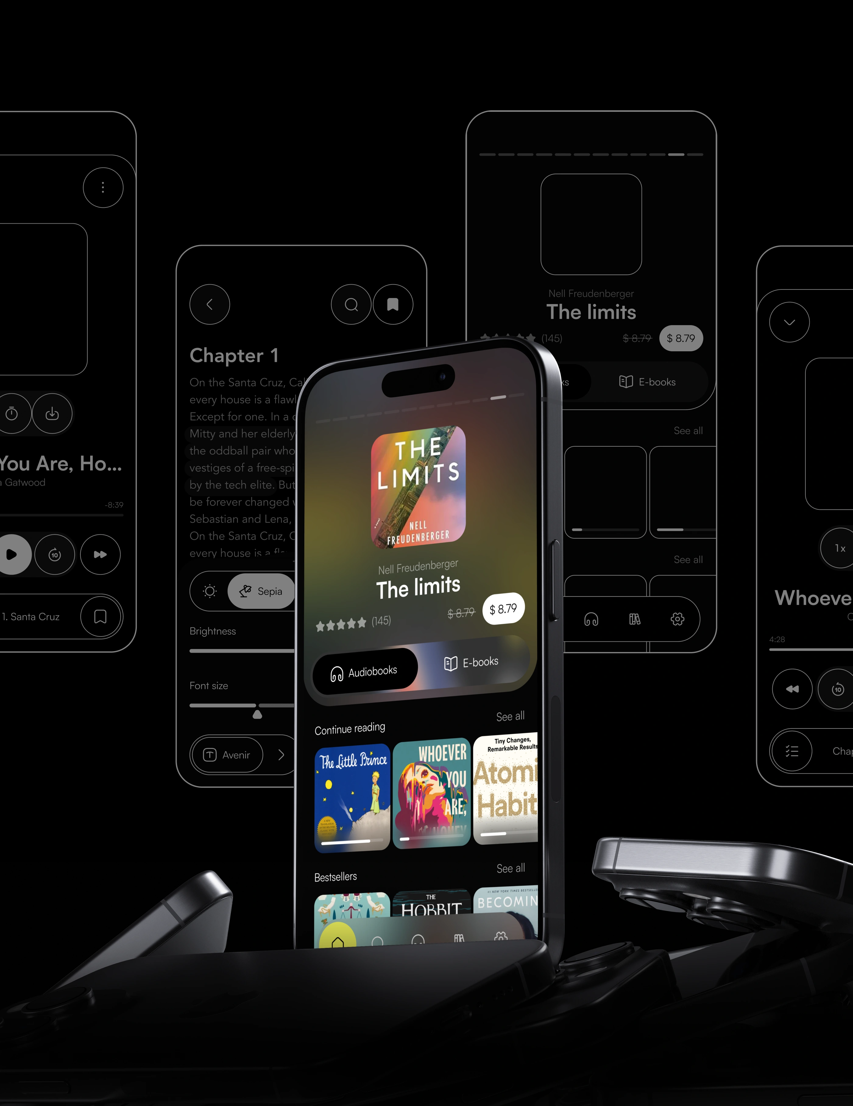
The hero section introduces the core idea of the product: a personal library that is always available. Users can discover new titles, listen to audiobooks, read e-books, save favorites, and adjust the experience to their preferences. The interface balances rich visual content with simple controls, making the product approachable without losing personality. Custom reading settings, personalized recommendations, offline access, and flexible playback controls help create a more comfortable everyday experience. The visual direction combines cinematic presentation with functional UI, presenting the app as both a useful tool and a lifestyle product.
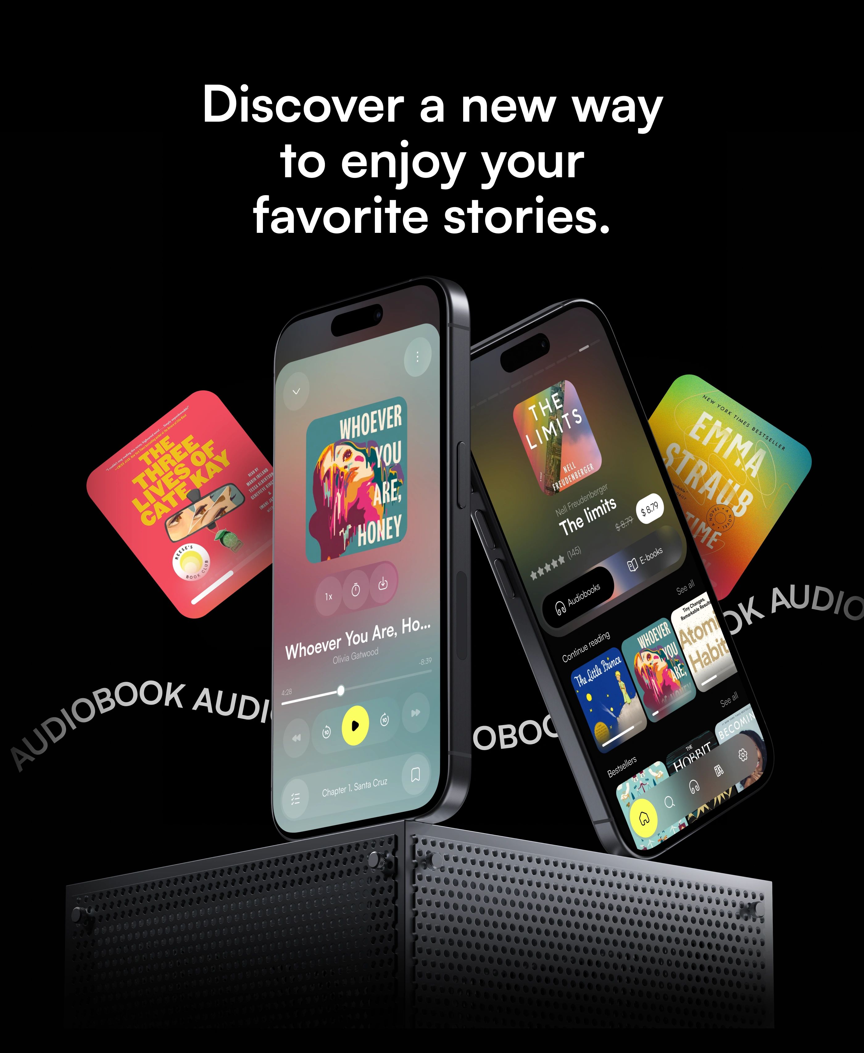
The main product message focuses on freedom and flexibility. Audiobooks allow users to enjoy stories while traveling, working, relaxing, or completing everyday tasks, turning small moments into opportunities to learn or escape into a story. The visual language supports this idea through expressive typography, floating interface elements, and colorful accents placed against a dark background. The experience is intended to feel modern, calm, and personal rather than overly technical. The product gives users multiple ways to interact with books while keeping discovery, listening, and reading connected within one consistent ecosystem.
The product experience was designed around one simple idea: make books easier to enjoy in different situations. Users can move naturally between browsing, purchasing, listening, and reading without leaving the app. The audio player prioritizes essential controls, while the home experience helps users discover new titles and continue unfinished content. Book covers become an important part of the visual system, adding personality and variety to the interface. By combining clean UI patterns with immersive presentation, the app creates a flexible environment where content remains the focus while controls stay accessible and easy to understand.
The design process followed three key stages: Discover, Define, and Solution. During the discovery phase, we explored user needs, market patterns, competitor products, and common pain points related to digital reading and listening. The definition stage transformed these insights into user flows, information architecture, and early wireframes. Finally, the solution phase focused on visual design, interaction patterns, prototyping, and a scalable design system. This structured workflow helped maintain a clear connection between research and final interface decisions, ensuring that every feature supported a real user need rather than being added purely for visual impact.
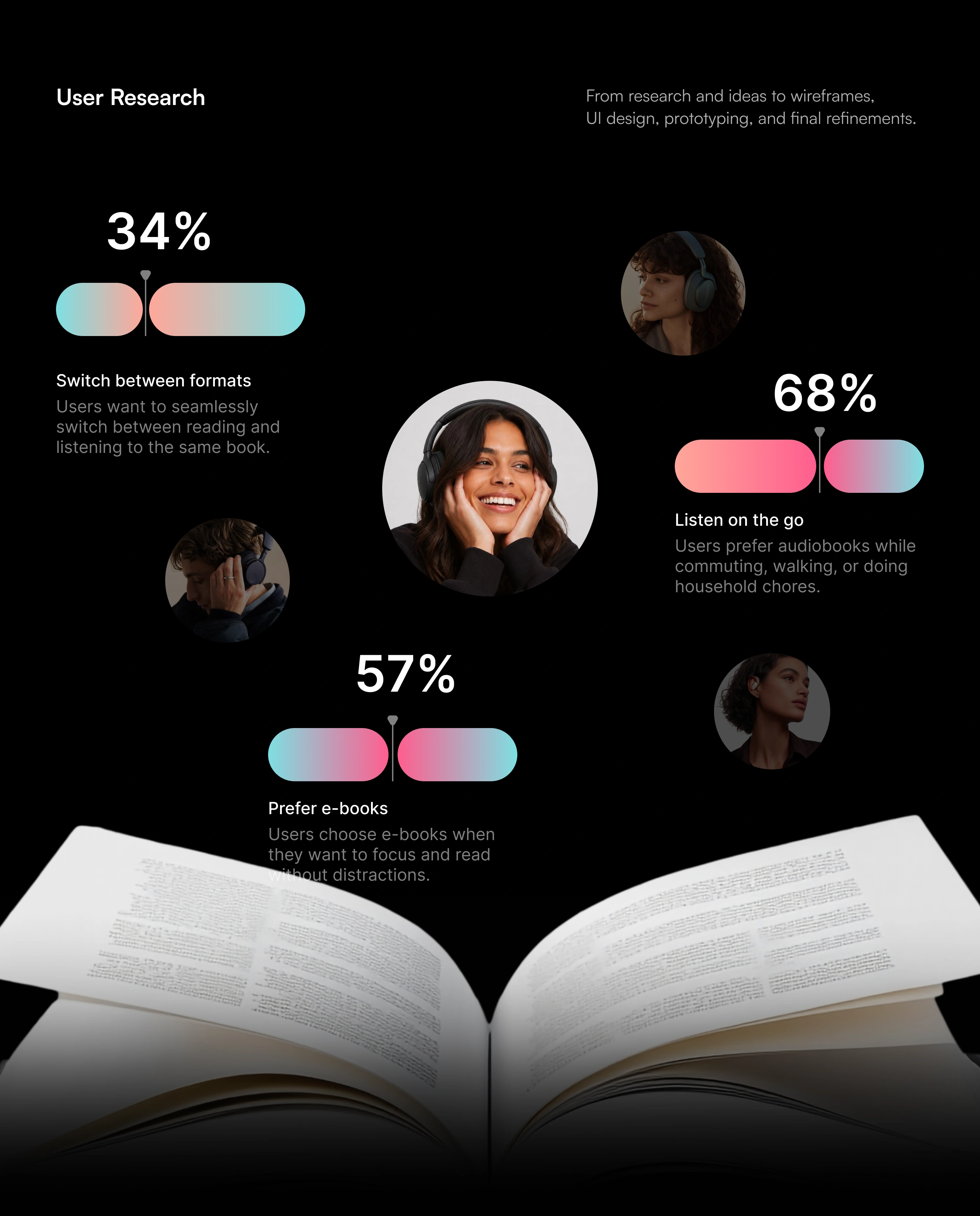
User research helped identify several important behaviors related to digital reading and audiobook consumption. Many users prefer audiobooks while commuting, walking, exercising, or completing household tasks, while others choose e-books when they want focused reading time. Another important insight was the desire to switch between listening and reading without losing progress. These findings influenced the structure of the product and helped prioritize features such as format switching, synced progress, offline access, personalized libraries, and simple playback controls. The goal was to create an experience flexible enough to adapt to different routines and preferences.
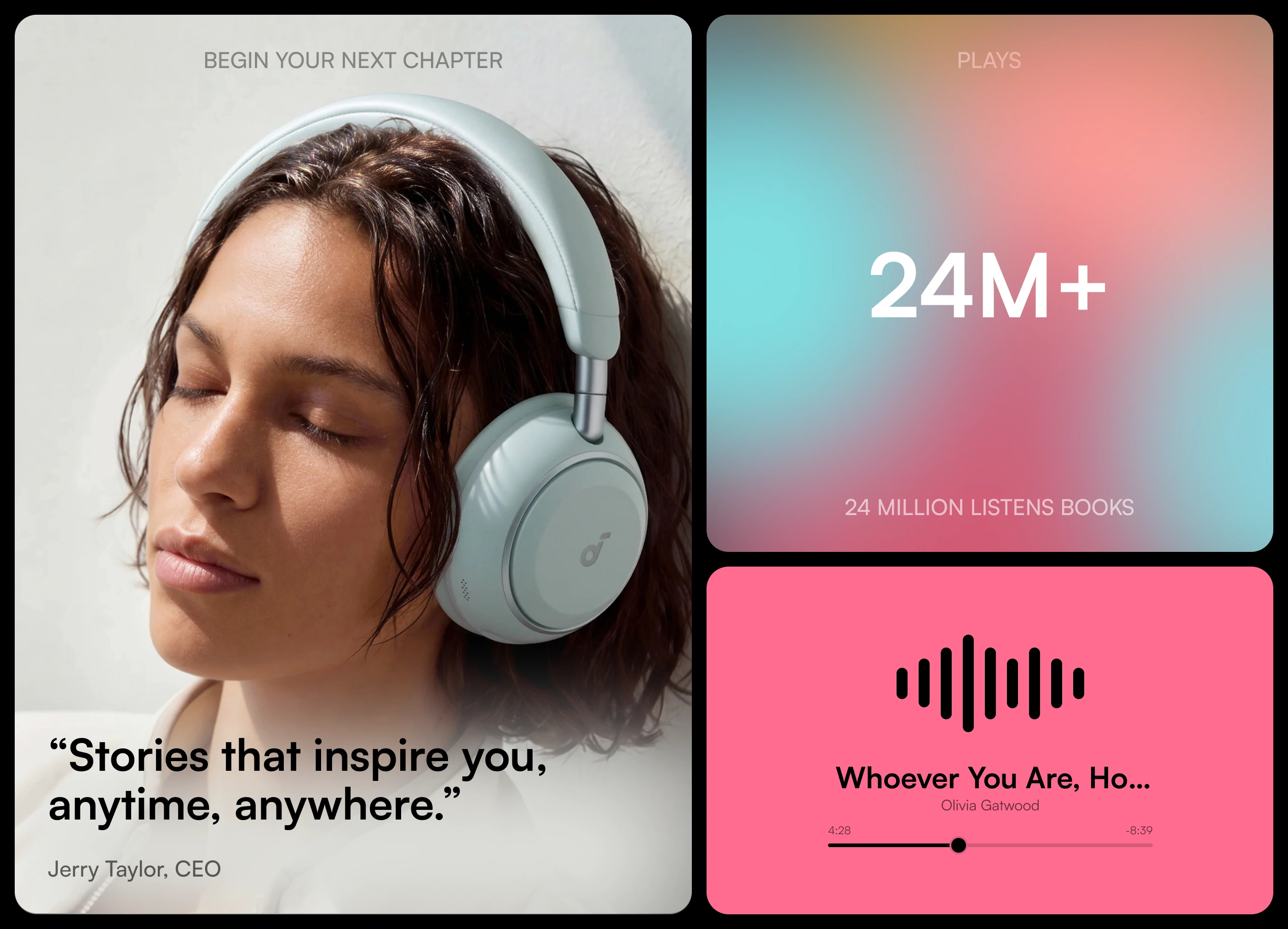
Audiobooks create a different relationship with reading by allowing stories to fit naturally into everyday life. The product concept highlights this flexibility through a combination of emotional imagery, listening statistics, and playback-focused components. Instead of treating audiobooks and e-books as separate experiences, the platform connects both formats and allows users to choose how they want to engage with a title. This approach creates more opportunities for users to continue a story throughout the day. The visual direction reinforces this idea with soft gradients, large typography, minimal controls, and imagery centered around personal listening moments.
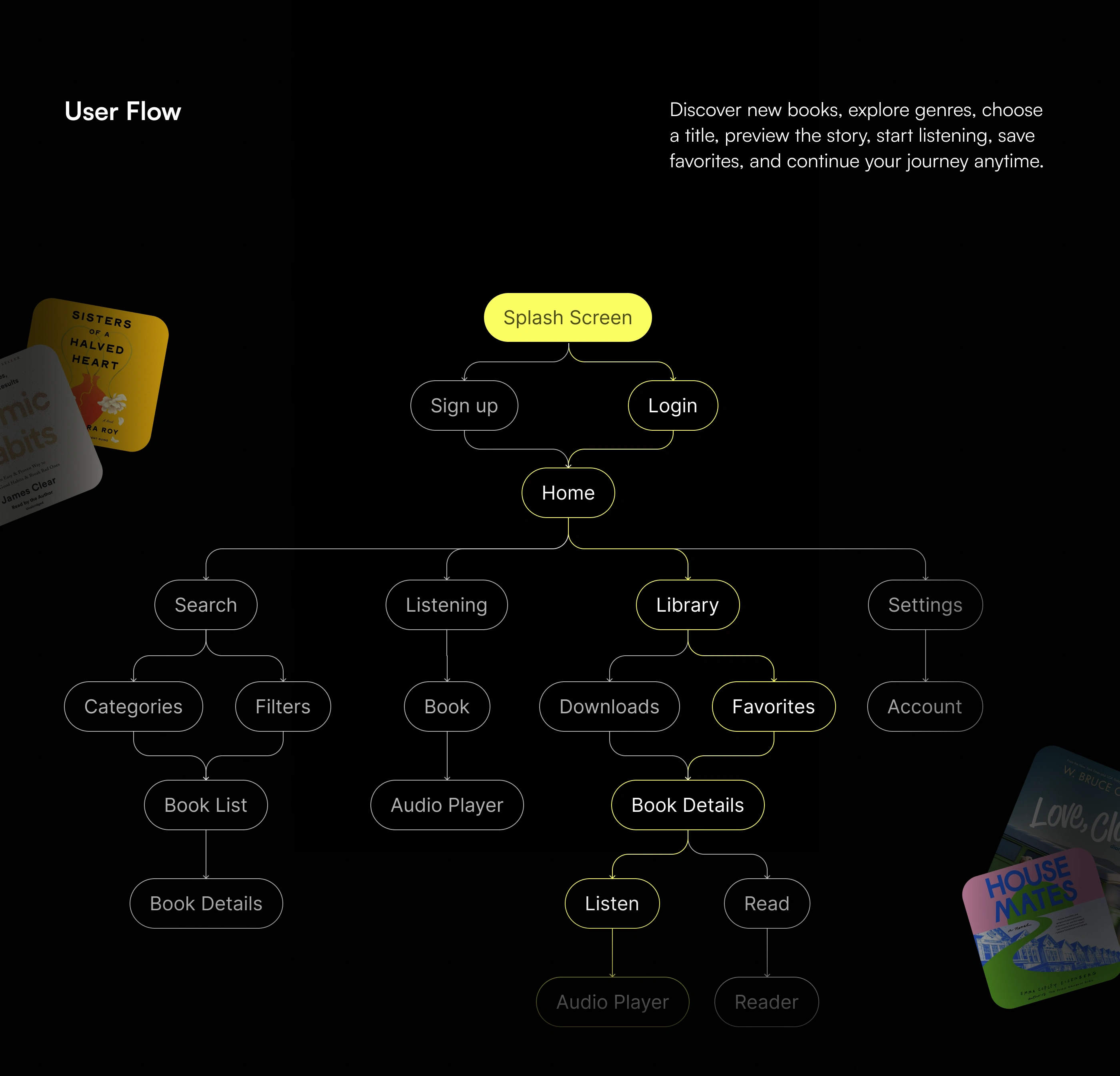
The user flow was created to support the most common actions without unnecessary steps. After signing up or logging in, users arrive at the home screen where they can explore content, search by category, access their library, manage downloads, or continue listening. Book detail pages connect directly to reading and listening modes, while saved titles remain accessible through favorites and library sections. Settings and account management are separated from content discovery to keep navigation clear. This structure helps users understand where they are in the app and makes movement between discovery, selection, and consumption feel natural.
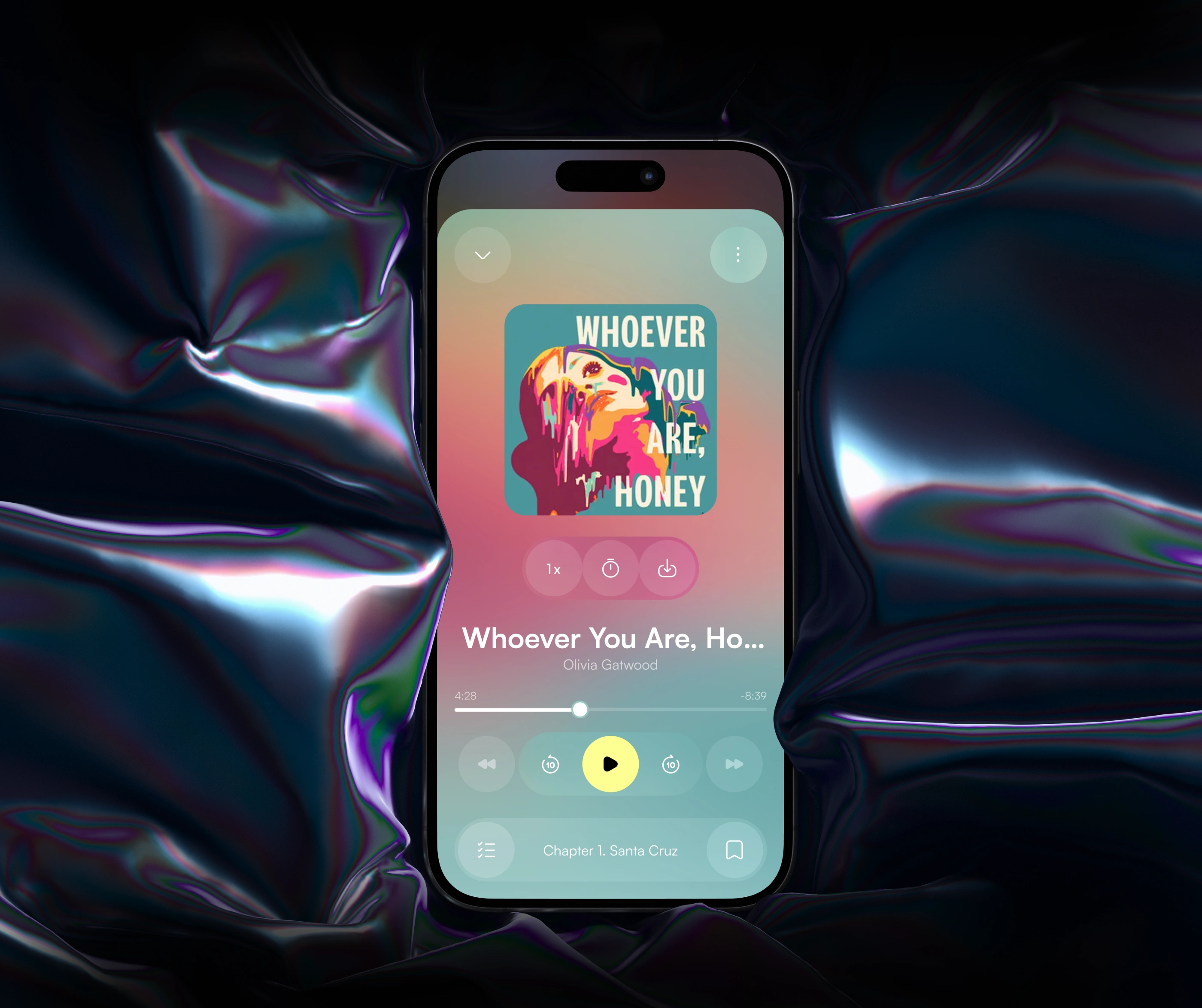
The audio player is one of the central elements of the product. It was designed to keep essential playback tools visible while reducing unnecessary complexity. Users can control playback speed, move between sections, skip forward or backward, track progress, access chapters, and save content without leaving the listening screen. The background uses artwork-inspired gradients to create a more immersive connection with each title. Large typography and generous spacing improve readability, while the bright primary action creates a clear interaction hierarchy. The result is a focused listening experience that feels expressive, comfortable, and easy to use.
Typography plays an important role in balancing interface clarity and long-form reading comfort. Satoshi was selected as the primary UI typeface because of its contemporary appearance, clear letterforms, and strong performance across different sizes and weights. Avenir supports longer reading content and creates a slightly softer visual character for e-book pages. Together, the two typefaces create a clear hierarchy between interface elements and editorial content. Regular, Medium, and Semibold weights provide enough flexibility for labels, navigation, titles, metadata, and buttons while maintaining a consistent visual identity throughout the application.
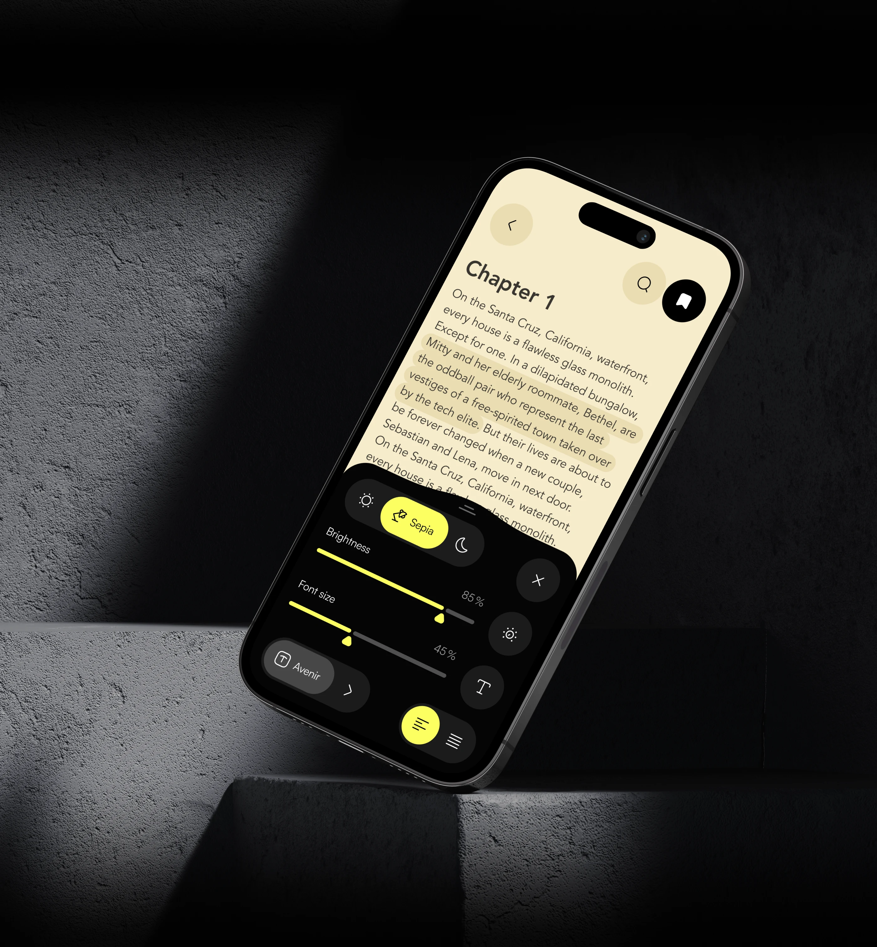
The reading interface was designed around comfort and personalization. Users can change brightness, font size, text alignment, and reading mode depending on their environment and preferences. Light, sepia, and dark options make the reader suitable for different lighting conditions, while typography controls allow users to adapt text density to their needs. These settings are placed in an accessible panel that can be opened without interrupting the reading experience. The design keeps controls visually separated from the content while making them easy to reach. This creates a flexible environment where users can shape the reading experience around themselves.
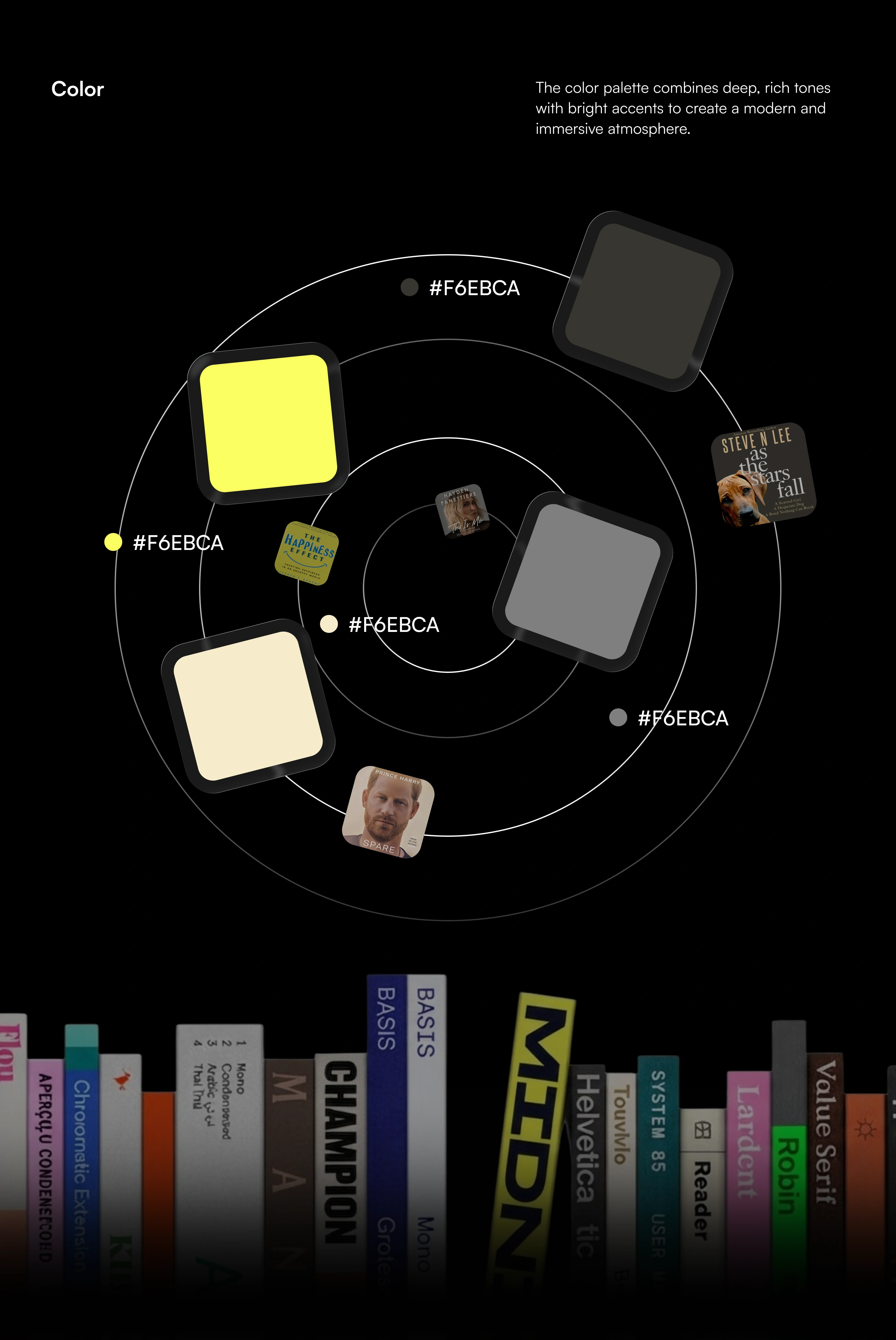
The color palette combines deep neutral tones with bright accent colors to create a bold and immersive product identity. Black and dark gray provide a strong foundation that allows book artwork and interface content to stand out. Soft cream tones support reading-focused screens, while vivid yellow is used for important actions and active states. Gradient combinations of cyan, coral, and pink add a more expressive layer to promotional areas and media-related components. The system balances functionality with personality, using color to guide attention, communicate states, and create a recognizable visual language across the entire mobile experience.
The interface system brings together several core experiences: home discovery, book details, audio playback, e-book reading, and personalization settings. Each screen follows the same visual logic while adapting to different content needs. The home screen prioritizes recommendations and browsing, while book details provide key information and format options. The listening interface minimizes distractions, and the reader focuses on typography and comfort. By maintaining consistent spacing, controls, rounded shapes, and navigation patterns, the product feels unified across different functions. This consistency also makes the experience easier to learn and more predictable during everyday use.
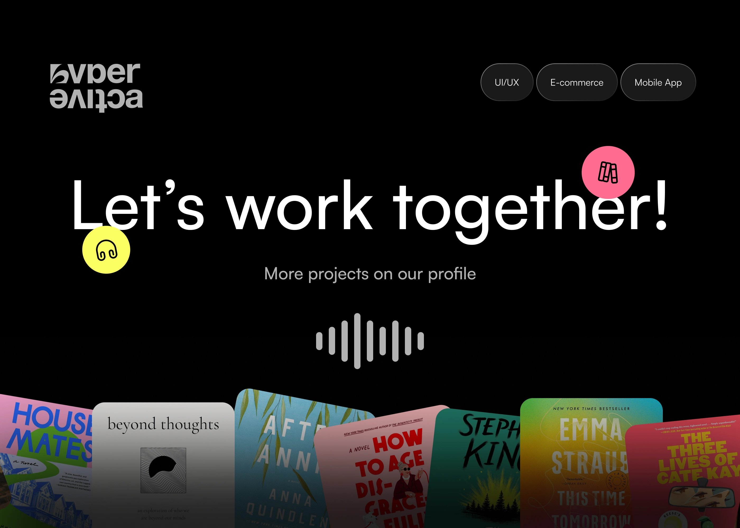
The final product brings discovery, listening, reading, and personalization together in one cohesive mobile experience. The visual system combines dark cinematic backgrounds, colorful gradients, expressive book artwork, and simple interaction patterns to create a product that feels modern and engaging. At the same time, the UX remains focused on usability, making essential actions easy to find and understand. From discovering a new title to customizing the reader or controlling playback, every part of the interface was designed to support a smooth content journey. The result is a flexible digital library built around different ways of enjoying stories.

Like this project
Posted Sep 16, 2026
Modern audiobook app with personalized recommendations, seamless playback, customizable reading settings, intuitive UI/UX, and immersive listening experience.