Ice Breaker App Design

Andy Sworyk


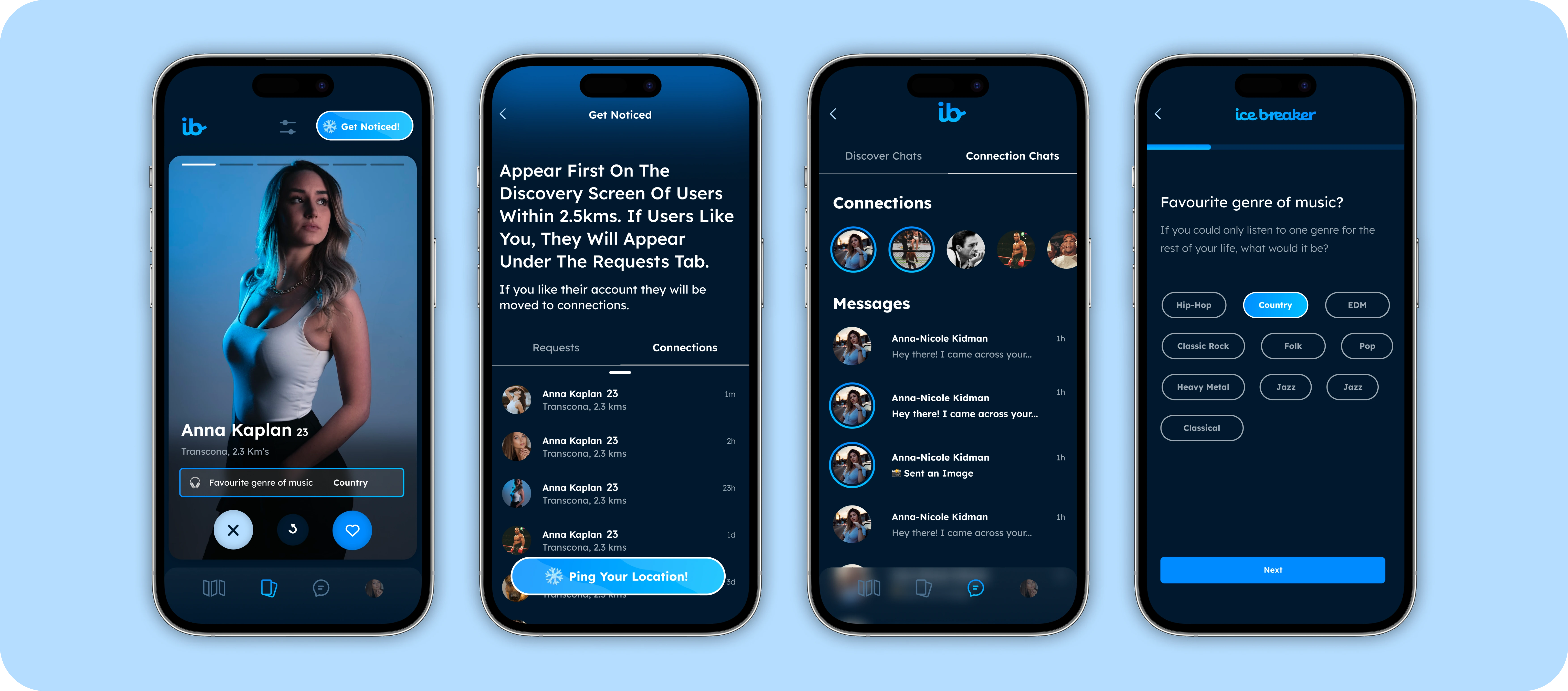
The development of Ice Breaker, a modern and engaging dating app, was driven by a clear vision from the founders: to create a platform that was not only enjoyable to use but also fostered genuine connections between users. Their directive was to infuse the app with a vibrant and fun aesthetic, coupled with a user experience (UX) that was crisp, intuitive, and conducive to prolonged engagement. This ethos guided every aspect of the app's design, particularly in integrating its two core features: Boost and Pings.
Core Features and Design Approach
Boost
The Boost feature was designed to enhance visibility among users, allowing individuals to elevate their profile in the swiping queue. Recognizing the importance of this feature, it was imperative that the Boost option was prominently displayed, ensuring users could easily understand and access this benefit. The design leveraged hierarchy identifiers, such as the size of the tab and its position within the app's interface, to make Boost stand out. Additionally, the use of vibrant colors helped to capture users' attention and signify the feature's importance, making it an intuitive part of the user journey.
Pings
Pings, the second core feature, allows users to discover and connect with others in their immediate vicinity, emphasizing in-person interactions. To differentiate Pings from other features, we employed bright colors and distinctive icons that resonated with the concept of "Ice Breaker" - facilitating the initiation of conversations and connections. The design ensured that Pings were easily identifiable, encouraging users to engage with the feature to meet interested people nearby. This proximity-based feature was a critical differentiator for Ice Breaker, setting it apart from other dating apps by focusing on real-world connections.
Modern Design and UX
In aligning with the founders' vision for a modern design, the app's interface was crafted to be visually appealing and engaging. The design team focused on creating an experience that was both aesthetically pleasing and functional, using contemporary design principles to guide the layout, color scheme, and typography. The crispness of the UX was achieved through streamlined navigation and the thoughtful organization of elements, ensuring that users could seamlessly move through the app, from swiping through user cards to engaging with Boost and Pings features.
The utilization of hierarchy identifiers extended beyond the core features to encompass the entire app, guiding users' attention to key functionalities and improving the overall usability. The strategic use of size, color, and placement helped to create an intuitive environment where users could easily discover and enjoy all that Ice Breaker has to offer.
Conclusion
The design and development of Ice Breaker were rooted in a deep understanding of the dating app landscape and a commitment to stand out through unique features and an unmatched user experience. By focusing on fun, ease of use, and modern design aesthetics, Ice Breaker was crafted to not only meet the founders' vision but also to create a platform where genuine connections could flourish. The thoughtful integration of Boost and Pings, along with a keen attention to design and UX principles, ensured that Ice Breaker would become a go-to app for users looking to connect with others in a meaningful way.
Ice Breaker Core Screens
Like this project
Posted Nov 11, 2023
Ice Breaker is a dating app akin to Tinder, built for connecting nearby users in person. When not utilizing the proximity feature, users can swipe through user
Likes
0
Views
28