Design System Revamp for by.U
Rachmat AG
🪞 Background: A System That Looked Connected, but Wasn’t
When I first joined the team, I was excited to see that by.U already had a design system in Figma. At first glance, it felt like a good sign: the industry standard tool, a shared library, everything in one place.
But after a few days of digging in, I realized something wasn’t right. The so-called “design system” in Figma was actually just a legacy copy from Sketch, never fully updated or maintained. Some components looked outdated, others were missing entirely.
To make things more complicated, developers still relied on Zeplin for documentation. Which meant:
The “latest” design file was supposed to live in Figma,
But the implementation reference was only available in Zeplin,
And every time something changed, developers had to double-check with designers (or even backend teams) just to confirm which version of the design was the real source of truth.
I still remember one developer asking me during handoff:
“Should I follow the button in Figma, or the one in Zeplin?”
That moment made the problem crystal clear: the team didn’t have a single source of truth. What looked like a connected system from the outside, was actually fragmented inside.
👤 My Role
In this project, I took on the role of UI/UX Designer & Design System Specialist.
My mission wasn’t just about “moving files” from Sketch to Figma, but rebuilding the system’s foundation to make it future-proof.
I focused on four key responsibilities:
Restructuring components for consistency
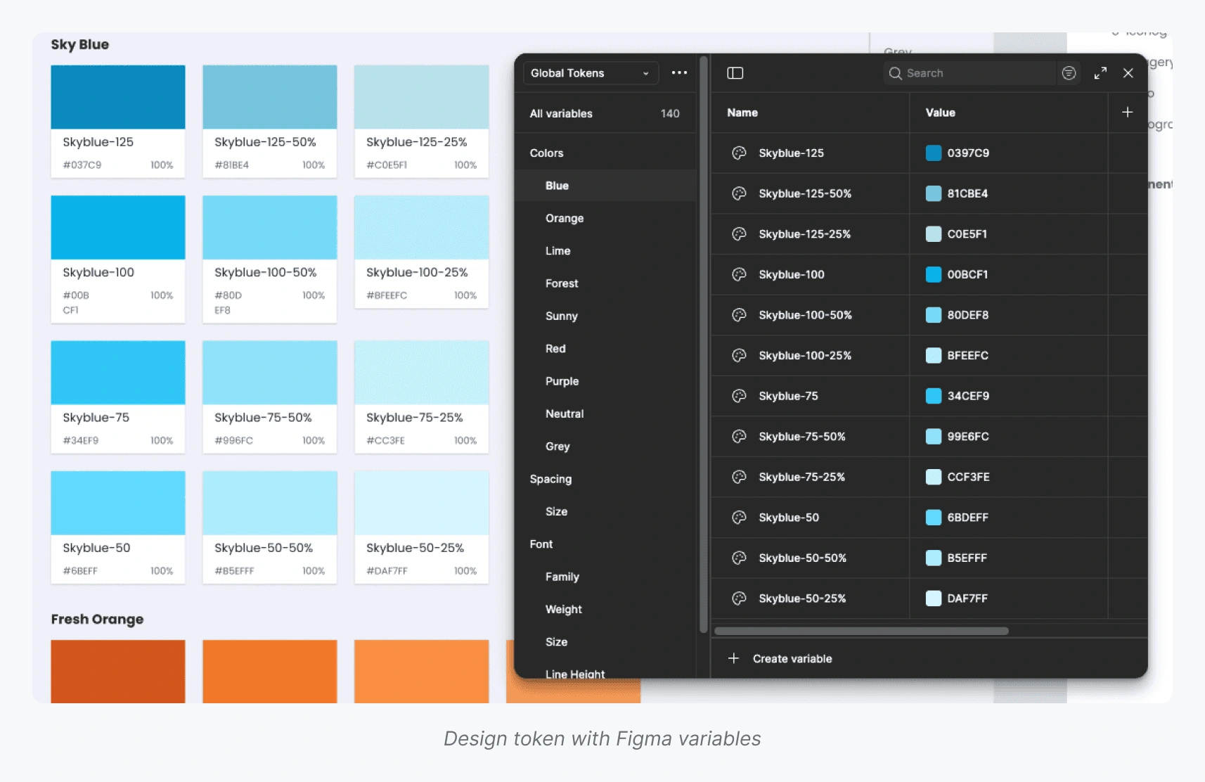
Building foundation variables (colors, grid, typography, spacing)
Writing guidelines and documentation that were easy to follow
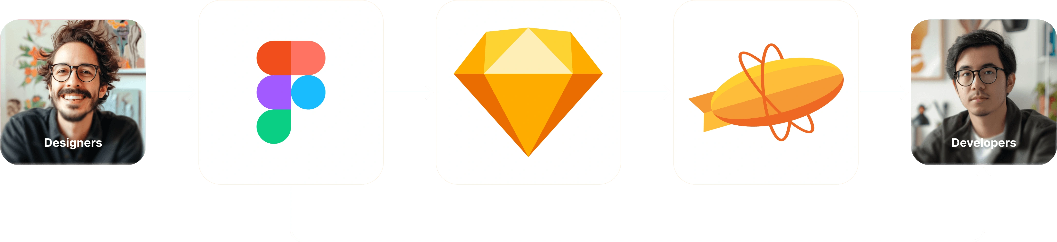
Acting as a bridge between designers and developers
🎯 Challenges: No Single Source of Truth
The deeper I went, the clearer it became: the real problem wasn’t just about components being messy, it was about trust.
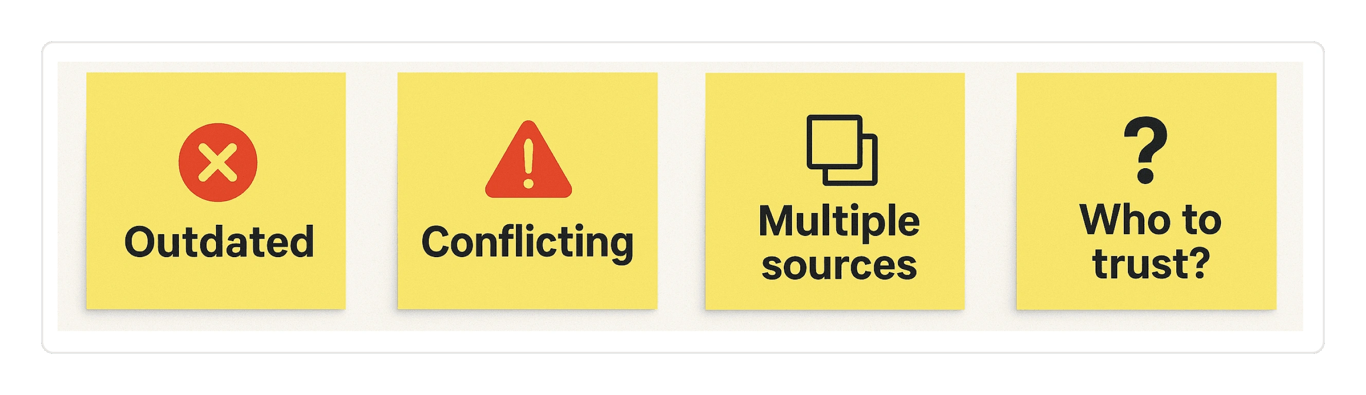
Outdated Library
The Figma library looked modern on the surface, but many components were stale copies from Sketch. Designers couldn’t rely on them for new projects.
Split Documentation
Developers were still opening Zeplin for specs and guidelines, while designers pointed to Figma. The team ended up in endless back-and-forth just to confirm which version was correct.
Inconsistent Styles
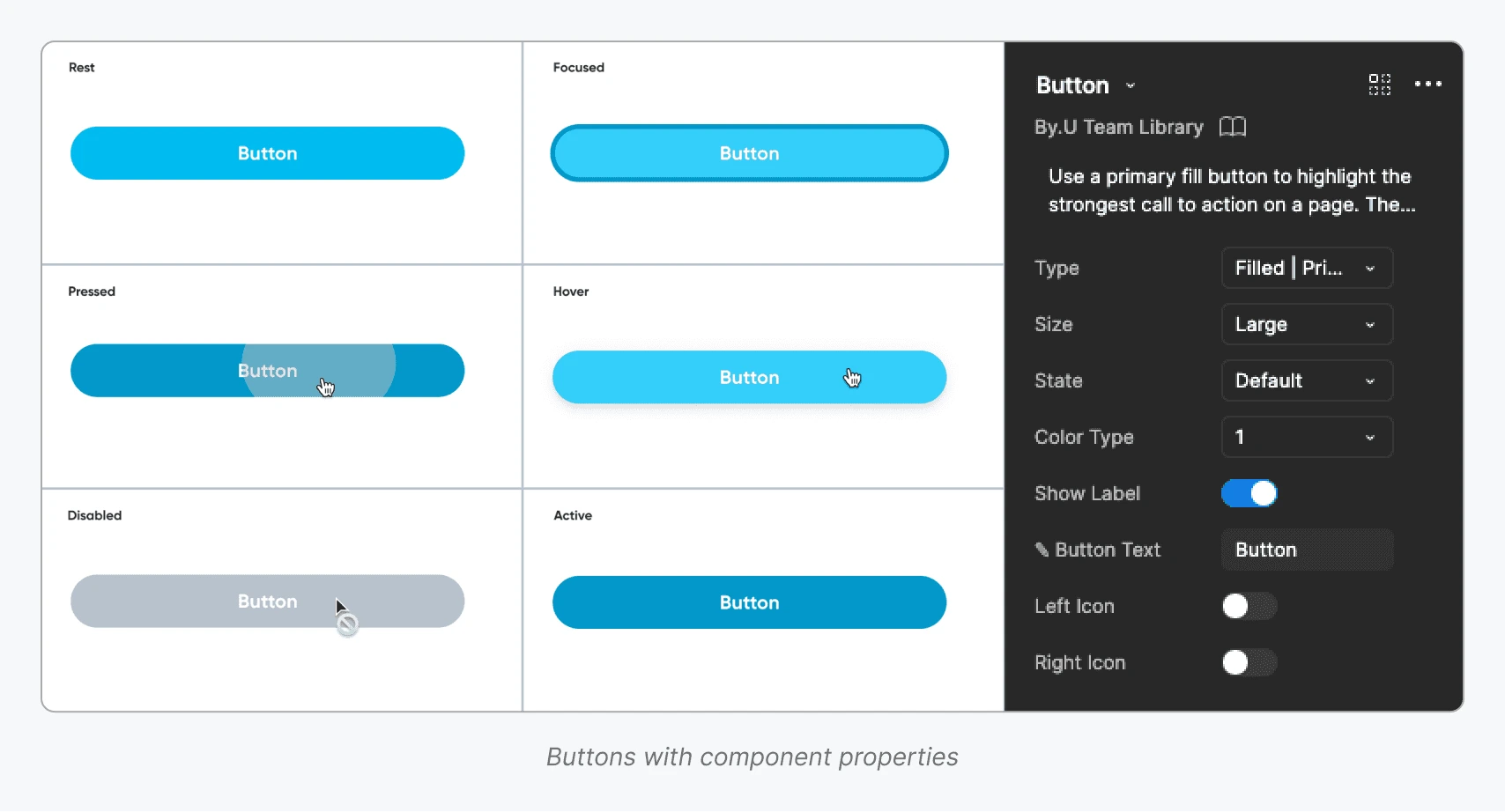
With no written do’s & don’ts, even a simple element like a “primary button” appeared in multiple versions, some with different font sizes, others with inconsistent spacing. Developers were left guessing which version to trust.
Collaboration Gap
Designers, developers, and even backend teams had to sync manually, because no one trusted a single reference.
What looked like a working system from the outside was, in reality, a patchwork of disconnected parts.
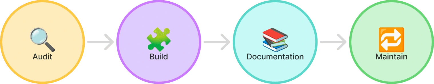
🔁 Process: From Audit to Documentation
I didn’t treat this migration as a copy-paste job. Instead, I ran it as a structured process, directly addressing the challenges we faced:
Audit Legacy Components
Gathered everything from Sketch, Figma, and Zeplin.
Marked components as keep, improve, or rebuild.
👉 Fix for: outdated library.
Rebuild the Foundation
Established design tokens for colors, typography, spacing, and grid.
Standardized button font sizes and created rules around text usage.
👉 Fix for: inconsistent styles, missing guidelines.
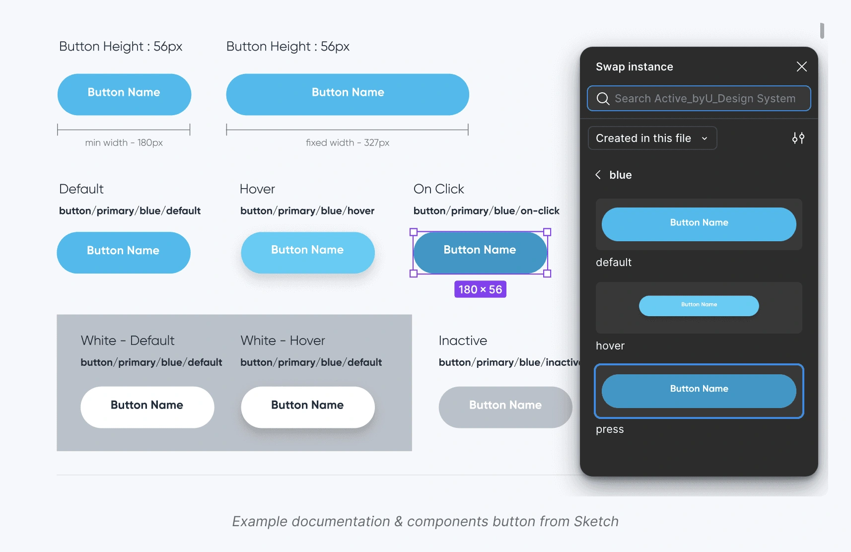
Create Modular Components
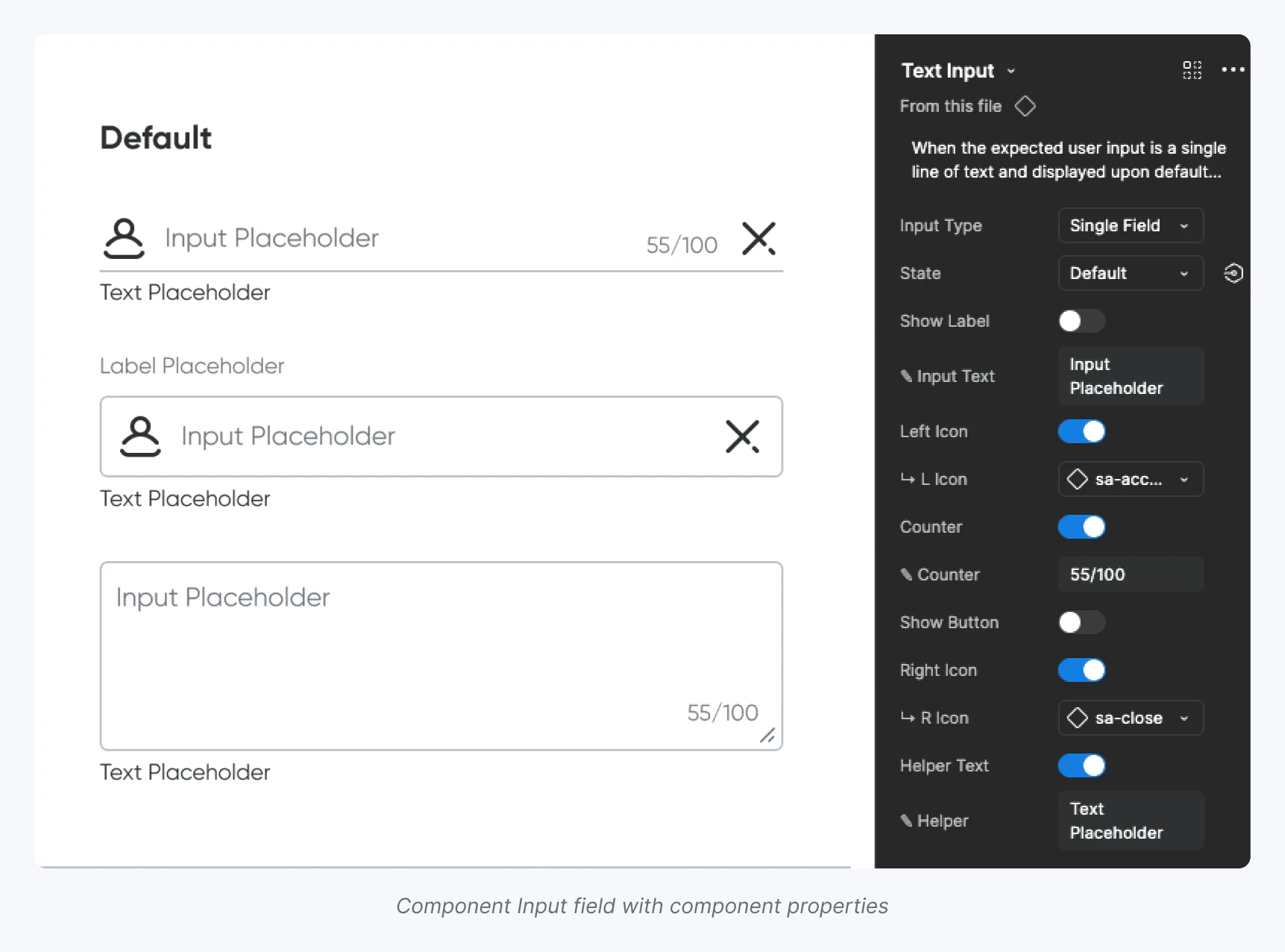
Built atomic components (buttons, inputs, cards) designed for scalability.
Added responsive variants for different use cases.
👉 Fix for: scalability issues.
Align with Developers
Weekly syncs with engineers to match design tokens in Figma with the codebase.
Set up a feedback loop to validate feasibility.
👉 Fix for: collaboration gap.
Document Everything
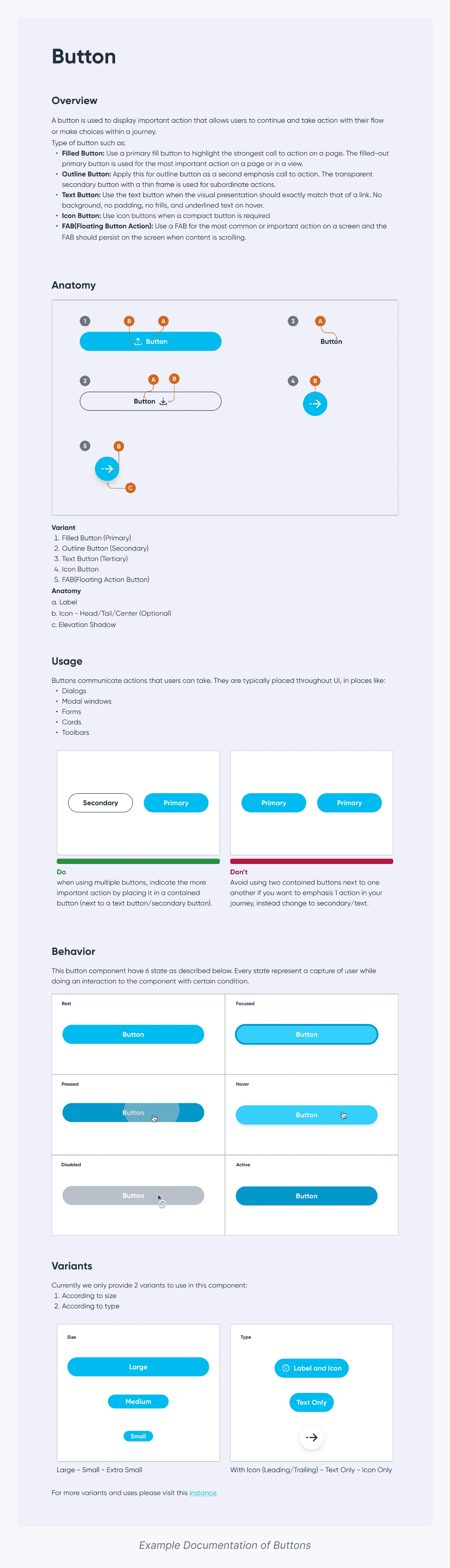
Wrote clear do’s & don’ts with usage examples.
Centralized the documentation in Figma so no one had to open Zeplin anymore.
👉 Fix for: split documentation, no single source of truth.
📈 Impact: Tangible Results for the Whole Team
Once the migration was complete, the benefits became clear almost immediately.
40% faster design workflow
Designers no longer had to rebuild the same buttons, cards, or inputs from scratch. Everything was ready in the library.
Consistent visual language
UI across the product finally looked unified. A “primary button” meant the same thing everywhere: same font size, same spacing, same color.
Smoother developer handoff
With tokens aligned between Figma and the codebase, engineers no longer asked: “Which version should I follow?” Instead, they could directly trust the documentation inside Figma.
Shared language across roles
For the first time, designers and developers were speaking the same “visual language.” This made discussions faster and reduced unnecessary friction.
One of the developers even said:
“It’s the first time I can just open Figma and know that’s the version I should implement — no need to cross-check Zeplin anymore.
✨ Key Learnings
Working on this project reminded me that design systems are not just about Figma files or UI kits. They’re about people and alignment.
The real value comes when everyone shares the same language, from designers to developers, so that trust in the system grows naturally.
And along the way, I discovered a few things worth keeping in mind:
Clarity beats complexity
Even small things like consistent font sizes can reduce so much confusion.
Documentation is part of design
It’s not an “extra task,” it’s what makes a system truly usable.
Small wins matter
Fixing little inconsistencies early builds momentum for bigger improvements later.
A system is never “done”
It’s a living process that evolves with the product and the team.
🌿 Closing
At the end of the day, this wasn’t just about cleaning up buttons or text styles.
It was about helping the team see the design system as something reliable again, a tool they could trust.
Design systems are like living organisms: complex, always changing, and always growing.
If you’d like to know more about how I applied this system in real projects, feel free to reach out.
And this is only the beginning. In my next case study, I’ll dive deeper into how we sustained and evolved the by.U design system, from governance and versioning to cross-team adoption and scaling across platforms.
Like this project
Posted Dec 12, 2025
Rebuilt by.U's design system in Figma, improving consistency and collaboration.
Likes
0
Views
6
Clients
by.U