TimeBoss Website Redesign
Kevin Richards
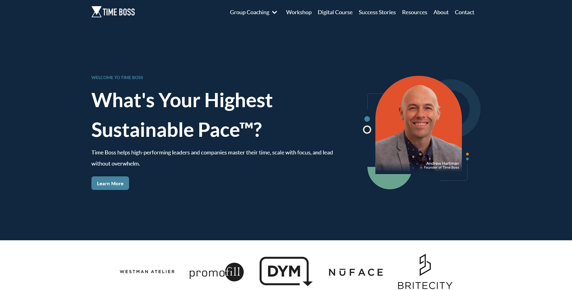
Time Boss - UK/US
Case Study: TimeBoss.us Website Refresh
Client
TimeBoss teaches managers and business owners how to control their workload, run better days, and save hours each week through smarter task planning.
Project Goal
You needed a website that matched the clarity of your message. The old site felt uneven across pages and made it harder for visitors to understand the offer fast. The goal was simple. Improve structure, flow, and usability so visitors could grasp the value in under 10 seconds and move confidently through the site.
Scope of Work
• Visual consistency across all pages
• Clear page hierarchy and layout structure
• Improved navigation paths
• UX and UI refinements for faster scanning
• Better alignment between content and user intent
Key Problems Identified
• Pages used different layouts and spacing rules
• Navigation did not reflect how visitors think about time management
• Important pages required too many clicks
• Calls to action blended into surrounding content
• Mobile experience felt cramped and uneven
What I Changed
Design consistency
• Unified typography sizes and spacing rules
• Standardized section layouts across pages
• Aligned colors and buttons to a single system
Page flow
• Reordered sections to follow a logical decision path
• Moved core value statements above the fold
• Reduced distractions that pulled attention away from the main offer
Navigation
• Simplified menu labels using plain language
• Grouped related pages based on user goals
• Reduced friction between learning and taking action
UX and UI improvements
• Increased white space for faster reading
• Improved button placement and visibility
• Refined mobile spacing to reduce scroll fatigue
Results
• Visitors understand what TimeBoss does within seconds
• Pages feel calmer and easier to move through
• Navigation supports real user behavior, not internal structure
• Calls to action stand out without feeling aggressive
• The site now reflects the clarity and control the brand teaches
Why This Matters
TimeBoss helps leaders save hours every week. The website now does the same for visitors. Less confusion. Fewer clicks. Clear direction. A site that supports decision making instead of slowing it down.
This refresh created a solid foundation for future growth, content, and marketing without changing the core message of the brand.
Like this project
Posted Dec 22, 2025
TimeBoss needed a website that matched the clarity of their message. Improved structure, flow, and usability and move confidently through the site.
Likes
0
Views
2
Timeline
Jun 9, 2025 - Jun 18, 2025