Visual Language - Credit Agricole, 2021

Klaudia Olejnik


Client: Credit Agricole Bank Polska / Agency: JUST
Art Director: Klaudia Olejnik
Senior Graphic Designer: Natalia Książkiewicz
Senior Copywriter: Miłosz Klimczuk
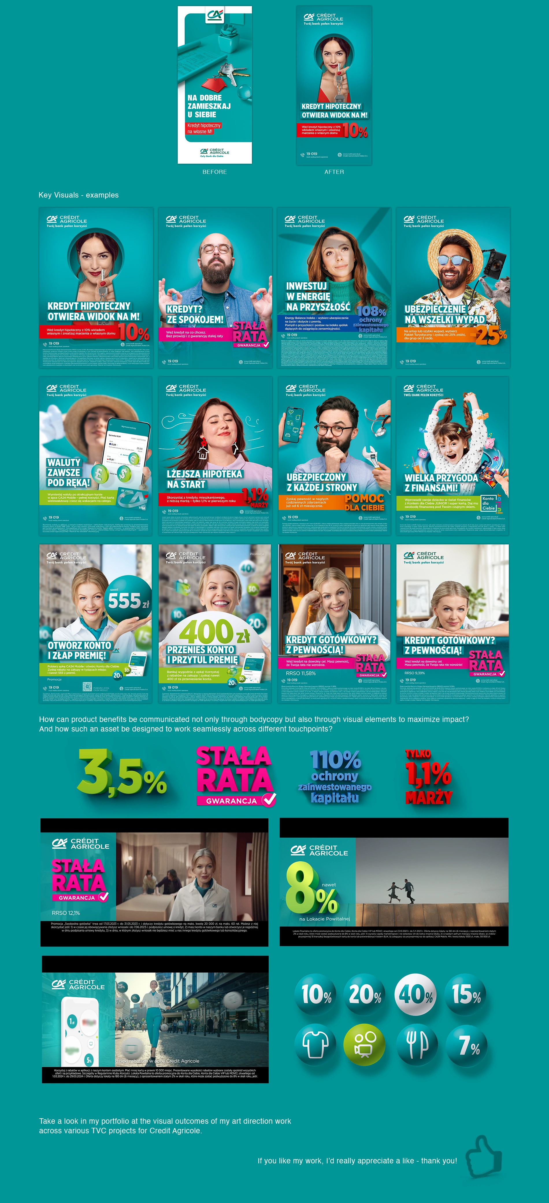
After three years of successfully applying the existing visual language, a repositioning of the brand prompted a request to refresh it — while preserving the brand’s distinctive “duck blue” color, introduced in the previous visual identity work and now a well-established brand asset. Together with the team, we explored a variety of creative directions — some closely aligned with the existing visual language, others pushing further away. Ultimately, I chose to place the human and their emotions at the heart of the concept. After all, the bank’s focus is on its customers — offering them products tailored to their needs — and we wanted to reflect the emotions tied to that experience. That’s why, in the new key visuals, a human figure takes center stage — always portrayed with consistent proportions, in a portrait-style composition. I also developed a catalogue of formal solutions that allows for creative interpretation within the established visual theme. Sometimes, a simple gesture or facial expression is enough to convey the product idea and its emotional impact. In other cases, we might play with shadows, dreamlike visualizations, holographic projections, or even turn the character upside down. While the focus is always on a single person, we allow subtle appearances of other figures — such as a hand reaching in from out of frame — as long as they don’t steal attention. All key visuals maintain consistent use of typography, the product color field (which changes depending on the product), 3D benefit presentation, and background treatments. The only exception are campaign-specific themes, where the featured character is either a bank advisor or a celebrity from the TV commercial — in these cases, the background aligns with the narrative of the spot. The updated visual language is fully adaptable across formats — used in print, digital, and even film productions.
Like this project
Posted May 22, 2025
Visual Language created for bank Credit Agricole.