The Chatwin Building: A New Brand Identity
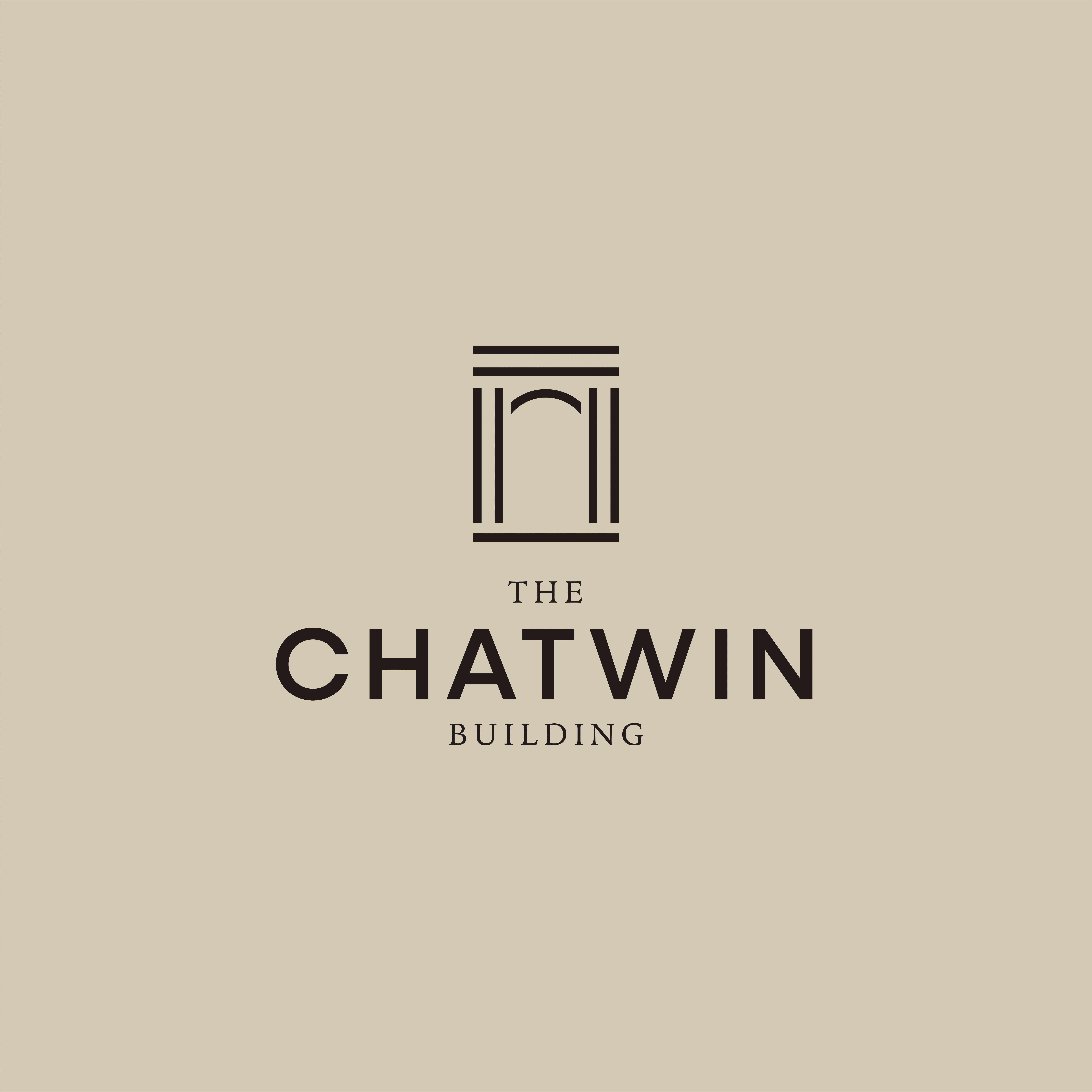
One of my favourite projects I took part in was the development of a new brand identity for the Chatwin Building in Birmingham city centre. Their office space was undergoing a large redesign which also included a complete refresh of their brand identity.
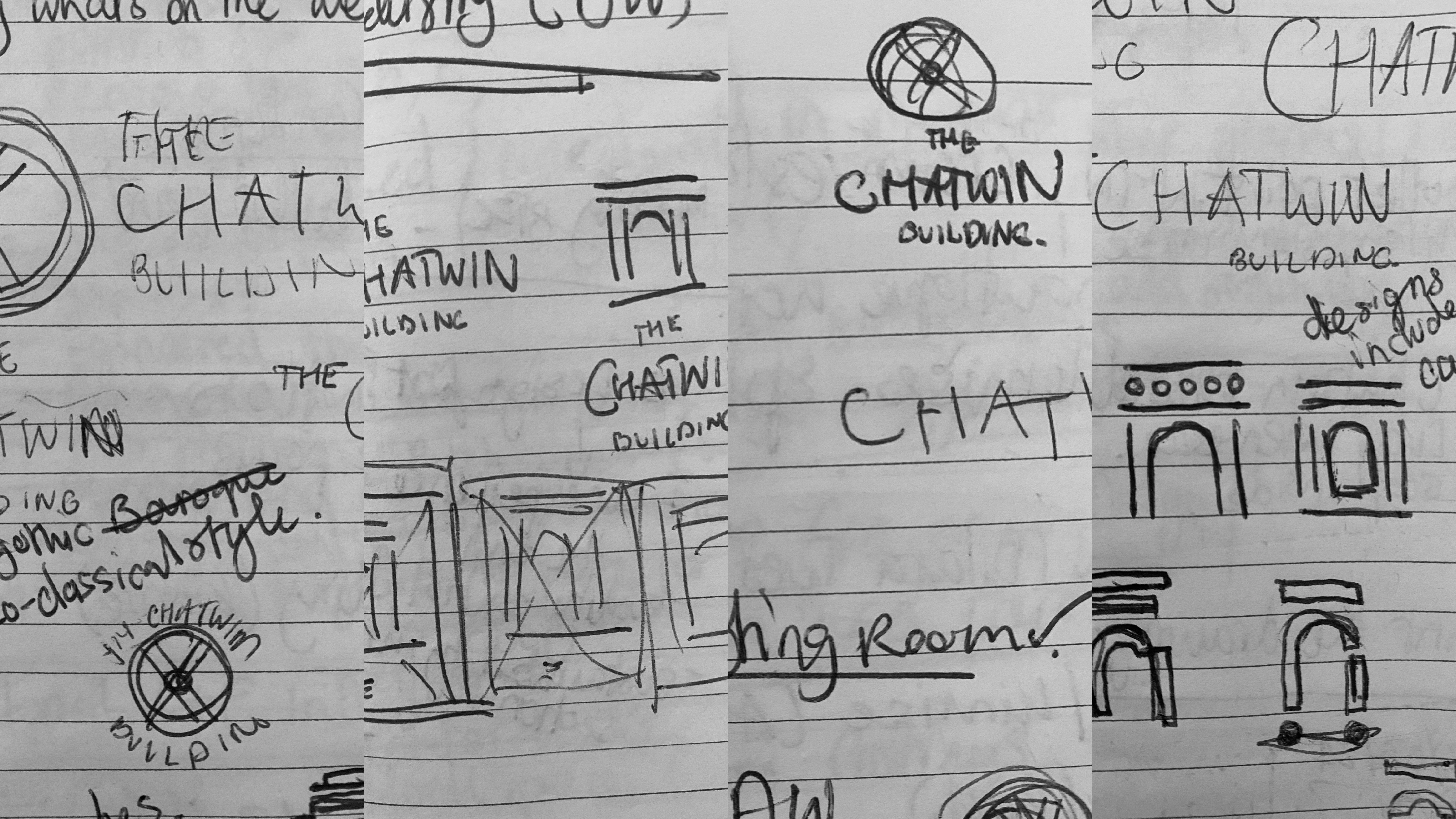
Early Stages
Inspiration for the brand identity has been drawn from the architecture of Julius Alfred Chatwin, who was born in Birmingham and one of the City’s most prolific architects. His legacy lives on in the form of many buildings still standing today including the impressive Old Joint Stock pub, the graceful St Philip’s Cathedral, and a huge number of other churches throughout the region.

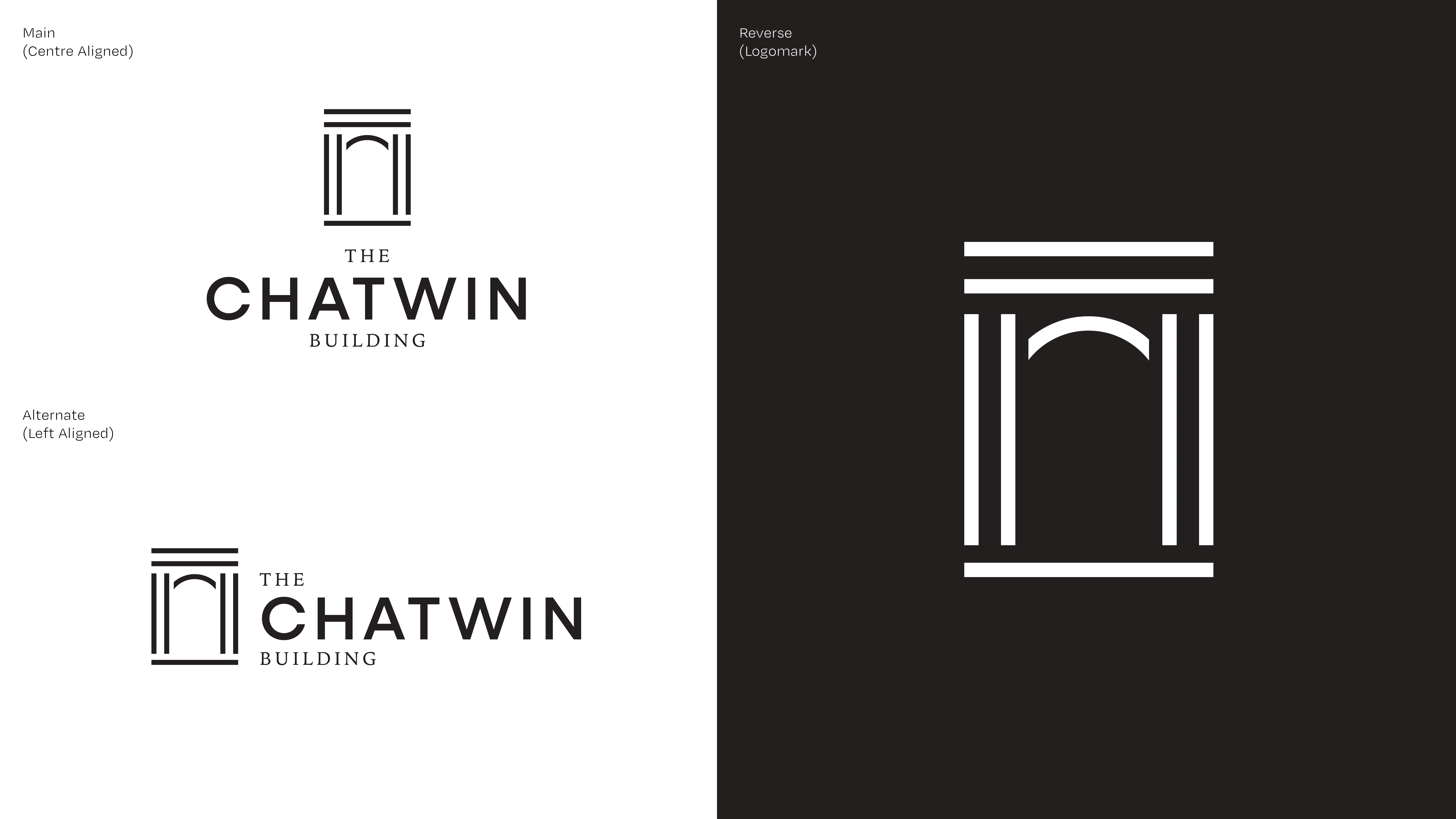
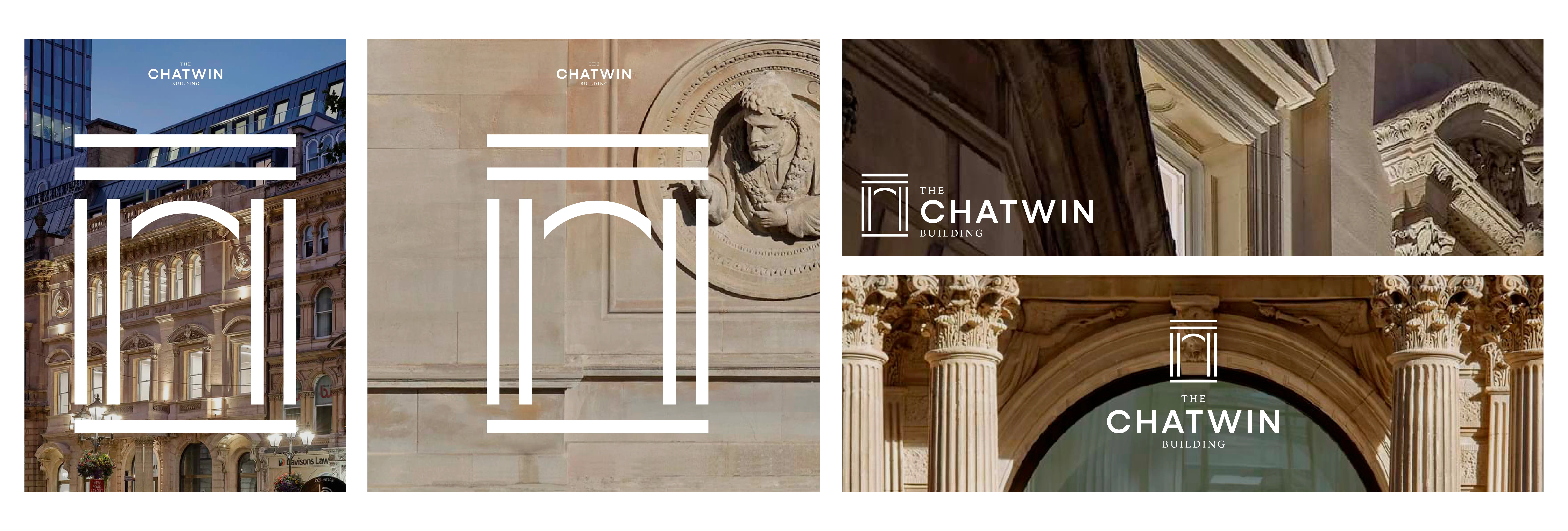
The logo mark pays homage to the main doorway entrance into the building creating a stylised version of the signature columns and arched window. The intended design aims to be versatile across different formats while maintaining its recognisable shape and form.
The main logo mark is paired with a classic serif font to keep the traditional and classical feel, as well as a larger more legible sans serif as the emphasis was centred on the word 'Chatwin' rather than 'the' and 'building'.
Development
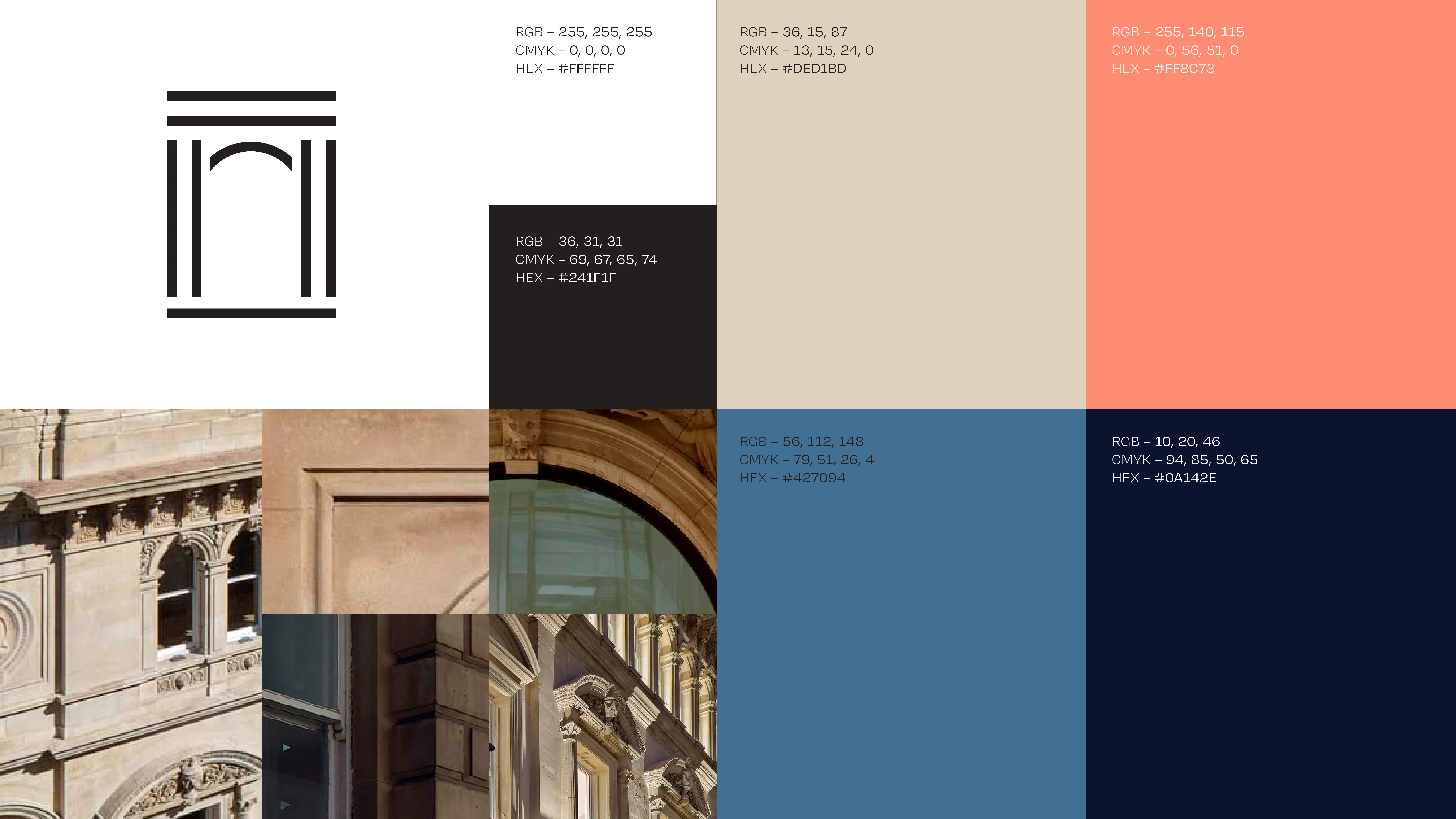
The proposed colour scheme reflects the rich history, textures and materials of The Chatwin Building, allowing for flexibility and versatility across both print and digital applications.
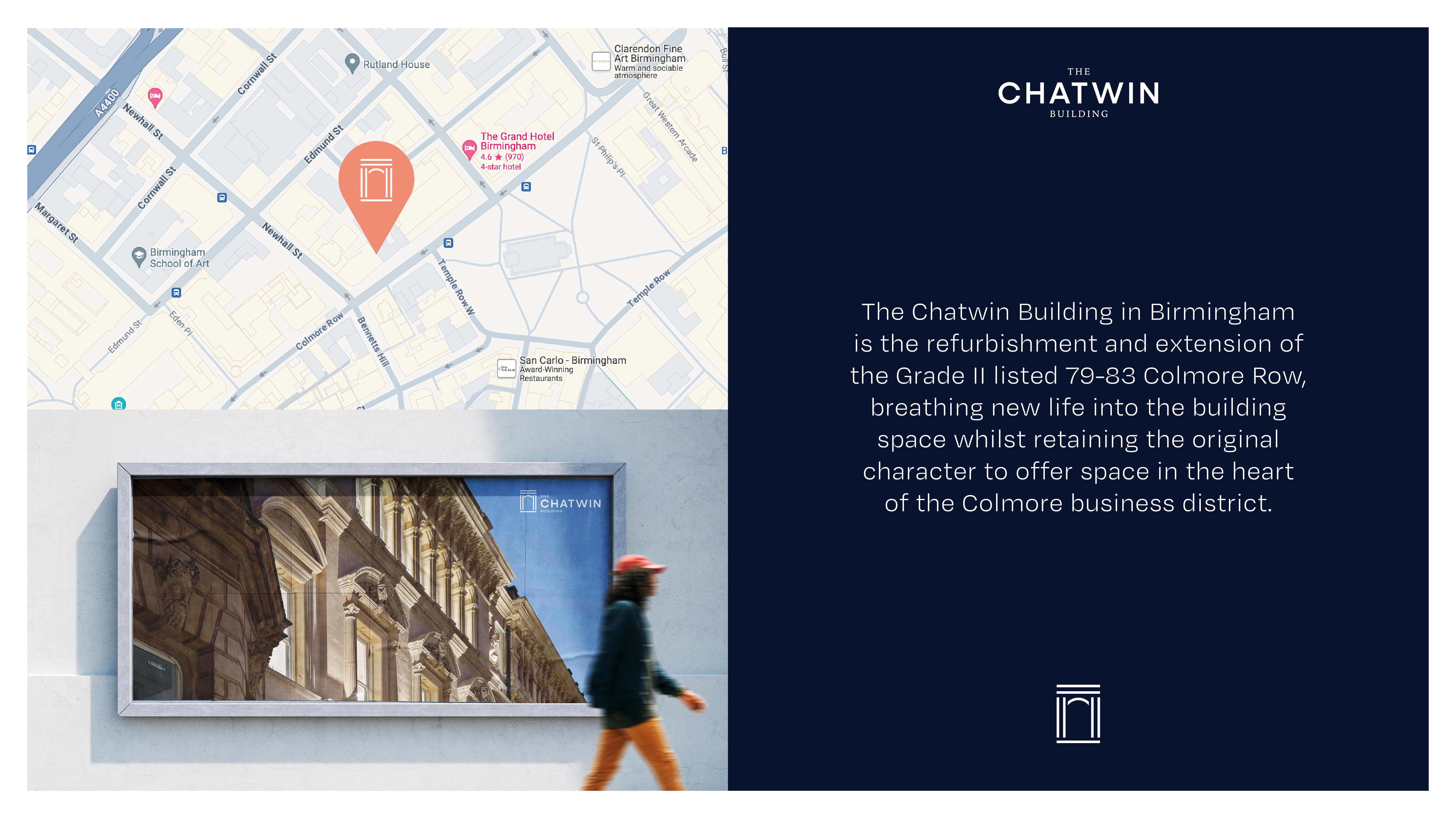
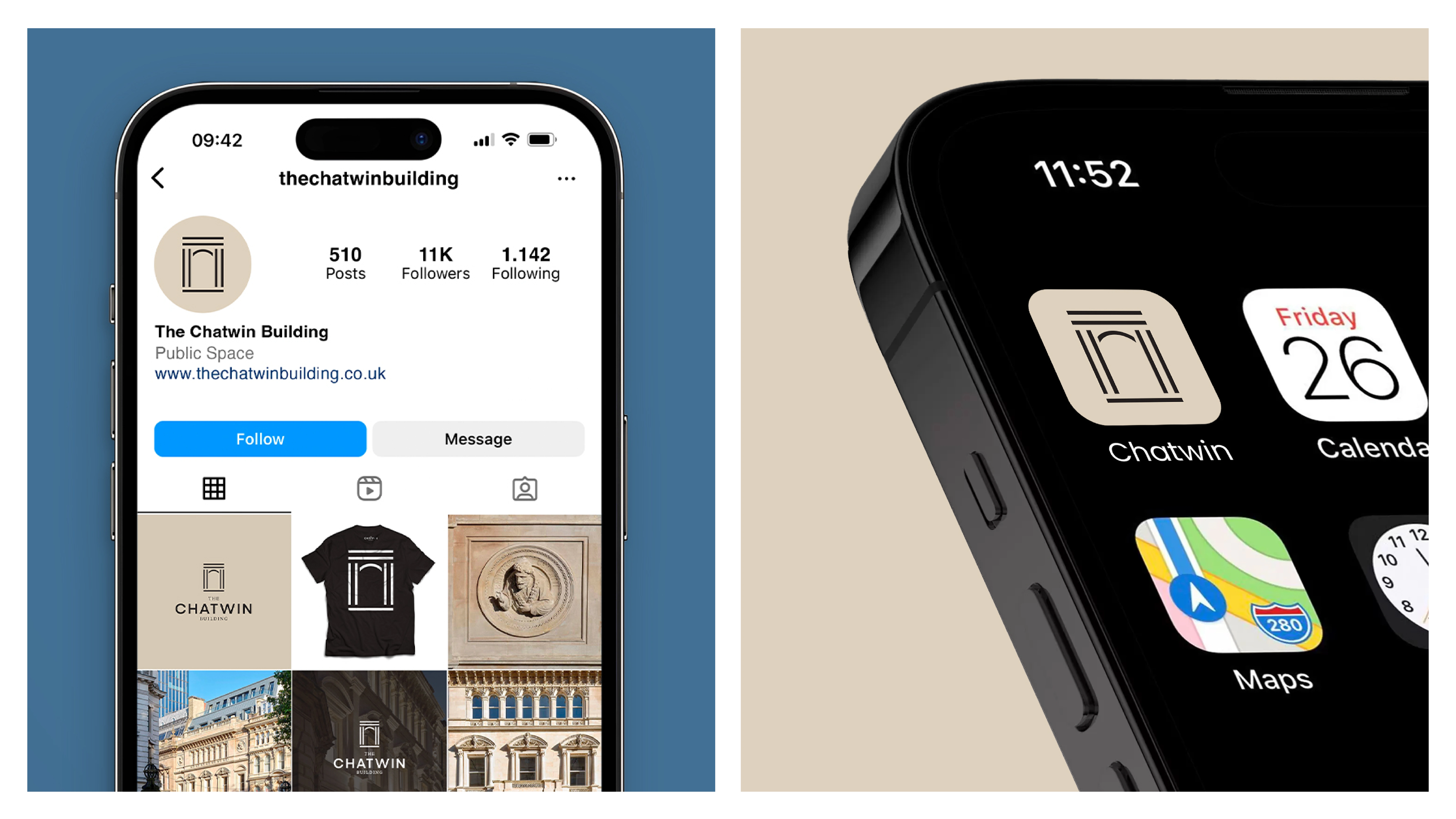
Following on from the above, the next step was to try to update The Chatwin Building's online presence in the form of some updated brand assets to use on social media and (for now) a new app icon. The goal was to create a cohesive and professional visual identity that still resonates with the target audience using the logo mark and selected colour palette.
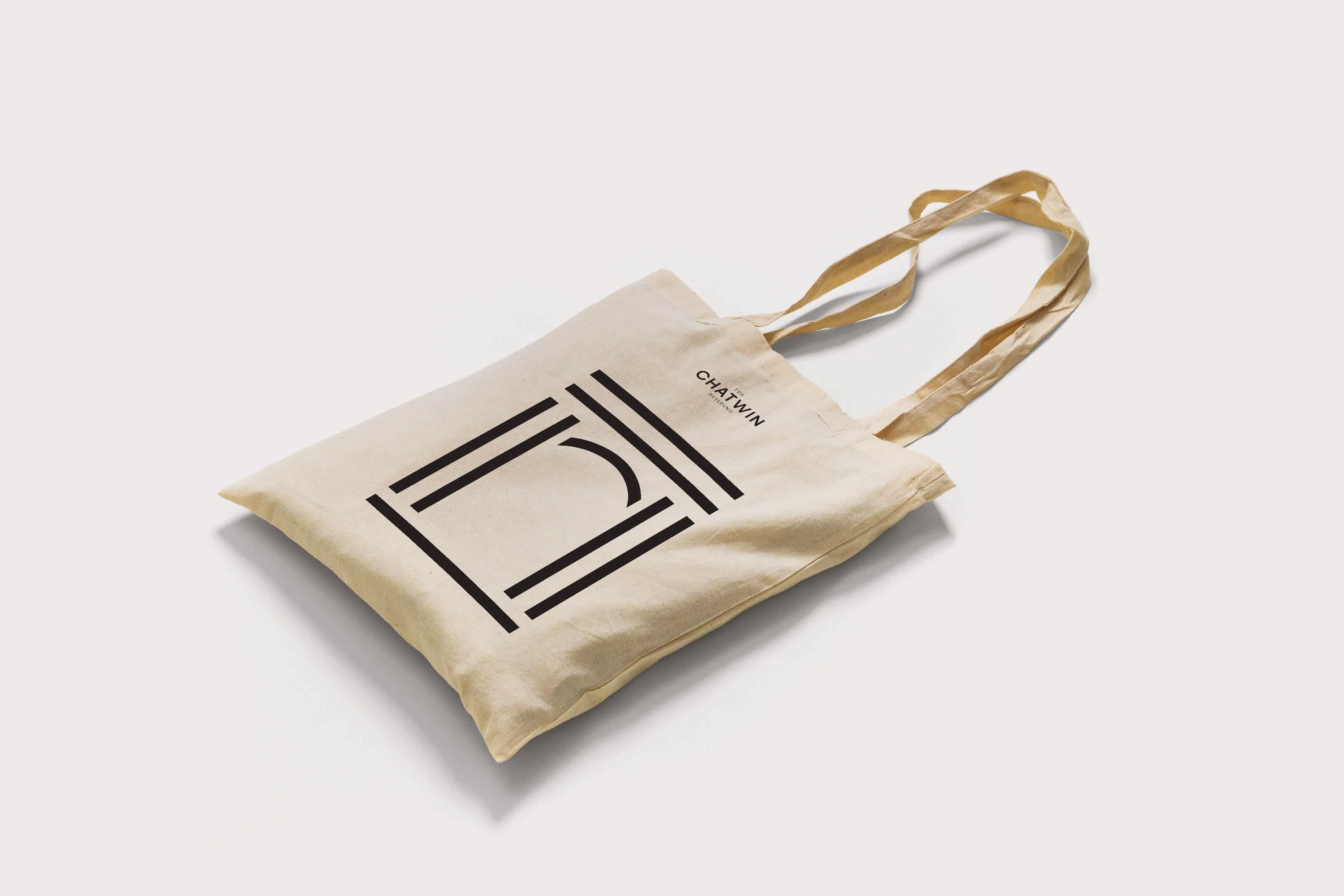
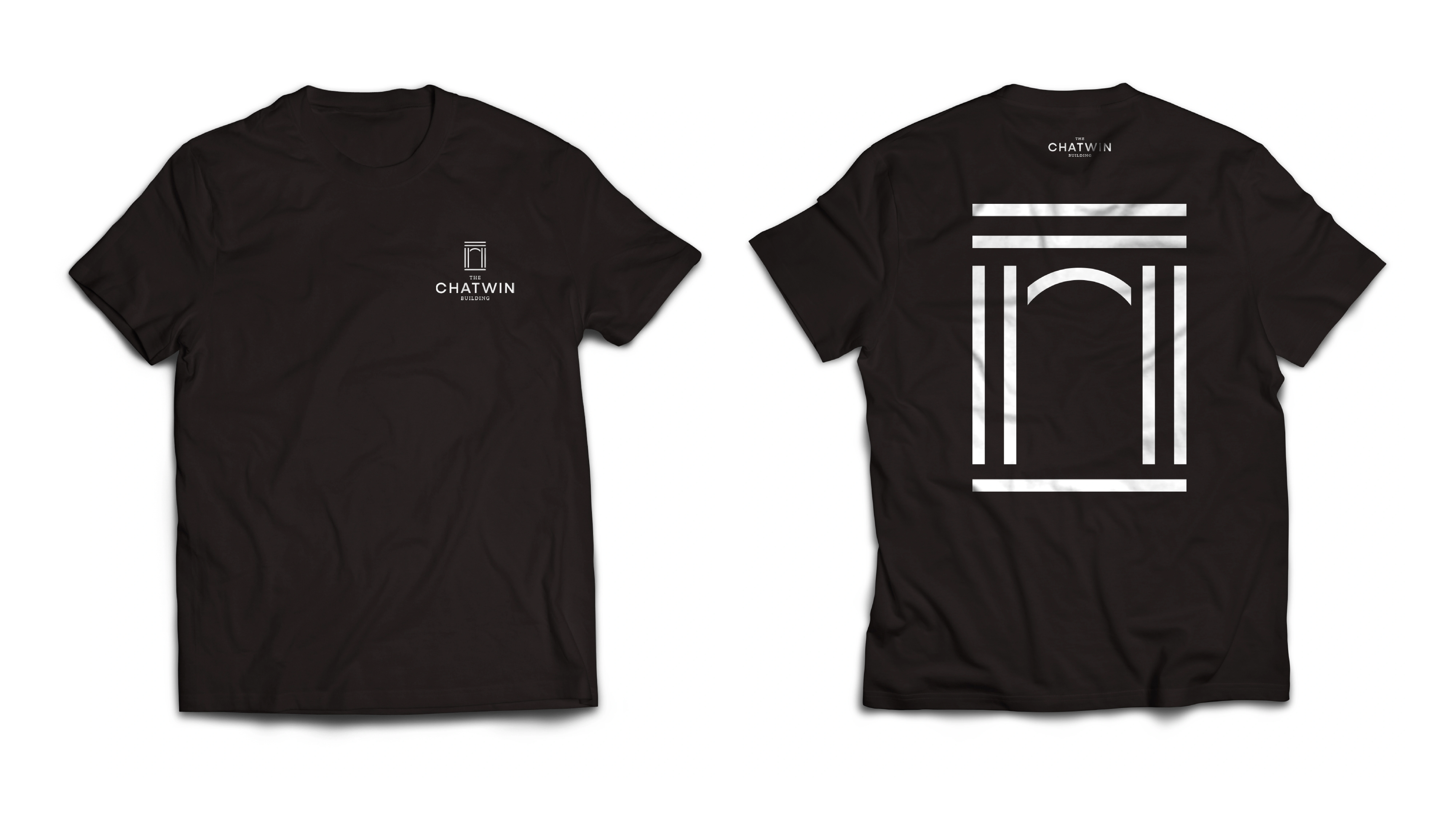
One of the last steps was to provide some visual mock ups of how the brand would look physically printed on merchandise. I used the bold logomark as the centre point for the tote bag and back of the t-shirt. The idea was keep the design language as timeless as possible and together with the client, we made sure we hit that requirement from all angles.
Like this project
Posted Oct 29, 2024
Development of a new brand identity for the Chatwin Building in Birmingham city centre, helping to win a roughly £1M deal.
