Built with Framer
Voluminous Website ( design + development )
Orion Farag
Verified
OVERVIEW:
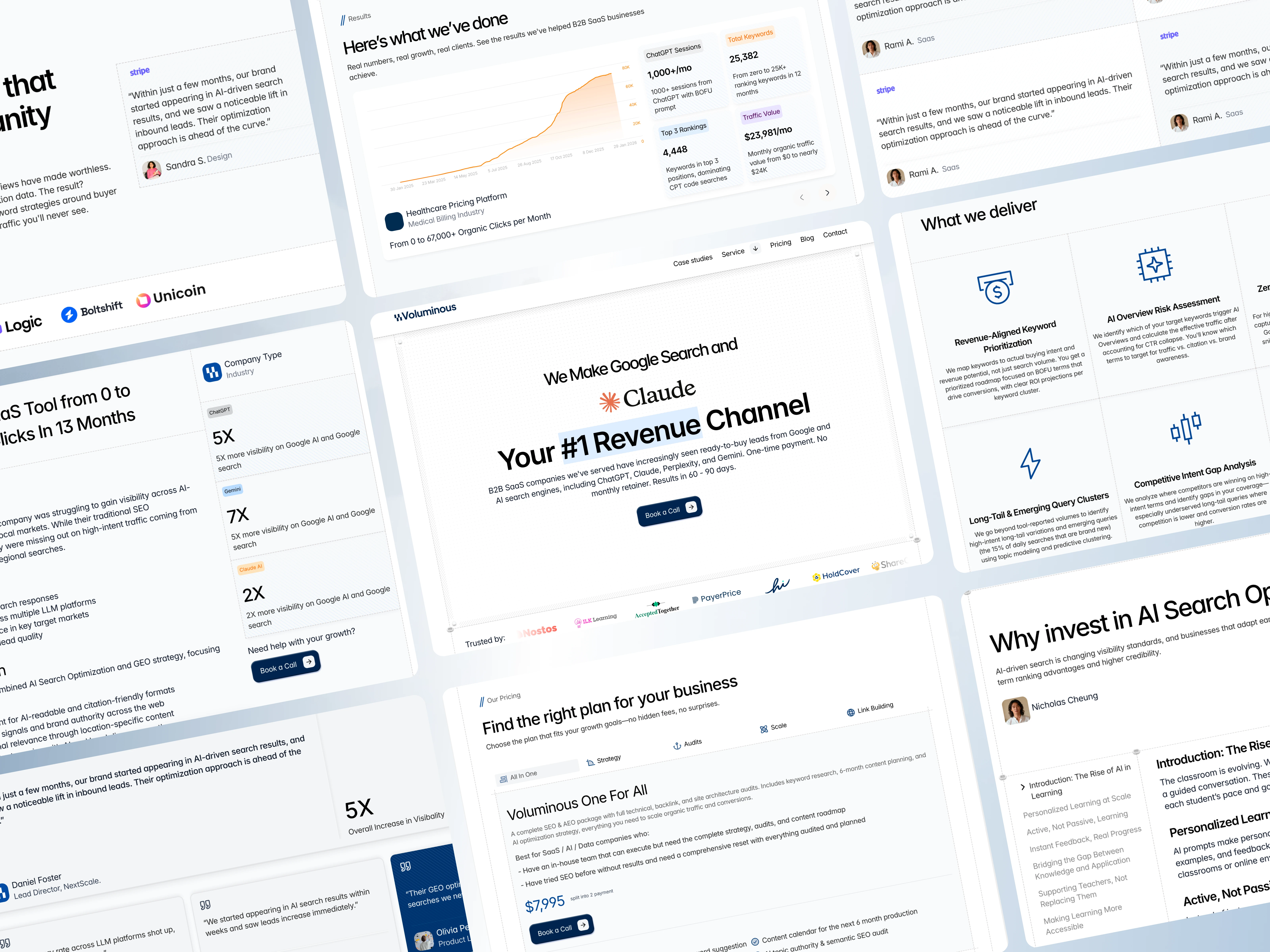
Voluminous is an SEO and GEO agency helping B2B SaaS companies turn Google and AI search into their #1 revenue channel.
The scope was significant: home, services, case studies, blog, and legal pages. Each one packed with content that mattered. The challenge was making sure none of it felt that way.
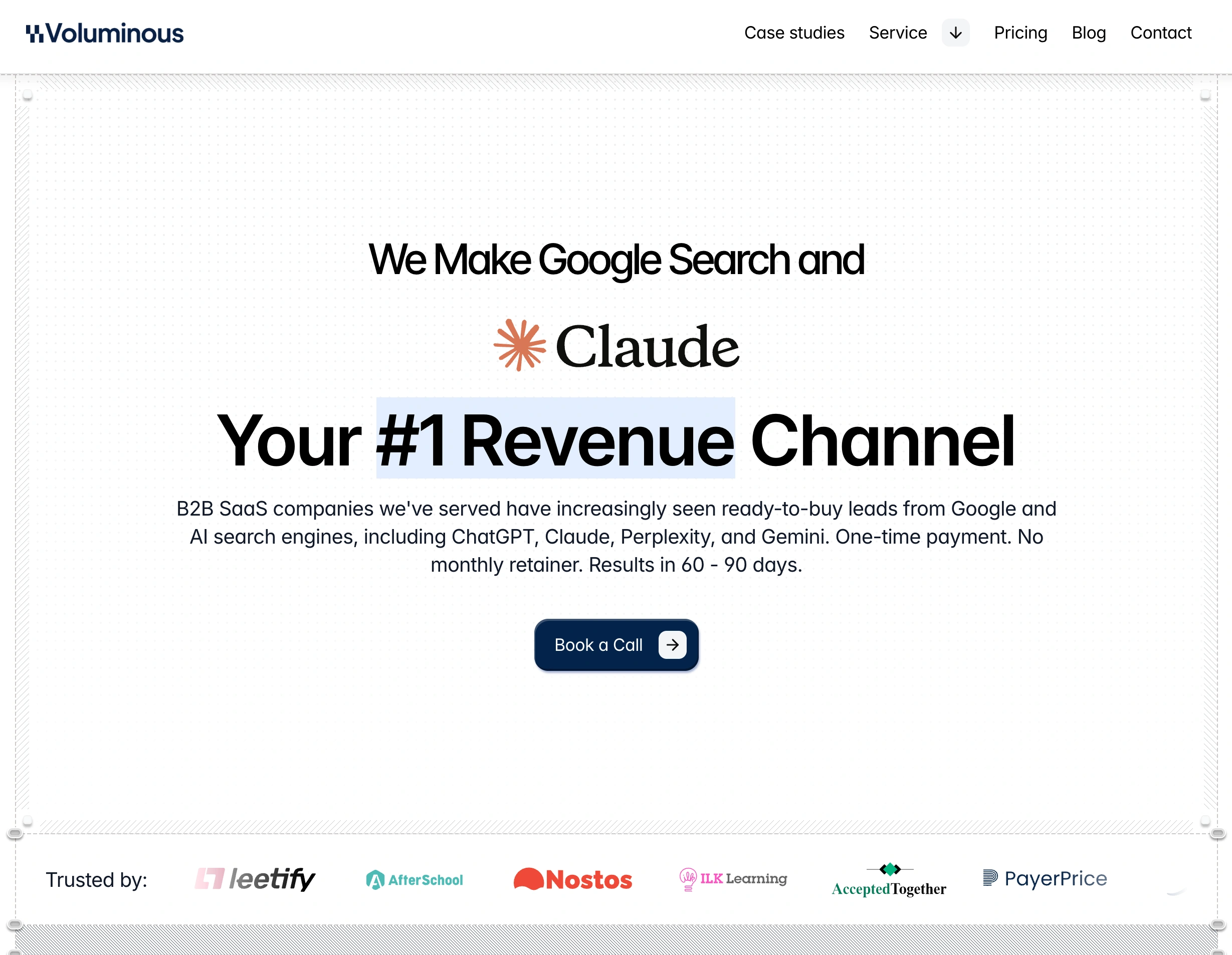
Hero section
THE CHALLENGE:
A lot to say. A clear way to say it.
SEO agencies live and die by credibility. That means numbers, testimonials, service breakdowns, case studies, pricing tables, and FAQs and all of it necessary, none of it optional.
The real design challenge here wasn’t visual, it was editorial. Every section needed to carry its weight without making the page feel heavy.
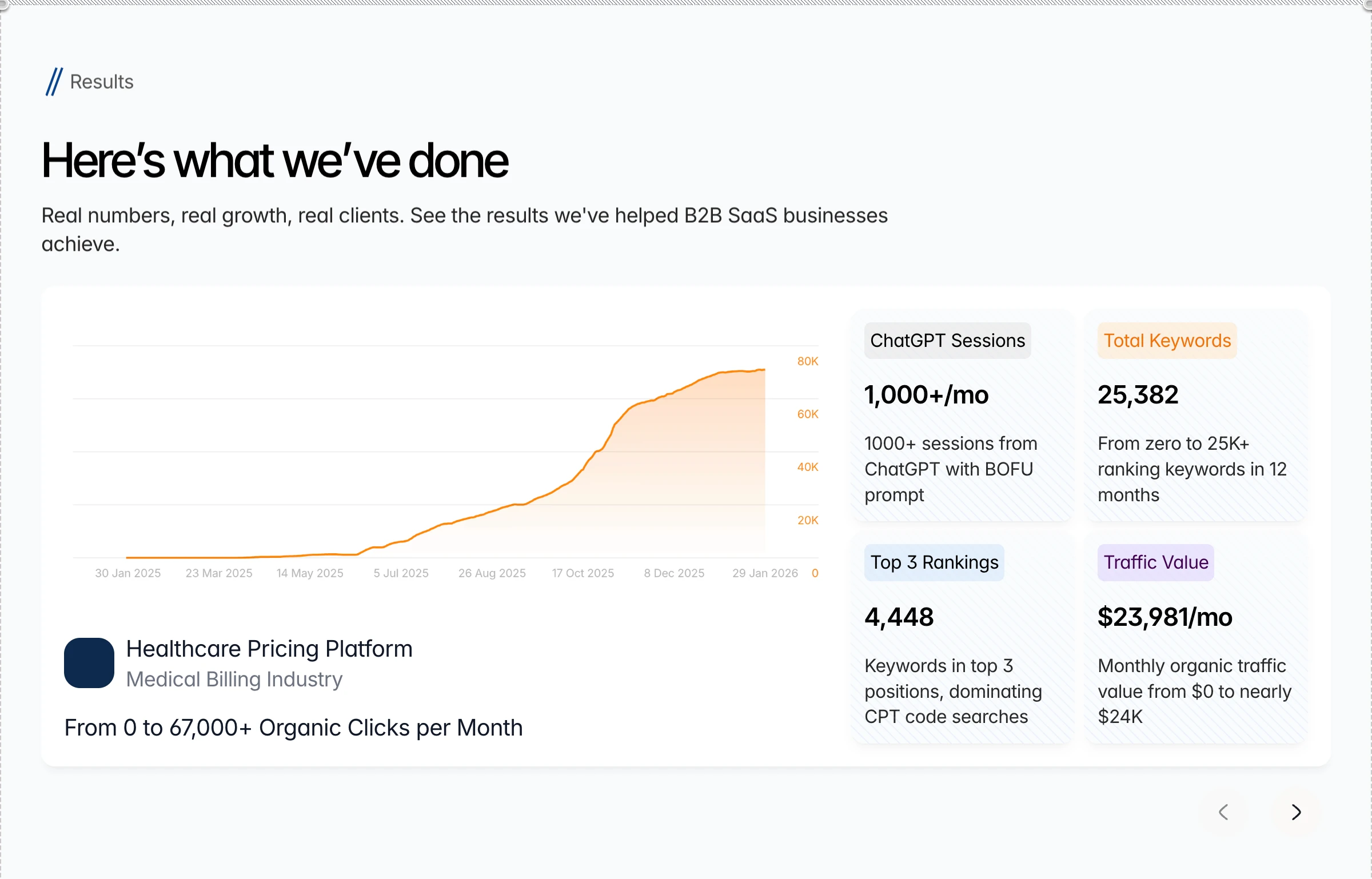
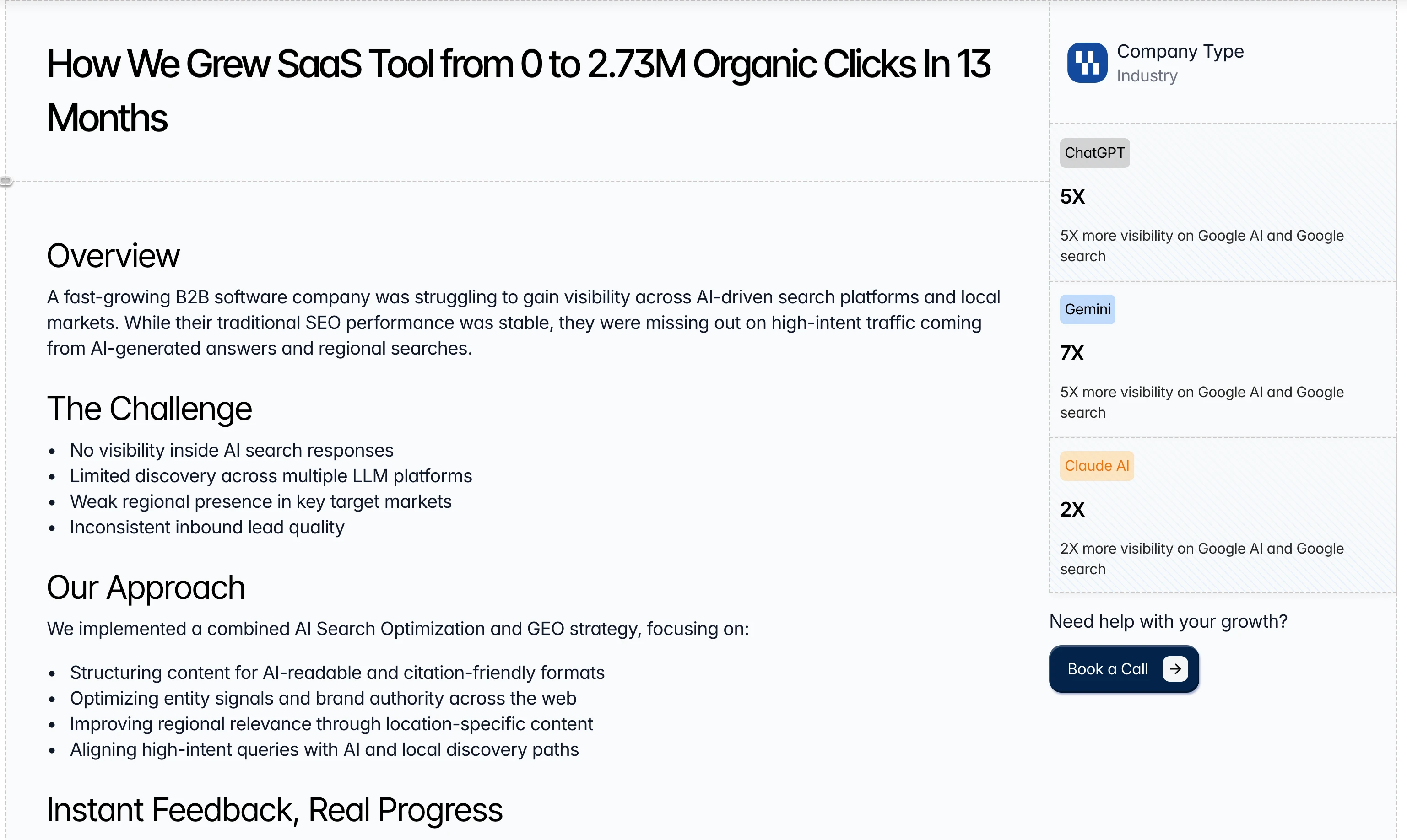
case study card shows (4 metrics, SVG chart, company info, goal achieved), visually balanced.
SCOPE OF WORK
A alot of pages. One cohesive experience.
Home
The hero led with the core value proposition. making Google and AI search a revenue channel and moved quickly into social proof, trusted logos, results, and a clear CTA. Hierarchy did the heavy lifting so visitors understood the offer before they had to think about it.
Services
Detailed service breakdowns covering Revenue-Aligned Keyword Prioritization, Long-Tail & Emerging Query Clusters, Competitive Intent Gap Analysis, and AI Overview Risk Assessment. Each service was given enough room to breathe — clear icons, concise descriptions, and no visual clutter competing for attention.
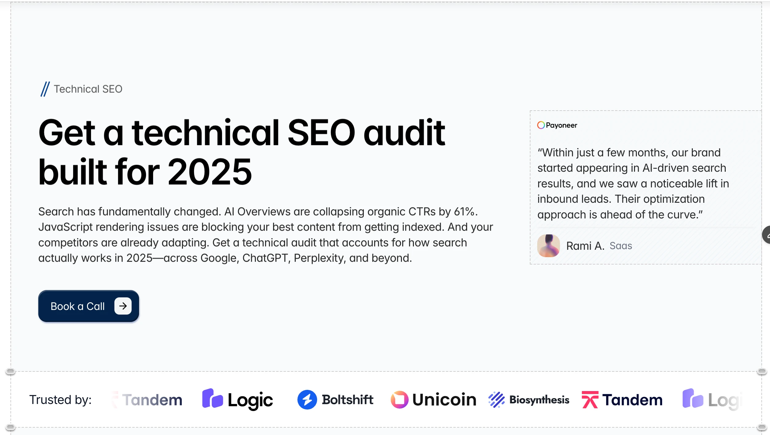
hero section for one service page with a placeholder testimonial
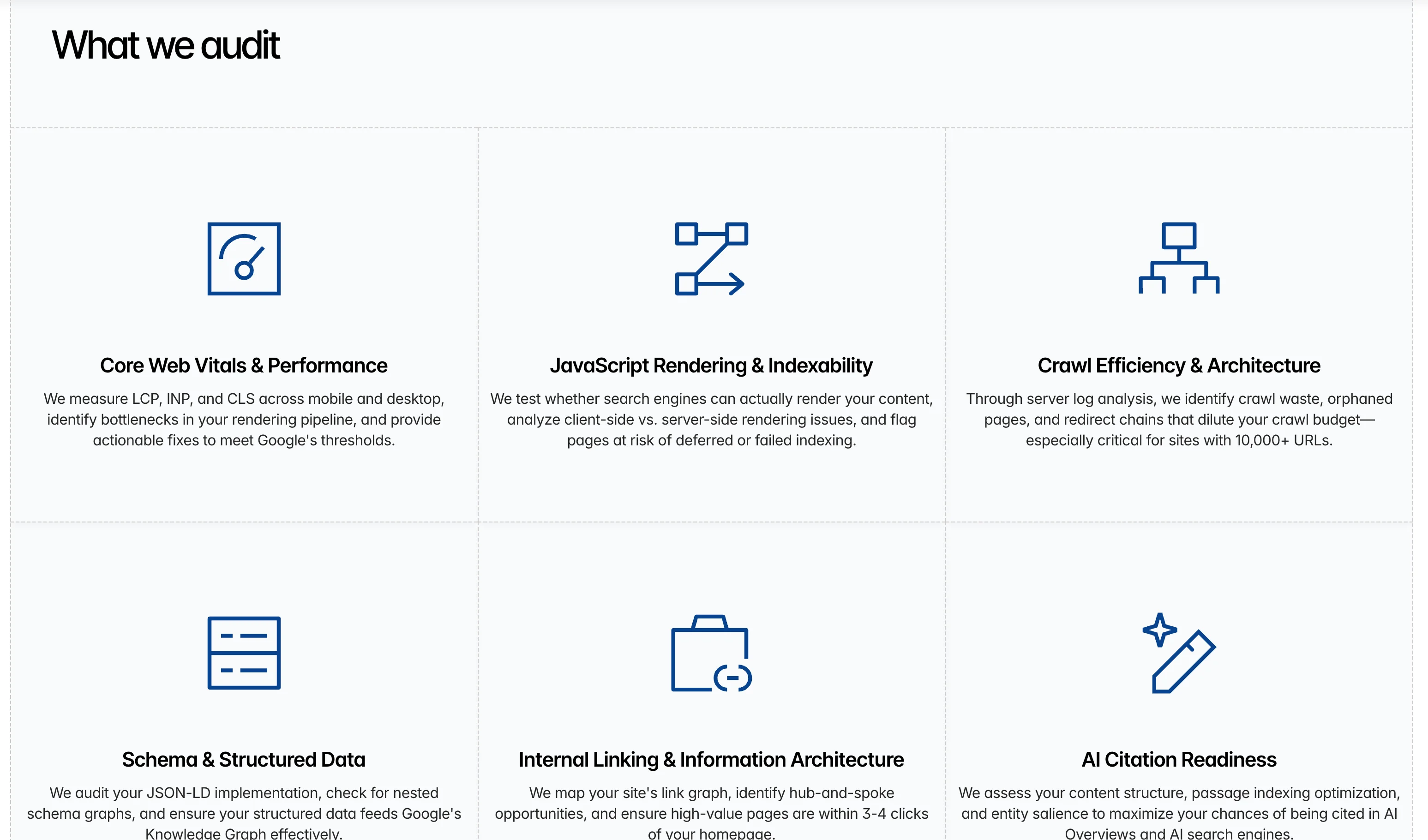
what we audit section from service page
Case Studies
Results pages are only as good as the numbers they show. The case study layout was built to surface metrics fast like 5X visibility, 7X AI search presence, 67,000+ organic clicks with enough narrative context to make them believable.
case study ( detailed page )
Blog
A structured content hub designed to support long-form SEO articles without feeling like a wall of text. Clean typography, table of contents, strong spacing, and a layout that makes reading feel effortless.
Blog detailed page with table of content
Other
THE APPROACH
Content density without visual noise:
The solution came down to a few core principles applied consistently across all pages.
Hierarchy over decoration :
Every page was structured so the most important information was always the most visible. Size, weight, and spacing did the work that color or graphics might otherwise overcomplicate.
Sectioning as breathing room:
Heavy content becomes manageable when it’s clearly broken into sections. Generous whitespace between blocks let each piece of information land on its own before the next one arrived.
Numbers as anchors.
For an SEO agency, data is the product. Metrics were sized up and placed strategically not buried in paragraphs but presented as the visual centerpiece of results sections.
KEY TAKEAWAY :
Voluminous is proof that content-heavy doesn’t have to mean overwhelming. When structure is strong enough, there’s no ceiling on how much a website can hold — and still feel light.
**placeholder images are used till they are updated by the client.
Like this project
Posted Mar 1, 2026
Designing a Content-Heavy SEO Agency Website Without the Overwhelm.
Likes
0
Views
10
Timeline
Nov 13, 2025 - Jan 29, 2026
Clients
Voluminous