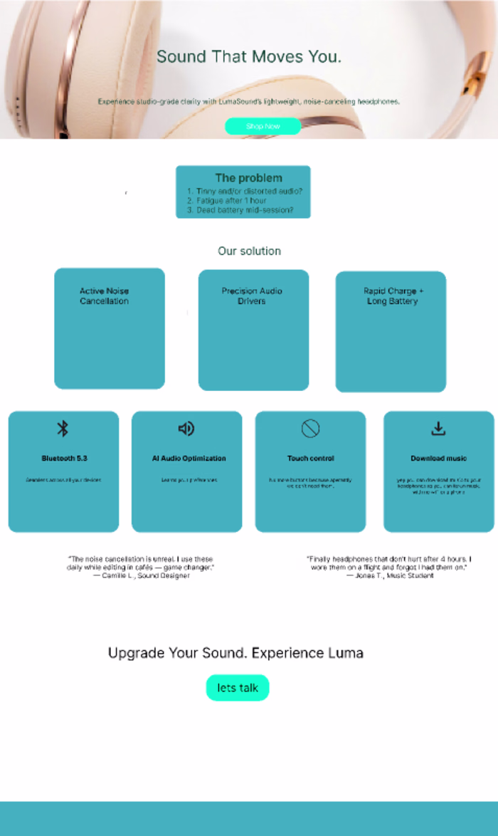
LumaSound Landing Page Design
Sem Visser
Role: UI/UX Designer
Tools: Figma, Coolors, Lucide Icons
Device Focus: Desktop-first
Status: Concept / Practice Project — LumaSound is a fictional brand
📍 Project Overview
LumaSound is a fictional premium audio brand I created as a concept project to challenge myself with real-world landing page design thinking. The goal was to design a sleek, conversion-optimized page for a high-end headphones.
I treated this project like a client brief — applying strategy, visual hierarchy, and UX flow to make it portfolio-ready.
🔎 The Problem
Many tech landing pages are cluttered or overly technical. I set out to design a product page that:
Feels premium and modern
Focuses on benefits, not just specs
Builds trust and guides the user toward action
A clean, 7-section desktop landing page that:
Grabs attention with a bold hero section
Shows pain points the headphones solve
Highlights key features using visual cards
Builds trust with testimonials
Ends with a clear CTA
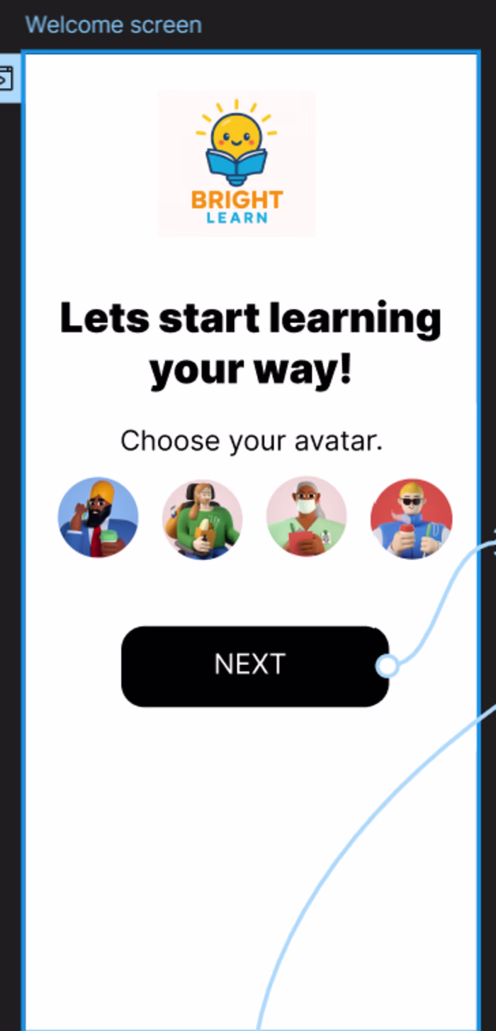
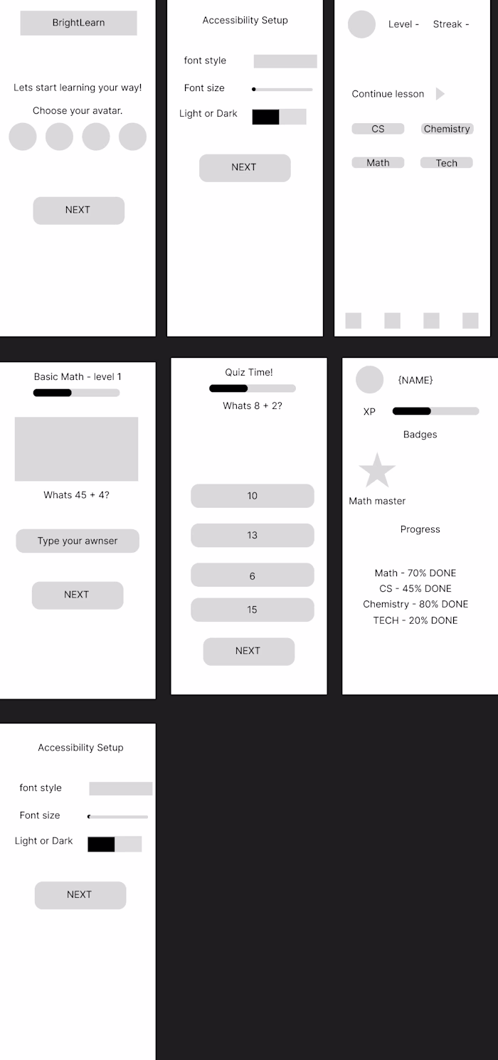
🧱 Wireframe First
I mapped the layout in grayscale wireframes to:
Lock in structure and spacing
Plan responsive breakpoints
Ensure copy and visuals had space to shine
🎨 Design System
Color Palette:
Dark Green → depth, trust
Fluorescent Cyan → bold CTAs
Moonstone → soft backgrounds
White → clean readability
Typography: A modern sans-serif like Inter with strong hierarchy across sections.
UI Elements: Built using auto layout, consistent padding, and reusable components for developer handoff.
✅ Outcome & Learnings
Designed a developer-ready UI that balances style and performance
Created a full case study for my portfolio
Learned how to pace the user’s attention while keeping it visually clean
Proved I can handle a real-world design process, start to finish
Even though this was a fictional brand, I approached it like a real client project to sharpen my process, storytelling, and presentation skills.
Like this project
Posted Jul 23, 2025
Designed a sleek, conversion-optimized landing page for a fictional audio brand.
Likes
1
Views
1