Built with Framer
Stackr - Developer-focused Marketing Site in Framer
Kaine Michael
Project Title: Stackr - Framer Marketing Site for a DevTool
Overview
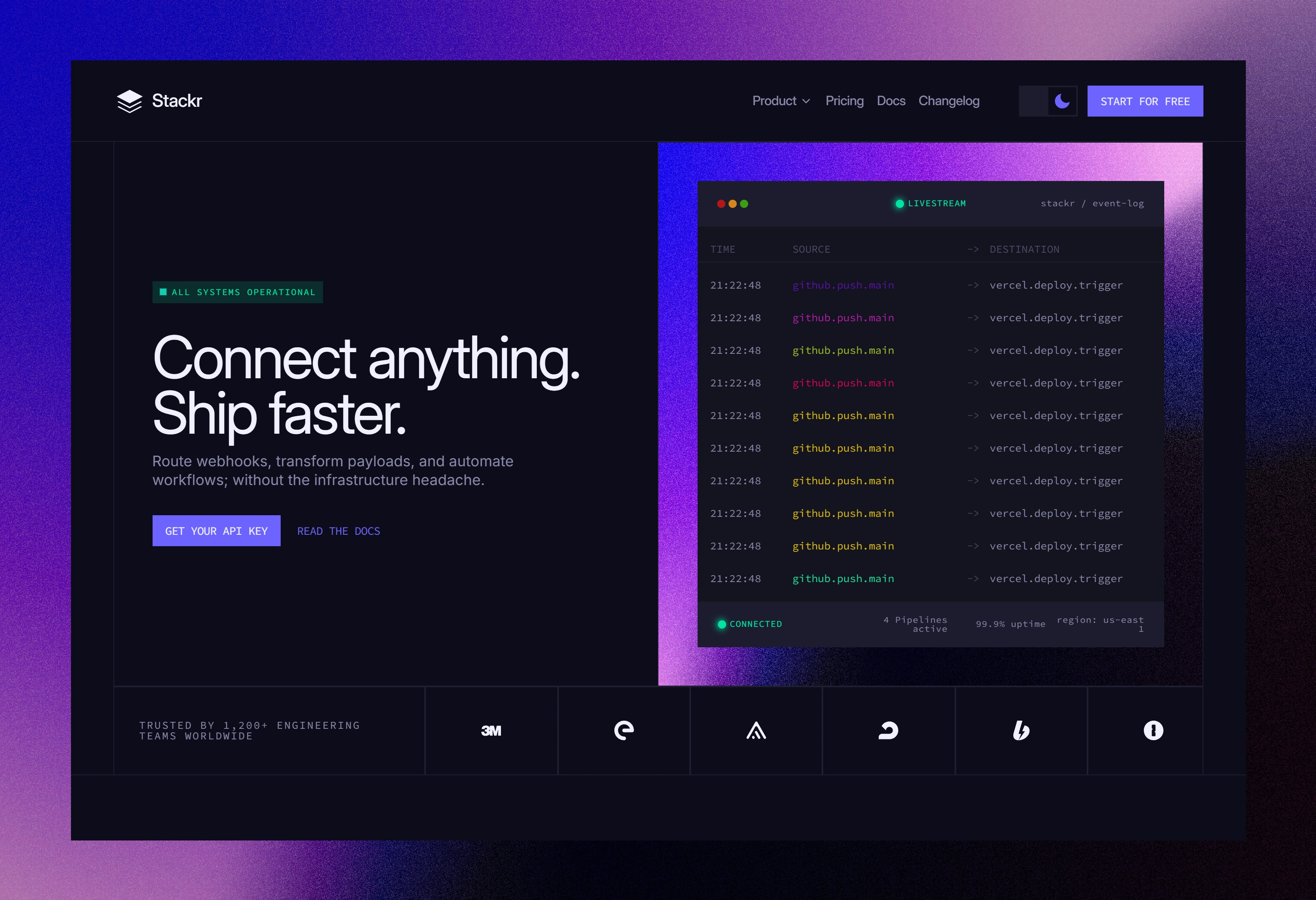
Stackr is a concept spec project, a marketing site for a fictional real-time webhooks and data pipeline API built in Framer. The goal was to design a site that speaks directly to a developer audience: technically credible, visually confident, and fast to navigate. The project demonstrates Framer animation, dark-mode UI, and developer-first design patterns.
The Challenge
Developer tool companies live or die by credibility. Engineers are skeptical of marketing they scan for real signals: clean documentation, working code examples, evidence that the people who built the site actually understand the product.
The design challenge was to create a marketing site that earns a developer's trust in under 10 seconds, while still driving signup conversions for less technical visitors (like founders and CTOs).
The Objectives
Design a dark-first, developer-native marketing site that feels production-ready, not template-picked
Build a full design system - color tokens, typography scale, and component library.
Demonstrate Framer's animation and interaction capabilities through scroll-triggered effects, a terminal typing animation, and an infinite logo ticker
Produce a pricing page that removes friction and converts across both technical and non-technical visitors
Process
Research & References: Before opening Framer, I spent time studying best-in-class devtool sites; Linear, Vercel, Resend, Planetscale, and Railway. The goal was not to copy but to understand the patterns that earn developer trust: restrained animation, monospace accents and pricing transparency
Design System First: I built the design system before designing a single page. This covered the full color token set for both dark and light modes, a typography scale, buttons, badges, code blocks, and inline code were built and documented before any layout work began.
Content First: All copy was written and finalised before layout. Headlines, sub-headlines, feature descriptions, testimonials, pricing tiers, FAQ and footer were all locked before touching Framer. This prevented layout decisions from being driven by placeholder text.
Page by Page Build: Pages were built in order; Homepage first, then Pricing. Each section was built, animated, and reviewed at desktop, tablet, and mobile breakpoints before moving to the next.
Pages Designed
Homepage
Navbar · Hero · Logo Wall · Feature Highlights · How It Works · Integration Grid · Testimonials · CTA Banner · Footer
Pricing Page
3-tier pricing cards · Monthly / Annual toggle · FAQ accordion · CTA Banner

Hero Section
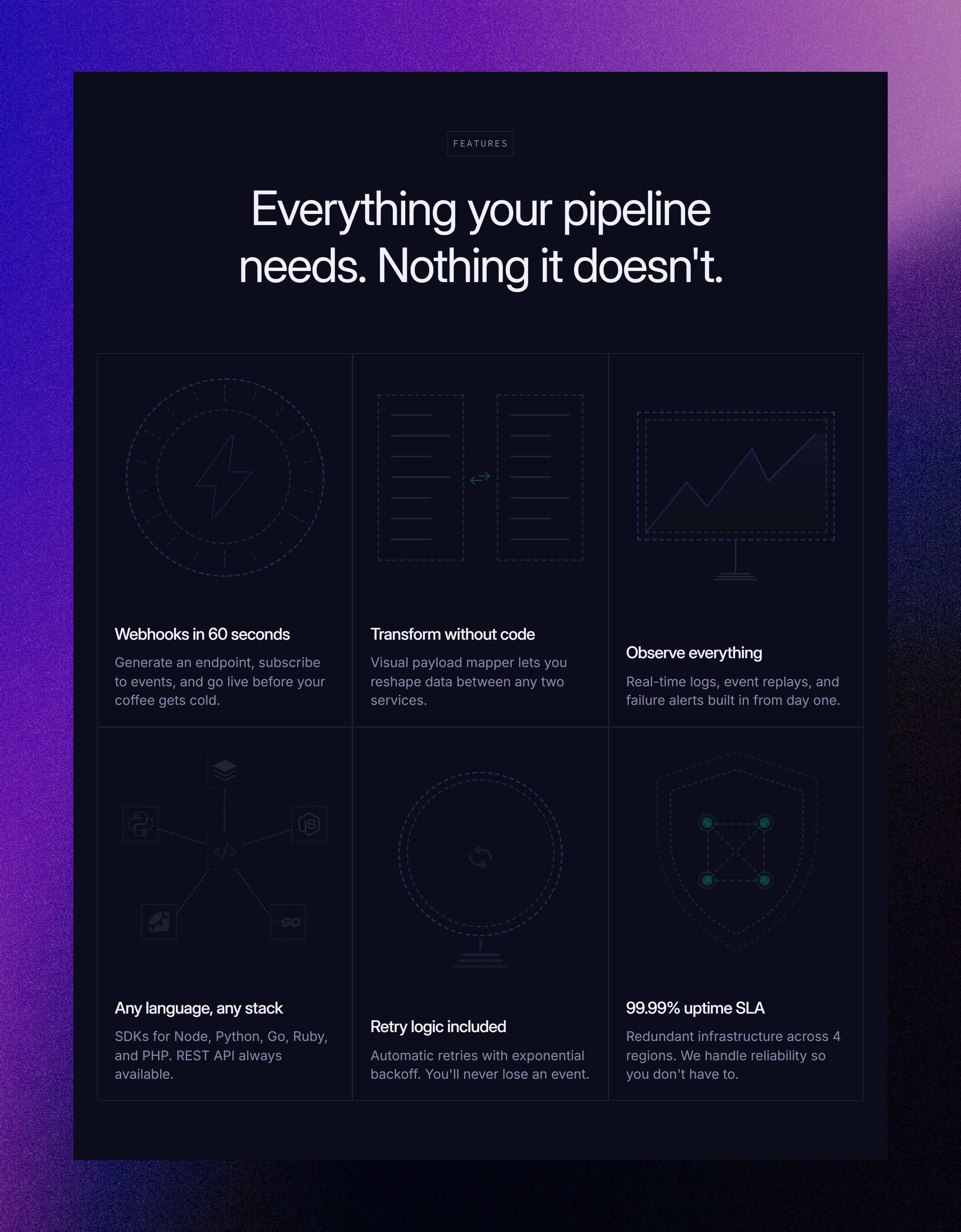
Features Sectin

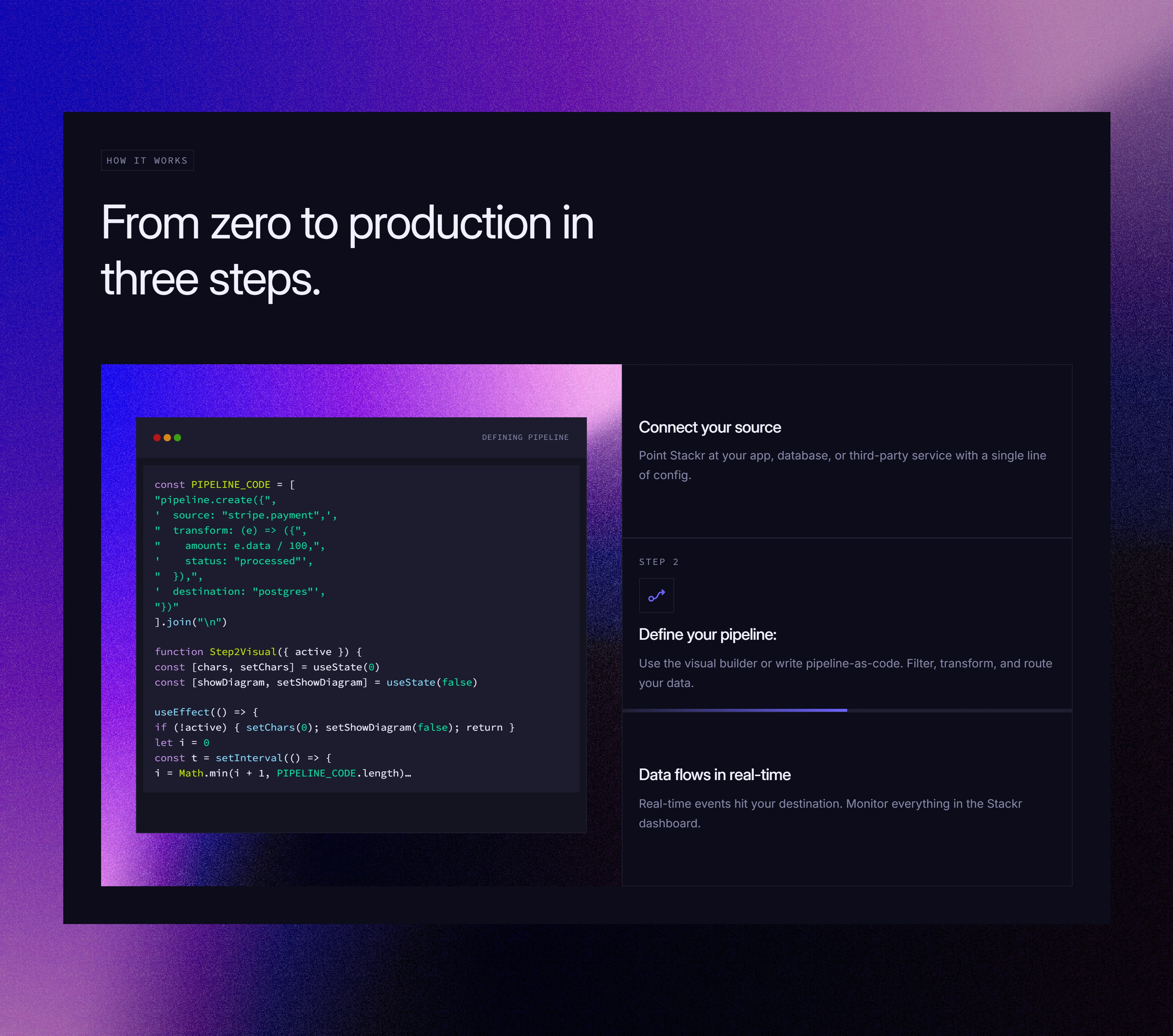
How it works Section 1
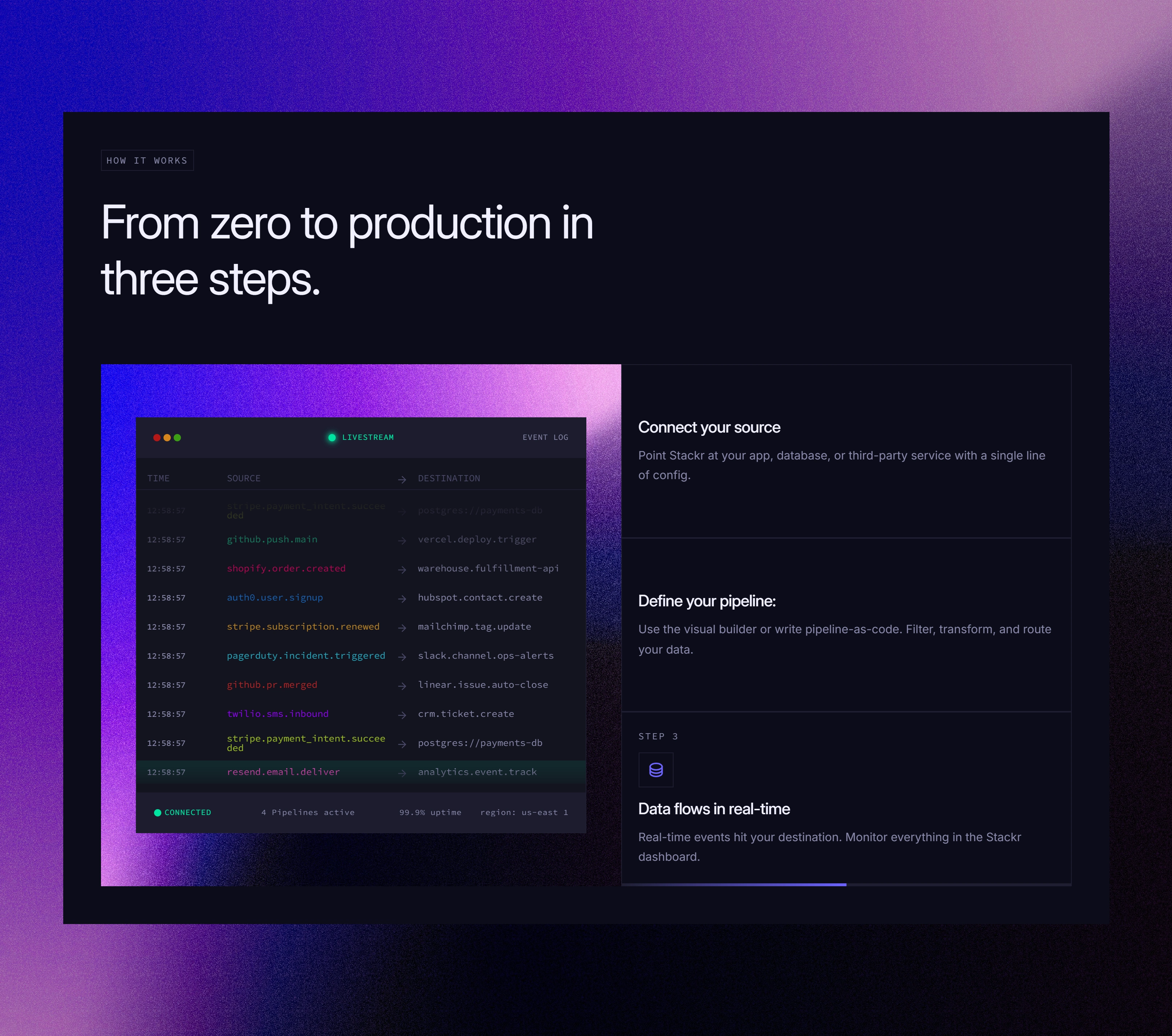
How it works Section 2
How it works Section 3
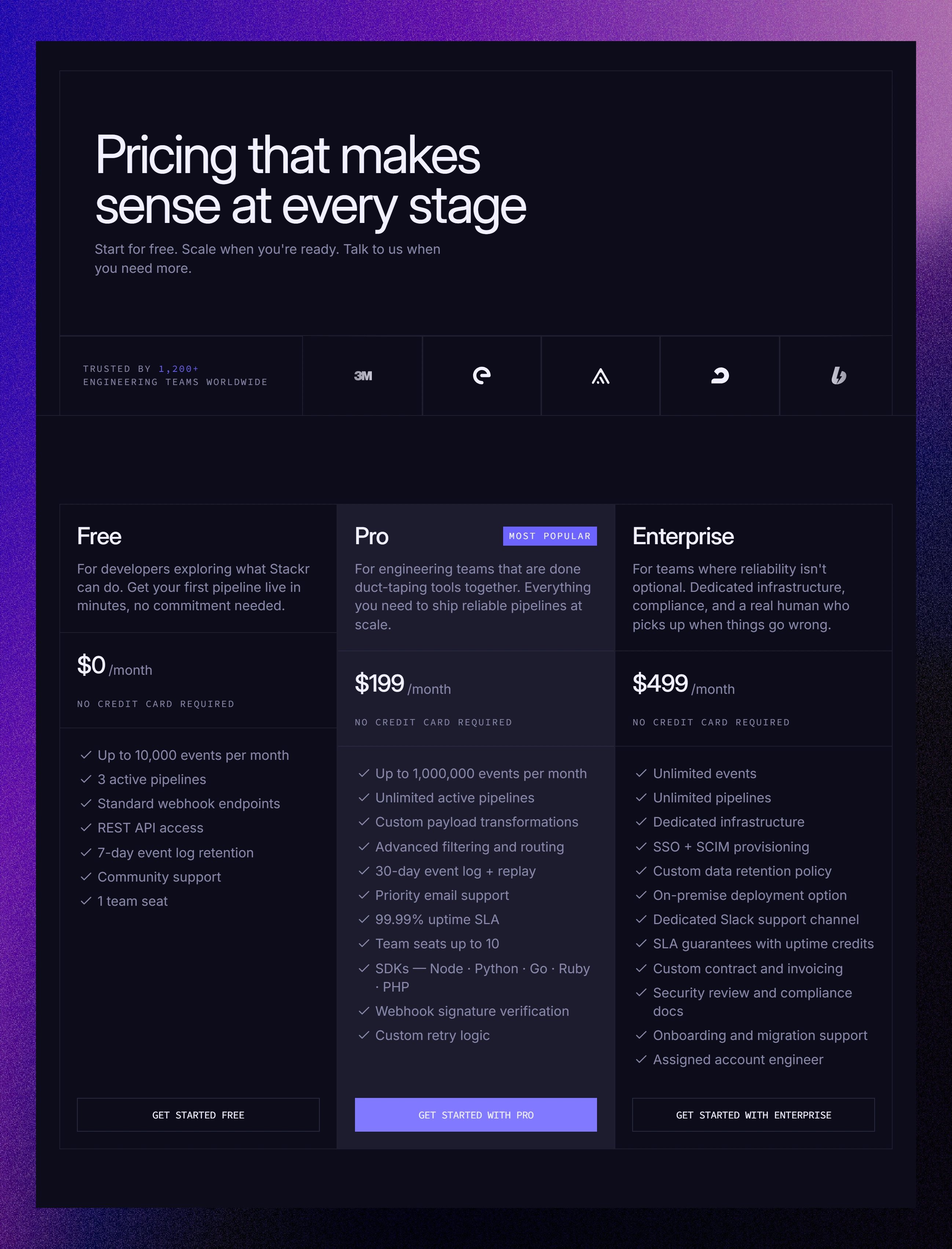
Pricing Section
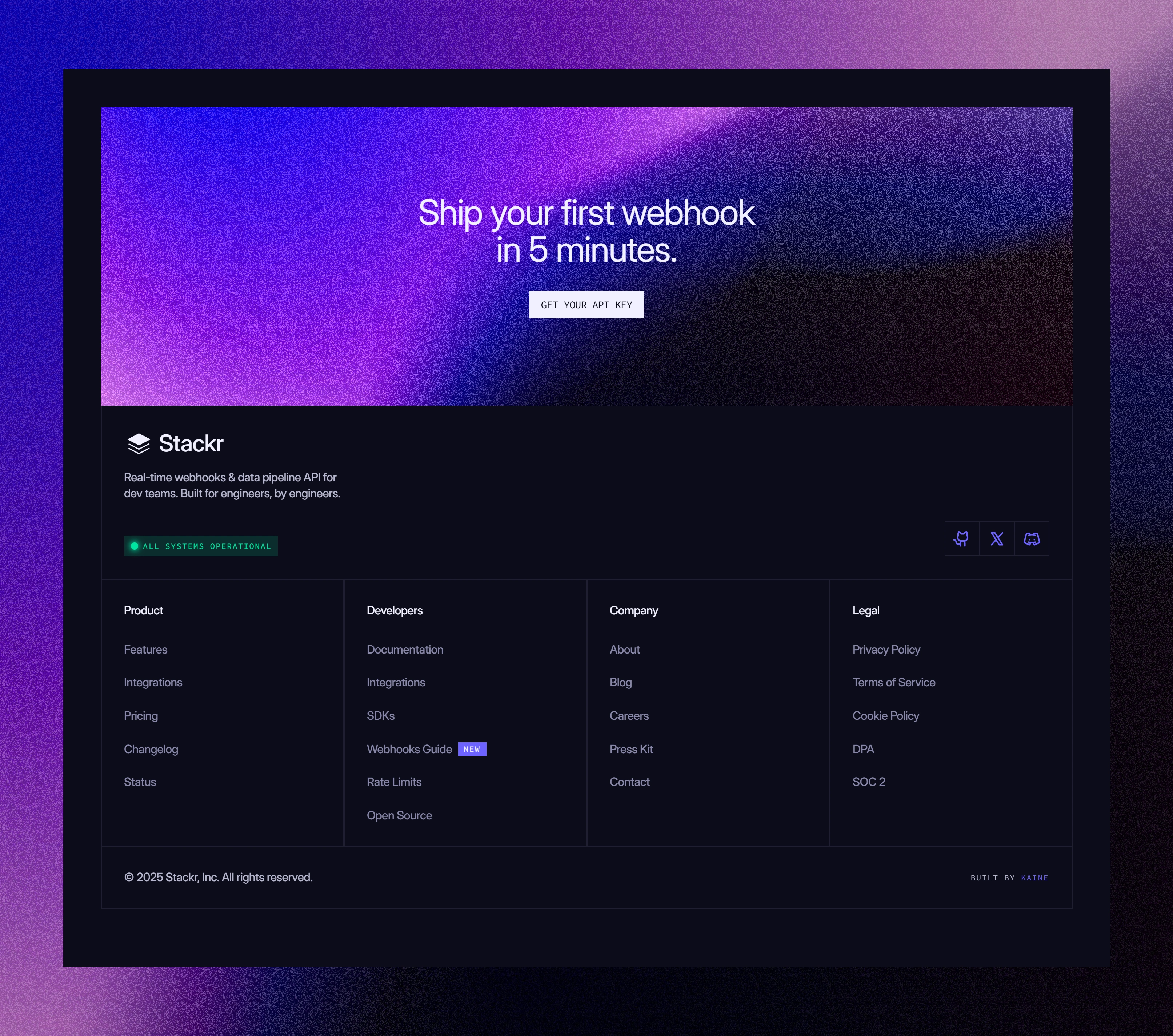
Footer Section
Framer Techniques Used
Terminal typing animation: Hero livestream block built as a reusable Framer component with a delayed appear affect.
Scroll-triggered stagger: Feature cards fade up individually as the user scrolls into the section
Pricing toggle: Monthly / Annual switch built as a Framer variant with spring animation
Sticky navbar: Blur backdrop effect triggered on scroll using Framer scroll events
CTA hover glow: Box shadow animates on button hover
Pulsing dot animation
Highlights
The Hero Terminal: The most technically impressive element on the site. The hero leads with a real-looking API call scrolling into view - the single most effective trust signal for a developer audience. Built as a reusable Framer component with line-by-line reveal on scroll entry.
Sharp Edge Design System: Zero border radius throughout the entire site. Every button, card, badge, input, and code block is sharp-edged. This was a deliberate decision; it reinforces the technical, precise aesthetic and differentiates Stackr from the sea of soft, rounded SaaS sites.
Pricing Transparency: Hiding pricing is a red flag in the developer community. Pricing is a primary nav item, all tiers are clearly listed.
Results
This project demonstrates:
Audience intelligence: The ability to design for a technical, skeptical audience without sacrificing visual quality or conversion intent.
Design system thinking: A complete token-based system built from scratch covering color, typography, spacing, and components across both light and dark modes.
Framer proficiency: Scroll animations, variants, component architecture, and interaction design used purposefully: not decoratively.
Full-site thinking: Two complete pages with consistent hierarchy, spacing, and component reuse. Not just a hero section.
Developer marketing understanding: Every design decision; the code in the hero, the pricing transparency, the monospace labels was made with the developer audience's trust in mind first, aesthetics second.
Preview Live site: Stackr
Like this project
Posted Mar 23, 2026
A fully designed marketing site for a fictional real-time webhooks and data pipeline API platform targeting backend engineers and DevOps teams built in Framer
Likes
0
Views
2
Timeline
Mar 10, 2026 - Mar 20, 2026