iOS App Audiobook
Ayyas Al Faruq
Kafka Audiobooks
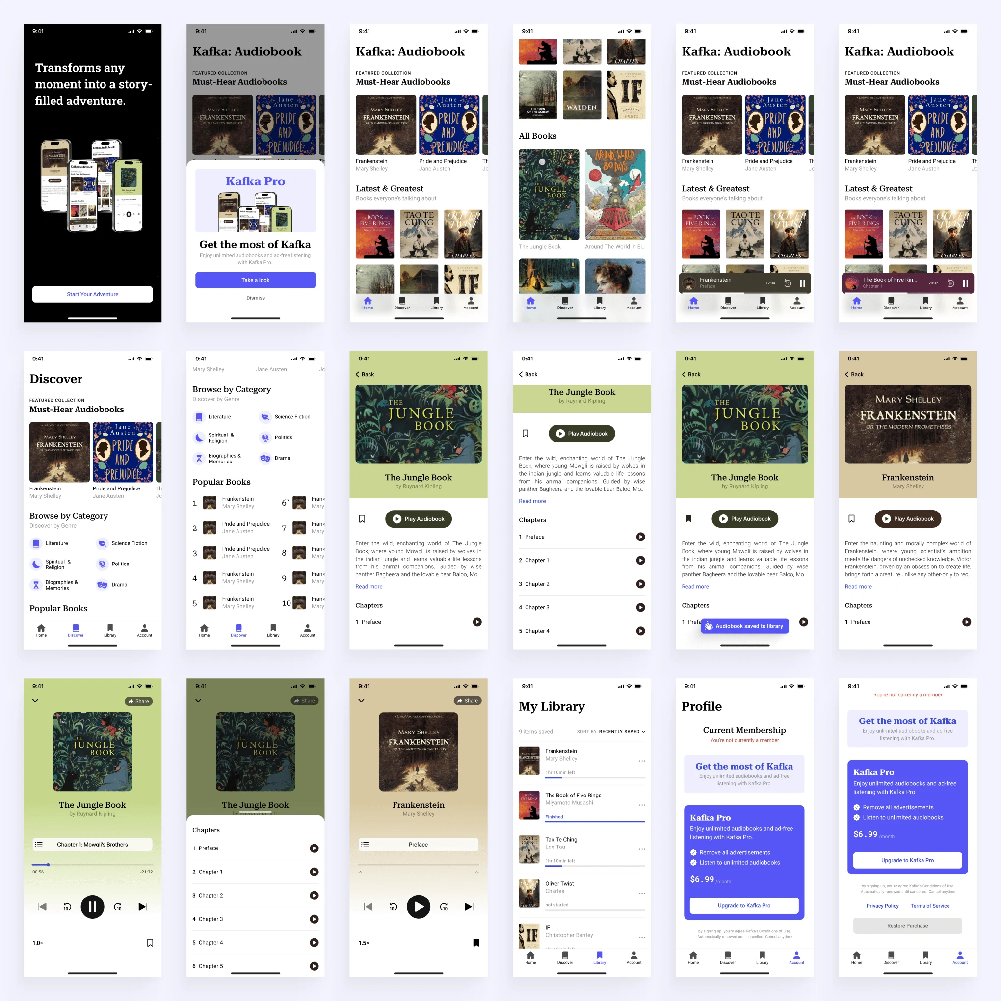
This app design focuses on making the app easy for users to navigate. The design is sleek yet clean and modern.
The blue color used in this design has several purposes:
1. Calming and Inviting: The shade of blue (#5555F5) conveys a sense of calmness and trust. This is essential for an audiobook app, as users often seek a relaxed environment for listening to stories or learning.
2. Modern and Sleek: The vibrant yet soft tone of this blue is modern and professional, aligning well with digital products and apps.
3. Focus-Friendly: Blue is known to enhance focus and concentration, which complements the immersive experience of audiobooks.
4. Excellent Contrast: Paired with white, this color provides high contrast, ensuring readability and visual clarity—essential for navigation and accessibility in an app.
5. Universal Appeal: Blue has a universal appeal and is often associated with technology and innovation, making it an approachable and reliable choice for a diverse audience.
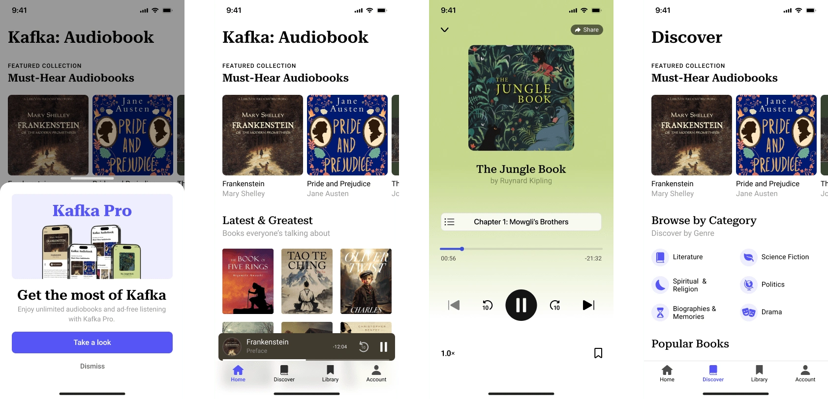
The color theme for the play screen and extended play on the homepage adapts to the color of the ebook thumbnail. The extended play screen adopts a darker shade, while the play screen uses a brighter color.
Users can also save audiobooks to listen to later. Additionally, I have added a progress tracker for each saved audiobook, which functions like a bookmark in a physical book.
Like this project
Posted Dec 17, 2024
This app design focuses on making the app easy for users to navigate. The design is sleek yet clean and modern.
Likes
0
Views
3