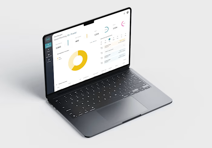
PEDICON 2025 Mobile Conference App Design

Arundhati Tiwari

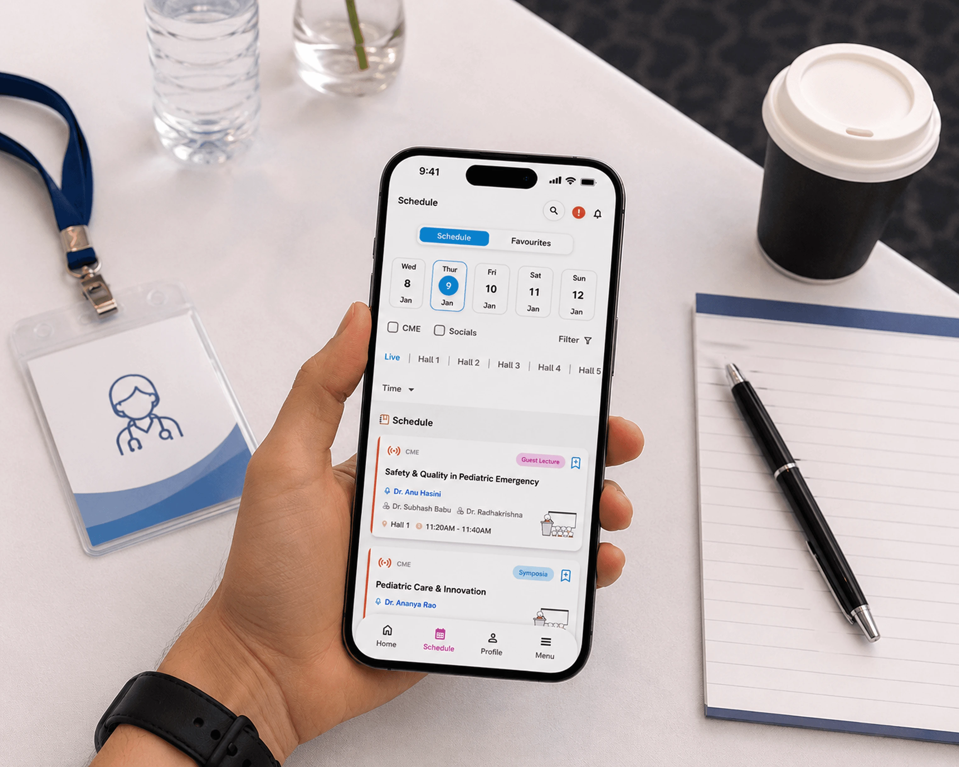
Designed a mobile first conference experience to help attendees explore sessions, live events, speakers, and city activities during PEDICON 2025.
Pedicon is one of India's largest pediatrics conferences, five days, five concurrent halls, thousands of doctors in Hyderabad.
Attendees got a printed pamphlet at the entrance with the full schedule. If anything changed, the pamphlet didn't. We were brought in to fix that.
We used IDEO's Learn, Create, Deliver process. We worked from the organiser's brief and ran product research at the same time to understand what works in conference apps and what doesn't.
We followed the IDEO Hear, Create, Deliver framework to guide our process, from understanding the problem to shipping the final product.
At Pedicon, every attendee gets a pamphlet on day one. It has the full schedule, all five days, all five halls, all speakers. It's a lot of information printed on paper.
The problem is it's static. If a session moves or a speaker changes, you don't know unless someone tells you. And if you want to plan your day across all the halls, you're scanning through pages trying to piece it together.
The app needed to solve this, give delegates a way to quickly see what's on, filter what's relevant to them, and get notified when something changes.
For accompanying partners, the pamphlet had nothing useful at all. They needed something completely different, information about the city, not the conference.
Given our 2-month timeline and no direct access to attendees pre-event, we based our competitive analysis on product demos and videos. We validated assumptions post-launch by being present at the event.
Delegates, speakers, and accompanying visitors all interacted with the conference differently. The challenge was creating a shared experience that still felt purpose-built for each audience.
The Core Problem
A delegate needs a live, filterable schedule. A speaker just needs to know when and where they're presenting. A family member has no use for any of that, they need the city.
Designing one app that works clearly for all three, without making any of them feel like an afterthought, was the real challenge.
Static printed schedules Updates, speaker changes, or hall switches couldn’t be reflected once the pamphlet was printed.
Too much information to scan quickly Five days, five halls, hundreds of sessions, finding relevant events manually was overwhelming.
No real-time event communication Attendees relied on word of mouth or WhatsApp messages to stay informed about changes.
No personal planning tools Delegates had no easy way to bookmark sessions or build their own conference schedule.
Different users had completely different needs Attendees needed schedules, speakers needed clarity, and accompanying family members needed local recommendations, not conference information.
The experience was fragmented Conference schedules, updates, speaker information, and local guidance existed in separate places instead of one connected experience.
The pamphlet had all the information but none of the answers. The app needed to actually help people quickly, clearly, without digging.
We did product research alongside the brief. We looked at other conference apps to understand where they work and where they fall short. Three things stood out:
Most conference apps are organized the way the organizer thinks, not the way an attendee navigates
Too many options at once makes people give up on the schedule
Real-time updates are the most
These became the things we focused on most.
One app for three very different users, no separate builds
About two months from brief to launch
Login worked only with a registered email and OTP, no other way in
The app needed internet to work, no offline mode
Three experiences, one app Each user needed something different. Instead of building separate apps, we designed distinct sections inside one.
Every user got a different experience, but none of them felt like they were using a different app. That's what we were really designing for.
The app launched at Pedicon 2025 in Hyderabad and ran across all five days. Delegates came in without pamphlets everything was on their phone.
Full mobile web app (PWA), login, schedule, live events view, favourites, notifications, speaker profiles.
Dedicated speaker view, session details, hall info, and real-time updates.
Filters for CME, Scientific Program, Socials, Oral and E-Poster.
Real-time notifications for schedule changes, cancellations, and countdowns.
Speaker profiles with LinkedIn connect.
City guide for accompanying family, restaurants, sightseeing, local travel info, and things to do in Hyderabad.
UI component library for future use.
When a live event goes wrong, there’s no fixing it, so every small decision matters.
I was present at the launch, which meant I got to see how the product actually behaved in the real world—not just in design reviews. Two issues became obvious almost immediately.
Connectivity became a real problem.
The app required an internet connection to work, which we hadn’t fully accounted for in a crowded conference environment. Some international delegates were using foreign SIMs or had weak network access inside the venue, making it difficult to load the app when they needed quick access to schedules or updates.
We had intentionally designed parts of the app for accompanying family members, restaurant recommendations, sightseeing, local travel information, but the login flow still depended on the primary attendee’s registered email and OTP.
In reality, this meant a spouse or family member had to contact the attendee, who was often in a live session, just to get access. The feature was useful, but the entry point created unnecessary friction.
Both issues were solvable, but seeing them during the live event was a reminder that designing the right features isn’t enough, the full experience, including access and real-world conditions, matters just as much. Callout: The people you don't fully design for are usually the ones who show you what you missed.
Like this project
Posted Jun 9, 2026
Designed a mobile app for PEDICON 2025 attendees to access real-time schedules and city info.
Likes
0
Views
1