Brand Identity & Landing Page for AI Supply Chain Platform

Pedro AGB

Brand Identity & Landing Page Design, Case Study
Concept Project for AI Supply Chain Risk Intelligence Platform
OVERVIEW:
Company: Meridian (Concept Project)
Industry: AI / Supply Chain / B2B SaaS
Scope: Brand Identity System + Conversion-Focused Landing Page
Timeline: 14-day sprint (projected)
Investment: $8,000
Platform: Framer. Figma
Meridian is a fictional AI-powered supply chain risk intelligence platform that predicts port delays, supplier failures, and geopolitical shocks 72 hours before they impact production lines. This case study documents the complete brand-to-web system I built as a concept project to demonstrate my process for AI and B2B SaaS startups.
LOGO
THE CHALLENGE
The Problem Meridian Solves
Global manufacturers operate in a constant state of reactive crisis. Supply chain disruptions — port delays, weather events, supplier bankruptcies, geopolitical shocks — cost the industry $184 billion annually. Yet 47% of these disruptions are detected too late to take meaningful action.
The typical manufacturer uses 8–12 different tools to monitor their supply chain:
Shipping trackers (Maersk, Flexport)
Weather feeds (NOAA, StormGeo)
News alerts (Google Alerts, RSS)
Supplier reports (manual, quarterly)
Financial data (Bloomberg, manual research)
ERP systems (SAP, Oracle)
TMS platforms (BluJay, MercuryGate)
None of these tools talk to each other. Operations teams spend their mornings in 6 different tabs, their afternoons in Slack threads, and their evenings updating spreadsheets. When a disruption hits, they find out when the container is already sitting offshore — and the only option is emergency air freight at 10x the cost.
The Design Challenge
Meridian needed a brand identity and landing page that could:
Signal serious infrastructure credibility — Not another SaaS toy with a purple gradient and cartoon illustrations. Supply chain is a legacy industry run by conservative operators. The design needed to feel like it belonged in the same room as SAP, Oracle, and McKinsey.
Convert enterprise buyers — The target customer is VP of Supply Chain or Director of Operations at a mid-market to Fortune 500 manufacturer. These buyers are skeptical, busy, and risk-averse. They don't buy software because it looks nice. They buy software because it reduces risk and saves money.
Differentiate from competitors — The supply chain visibility space is crowded with legacy players (project44, FourKites, SAP IBP) and newer AI entrants (Altana, Everstream, Resilience360). Meridian needed to look like the modern, intelligent alternative — not the incumbent, not the startup.
Work without a sales team — As a YC-backed startup with 2–10 employees, Meridian doesn't have an enterprise sales team doing dinners and golf. The website needs to educate, convince, and convert — mostly self-serve, with demo requests for larger deals.
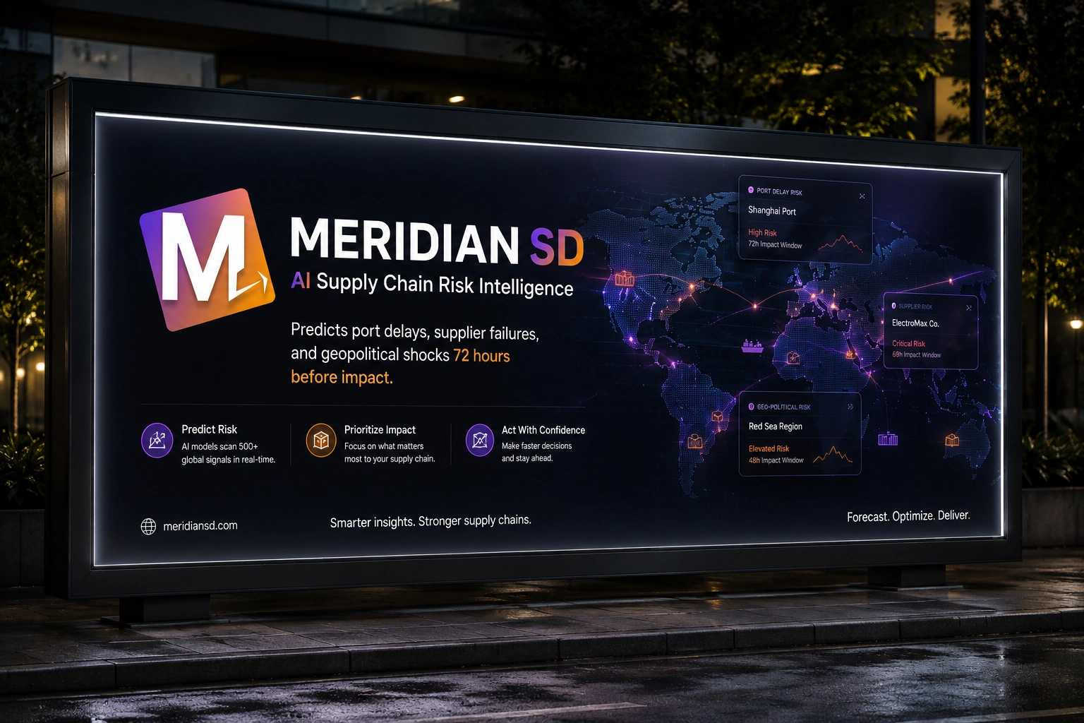
LOGO
THE BRAND IDENTITY SYSTEM
Naming & Positioning
Name: Meridian
Tagline: "Predicting the unpredictable."
Positioning: The decision layer for global supply chains. Not a dashboard. Not an alert system. A decision engine that tells you exactly what to do before disruption hits.
The name "Meridian" evokes:
Precision — A meridian is an exact line of longitude. Zero ambiguity.
Global reach — Meridians span the entire planet. Every port, every supplier, every route.
Navigation — The meridian helps you find your position and chart your course. Action, not just information.
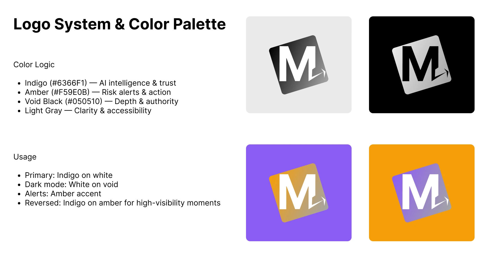
LOGO VARIATIONS
Logo Design
The Mark: A geometric "M" monogram set inside a forward-tilted square frame.
Design Rationale:
The "M" is constructed from precise geometric shapes — no curves, no flourishes. This signals technical precision and engineering credibility.
The forward tilt (12° rotation) creates a sense of velocity and forward momentum. The logo isn't static — it's leaning into the future, predicting what's next.
The square frame contains and protects the mark, suggesting stability and trust. But the tilt breaks the rigidity, suggesting the system is dynamic, not frozen.
The integrated arrow/cursor detail in the lower right represents actionable intelligence. This isn't just data — it's a direction to move.
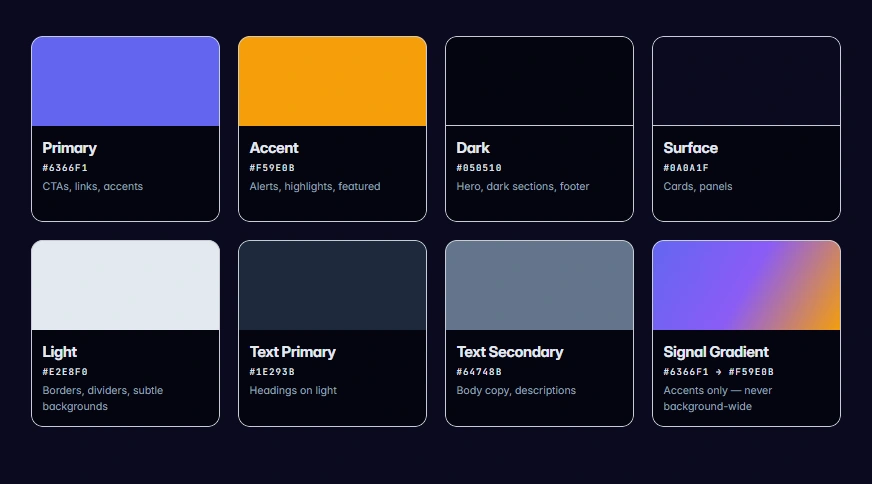
COLOR PALETTE
Color Variations:
Primary: Indigo gradient on white — for standard usage, web, and light backgrounds
Dark Mode: White on void black — for dark sections, hero areas, and high-contrast moments
Alert: Amber accent — for risk indicators, warnings, and high-priority calls to action
Reversed: Indigo on amber — for maximum visibility in marketing materials and event signage
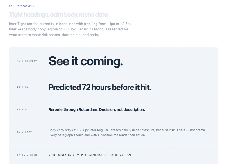
Typography System
Typography System
Heading Font: Inter Tight
Weights: 700 (Bold), 800 (Extra Bold), 900 (Black)
Tracking: -1px to -2.5px (tight, dense, authoritative)
Usage: All headlines, section titles, pricing numbers, stat numbers
Why Inter Tight:
It's a geometric sans-serif with the precision of a technical drawing — relevant to manufacturing and engineering culture.
The tight tracking creates density and authority. It feels like a headline in The Economist or a Bloomberg terminal — serious, informed, no fluff.
Unlike softer, more rounded sans-serifs (Circular, Poppins), Inter Tight doesn't feel friendly or approachable. It feels competent. That's exactly what a risk-averse buyer wants.
Body Font: Inter
Weights: 400 (Regular), 500 (Medium), 600 (Semi Bold)
Usage: Body copy, descriptions, navigation, buttons, labels
Why Inter:
The most readable screen font ever designed. At small sizes (14px), it's clearer than almost any alternative.
Neutral and invisible — it doesn't compete with the headlines for attention.
Massive character set supports international manufacturing clients.
Monospace Font: JetBrains Mono
Weights: 400, 500, 600
Usage: Data points, shipment IDs, risk scores, code snippets, technical labels
Why JetBrains Mono:
Data credibility. When you see a monospace font, you think "this is technical and precise."
Differentiates data from narrative. A risk score in monospace feels like a fact, not a marketing claim.
Ligatures and clear distinction between similar characters (0 vs O, 1 vs l) prevent errors in critical data.
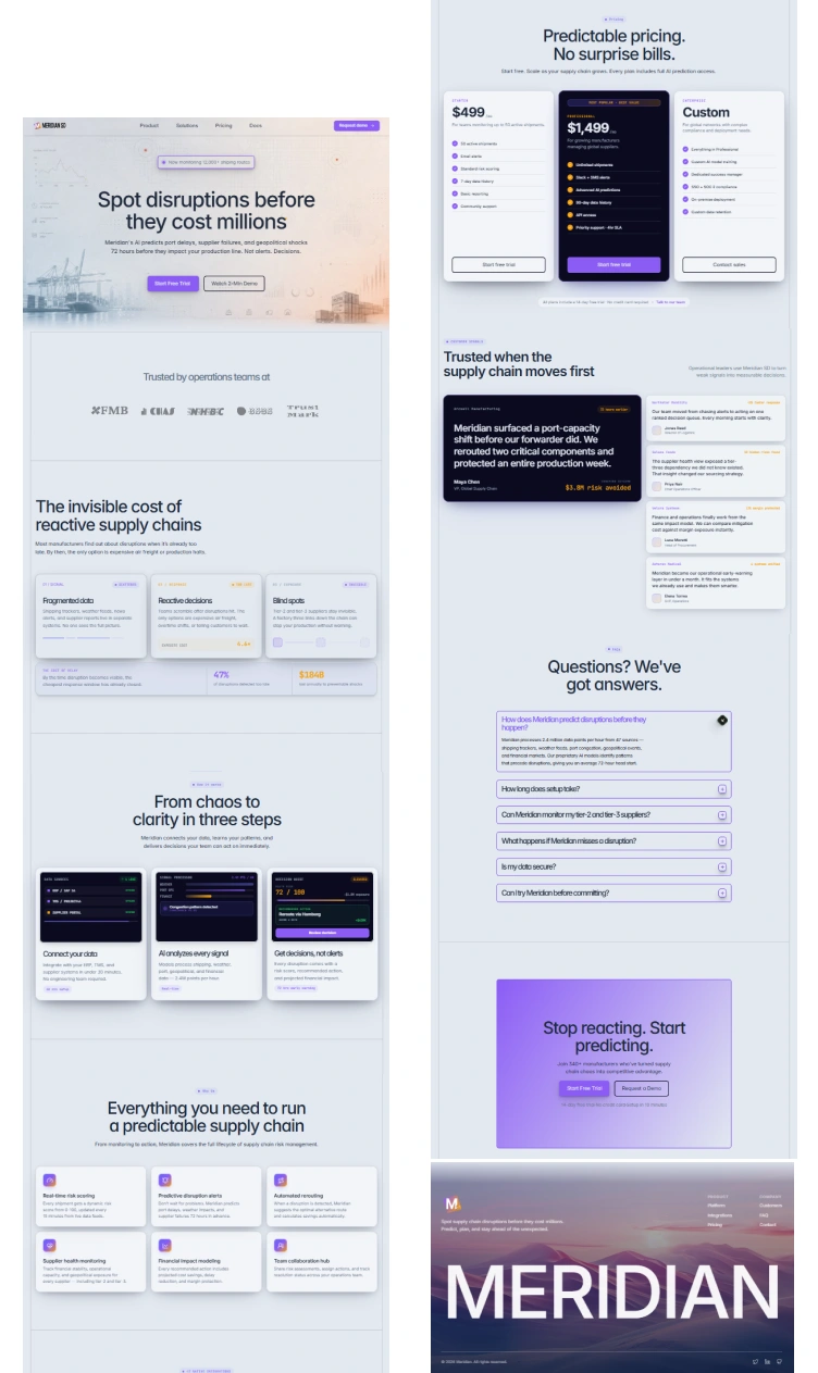
The Landing Page
THE LANDING PAGE
Section 1: Navigation
Design: Sticky, blurred background, subtle bottom border. Logo left, links center, CTA right.
Links: Product · How It Works · Integrations · Pricing · Docs
Primary CTA: "Request Demo" (Purple button)
Why this structure:
Enterprise buyers want to see pricing before they request a demo. Hiding pricing behind a "Contact Sales" wall creates friction.
"Docs" signals technical depth and self-serve capability. It says "we're not afraid of engineers evaluating our API."
The sticky nav keeps conversion options available as the user scrolls through the long page.
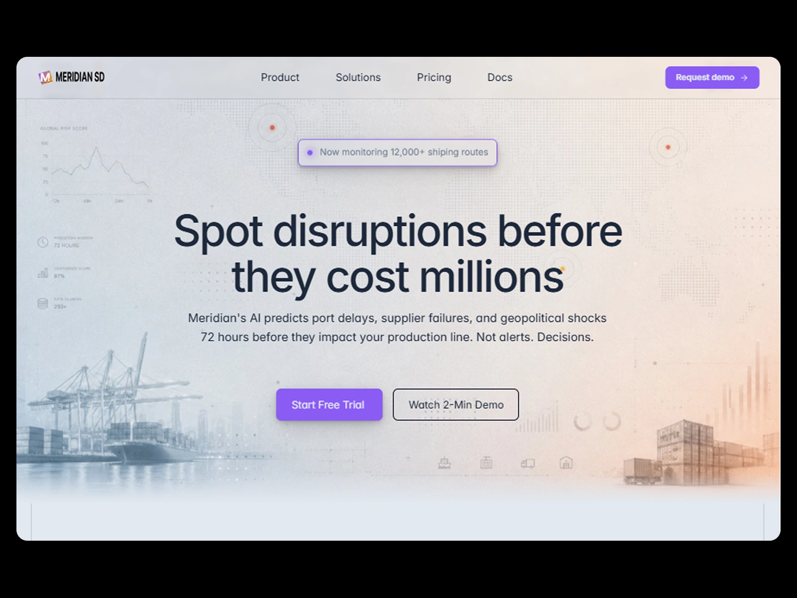
Section 2: Hero
Badge: "Now monitoring 12,000+ shipping routes" with live pulse dot
Headline: "Spot disruptions before they cost millions"
Subheadline: "Meridian's AI predicts port delays, supplier failures, and geopolitical shocks 72 hours before they impact your production line. Not alerts. Decisions."
Primary CTA: "Start Free Trial →"
Secondary CTA: "Watch 2-Min Demo
Design Decisions:
"Cost millions" not "save millions." Framing in terms of loss aversion (what you lose by not buying) is 2x more motivating than gain framing (what you gain by buying). Behavioral economics research (Kahneman, Tversky) consistently shows loss aversion dominates decision-making.
"Not alerts. Decisions." This is the core differentiation. Every competitor sends alerts. Meridian sends decisions. The parallel structure makes it memorable. The period after "Decisions" makes it final. No ambiguity.
Section 3: Logo Bar (Social Proof)
Label: "Trusted by operations teams at"
Logos: 6 placeholder company names
Why this works:
Social proof in the first 3 seconds of scrolling. Before the user reads a single feature, they see that other companies trust Meridian.
The names are industry-specific (manufacturing, aerospace, pharma, retail, energy) — signaling "we serve your industry" without saying it.
Grayed-out, low-contrast treatment keeps them visible but not distracting. They support the headline, not compete with it.
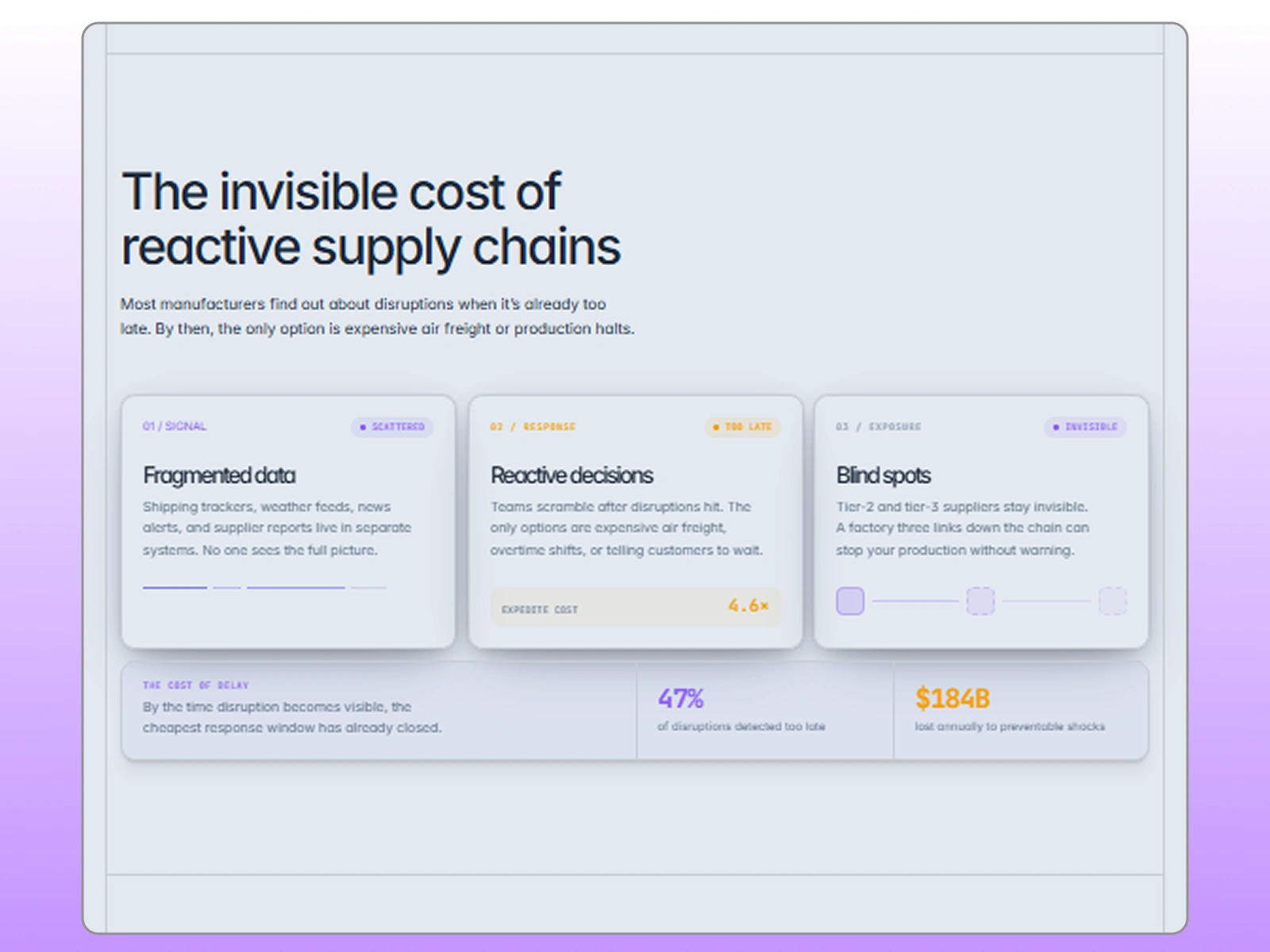
Section 4: The Problem
Headline: "The invisible cost of reactive supply chains"
Subheadline: "Most manufacturers find out about disruptions when it's already too late. By then, the only option is expensive air freight or production halts."
Three Cards:
Fragmented Data "Shipping trackers, weather feeds, news alerts, and supplier reports live in different systems. No one sees the full picture."
Reactive Decisions "Teams scramble after disruptions hit. The only options are expensive air freight, overtime shifts, or telling customers to wait."
Blind Spots:: "Tier-2 and tier-3 suppliers are invisible. A factory fire three links down the chain shuts you down with zero warning."
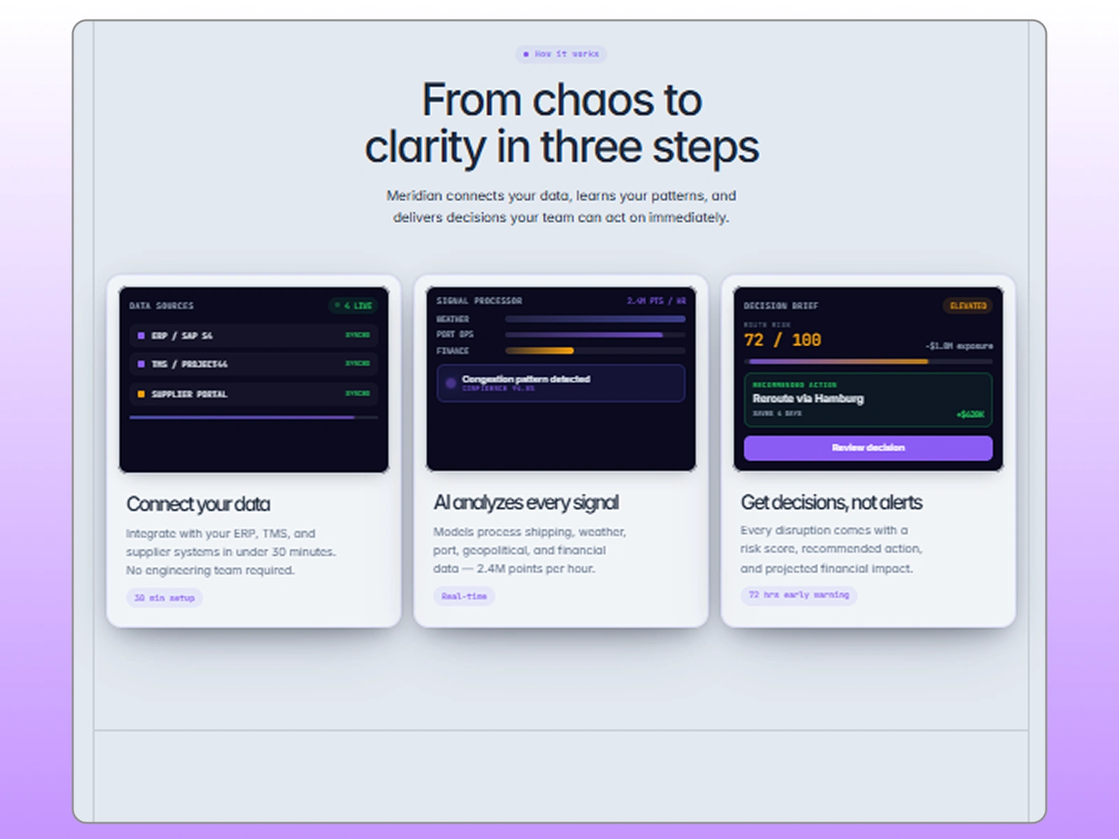
Section 5: How It Works
Headline: "From chaos to clarity in three steps"
Subheadline: "Meridian connects your data, learns your patterns, and delivers decisions your team can act on immediately."
Three Steps:
Why this section exists:
Most B2B buyers scroll to "How It Works" before they read features. They want to understand the process before they evaluate the product.
The three-step structure simplifies a complex AI system into something a non-technical operations director can understand in 30 seconds.
The time badges (30 min, Real-time, 72hrs) create a rhythm of speed and responsiveness.
Section 6: Features (6-Feature Grid)
Headline: "Everything you need to run a predictable supply chain"
Subheadline: "From monitoring to action, Meridian covers the full lifecycle of supply chain risk management."
Six Features:
Real-Time Risk Scoring — "Every shipment gets a dynamic risk score from 0-100, updated every 15 minutes based on live data feeds."
Predictive Disruption Alerts — "Don't wait for problems to happen. Meridian predicts port delays, weather impacts, and supplier failures 72 hours in advance."
Automated Rerouting — "When a disruption is detected, Meridian suggests the optimal alternative route and calculates time and cost savings automatically."
Supplier Health Monitoring — "Track the financial stability, operational capacity, and geopolitical exposure of every supplier in your network — including tier-2 and tier-3."
Financial Impact Modeling — "Every recommended action includes projected cost savings, delay reduction, and margin protection — so you can prioritize with confidence."
Team Collaboration Hub — "Share risk assessments, assign actions, and track resolution status across your operations team — all inside Meridian."
Design Decisions:
3x2 grid on desktop, single column on mobile. Scannable, not overwhelming.
Each feature has a gradient icon (indigo → amber) for visual consistency.
The descriptions are specific, not generic. "72 hours in advance" not "early warning." "Tier-2 and tier-3" not "your suppliers."
Section 7: Integrations
Headline: "Plays nice with your existing stack"
Subheadline: "No rip-and-replace. Meridian connects to the tools you already use."
Six Integration Categories:
ERP — SAP, Oracle, NetSuite, Microsoft Dynamics
TMS — BluJay, Oracle TMS, MercuryGate
WMS — Manhattan, Blue Yonder, SAP EWM
Communication — Slack, Microsoft Teams, Email
Data — Snowflake, Databricks, BigQuery
APIs — REST API, Webhooks, CSV Upload
CTA: "View all 47 integrations →"
Why this section matters:
Enterprise buyers have procurement processes that take 6–18 months. "Integrates with SAP" means "we won't break your existing workflow."
The specific names (not "major ERPs") signal deep industry knowledge. A buyer using Manhattan WMS sees "Manhattan" and thinks "they know my world."
"No rip-and-replace" addresses the #1 fear of enterprise software adoption: change management hell.
Section 8: Pricing
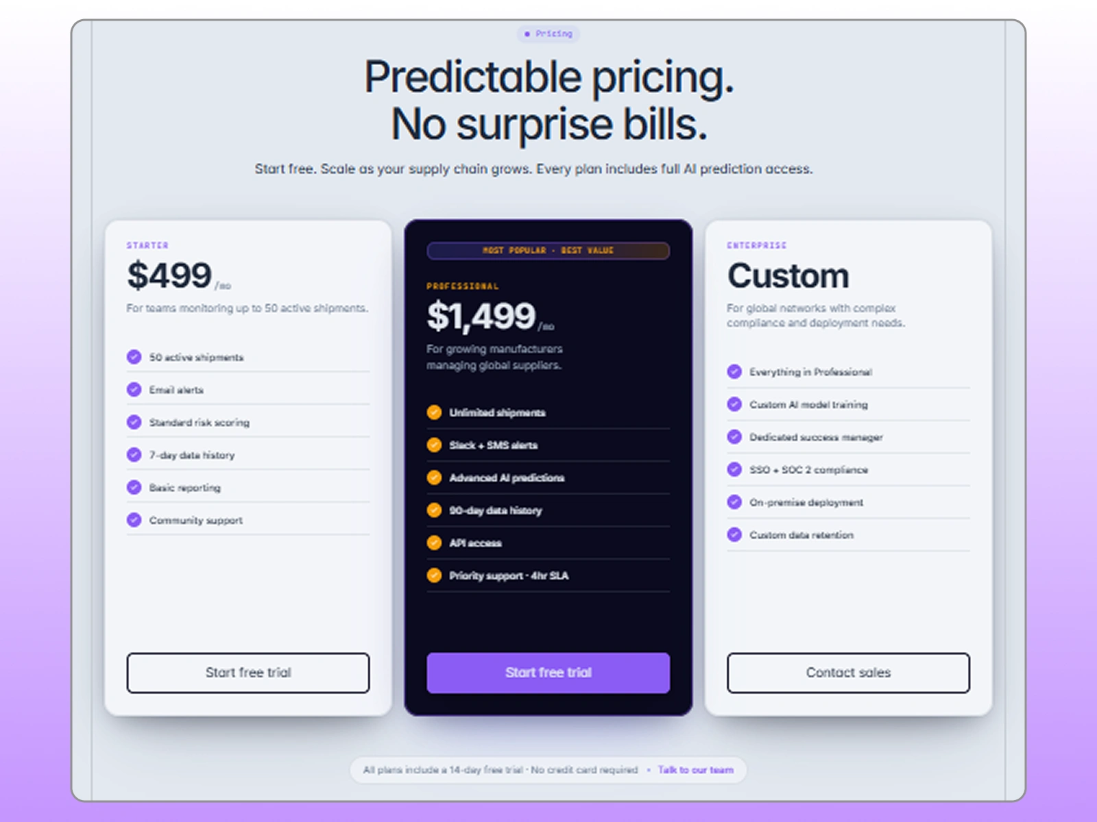
Headline: "Predictable pricing. No surprise bills."
Subheadline: "Start free. Scale as your supply chain grows. Every plan includes full AI prediction access."
Three Tiers:
Starter — $499/mo
For teams monitoring up to 50 shipments
50 active shipments
Email alerts
Standard risk scoring
7-day data history
Basic reporting
Community support
CTA: "Start Free Trial"
Professional — $1,499/mo (FEATURED / Most Popular)
For growing manufacturers with global suppliers
Unlimited shipments
Slack + SMS alerts
Advanced AI predictions
90-day data history
API access
Priority support (4hr SLA)
Custom dashboards
Team collaboration hub
CTA: "Start Free Trial"
Enterprise — Custom
For Fortune 500 with complex global networks
Everything in Professional
Custom AI model training
Dedicated success manager
SSO + SOC 2 compliance
On-premise deployment option
Custom integrations
Quarterly business reviews
CTA: "Contact Sales"
Below Pricing:
"All plans include a 14-day free trial. No credit card required. Need help choosing? Talk to our team →"
Pricing Psychology:
The middle tier is visually emphasized — dark card, scaled up 5%, amber CTA, "Most Popular" badge. This is the sweet spot for the ICP (growing manufacturer with global suppliers). It anchors against "too small" (Starter) and "not ready yet" (Enterprise).
Transparent pricing — In B2B, hiding pricing doesn't create intrigue. It creates friction. A VP of Supply Chain wants to know if this is a $500/mo tool or a $50K enterprise deal before they invest time in a demo.
"Every plan includes full AI prediction access" — Removes the fear that Starter is a gutted version. The difference is volume and support, not core capability.
"No credit card required" — Removes the final objection. The buyer can try without commitment.
Section 12: FAQ
Headline: "Questions? We've got answers."
Six Questions:
How does Meridian predict disruptions before they happen?
How long does setup take?
Can Meridian monitor my tier-2 and tier-3 suppliers?
What happens if Meridian misses a disruption?
Is my data secure?
Can I try Meridian before committing?
Why FAQ matters:
Handles objections before the user contacts sales. Every unanswered question is a lost lead.
The answers are specific, not vague. "2.4 million data points per hour" not "a lot of data."
The security question is included because 30% of B2B buyers won't request a demo until they see security addressed.
Section 13: Final CTA
Background: Void black (same as hero) with radial gradient glow. Bookend effect.
Headline: "Stop reacting. Start predicting."
Subheadline: "Join 340+ manufacturers who've turned supply chain chaos into competitive advantage."
Primary CTA: "Start Free Trial →"
Secondary CTA: "Request a Demo"
Trust Bar: "14-day free trial · No credit card · Setup in 10 minutes"
Why the bookend works:
The dark hero and dark final CTA create a visual frame. The user enters through darkness, travels through light (the content), and exits through darkness (the conversion).
"Stop reacting. Start predicting." is the shortest, most memorable version of the value proposition. It fits on a billboard. It fits in a tweet. It fits in memory.
Section 14: Footer
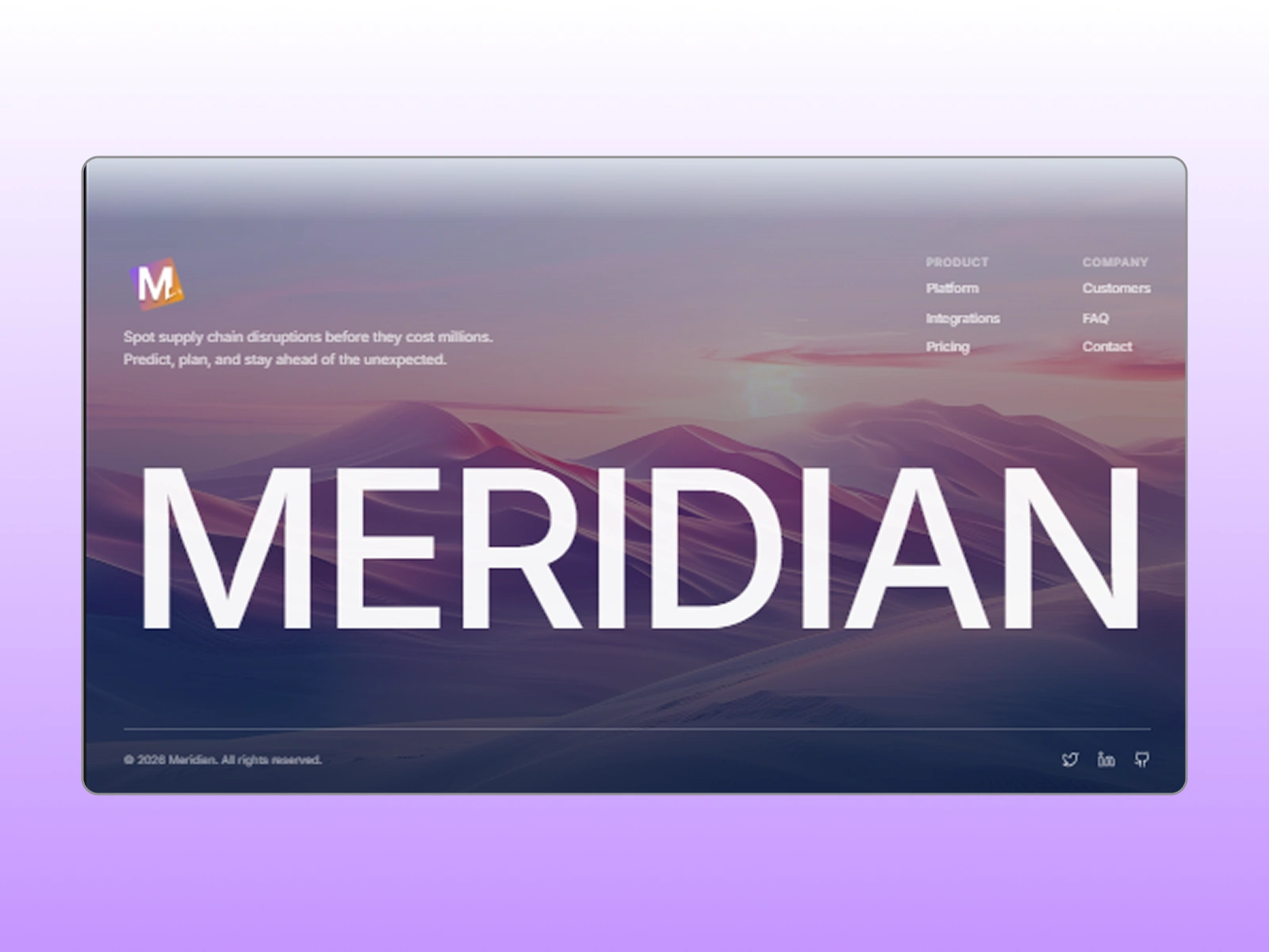
Four Columns: Product, Company, Resources, Legal
Bottom: "© 2026 Meridian Intelligence, Inc. Predicting the unpredictable."
Pricing
How It Works
Problem Section
Footer
ABOUT THIS PROJECT
This is a concept project, a full brand-to-web system built to demonstrate my process for AI, SaaS, and B2B startups. No real client. No fake results. Just real strategic thinking, real design decisions, and real conversion architecture.
If you're building an AI startup and your website doesn't match the sophistication of your product, let's talk.
Brand identity + Framer landing page: Start from $3,000
Multi-page site + CMS: Start from $5,000
DM me or book a discovery call.
Designer: Pedro
Role: Framer Developer & Brand Designer, SaaS, AI & B2B Startups
Contact: https://x.com/GrowithBadro \ mediafixbadro@gmail.com
Like this project
Posted Jul 13, 2026
Brand Identity & Landing page for an AI supply chain platform, the kind of site that makes a risk-averse enterprise buyer say yes before the demo call.
Likes
1
Views
20