ByePain, UX for Chronic Pain sufferers
Overview
ByePain is a mobile app and responsive web platform designed to support patients with chronic pain (CP) in their recovery journey. ByePain aims to provide a user-friendly experience that helps patients manage their symptoms and improve their quality of life. With a unique UX design, the platform offers an intuitive and seamless experience for users, making it easy to track progress and access helpful resources.
Goal 🎯
The objective of the present project is to provide a seamless and intuitive experience for patients, with the goal of making pain management as easy as possible.
The design aims to create a user-friendly interface that is easy to navigate, with clear and concise information presented in an aesthetically pleasing manner. Additionally, the design strives to provide a sense of comfort and support to users, as chronic pain can often be a stressful and overwhelming experience.
Overall, the UX design in ByePain plays a crucial role in enhancing the user's experience, making it easier for them to manage their symptoms and improve their quality of life.
Challenges 🧐
Understanding how a digital product could help people managing their chronic pain.
Helping patients feel confident and comfortable while navigating the User Experience.
Solution ✅
ByePain's UX design provides a visually appealing and easy-to-use pain management experience. Its intuitive interface, personalized treatment plans, and symptom tracking features are seamlessly integrated into the design, making it easy for users to monitor their progress.
Understand patients' needs 🫱🏼🫲🏾
First of all, I identified three painpoints for CP sufferers:
Difficulty in tracking symptoms.
Overwhelming amount of information.
Difficult access to actualized, science-based treatments.
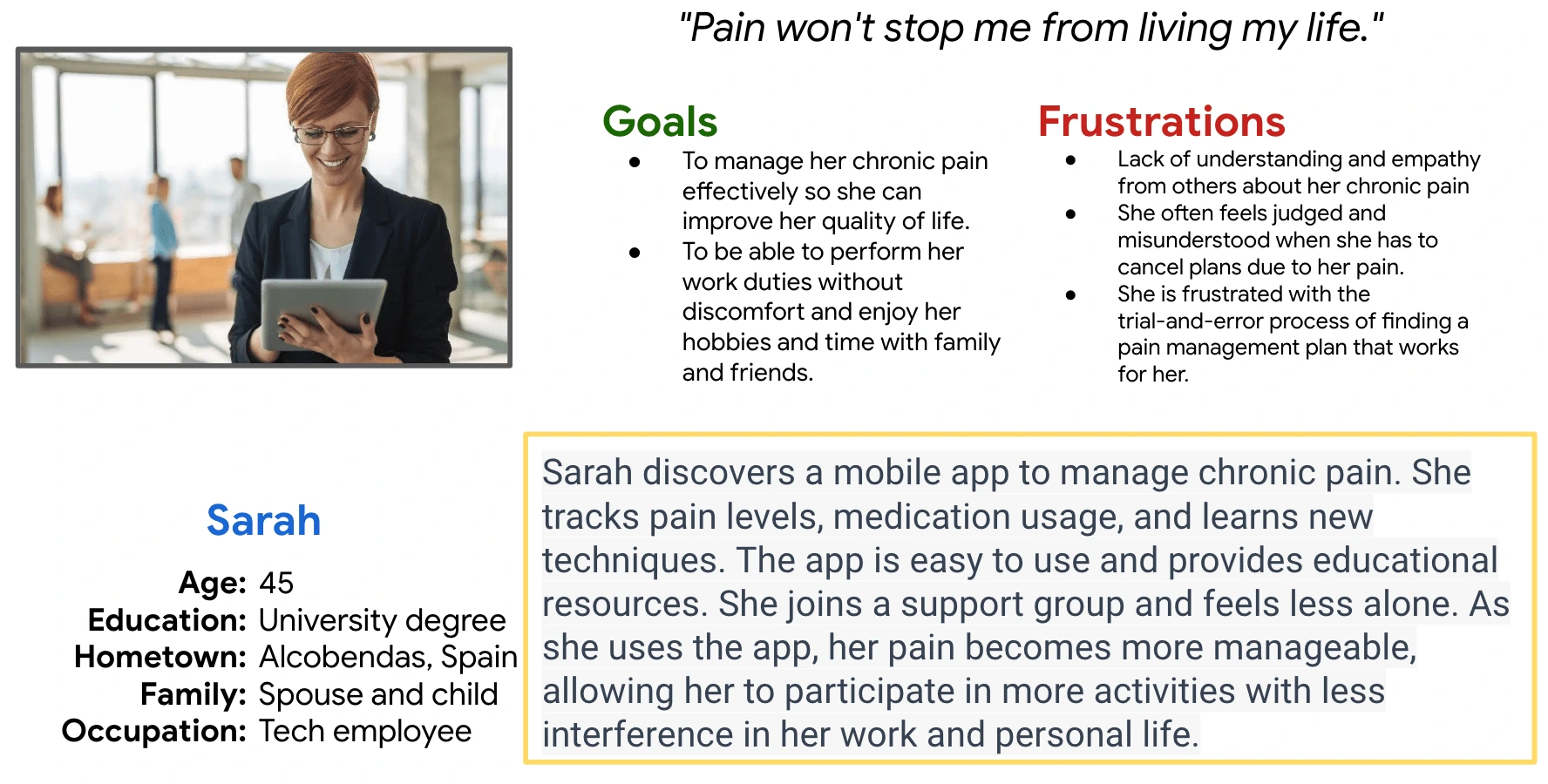
Then, I created a User's Persona based on potential users, which can be seen below.
Design
Information Architecture
The design process began with the creation of the information architecture (IA) for the mobile app, and only once it was done, the website's IA was designed. This order is due to the main outcome of our previous research, which was that the main use for ByePain would be via app, and the website would be use only to gather information about the app and to watch some educational resources.
The main pages to include were the Homepage, Journey page, New page, Progress page and Discover/Community page.
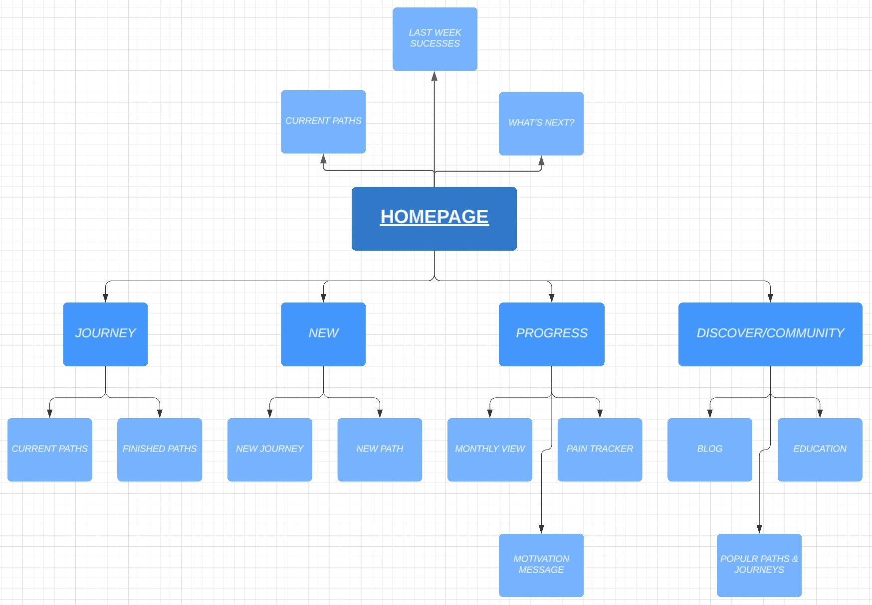
ByePain App's Architecture Information
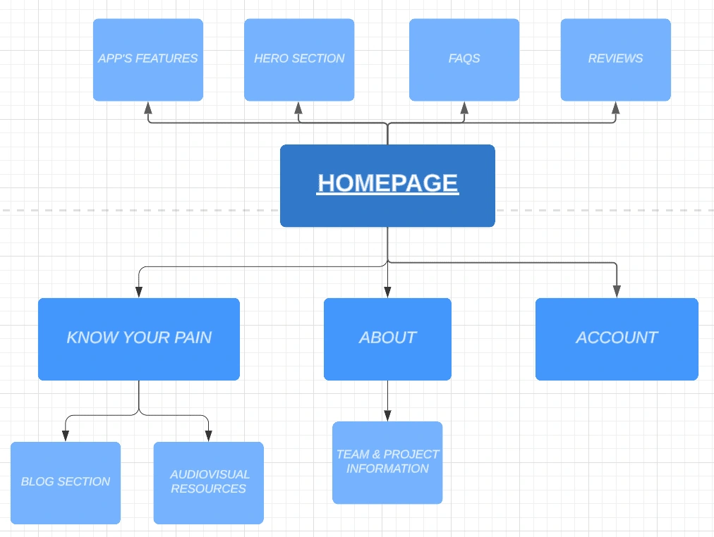
In the other hand, the main pages for the website are shown in the diagram below.
Wireframing
After defining structure and main mechanics of the product, I designed wireframes and created a clickable prototype to present it to stakeholders in a way that will be easier to understand.
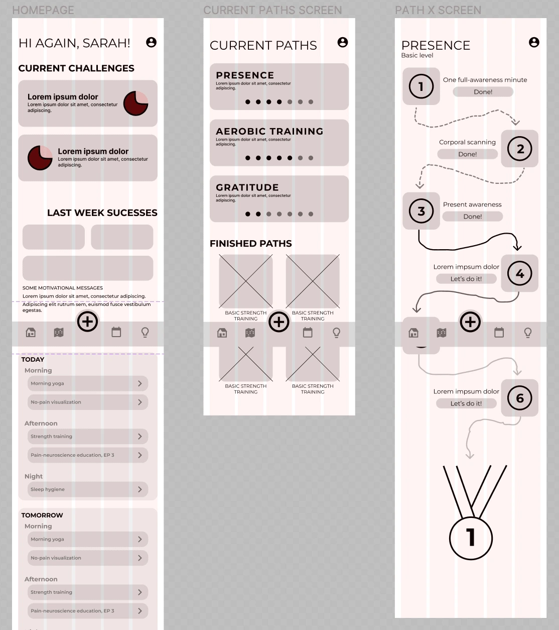
Mobile App's Wireframes
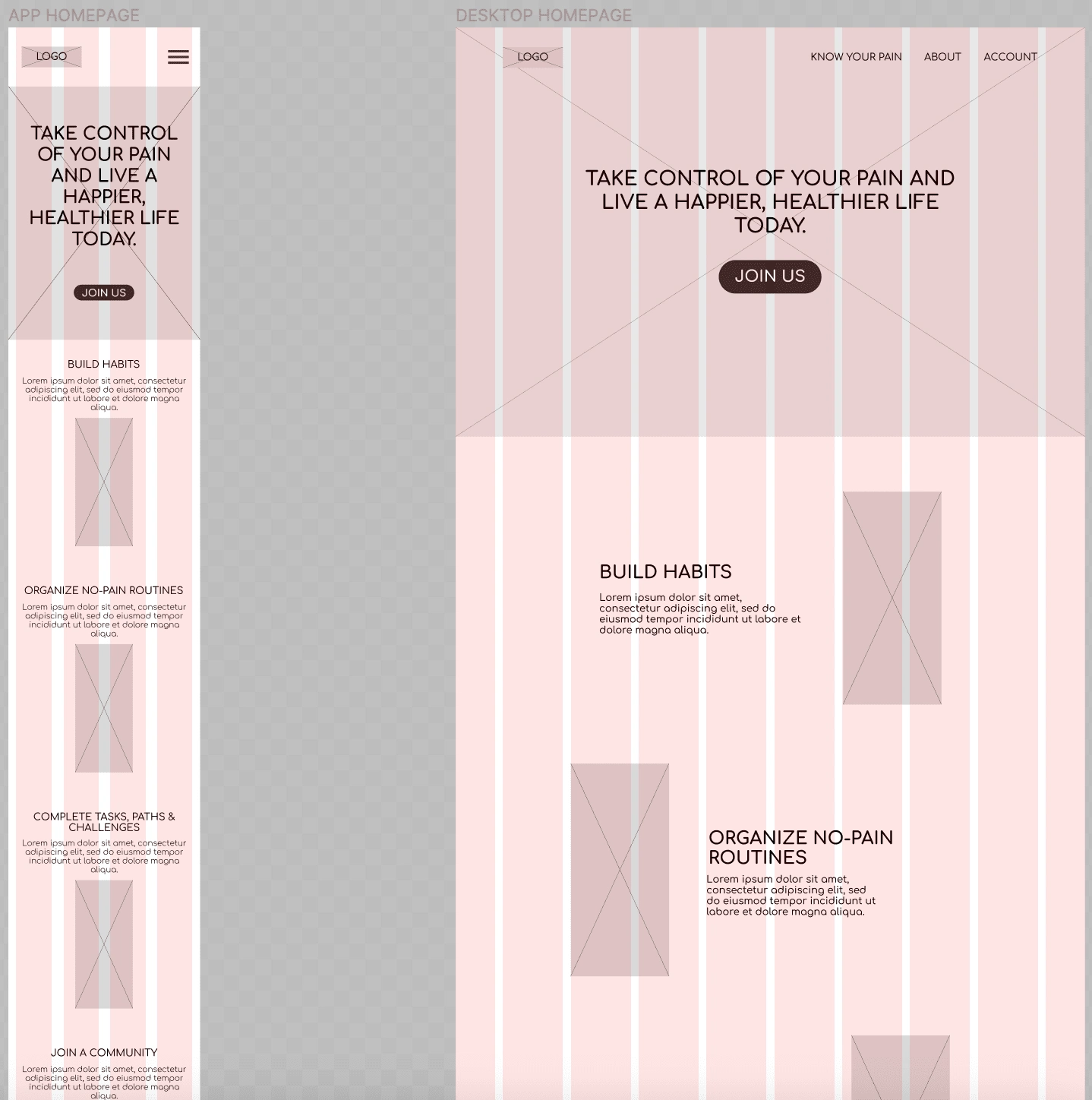
Website's Wireframes
Mockups
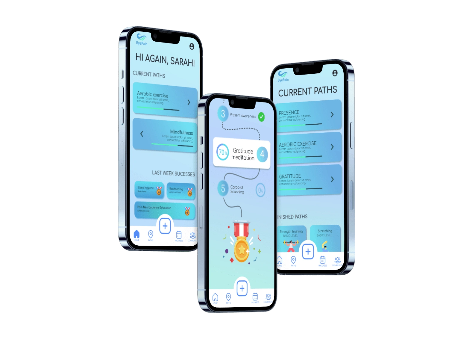
Mobile App's Mockups
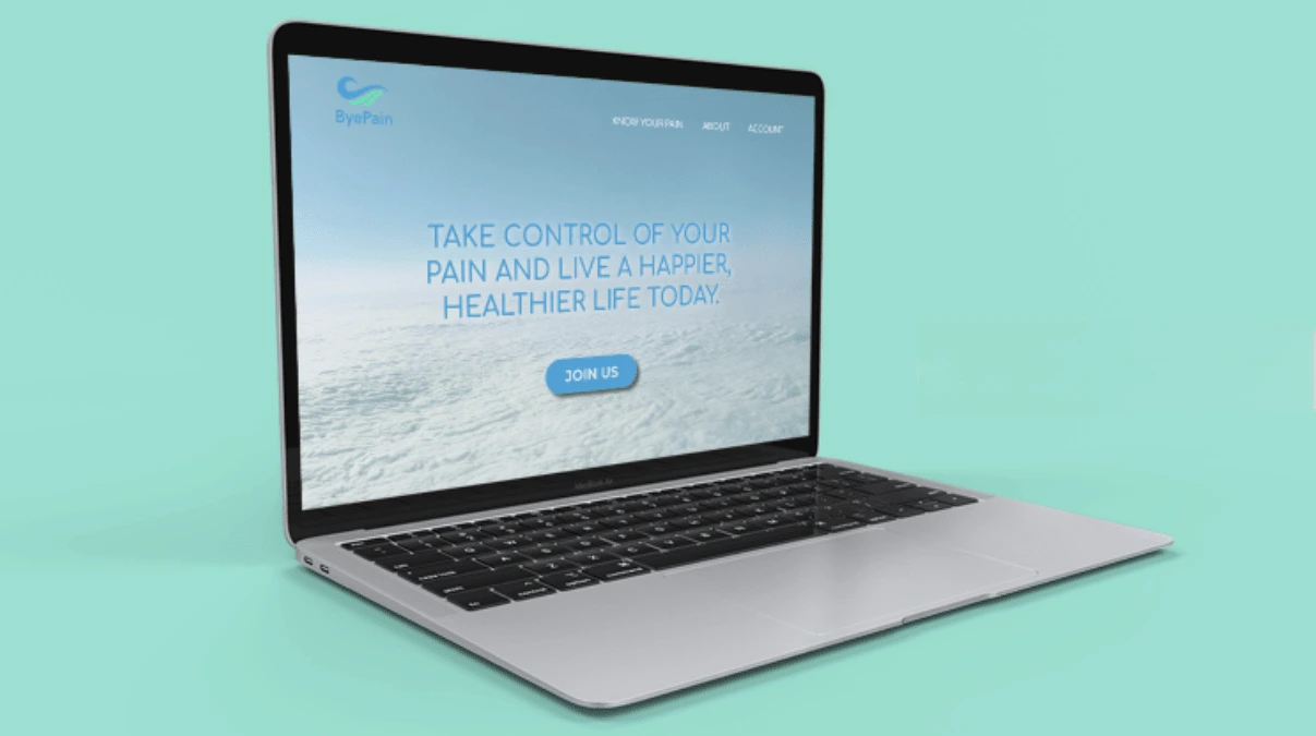
Desktop Website's Mockup
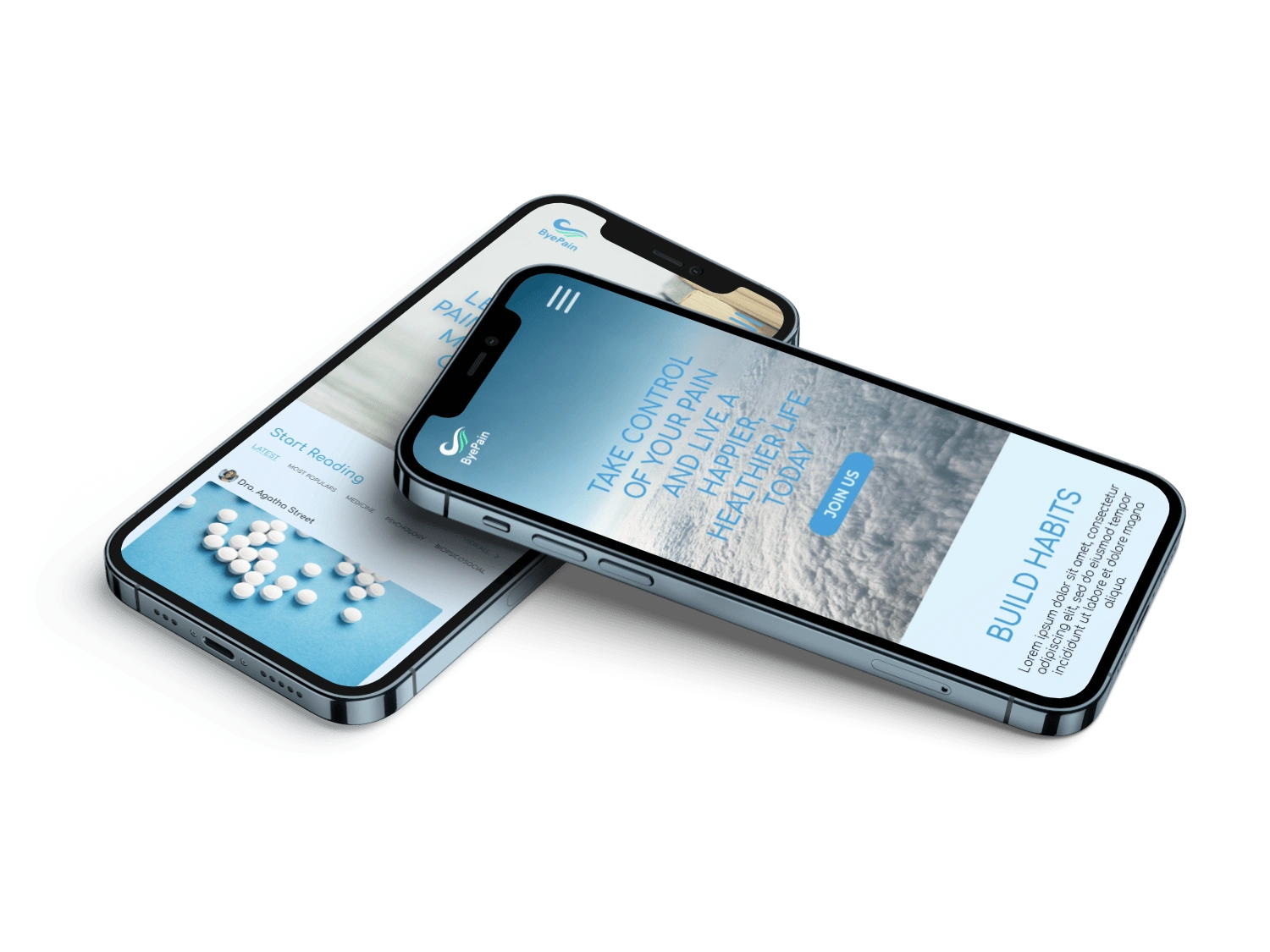
Mobile Website's Mockup
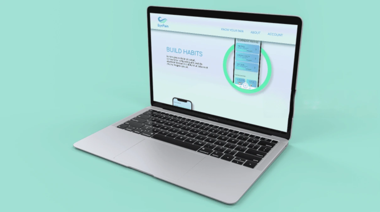
Desktop Website's Mockup
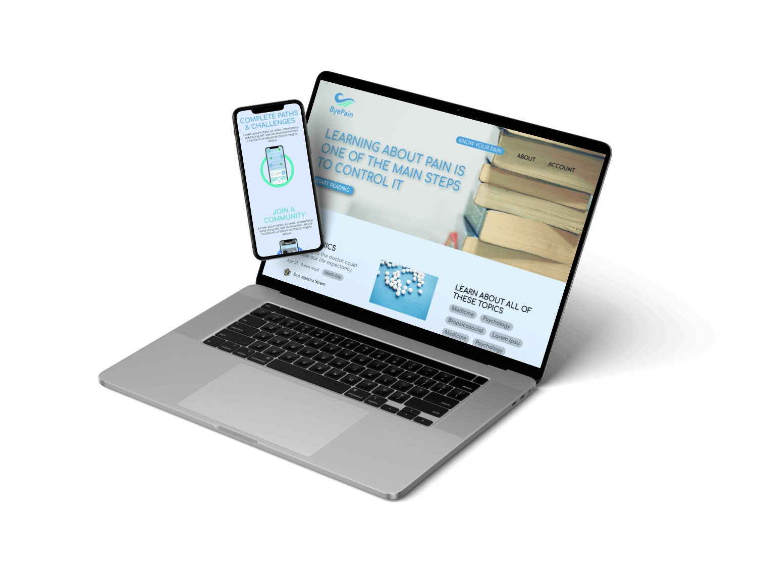
Desktop & Mobile Website's Mockup

Full Desktop Website's Homepage
Prototyping
In the following links you can watch the prototype of each of the mockups shown above. The main objective was to create a easy-to-use and intuitive user flow.
Like this project
Posted May 2, 2023
UX/UI project for Chronic Pain sufferers. ByePain consists in a mobile App and a Website with the aim of accompany patients in their healing process.
Likes
0
Views
6

