
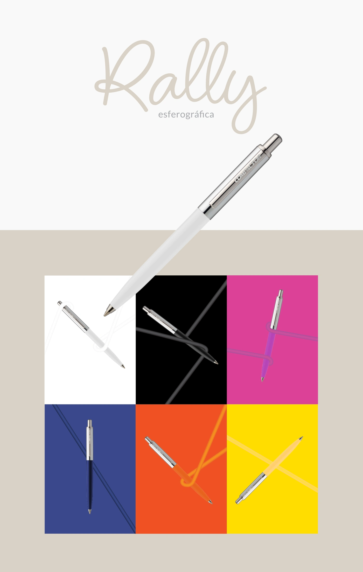
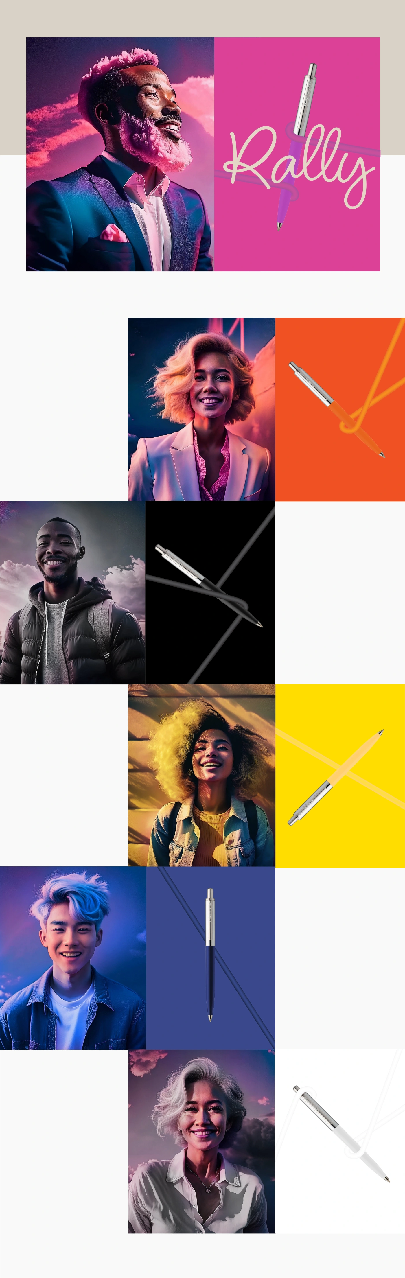
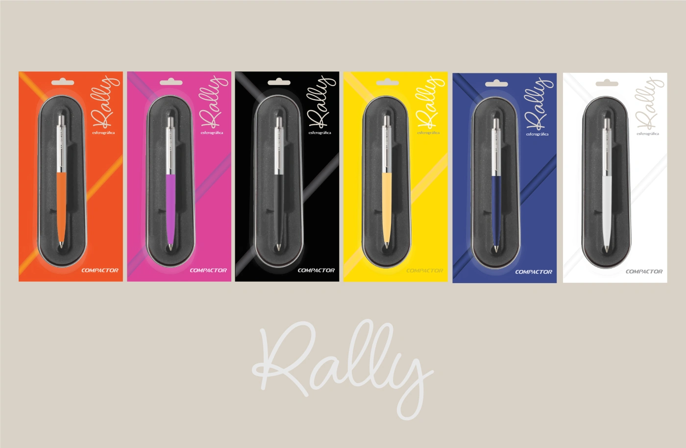
The visual identity and presentation system for the Rally ballpoint pen was developed to position the product within Compactor’s entry-level Gift Line (Linha Presente). The objective was to elevate the perceived value of a functional, durable writing instrument—shifting it away from the perception of a standard disposable school supply toward a contemporary, urban, and giftable identity.
Concept & Art Direction
Typographic & Gestural Contrast: The custom script lettering for "Rally" uses fluid, organic strokes to establish a direct contrast with the product's mechanical precision—clean cylindrical geometry, push-button mechanism, and engraved polished metal clip. A minimalist sans-serif descriptor anchors the layout with technical clarity.
Modular Color System: The visual framework relies on a six-panel modular grid featuring the available variants (White, Black, Magenta, Cobalt Blue, Orange, and Yellow). High-saturation color blocks correspond directly to the molded resin body of each pen, organizing the collection with structural clarity.
Continuous Line Graphic Language: Within each quadrant, vector lines simulate the continuous path of an ink stroke. These loops serve simultaneously as structural anchors, stylized drop shadows, and visual demonstrations of consistent ink flow.
0 likes · 0 views · Oct 29, 2026
The visual identity and presentation system for the Rally ballpoint pen was developed to position the product within Compactor’s entry-level Gift Line (Linha Pr


