Brand Identity Development for Craddle
Ismail Olajide
Role: Lead Brand Designer, I was responsible for the entire brand development process, from research and strategy to design execution. My role involved translating the design brief into a compelling and cohesive brand identity that resonates with the audience and supports business growth
Tools: Adobe Illustrator, Adobe Photoshop and Figma
Timeline: 12 days
The Problem: In a world of fragmented options and overwhelming choices, parents seeking child care are faced with a fundamental question "who can I trust with the most precious part of my life?". The market is saturated with generic, transactional services that fail to provide the peace of mind modern families truly need. This challenge is even more significant for families navigating the complexities of caring for children with diverse needs, from newborns to pre-teens, including those with ADHD, autism, and disabilities. The need for a brand that is not just a service, but a true partner, became the central focus of our design journey.

The Solution: A Cradling Embrace
Our mission was to create a visual identity for Craddle that would instantly communicate trust, professionalism, and compassionate expertise. We developed a brand that is a sanctuary, a safe haven and nurturing space where children of all ages and abilities can thrive.
Design approach:
➡ Discovery & Research: I conducted in-depth research into Craddle focusing on their mission, vision, values, target audience, and the industry they operate.
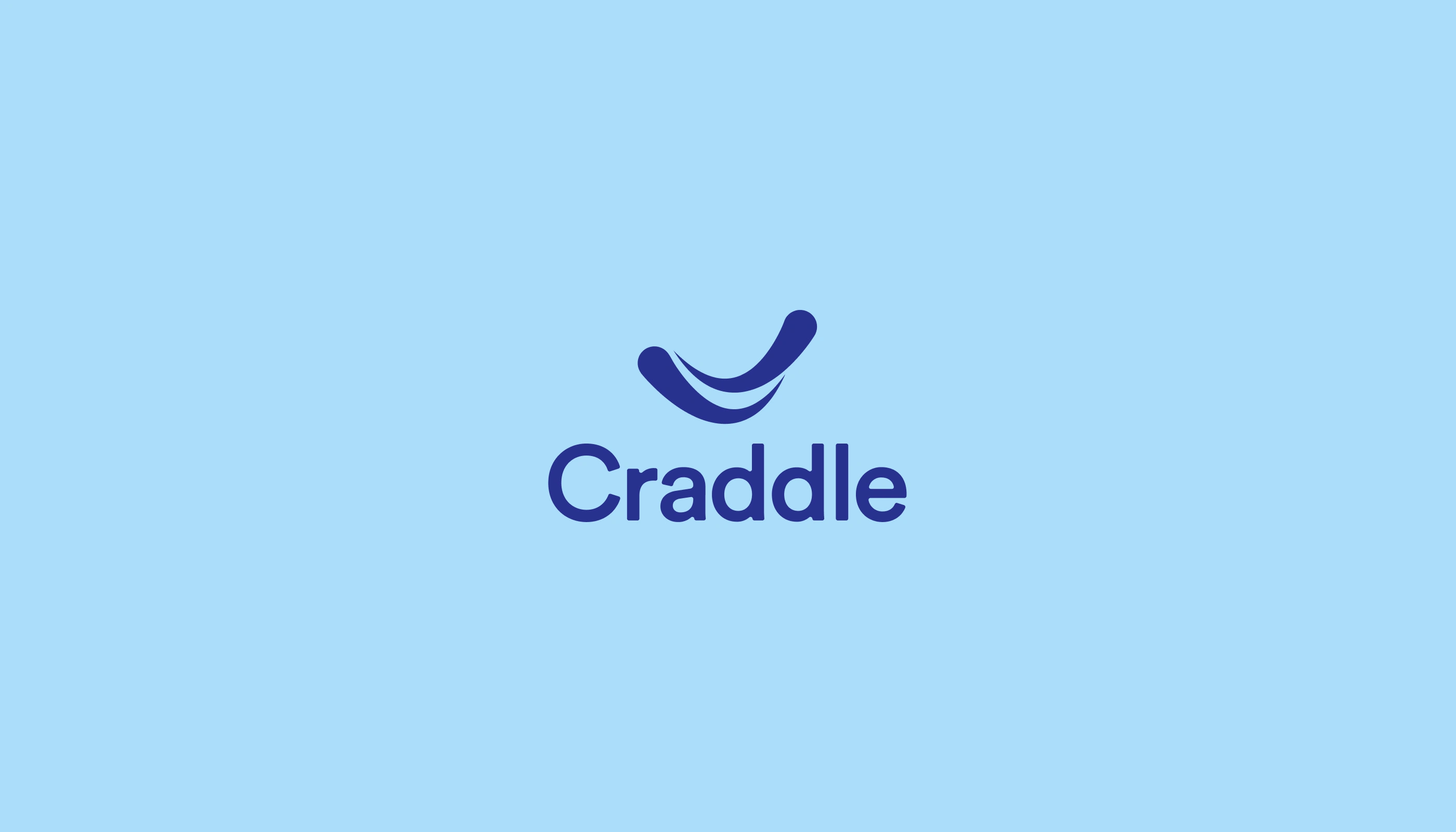
➡ Concept Development: I explored various design directions taking cues from the mind-mapping session for precision and creative innovation. The final concept is an abstraction of the brand's core purpose. It masterfully blends three concepts into a single, cohesive form. A simple, yet profound combination mark.
Design Execution
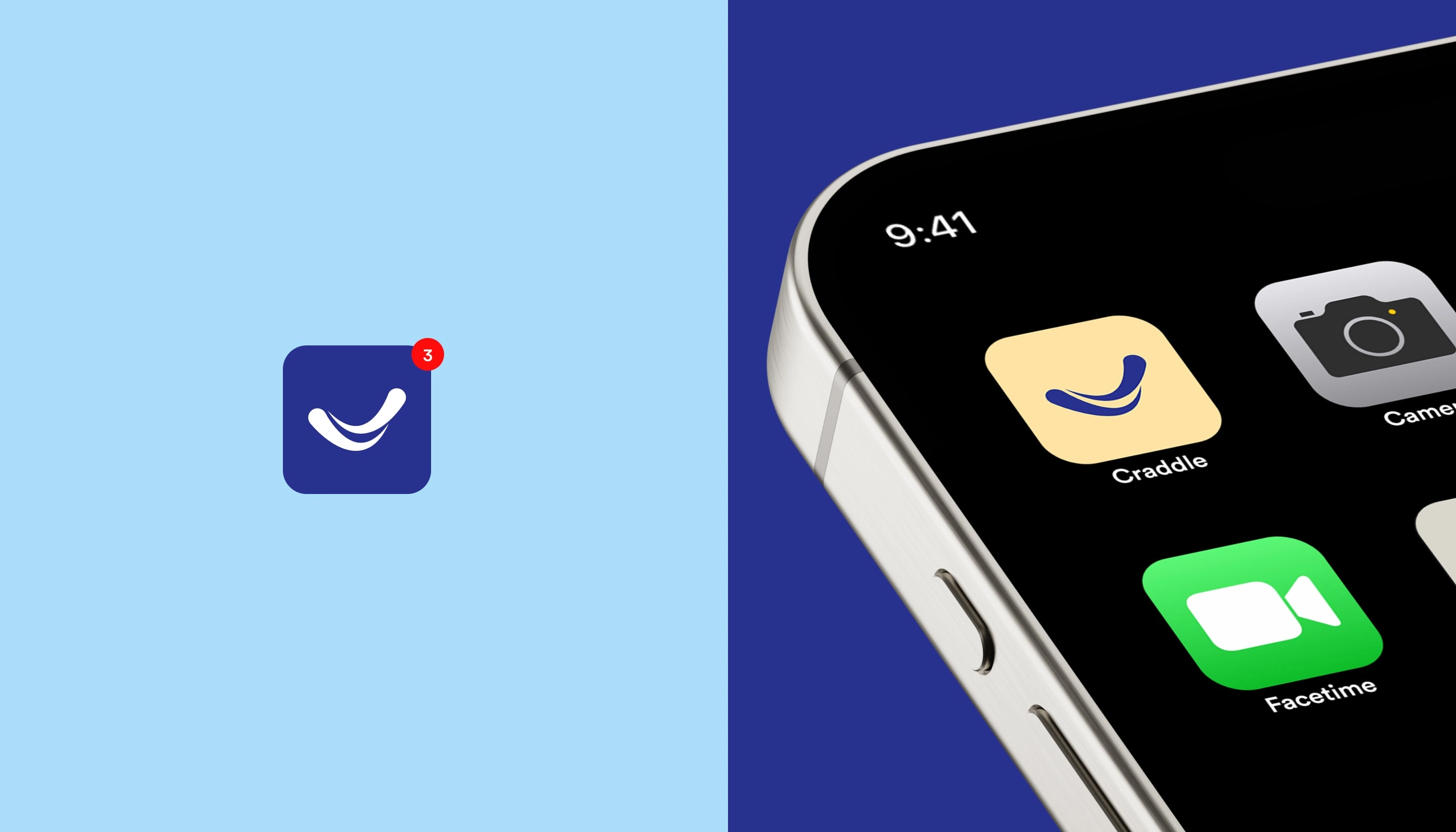
➡ Logo Design: I created a minimalist wordmark with a unique icon that reflects Craddle's modern design aesthetic and forward-thinking approach.
➡ Color Palette: A soothing and sophisticated palette was chosen to evoke feelings of calm and security. We opted for a deep trustworthy blue and sky blue as the main colors, with subtle accents of pink, soft green, pastel and pale yellow to add a touch of nurturing.
➡ Typography: The typeface Circular Std was selected for its balanced blend of modern professionalism and friendly, approachable letter-forms. Its clean lines and subtle curves align perfectly with the brand's personality, ensuring legibility and a consistent tone across all platforms while AesthetNova-Bold would be used for display purposes.
Deliverables
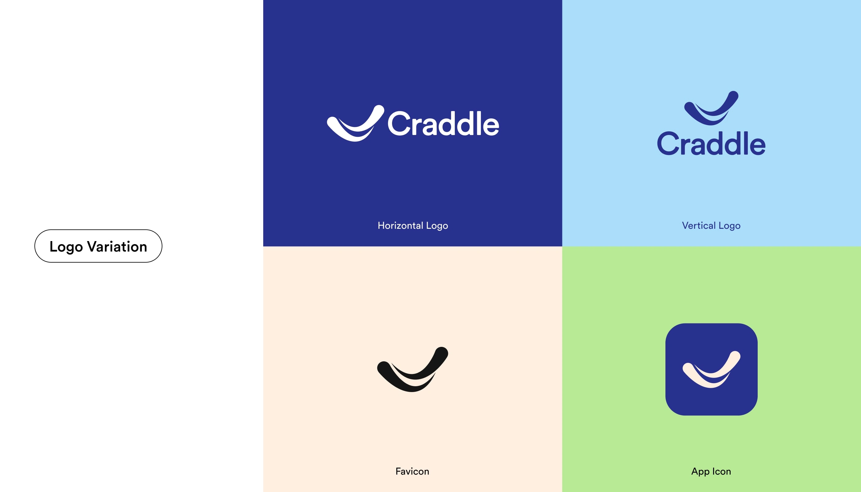
✔ Logo Suite (Horizontal, Vertical, Icon mark and App Icon)
✔ Color Palette & Typography System
✔ Brand Guidelines Document
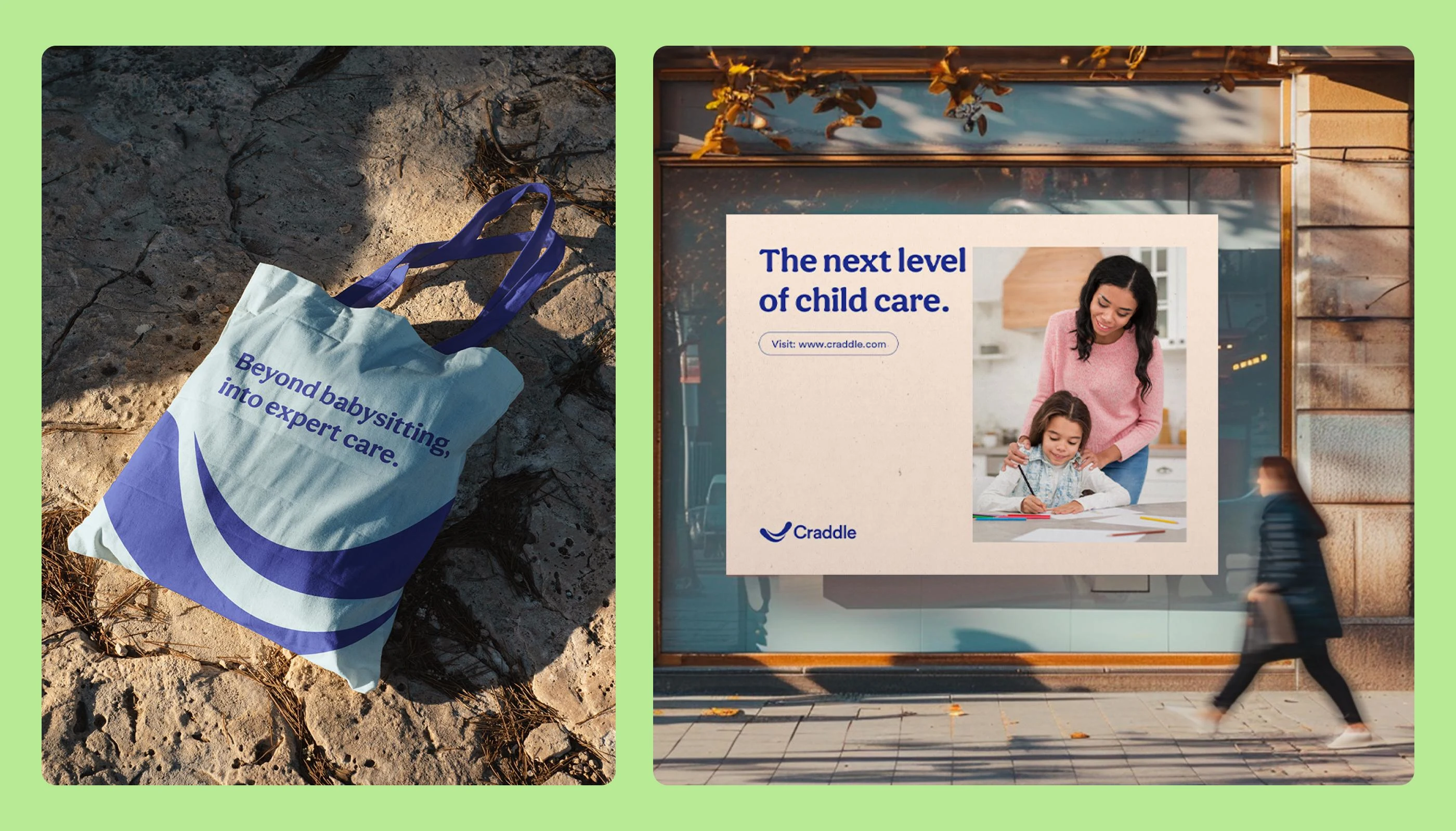
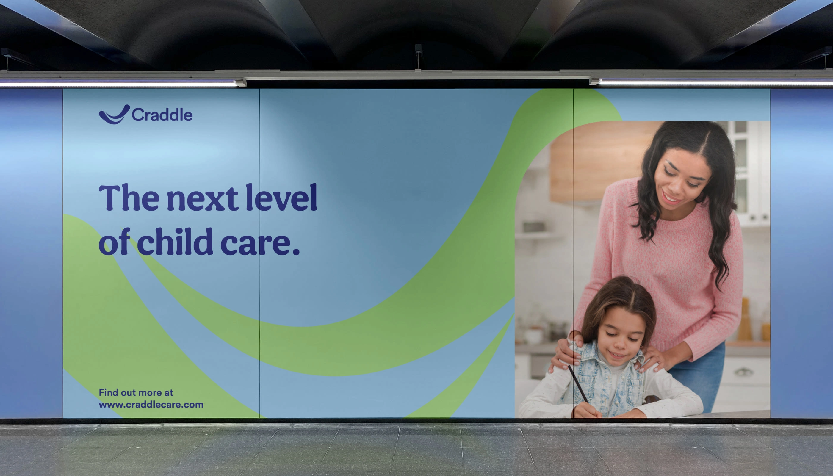
✔ Marketing Collateral Templates
Interested in crafting a distinctive brand identity for your startup? Let’s connect to bring your brand to life.
Like this project
Posted Oct 27, 2025
Brand identity for Craddle - A family and childcare brand.
Likes
0
Views
0
Timeline
Sep 10, 2025 - Sep 22, 2025
Clients
Craddle