
Role: Product Designer at The Operations Company | Scope: Website redesign | Timeline: 3 months | Tools: Figma, HubSpot
The Challenge
Kinetic provides workers' compensation insurance for frontline industries, with real-time intelligence and dedicated experts that put customers in control of their claims and costs. It's a strong offer, but the website didn't say so. It looked dated, it was crowded with information, and it didn't make clear what Kinetic does or why someone should choose it. The brief was to modernize the site, explain the company's mission clearly, and make it easier to sell their products to three very different audiences: policyholders, brokers, and self-insured companies.
The Approach
I started by studying Kinetic's main competitors to see what worked, what felt overwhelming, and where there was room to stand out. The takeaway was that insurance is complicated enough already. The site didn't need to be louder. It needed to be simple, clean, and helpful. I designed around one idea, making the decision to choose Kinetic feel easy, with dedicated pathways for each audience and products laid out so a visitor understands what's on offer in seconds.
The Messy Part
The old site had a lot of content, and cutting it was the hardest part of the project. A visitor deciding on insurance won't read a wall of text. I tightened the content, restructured the pages, and kept asking one question about every section. Does this help the user decide, or does it just fill space?
The Result
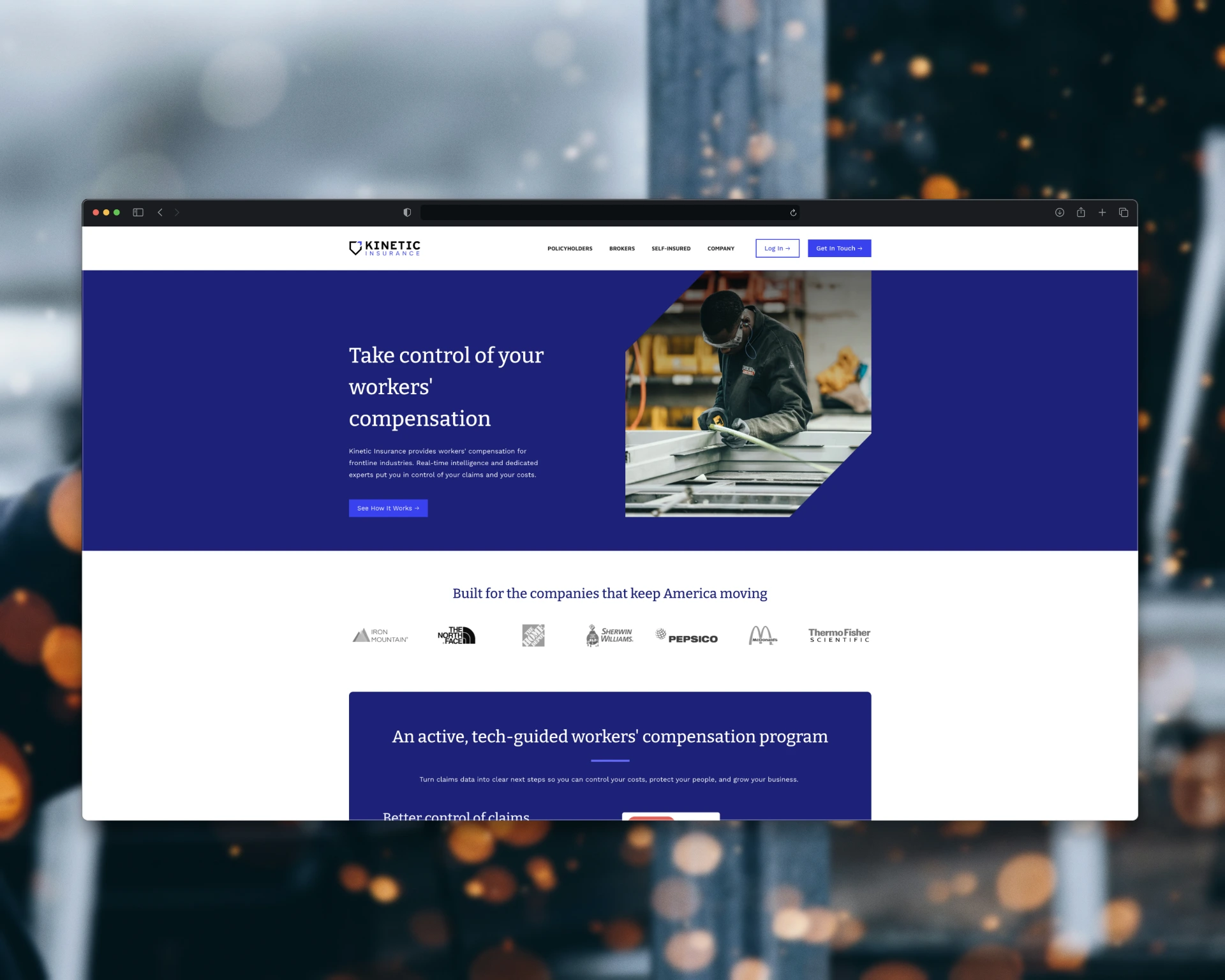
A cleaner, clearer, responsive HubSpot website built to convert across desktop and mobile. Kinetic's team gave the project a 5-star review, praising how quickly we delivered, how diligent the work was, and how easy it was to give feedback and see it come to life.
What I Learned
Redesigning isn't erasing. Before creating anything new, it helps to look back at what the client was trying to say in the first place. The best redesigns keep the spirit of the original and give it a modern face.
0 likes · 0 views · Oct 13, 2026
Redesigned a workers' comp insurer's HubSpot site with clear paths for policyholders, brokers, and self-insured companies.

