Building OwnMag's Editorial Vision Online | Design & Dev
J&J Digital Studio
About OwnMag
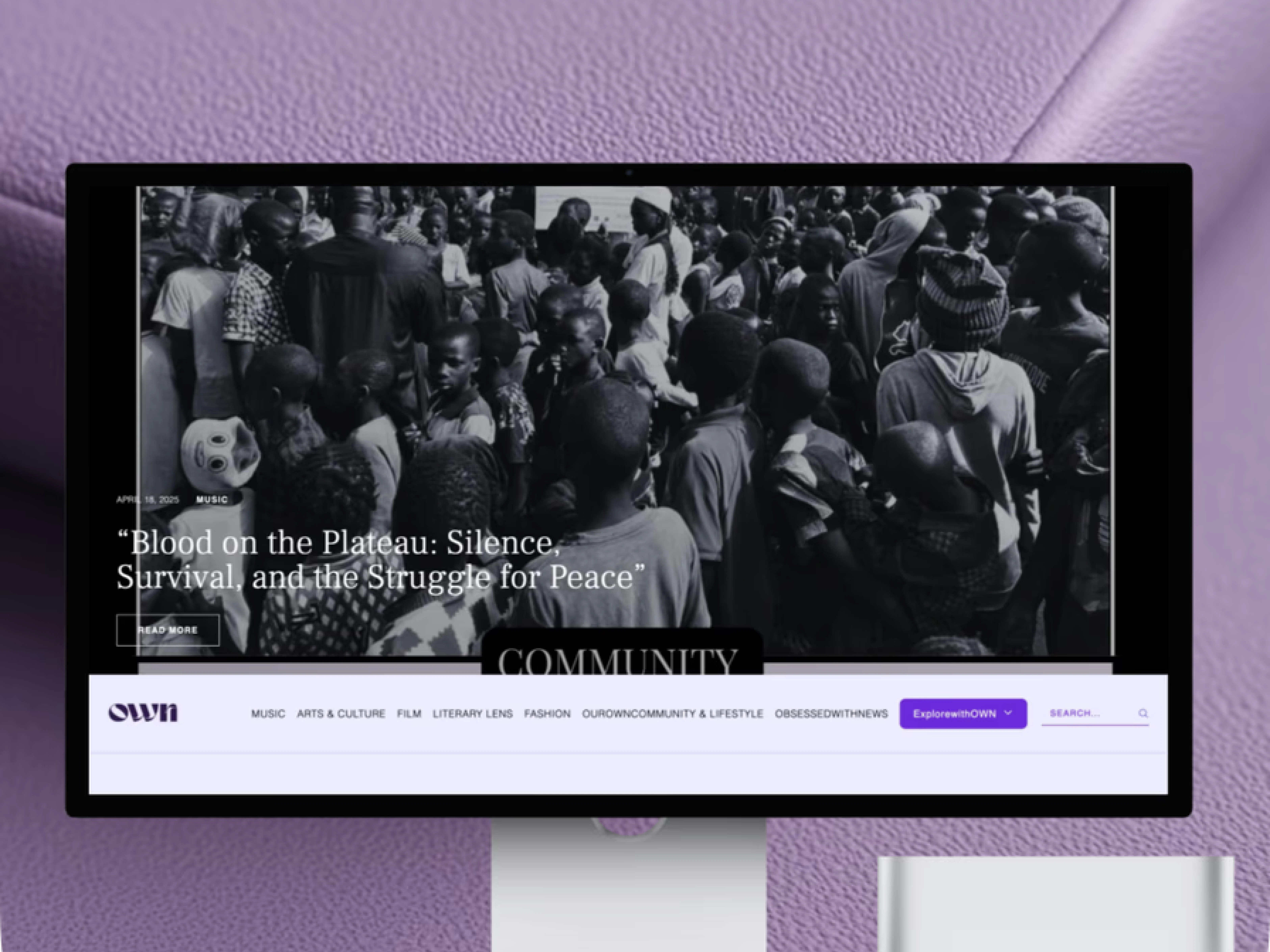
OwnMag presents itself as a creative magazine / art-culture website: it publishes content on music, arts & culture, film, literary reviews, and broader lifestyle and community pieces. The site aims to “share stories about creativity,” offering readers articles, commentary, and features on art and cultural topics.
Our Role
We designed and built the site from scratch using custom code — not a template or off-the-shelf CMS — to give OwnMag a unique, flexible, and maintainable web presence.
We handled the project end-to-end — designing the full UI/UX experience and developing the website from scratch using custom code. Nothing was built from templates; every layout, interaction, and component was crafted to reflect the brand’s creative identity and editorial style.
Our responsibilities included:
Translating brand identity and editorial vision (art, culture, creativity) into a clean, engaging website layout.
Building content structures: home page, category pages (music, film, arts & culture, literary, lifestyle), article pages, subscription/newsletter sign-up, contact page.
Ensuring all pages are responsive and render correctly across desktop, tablet, and mobile devices.
Setting up a user-friendly content management workflow so the client can publish new articles, images, galleries without breaking layout or styling.
✅ What We Delivered
Clear homepage + category navigation — A home page that welcomes readers, shows featured content, and helps them navigate to their interest (music, film, arts, lifestyle).
• Article & story pages ready for editorial content — Each article template supports text, images, galleries, and is styled for readability and aesthetic appeal.
• Subscription / mailing list feature — Enables readers to subscribe, helping the site build a community and return readership.
• Fully custom-coded and responsive site — No reliance on generic templates, so design and layout align perfectly with brand tone; works well across devices (desktop, tablet, mobile).
• Flexible CMS / content workflow — Allows the site owner/editor to add new content (articles, posts, galleries) without breaking design, keeping consistency over time.
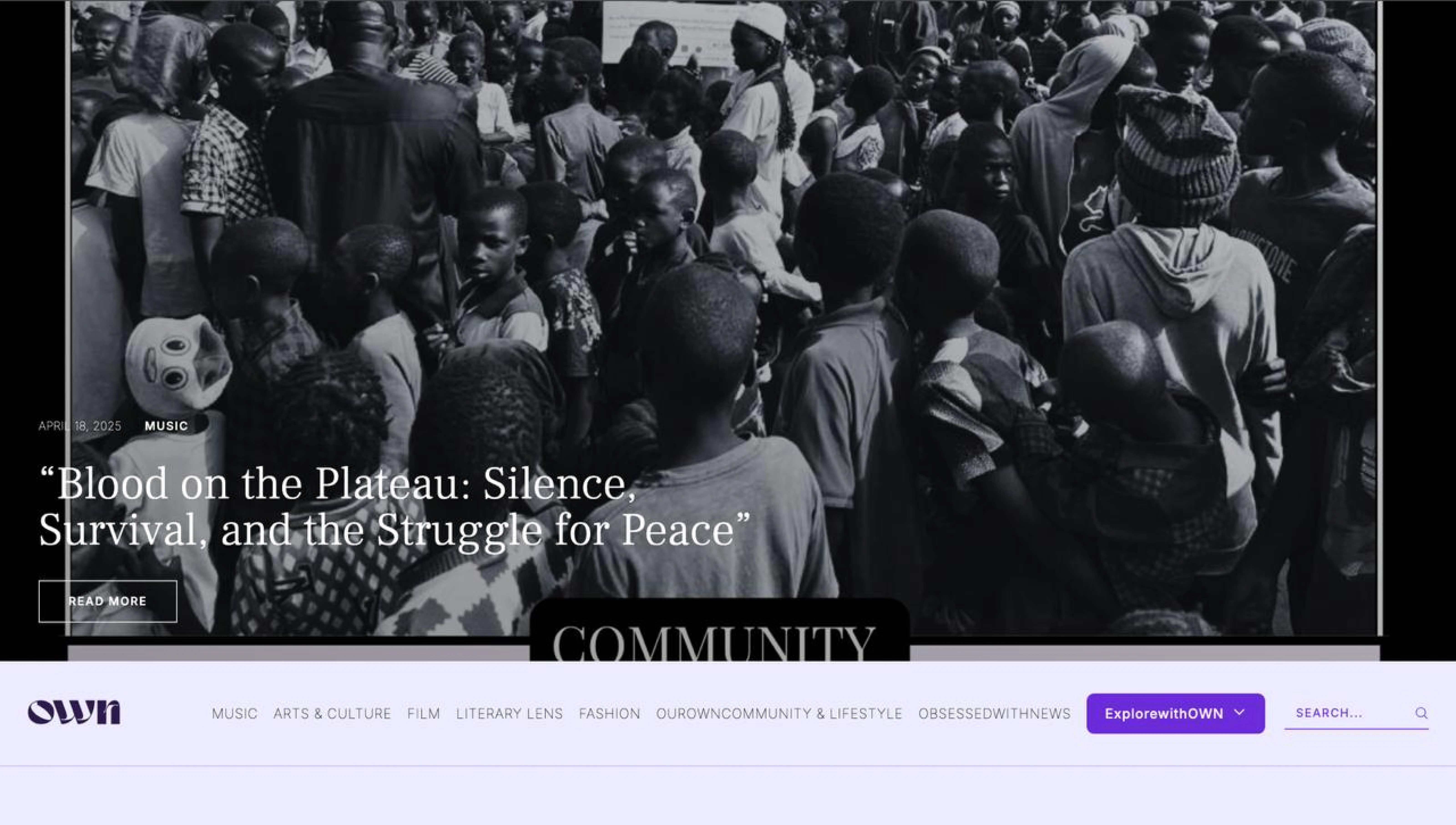
Hero Section
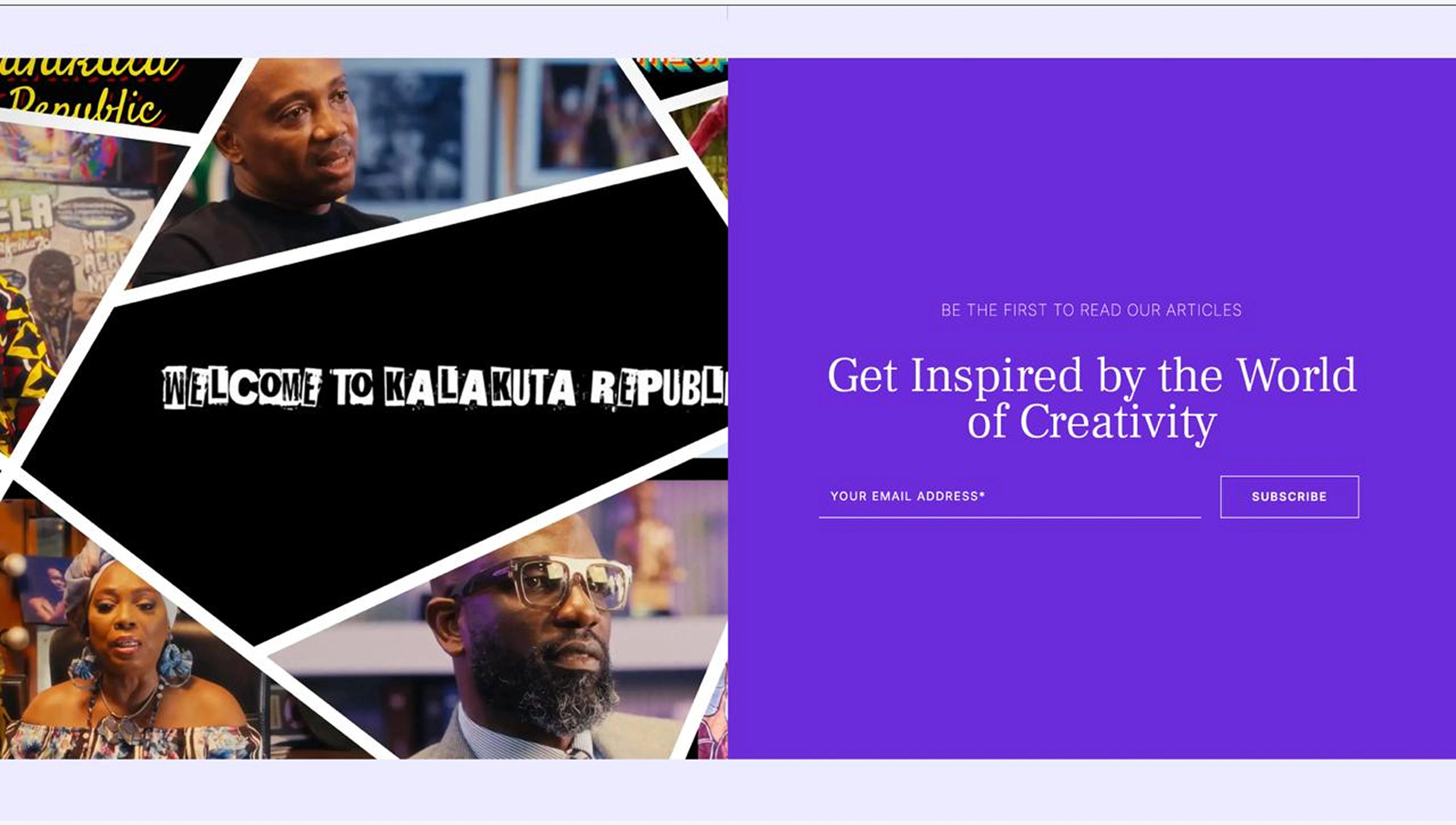
Newsletter Section
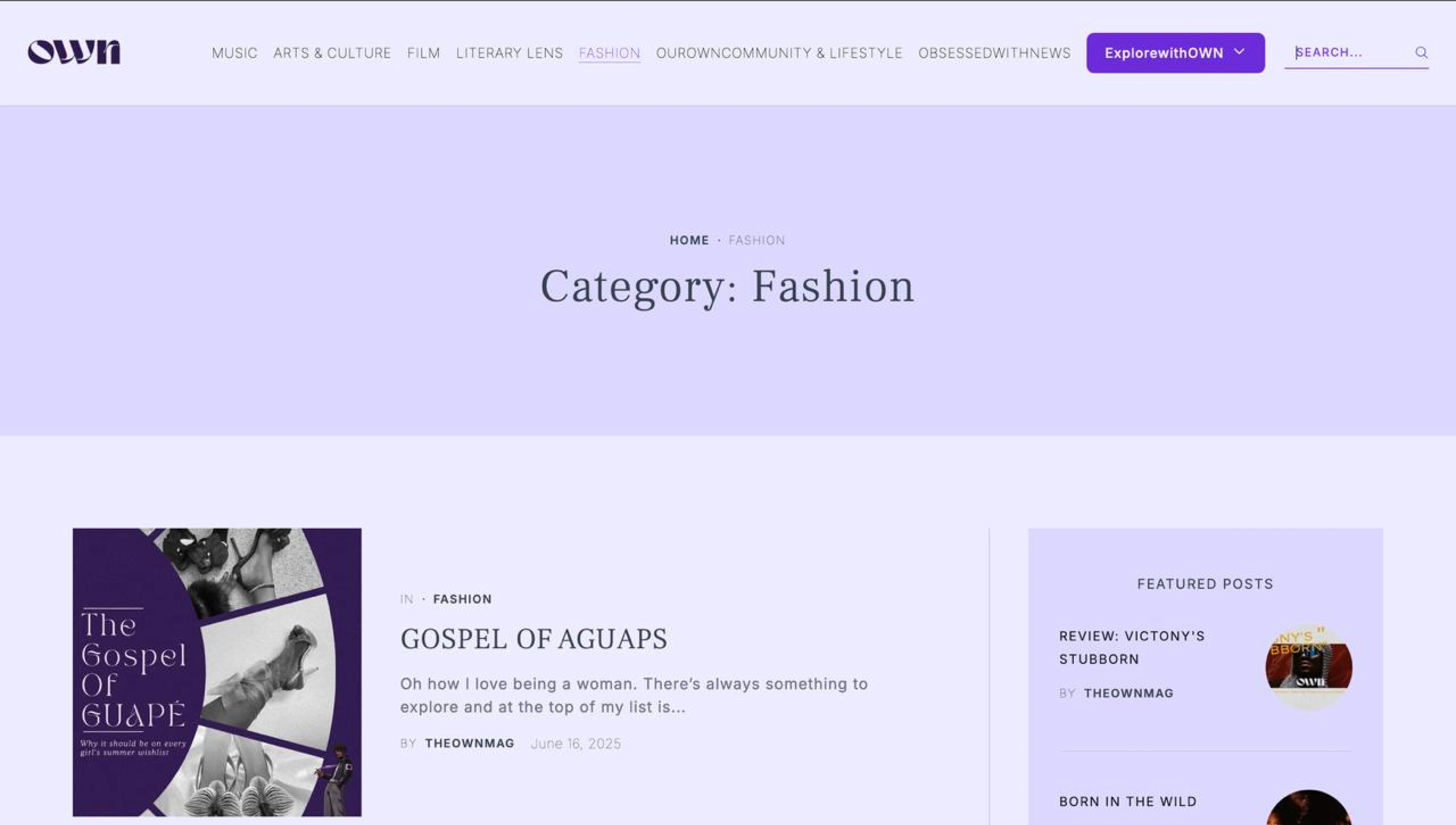
Category Section - Fashion
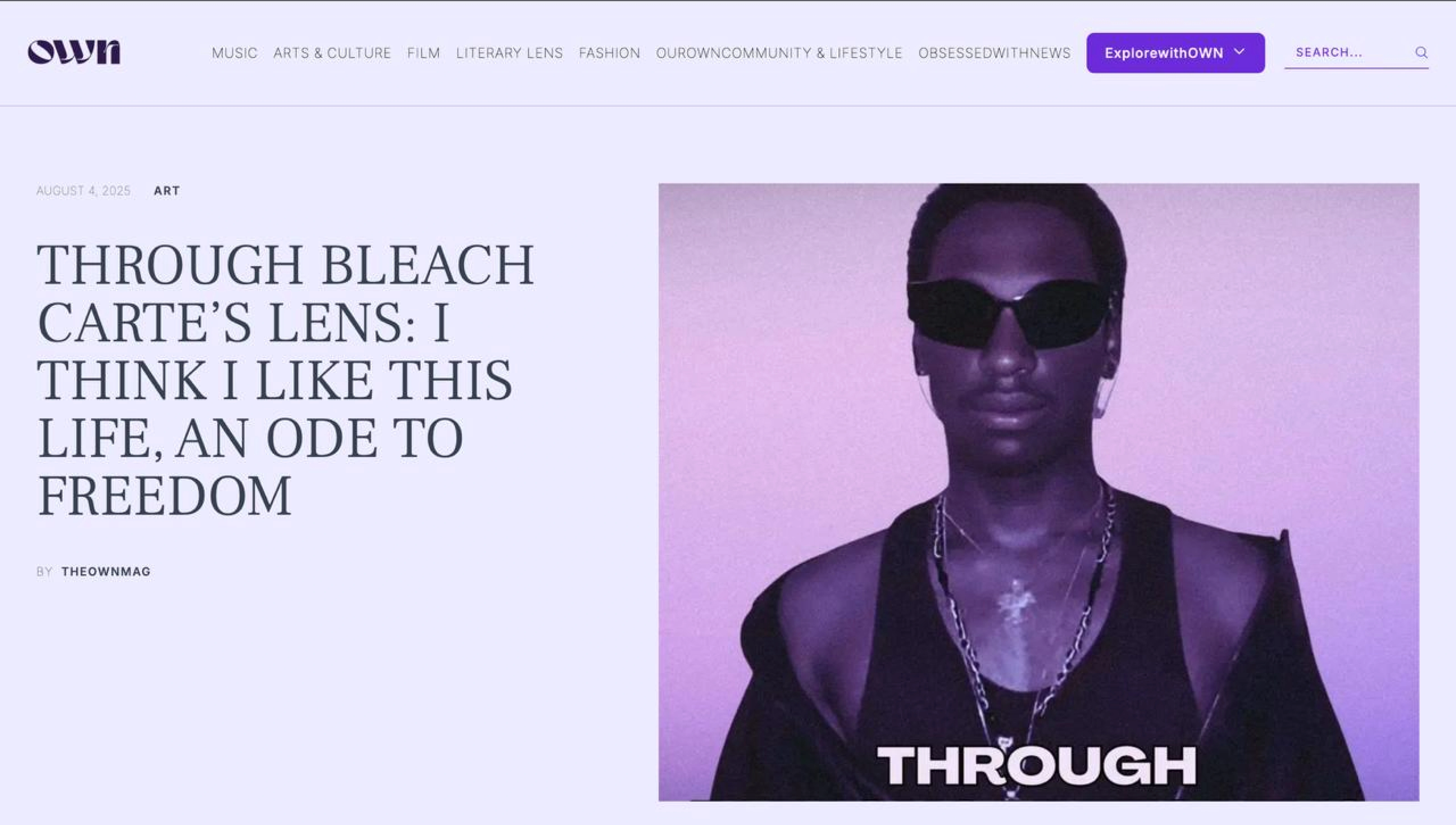
Category Section - Art
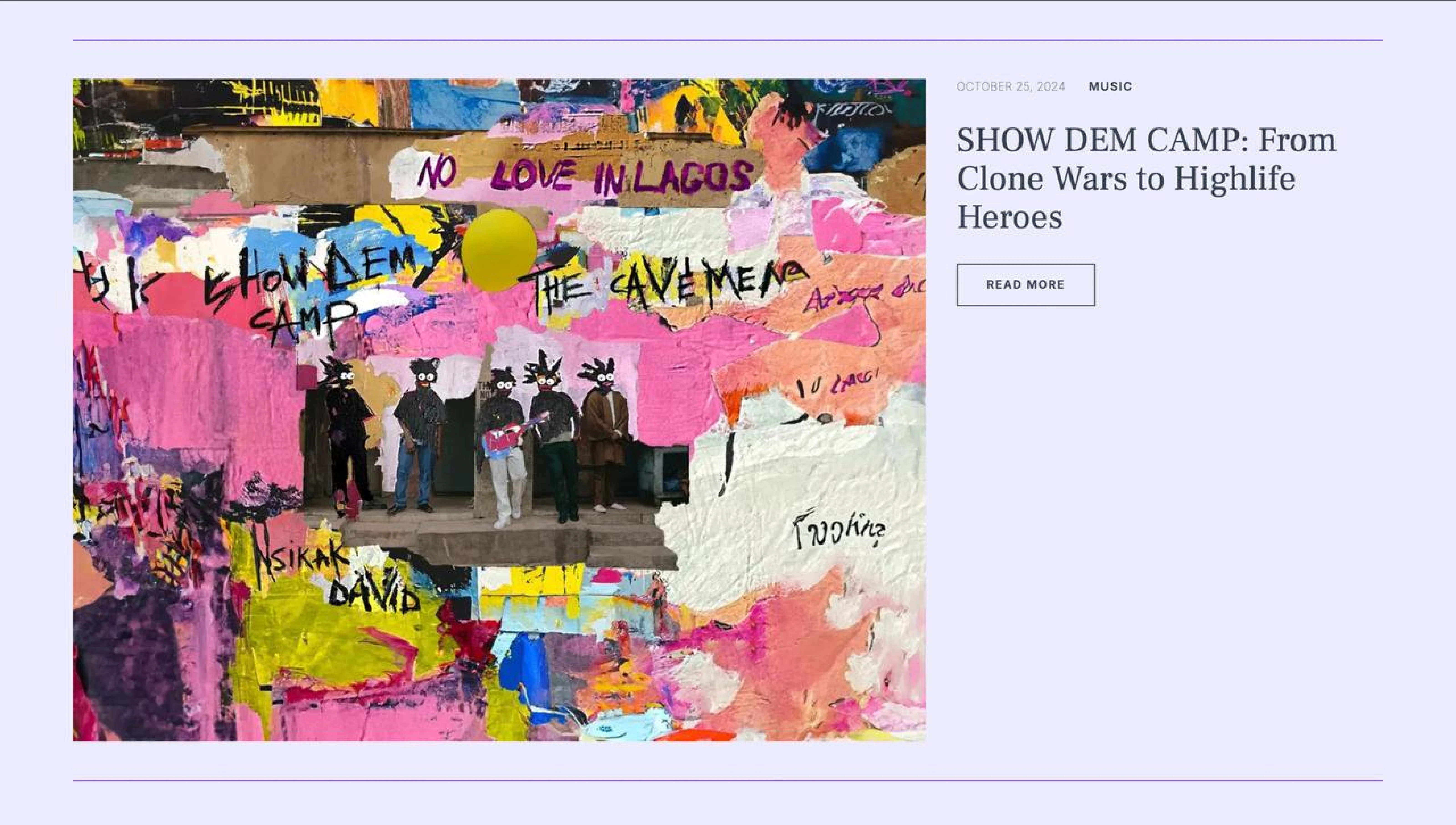
Category Section - Music
Now live at 👇🏼
Looking for a custom Website?
Book a quick FREE 30 min meeting where we discuss if our offer would work for your case
Like this project
Posted Dec 7, 2025
Designed and developed OwnMag’s custom website, creating a modern platform that celebrates art, culture, and meaningful editorial content.