Kineticbolt Logistics – Brand Identity

Zazzy Brand - Logo Designer


Introduction
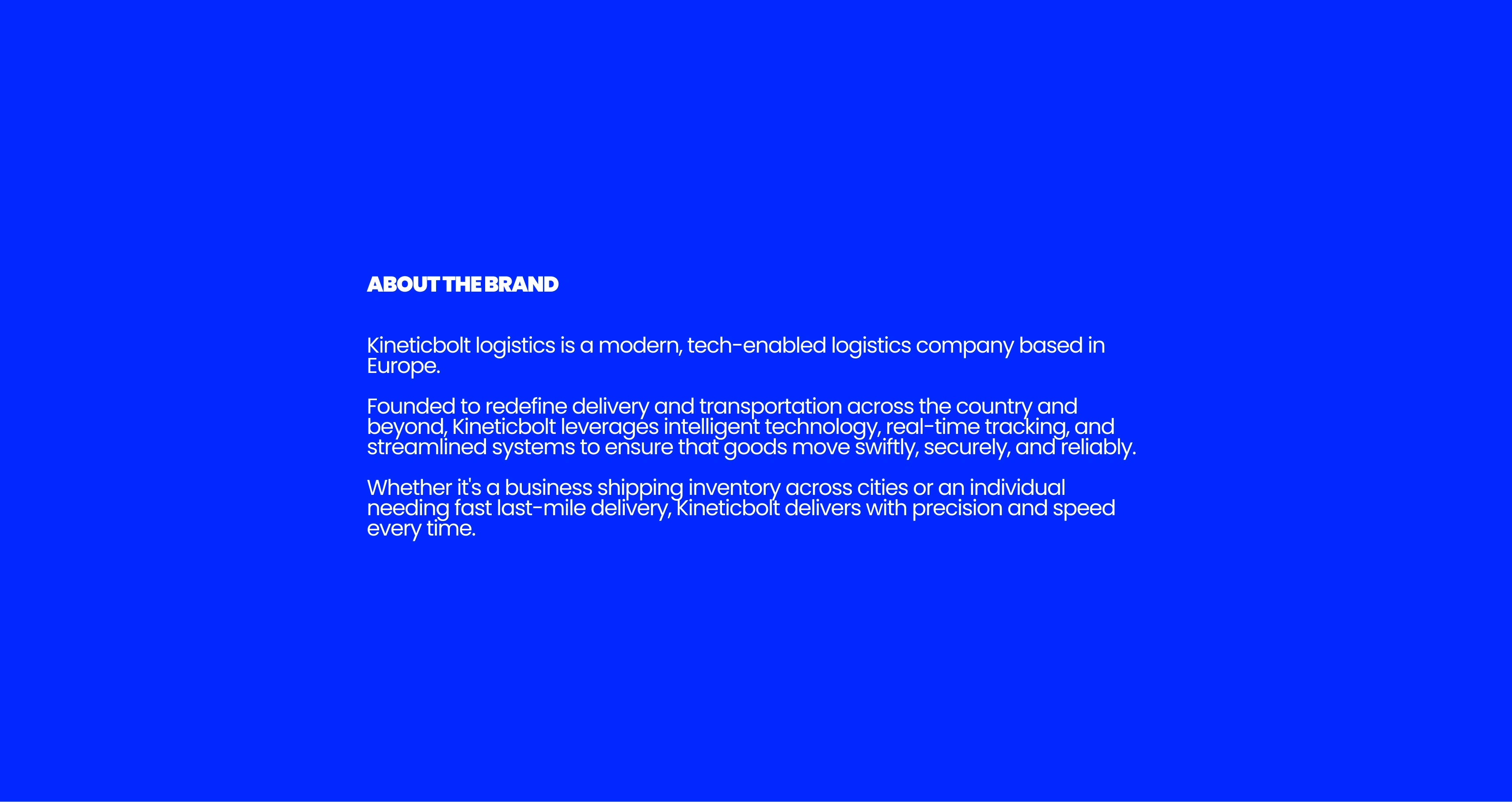
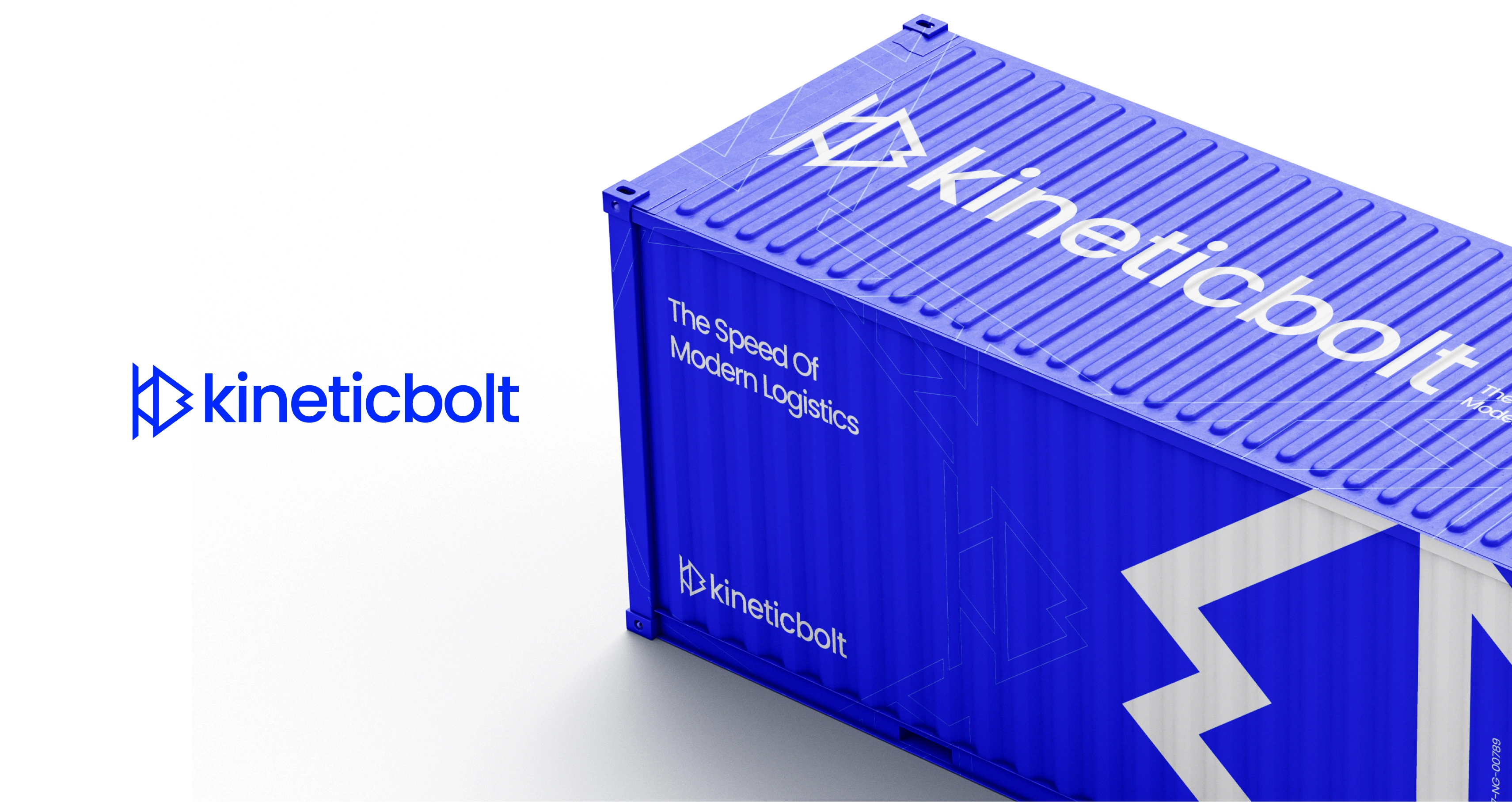
Kineticbolt Logistics is a modern, technology-driven logistics brand based in Nigeria. The identity was designed to reflect speed, precision, and forward movement. By merging the letters K and B into a single bold mark with a forward-pointing form, the brand communicates efficiency, motion, and a commitment to reliable delivery.
Concept and Logo Construction
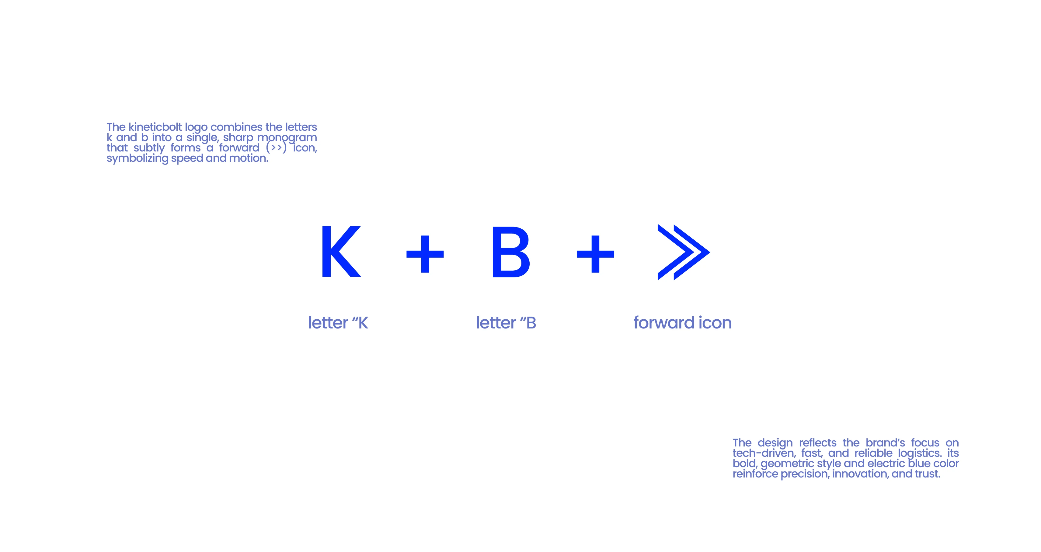
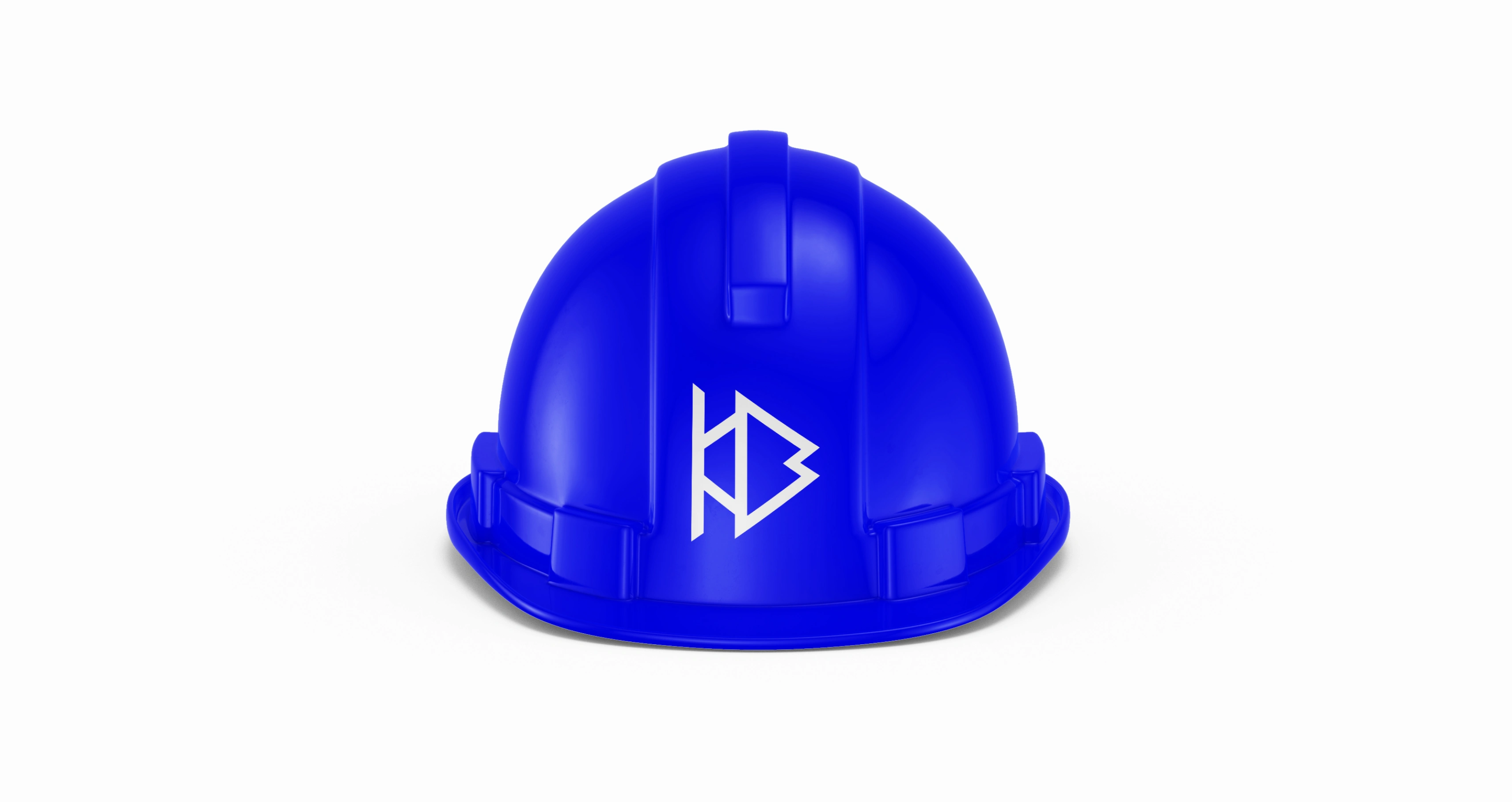
The core idea behind the logo was to bring together Kineticbolt’s initials, K and B, and integrate the visual language of movement. The symbol focuses on sharp geometric forms that naturally create a forward direction. This forward movement mimics the appearance of the fast-forward icon, representing progress, acceleration, and efficiency. The K structure provides the foundation and direction, while the B is formed within its angles to create a unified monogram. The overall mark retains a clean modern feel that aligns with a tech-enabled logistics brand. The result is a symbol that is simple, memorable, and instantly connected to speed.
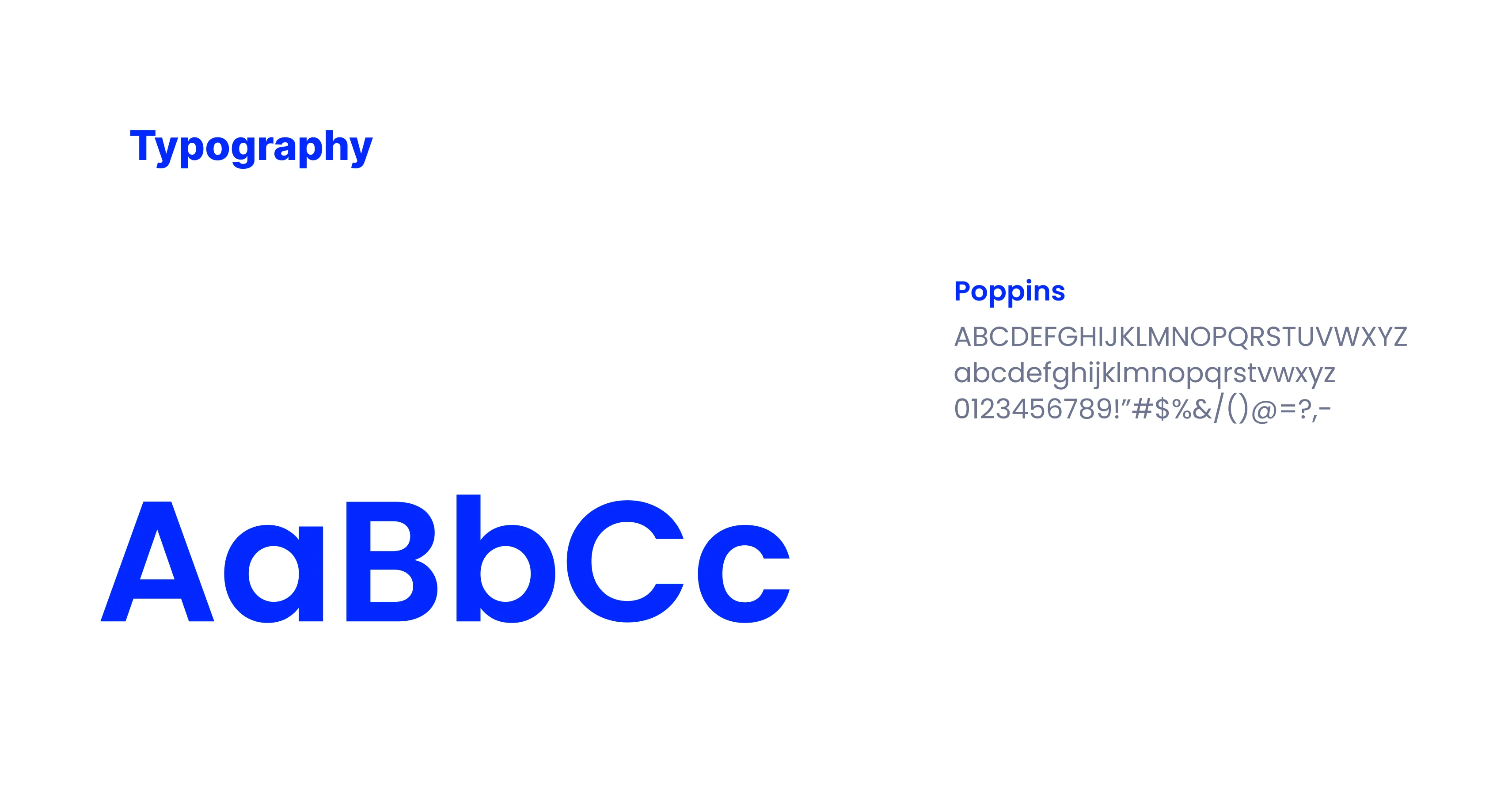
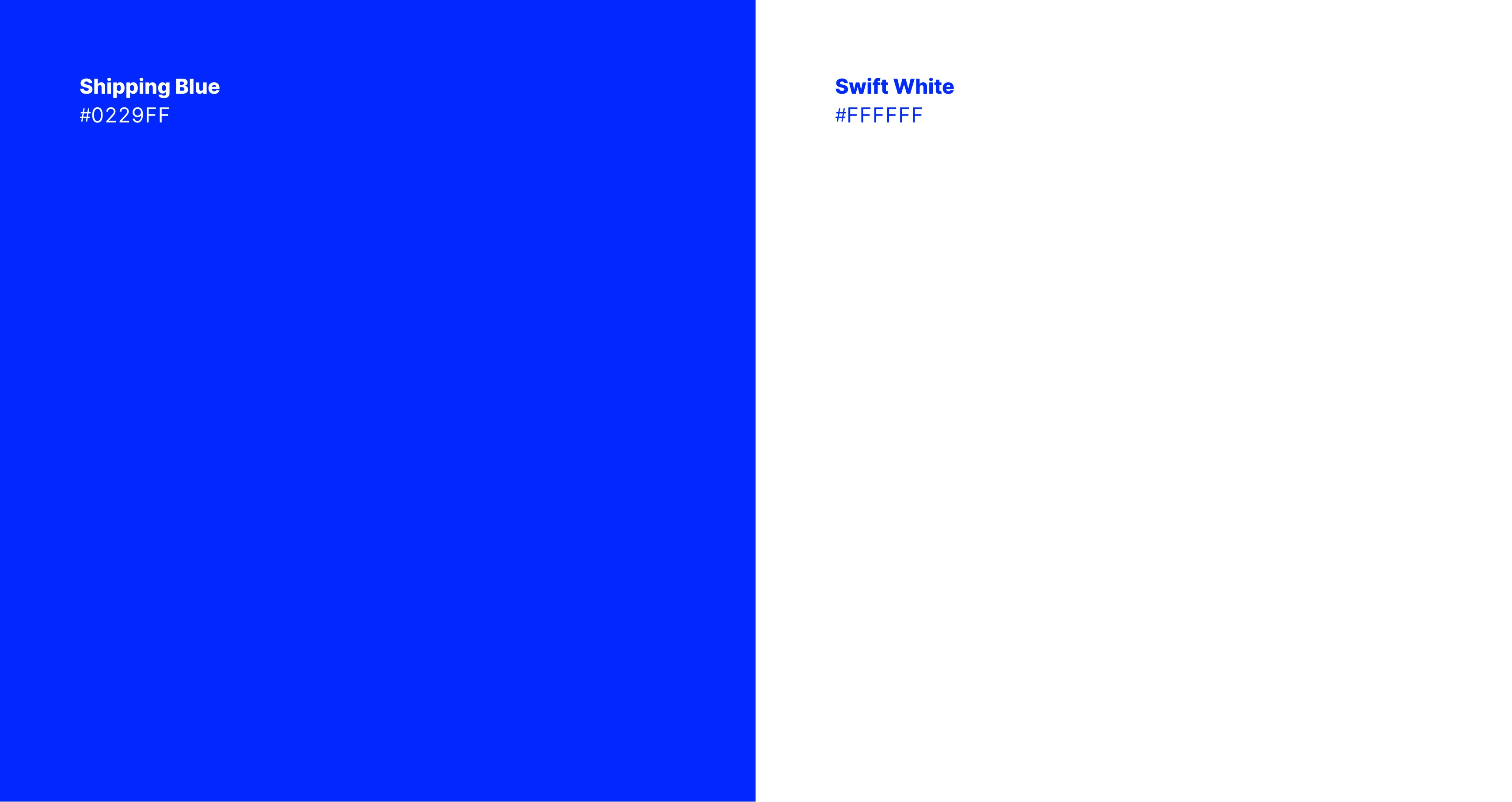
Color and Typography
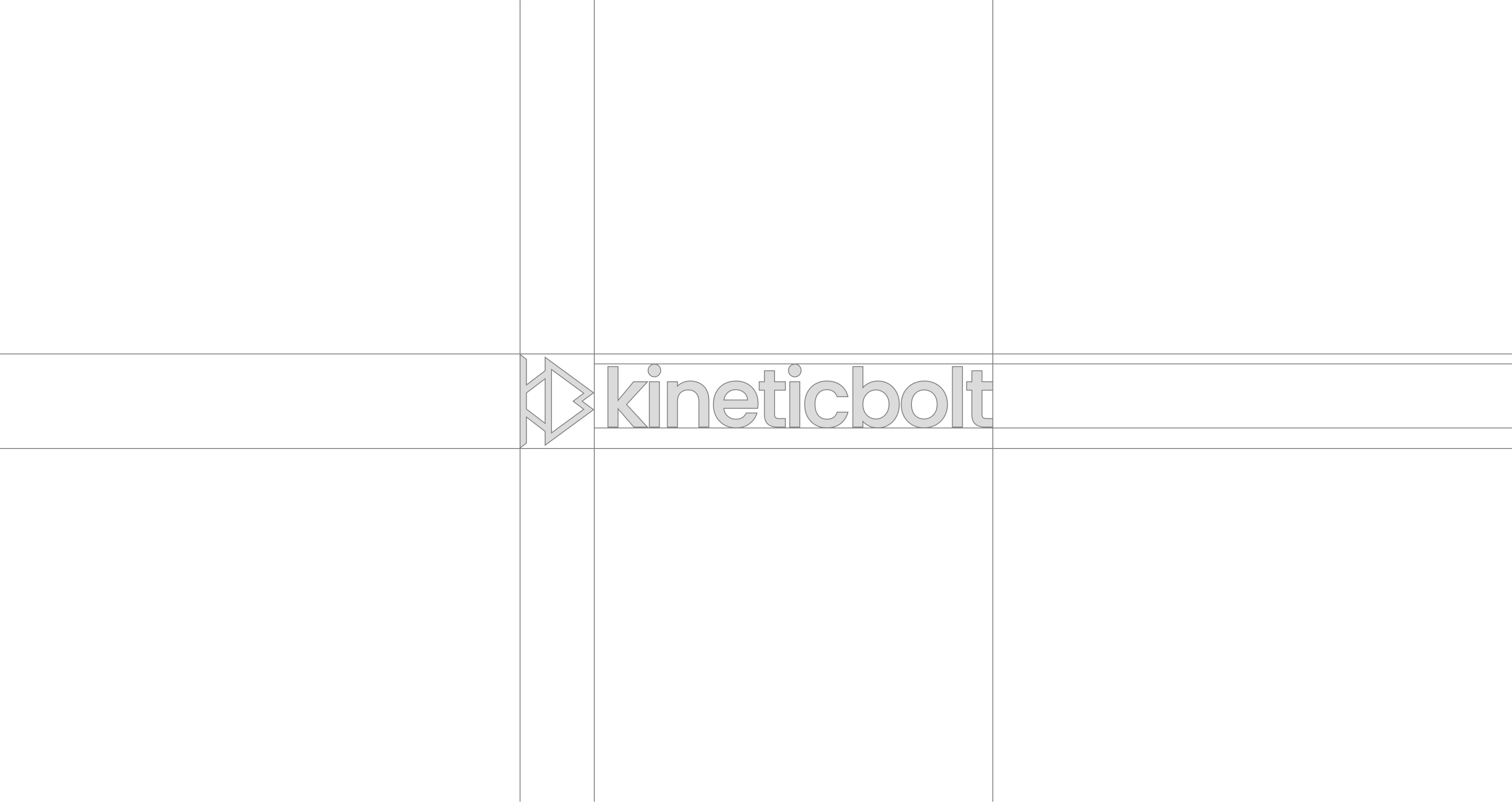
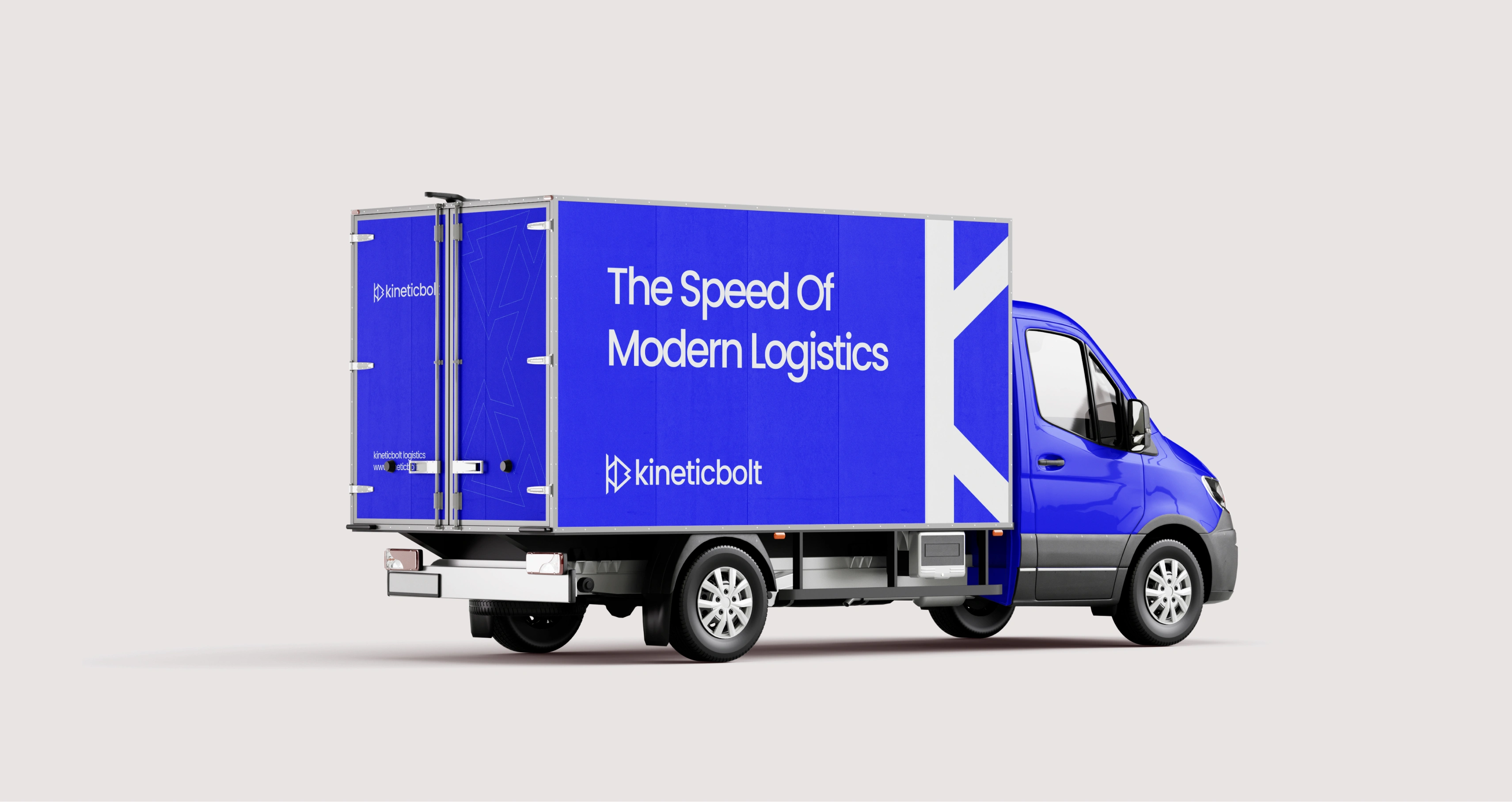
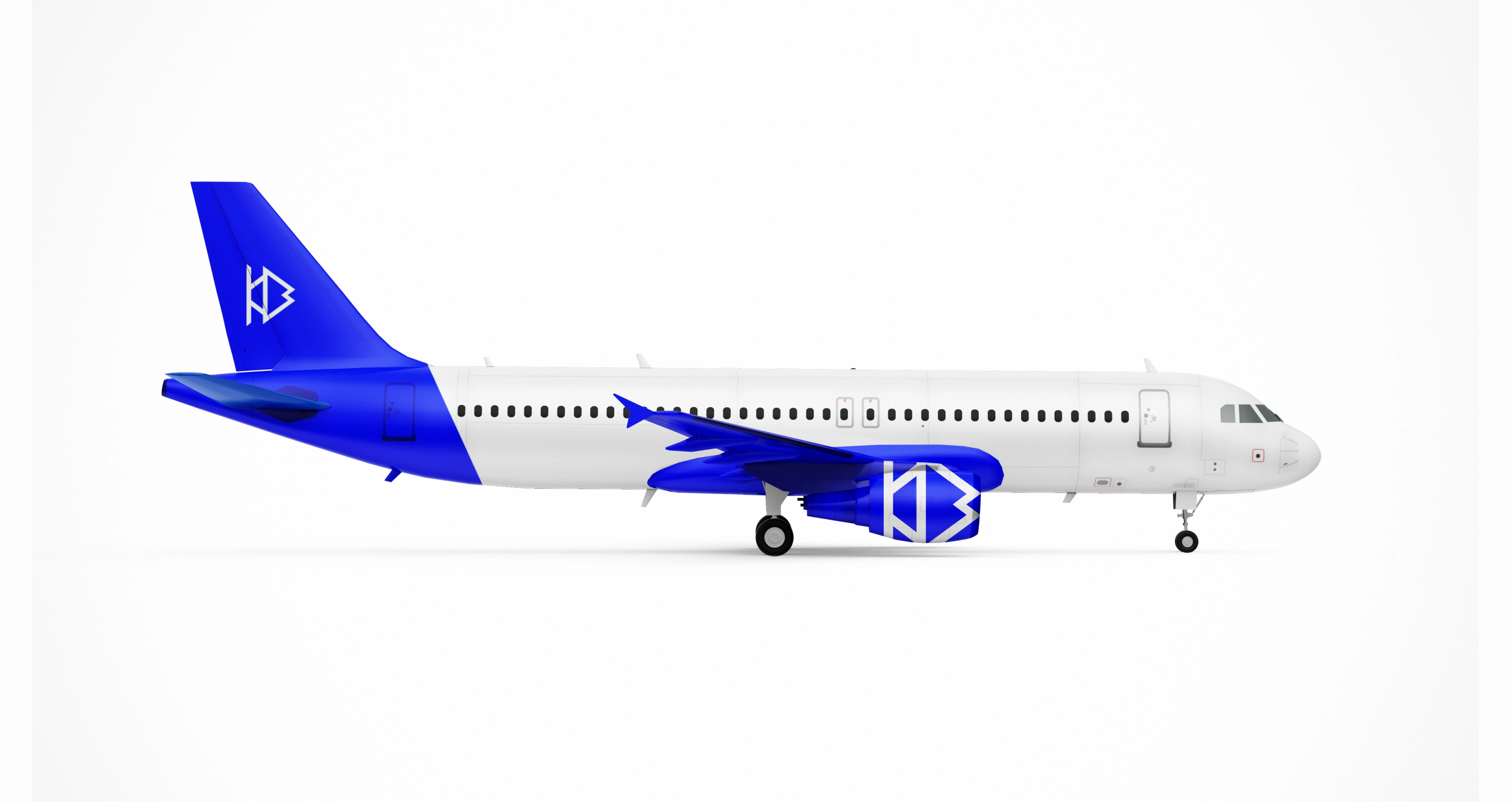
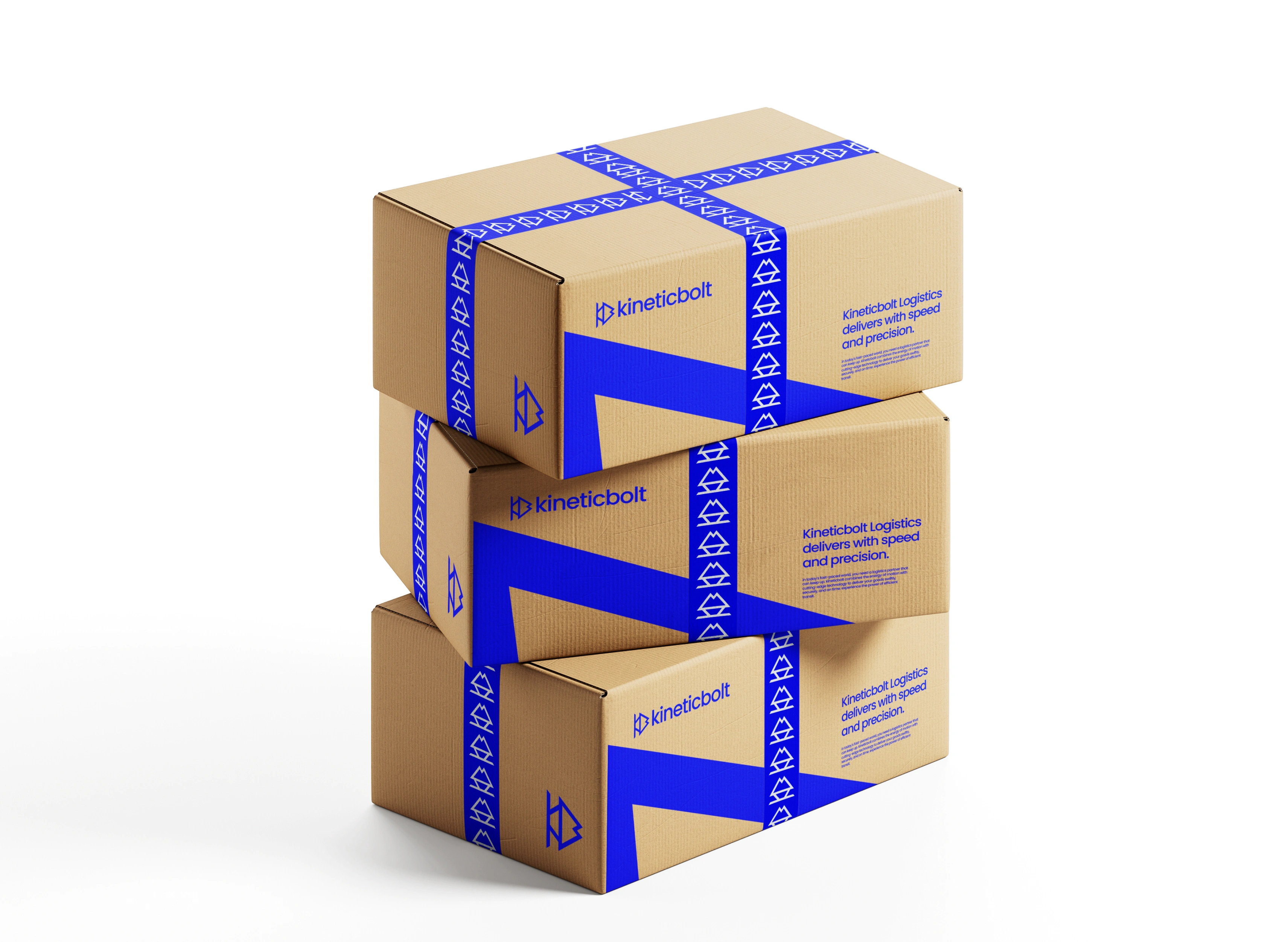
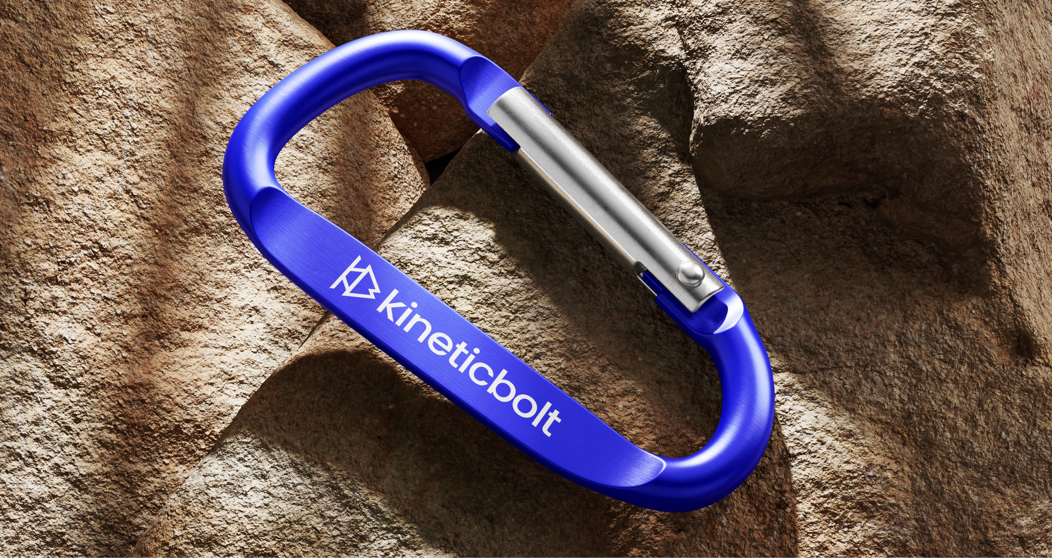
The primary color choice, a strong electric blue, represents trust, clarity, technology, and reliability. These are essential traits for any logistics company that wants to communicate confidence and precision. Typography follows a clean sans-serif style to reinforce modernity. The chosen typeface supports legibility and maintains a minimal, structured appearance that pairs well with the geometric logo.
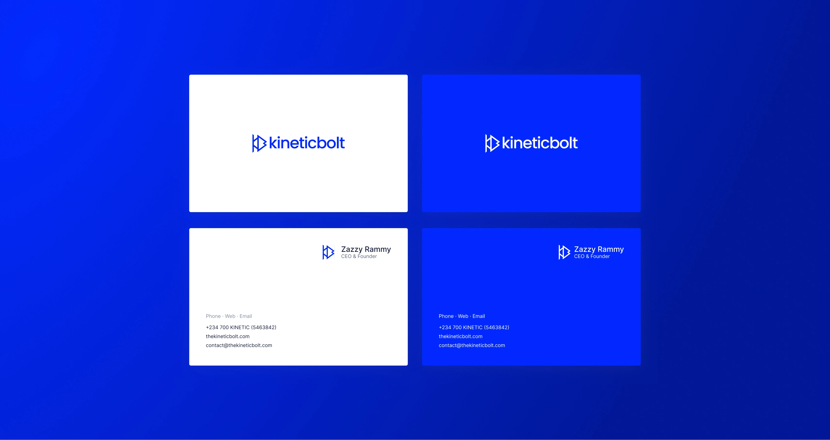
Visual Identity System
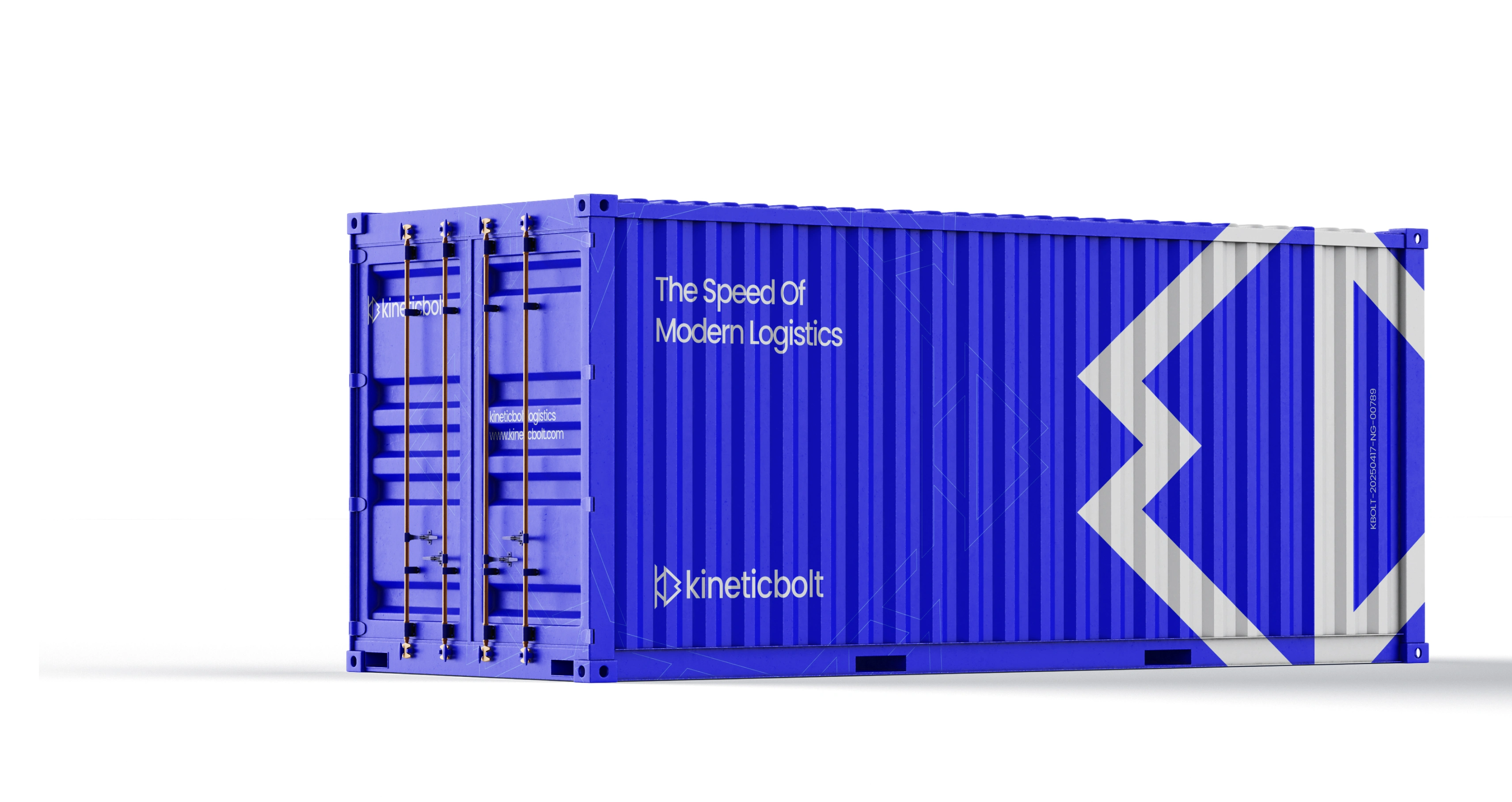
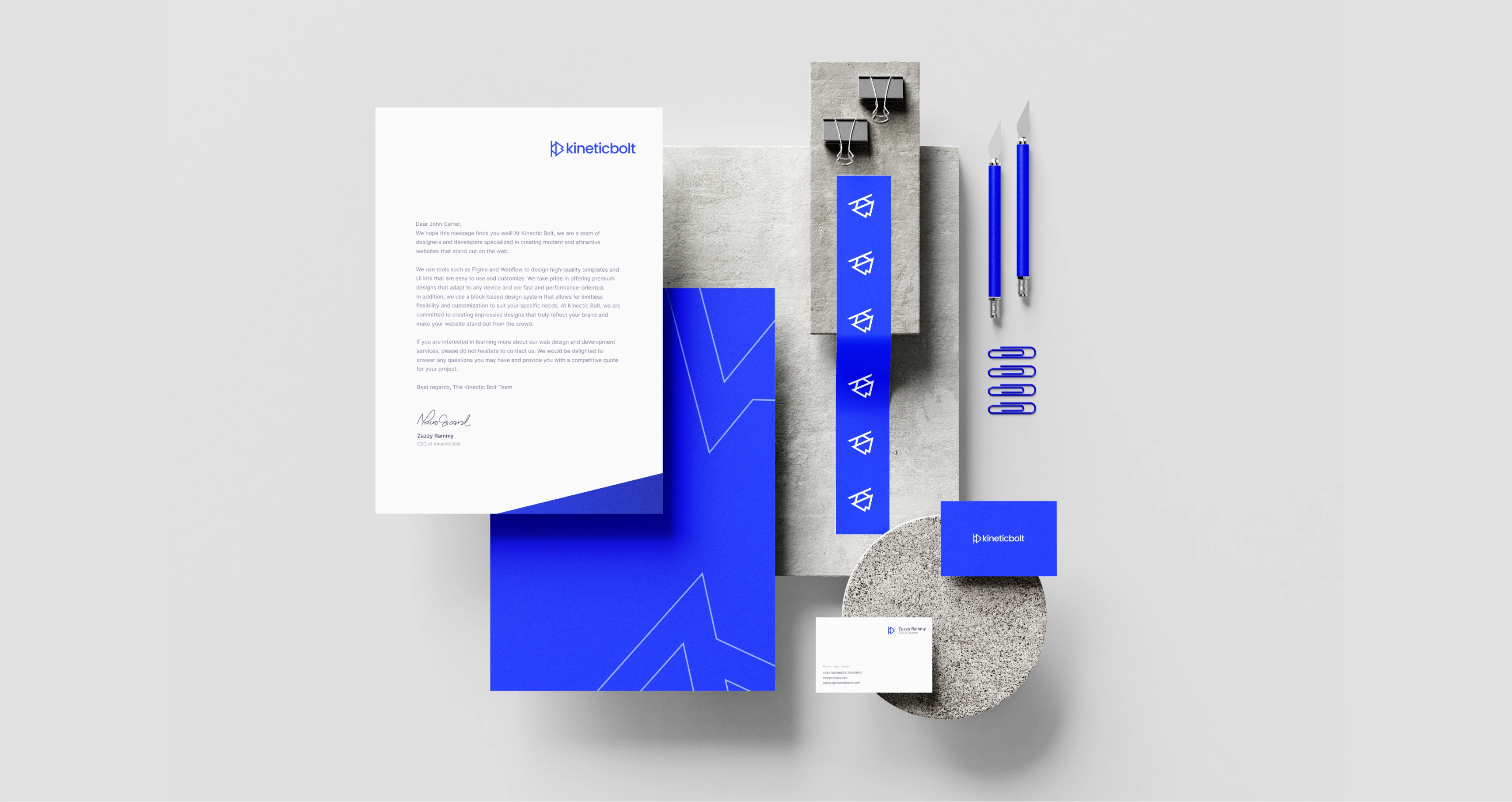
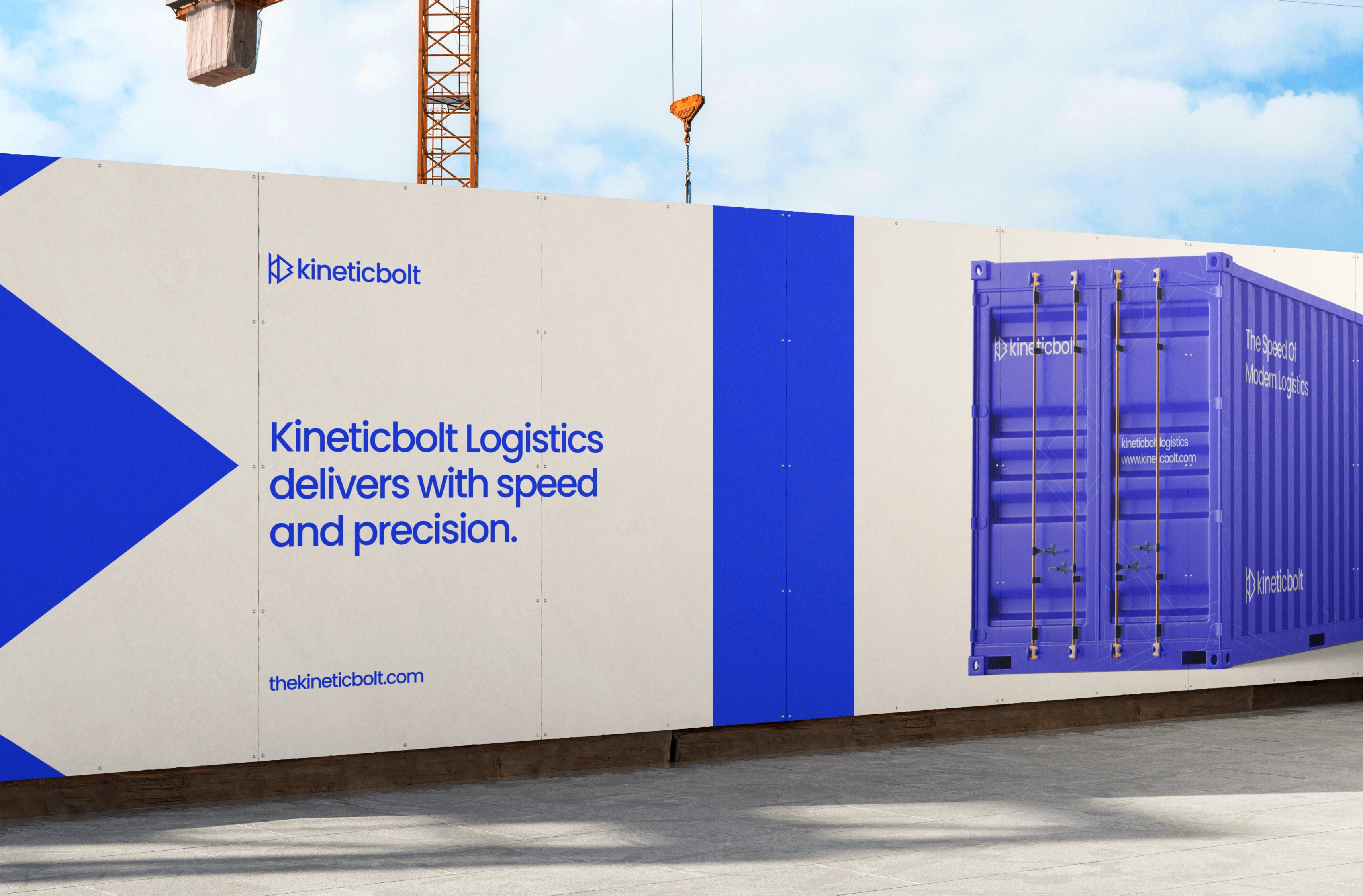
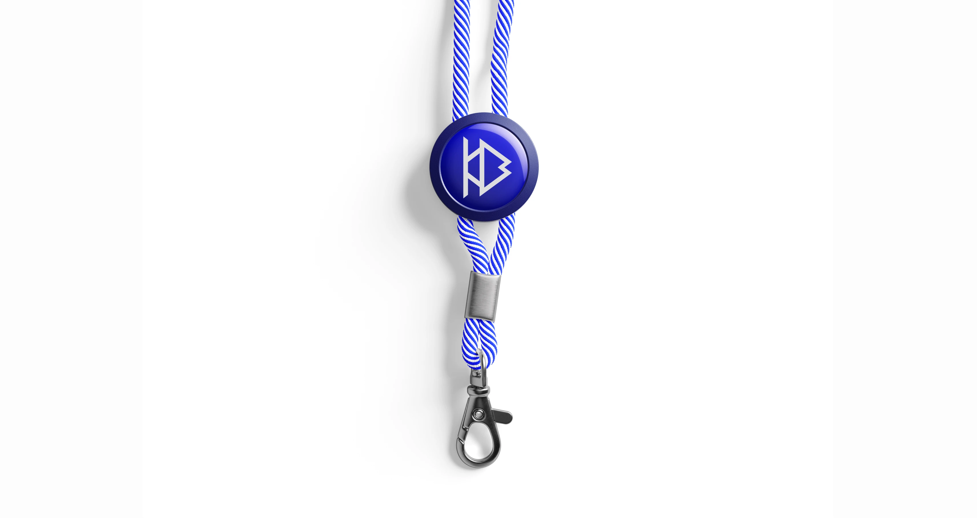
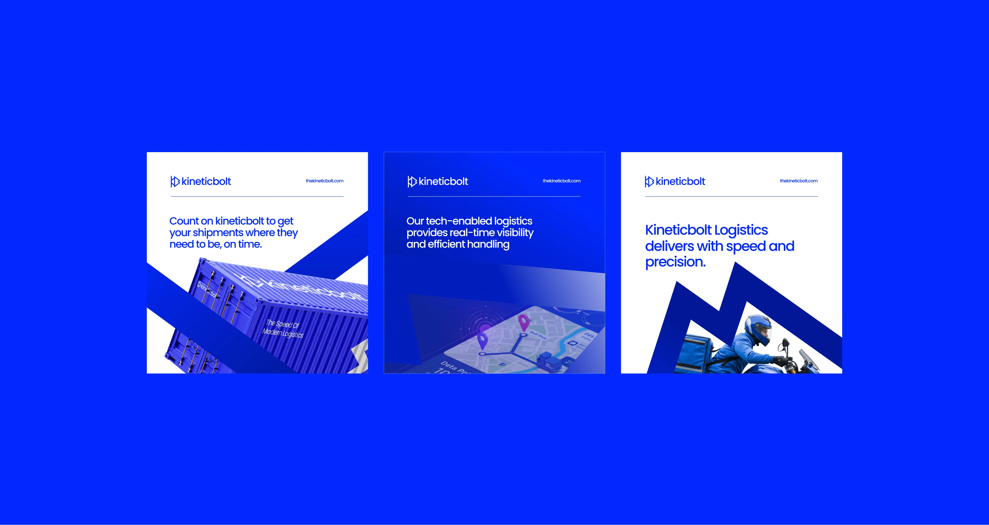
The identity system expands the idea of movement through angled shapes, directional elements, and consistent spacing. Applications such as delivery vans, uniforms, packaging, and digital interfaces maintain a streamlined look. This visual coherence helps create a recognizable brand that customers can trust. Icons, patterns, and layout choices stay aligned with the forward-thinking aesthetic introduced in the logo. Every touchpoint is designed to feel dynamic, smart, and energetic.
Brand Goal
The goal of the identity was to create a bold and functional system that clearly communicates Kineticbolt’s strengths: speed, reliability, technology, and modern logistics services. The brand needed to stand out visually while remaining practical and scalable across different use cases.
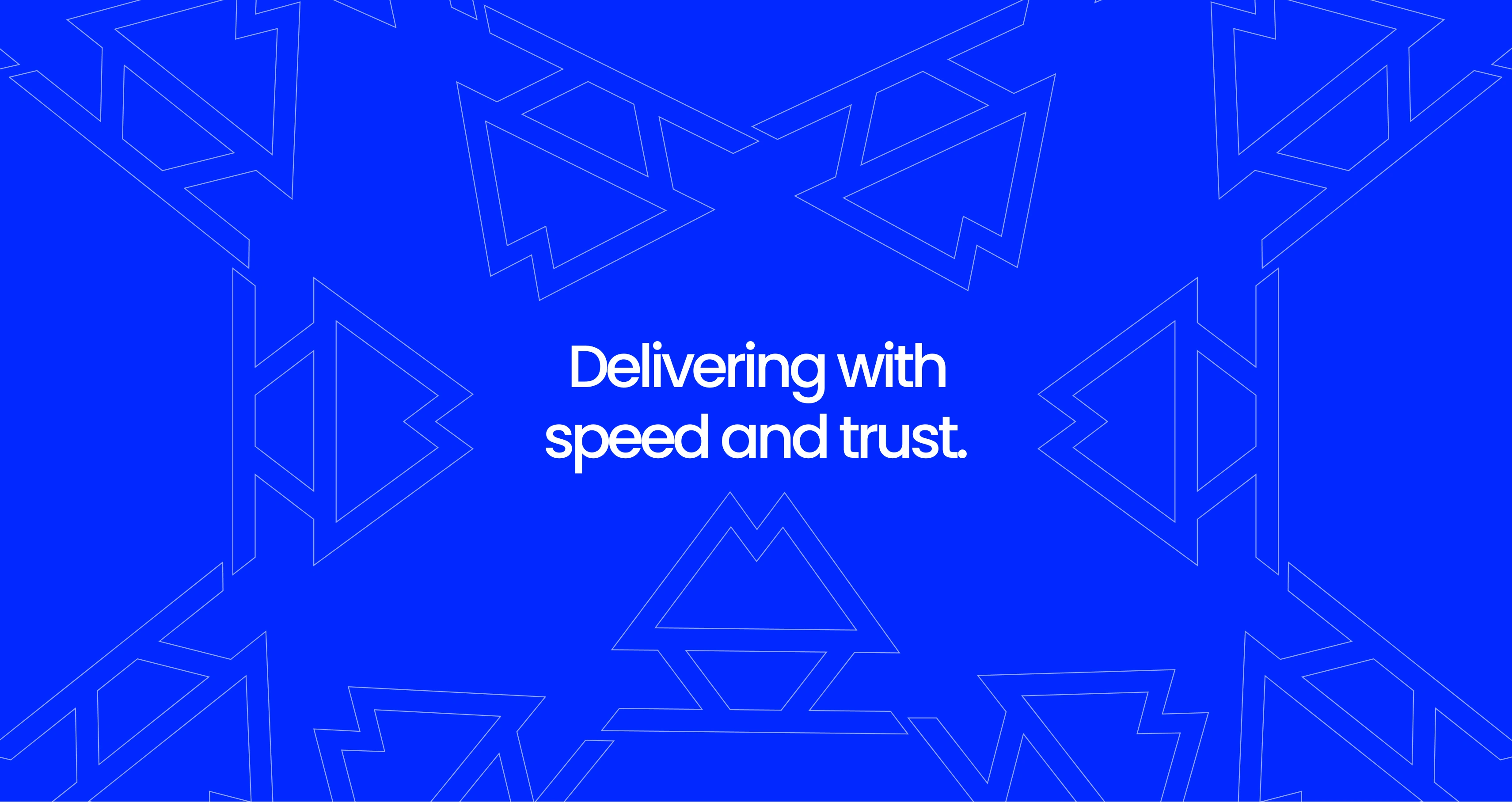
Conclusion
Kineticbolt’s identity captures the essence of movement and innovation. By combining strong symbolism with a modern visual system, the brand stands positioned as a logistics partner built for today’s fast-paced world. The design reflects a business ready to deliver with clarity, speed, and trust.

Like this project
Posted Apr 22, 2025
Modern Identity for a Fast Paced Logistics Brand in Europe. A clean, sharp, forward moving logo for a tech-powered logistics company.