SNUGG Coffee Roast -Branding and Packaging
Role Branding & Packaging
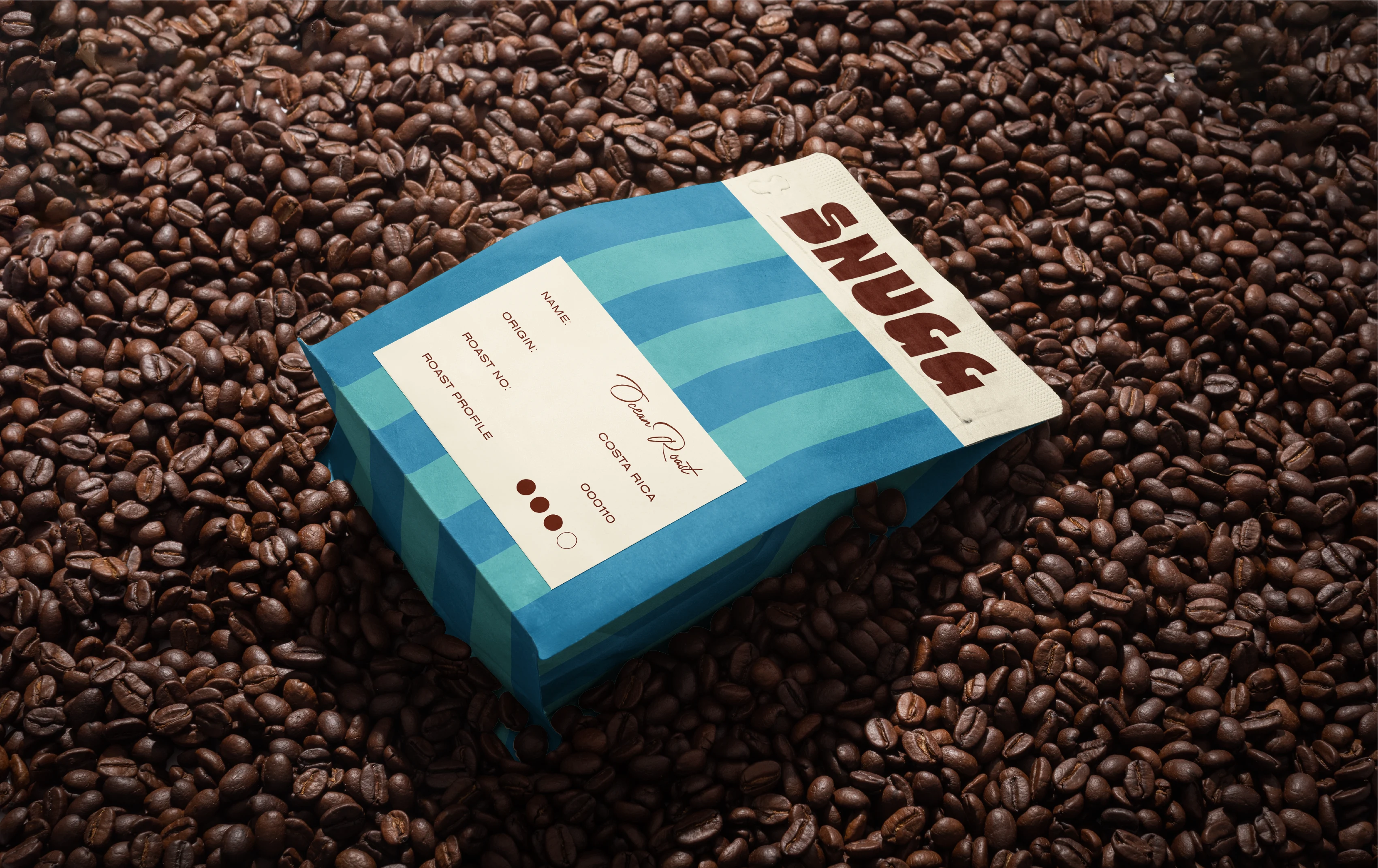
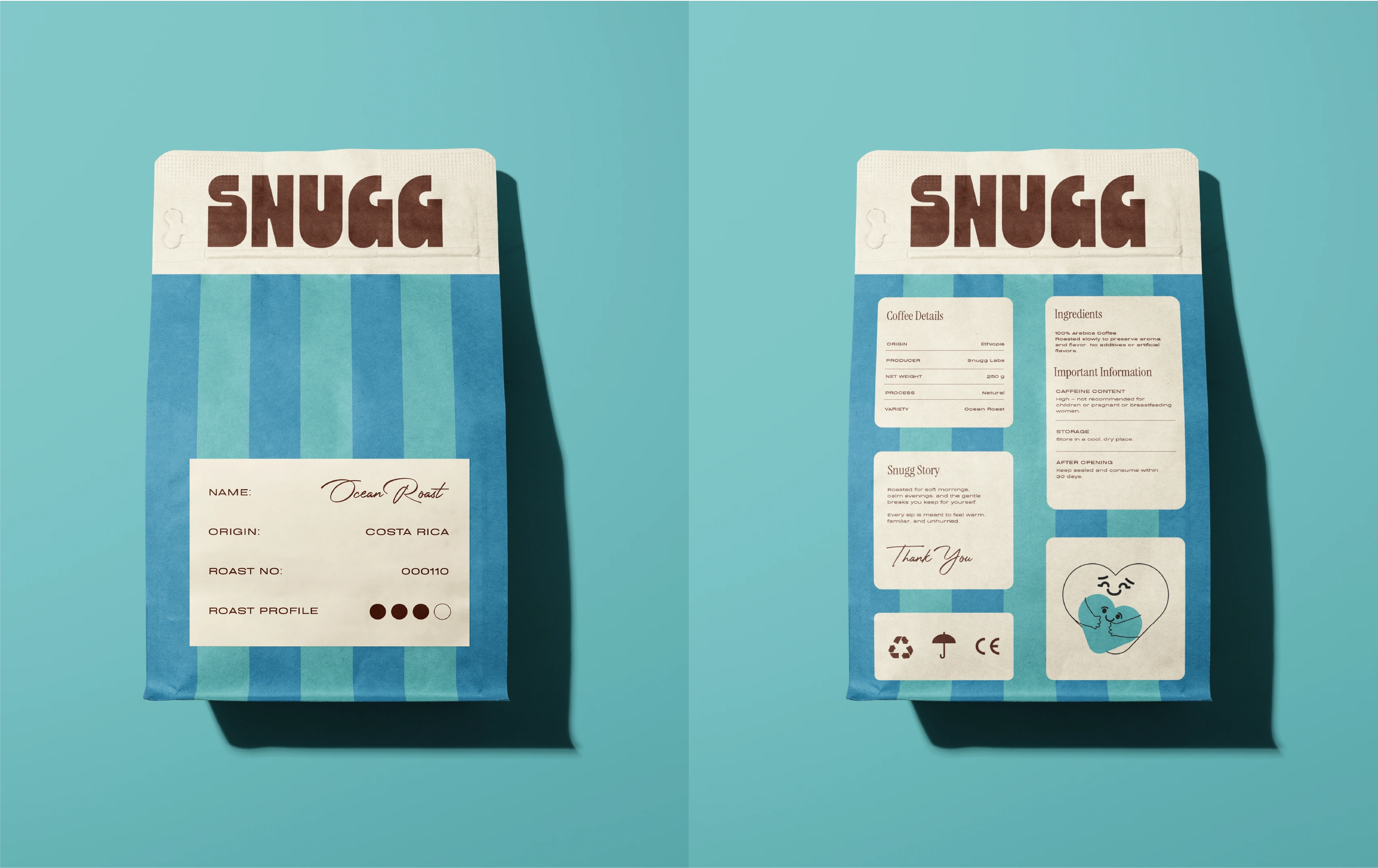
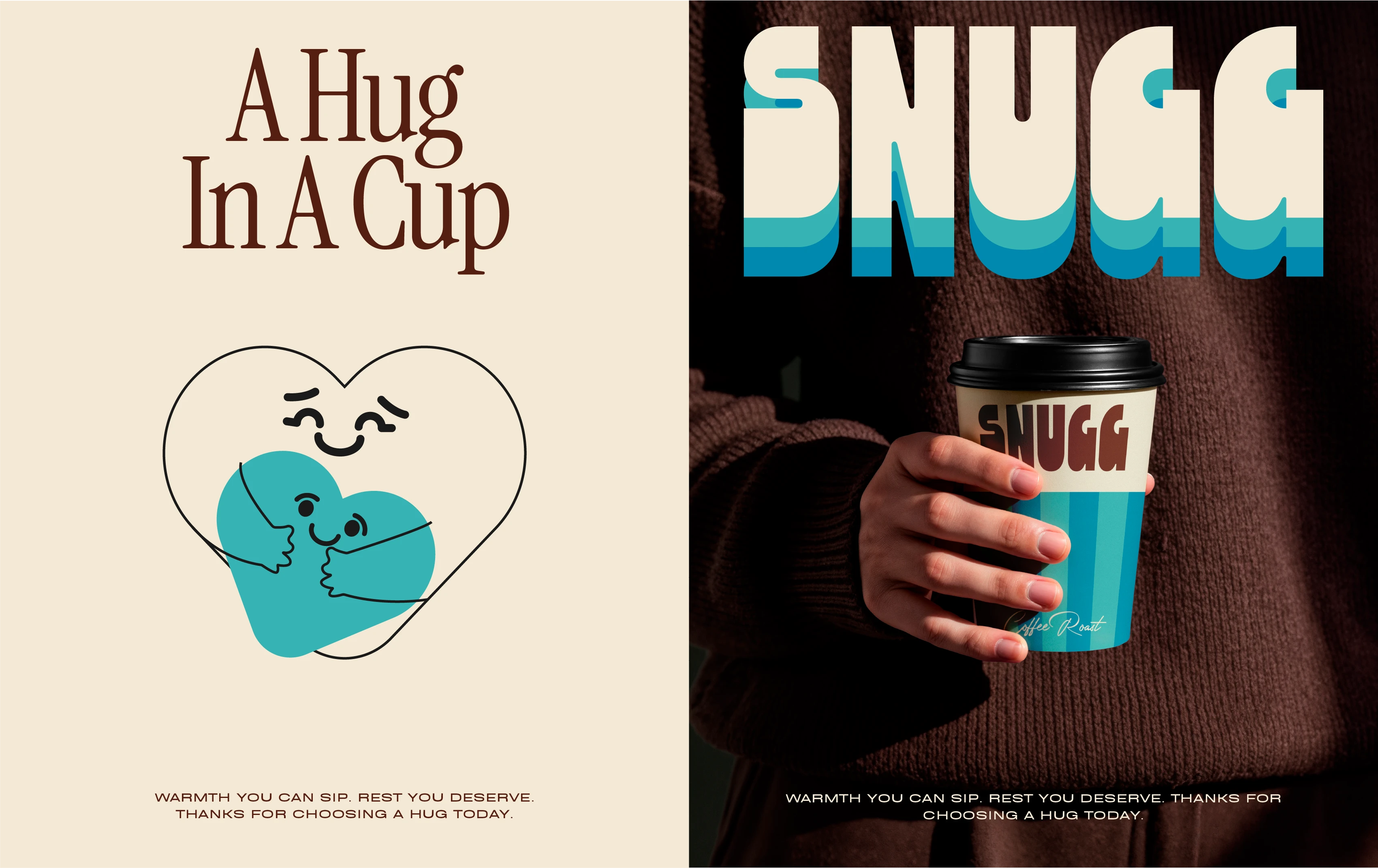
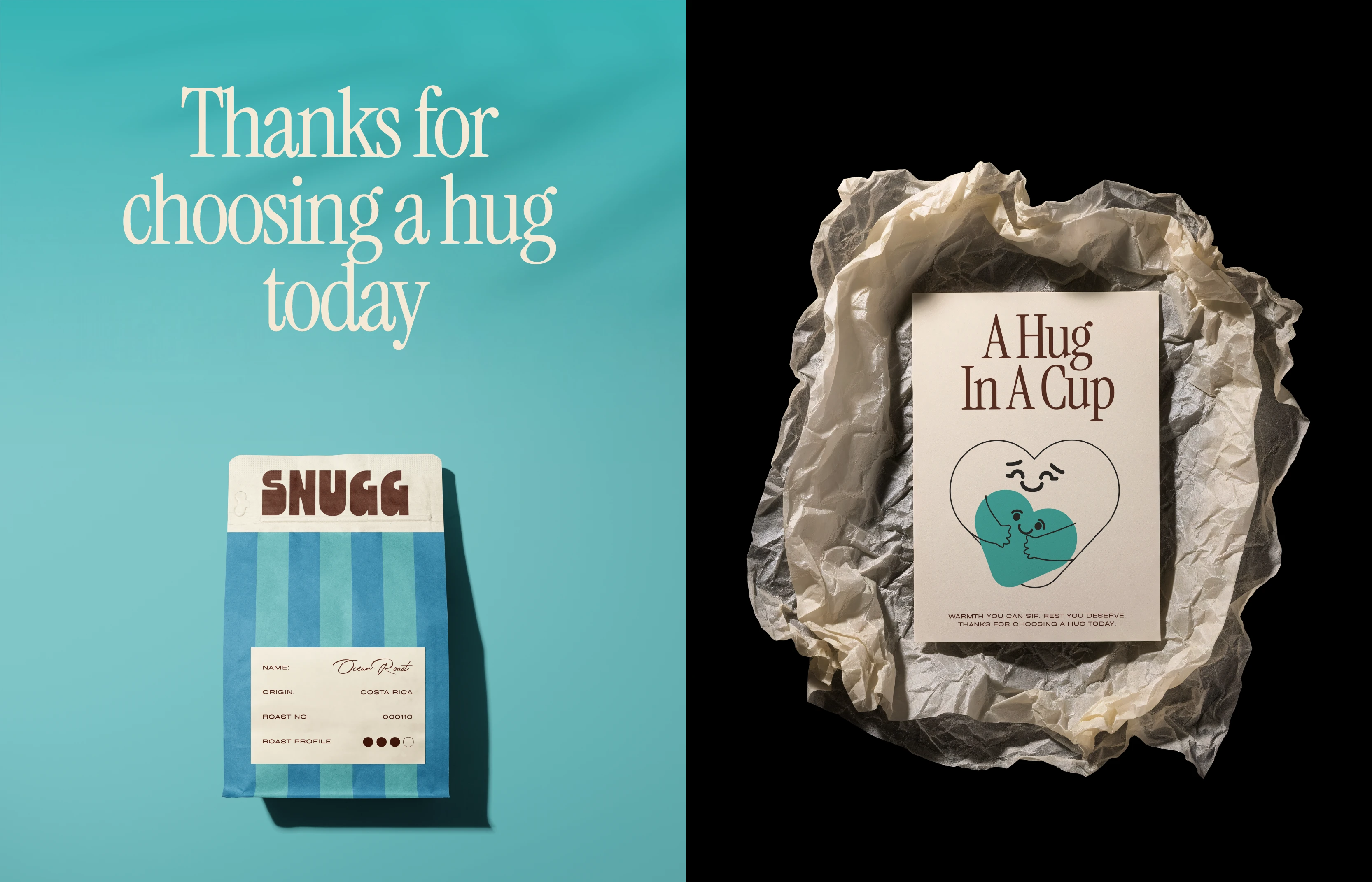
SNUGG Coffee Roast takes a gentler approach to coffee culture. Instead of the intense and energetic feeling most coffee brands project, SNUGG focuses on comfort. The brand is built around the soft moments people rarely get in a fast world.
The Challenge
The coffee market is crowded, but most brands speak the same language. Coffee packaging often focuses on intensity, performance and productivity. The emotional side of coffee is overlooked. People drink coffee not only for energy, but for comfort and calm.
The Stratagy
The goal was to build a brand that treats coffee like a comforting ritual. Warm visuals, calm pacing, soft emotional language and packaging that feels familiar.
Workflow • Visual Exploration
Workflow • Visual Exploration
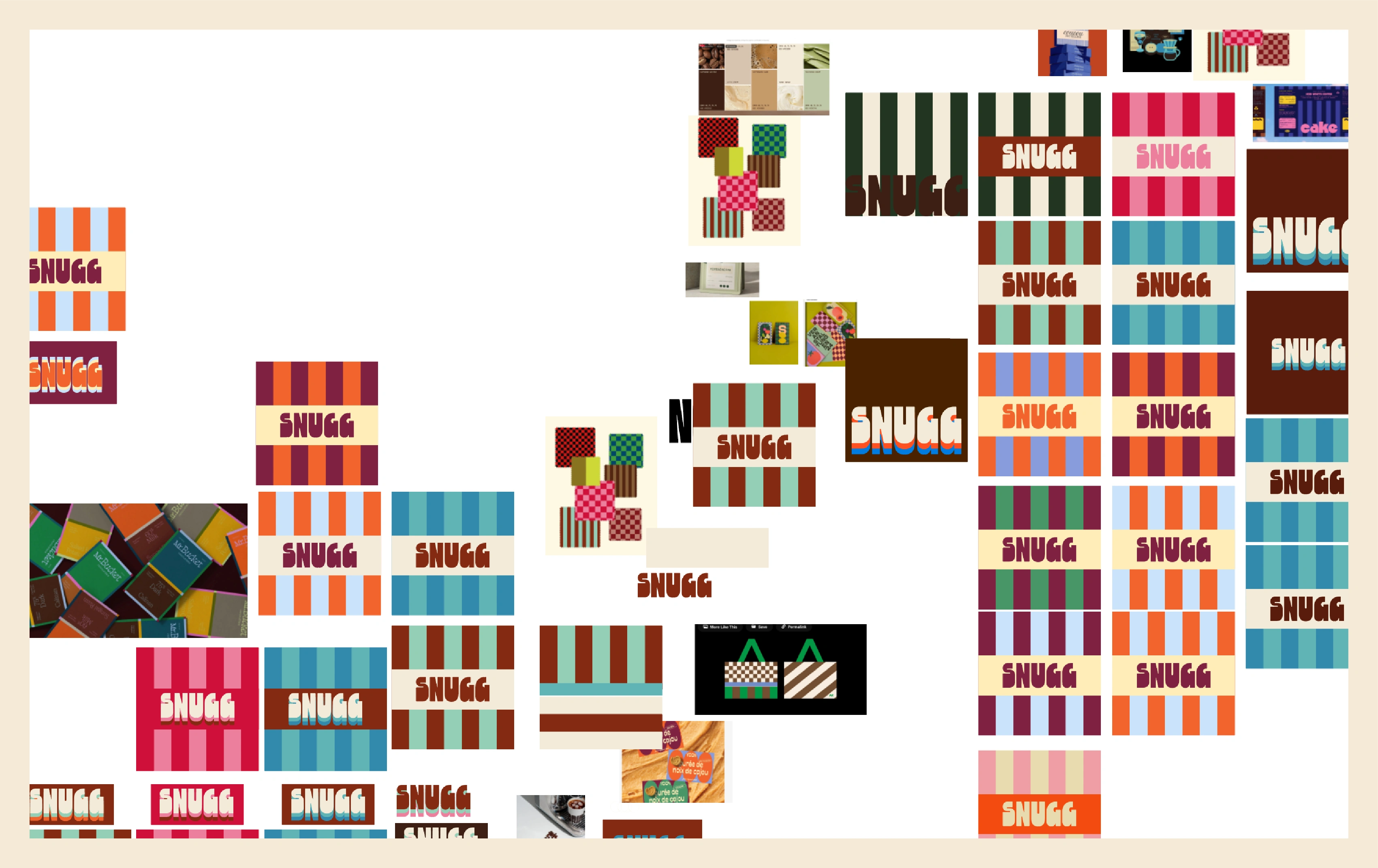
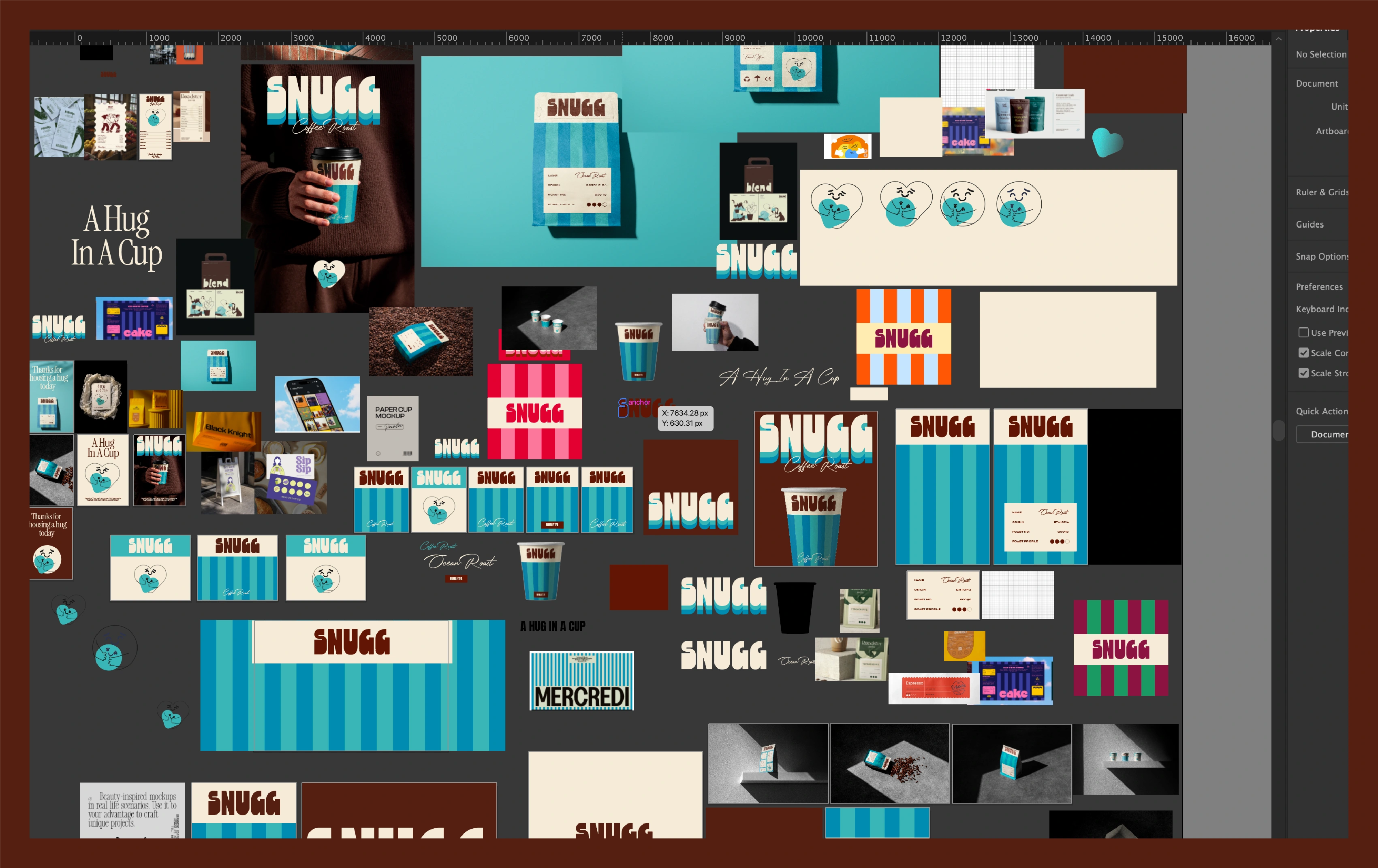
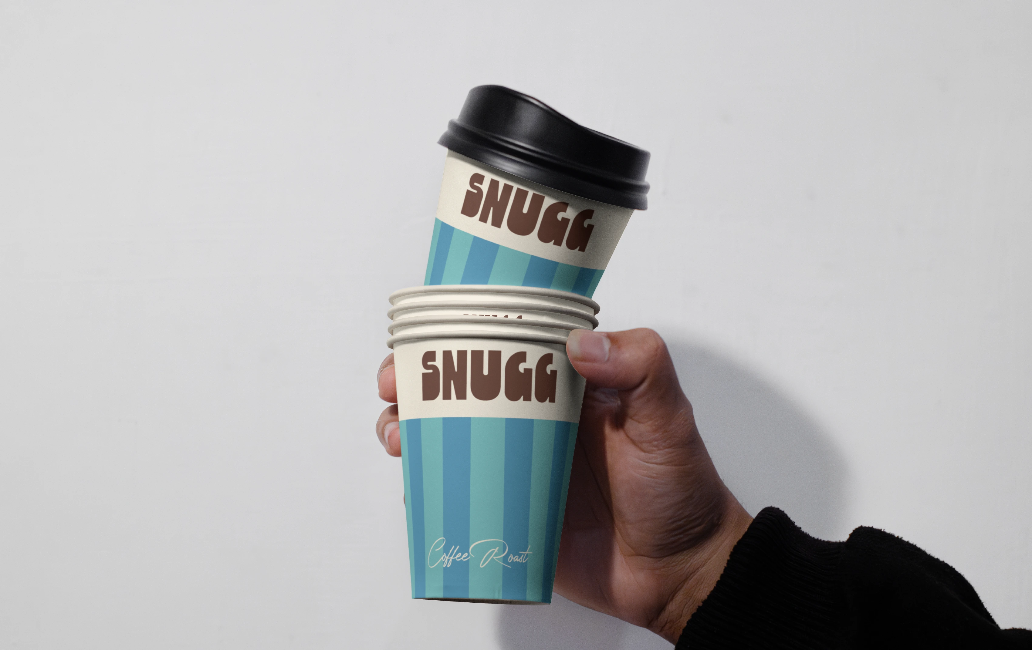
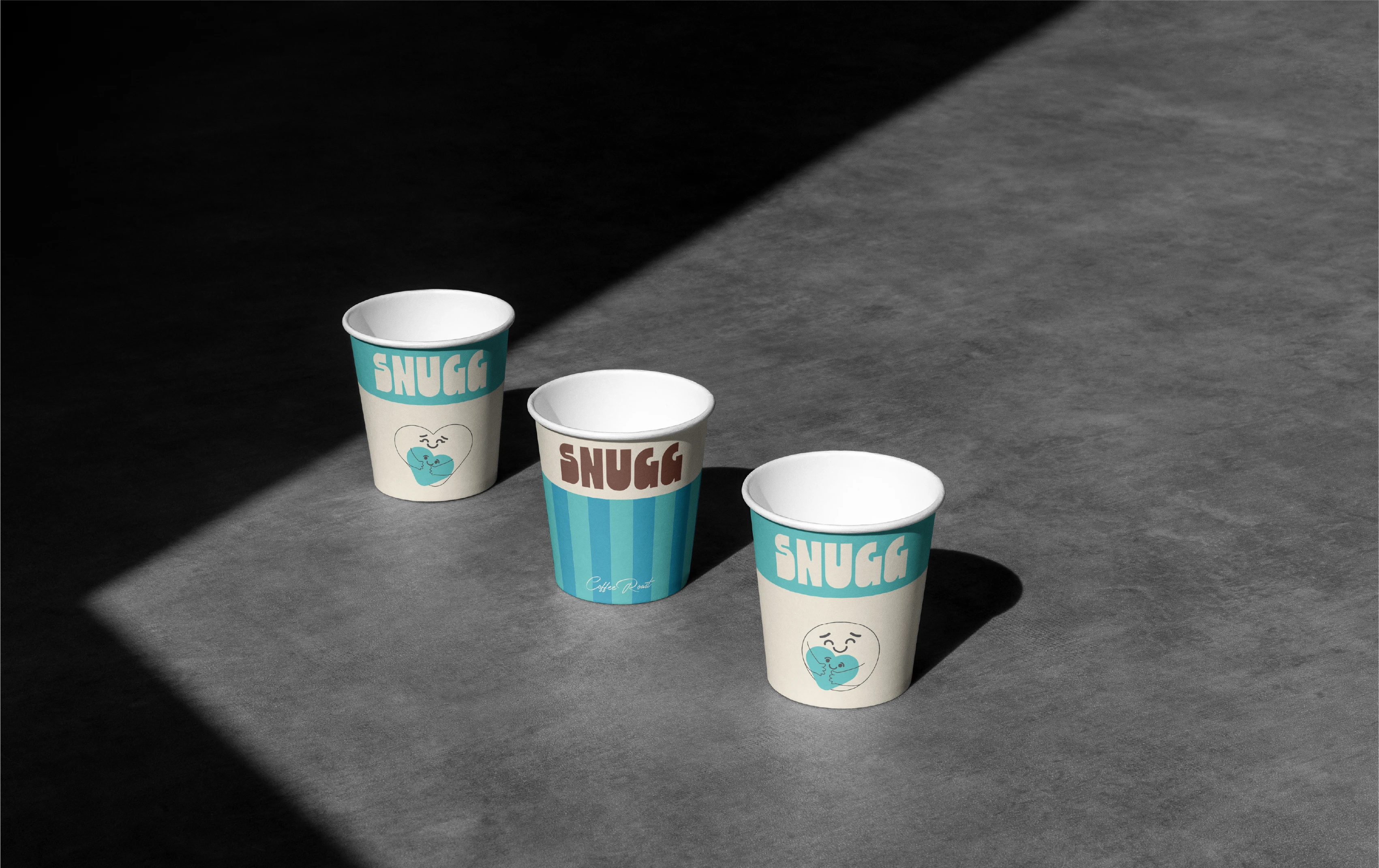
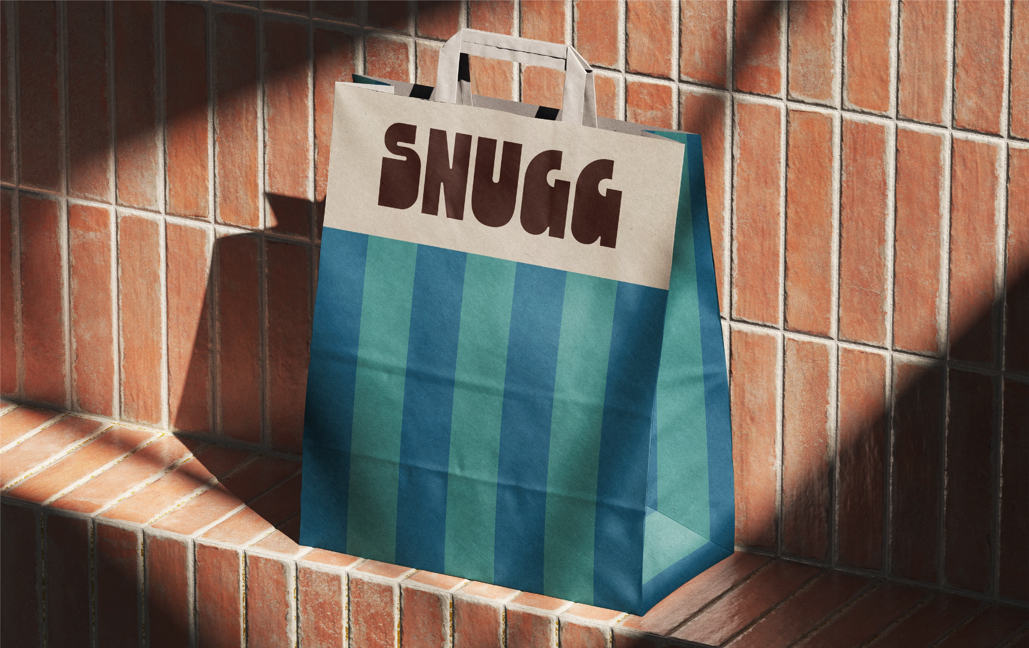
We tested many striped color palettes to find the one that truly felt comforting. Warm oranges, bold reds, chocolate browns, muted greens, and soft pastels were explored. Some looked premium but too serious. Some were playful but not calming. Some were energetic but distracted from the feeling we wanted.
Workflow • Brand Strategy
Workflow • Brand Strategy
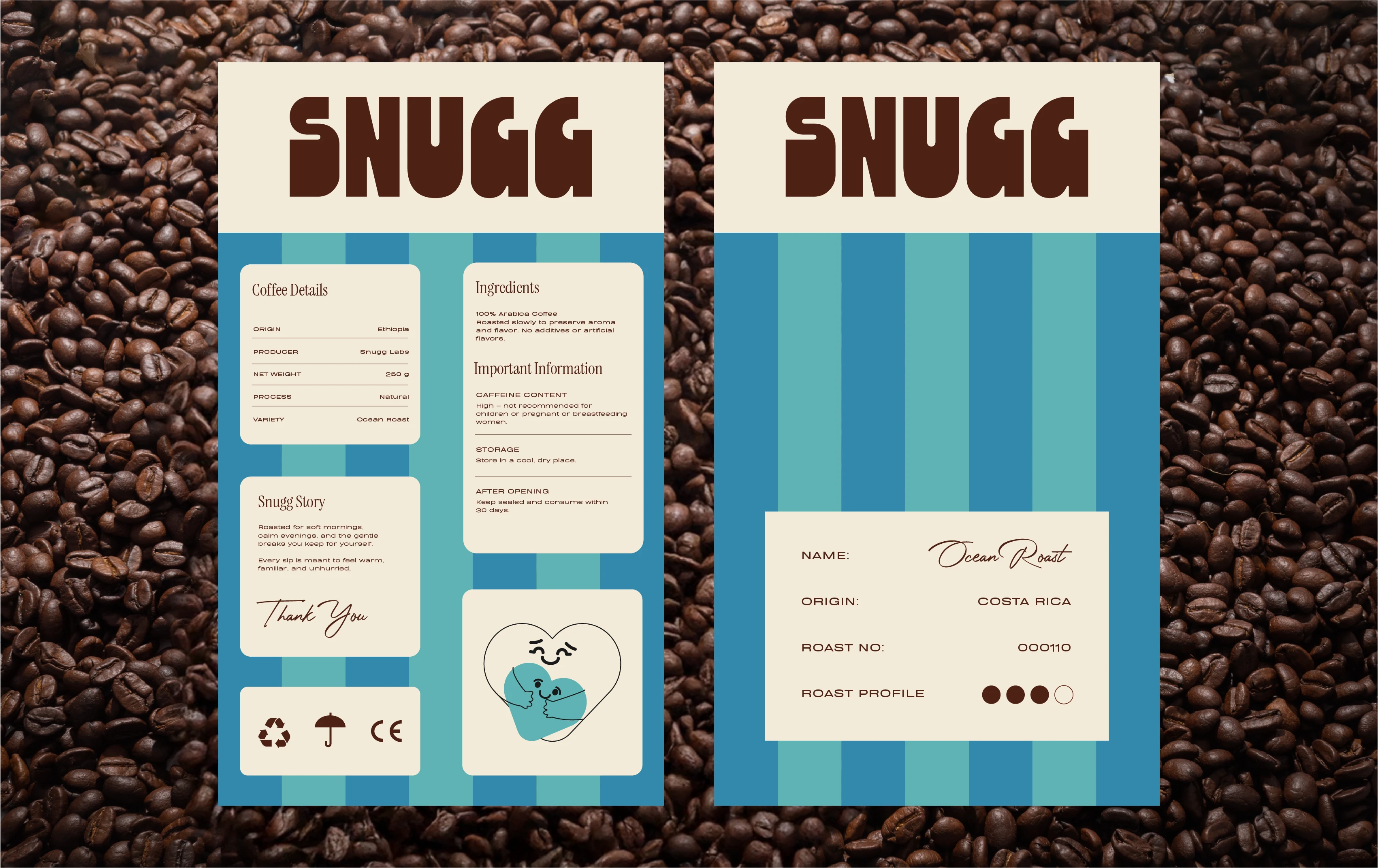
The identity did not come together in one step. We built SNUGG through constant refinement, exploring layouts, mockups, and countless stripe and color variations until the brand finally felt calm, warm and familiar.
Workflow • Illustration
The illustration was shaped around emotion, not style. We refined the hug sketch until it felt warm, gentle and reassuring without becoming childish or loud.
Design by CUBE STUDIOS®
A Visionary Creative Design Agency
Like this project
Posted Nov 24, 2025
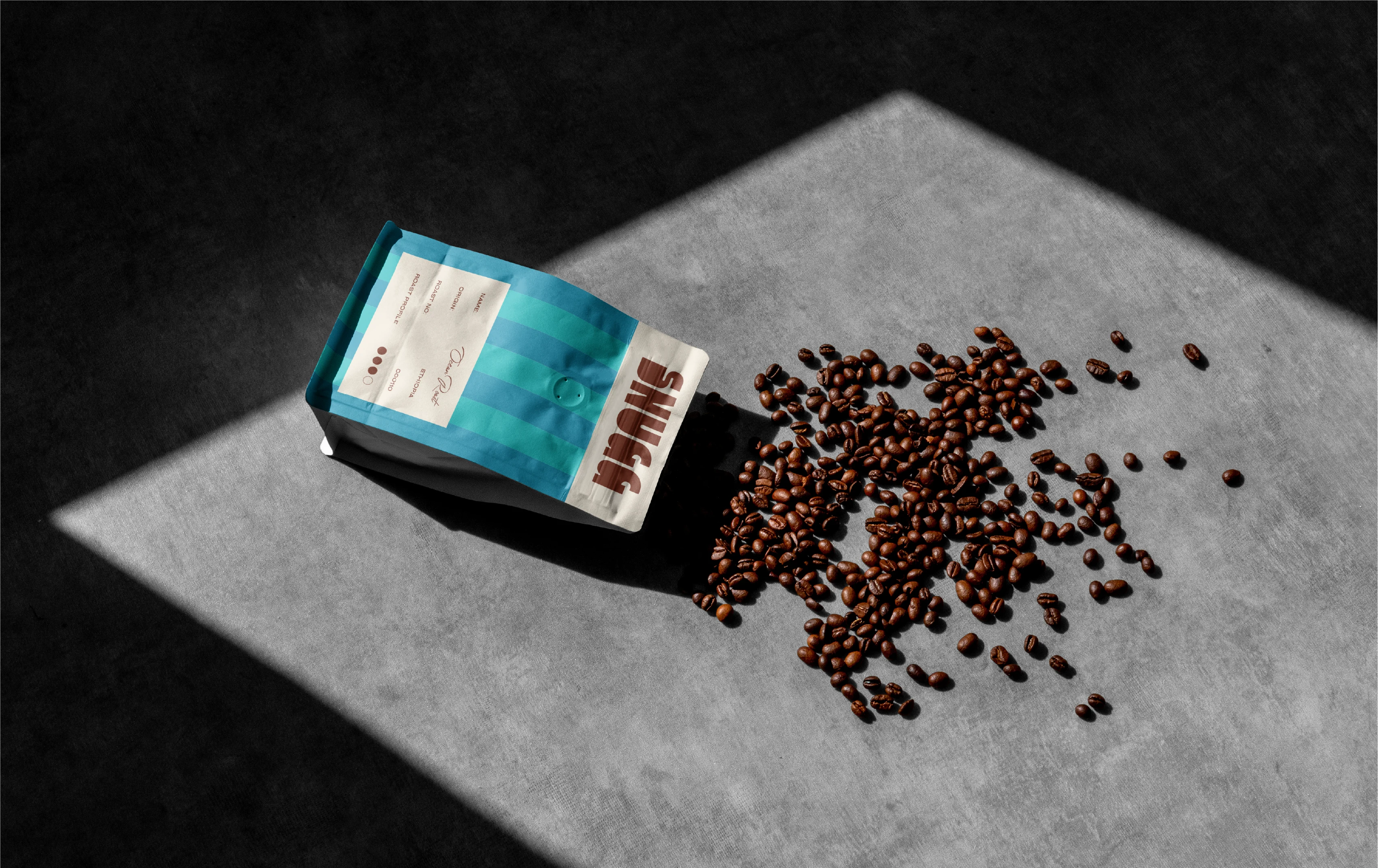
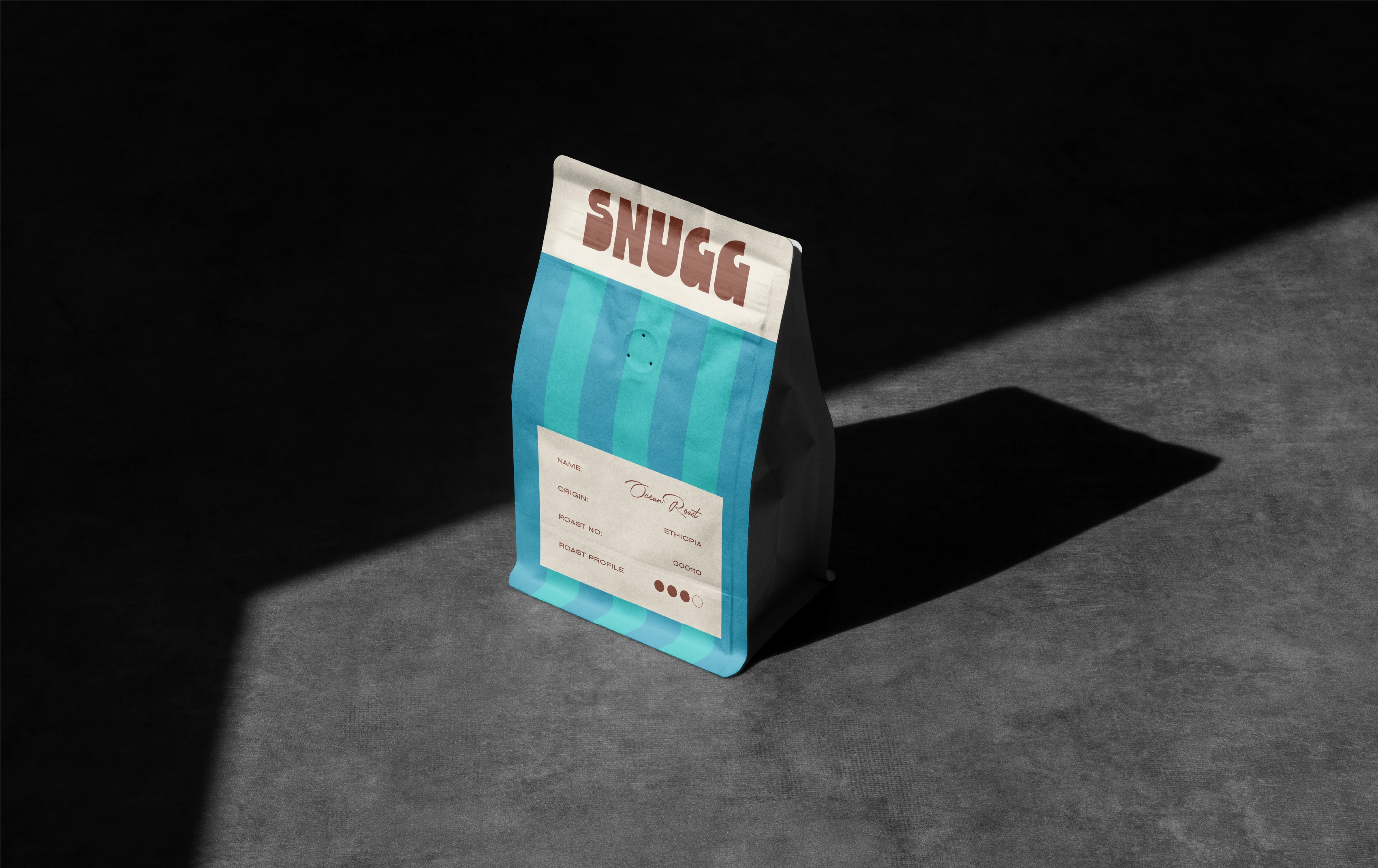
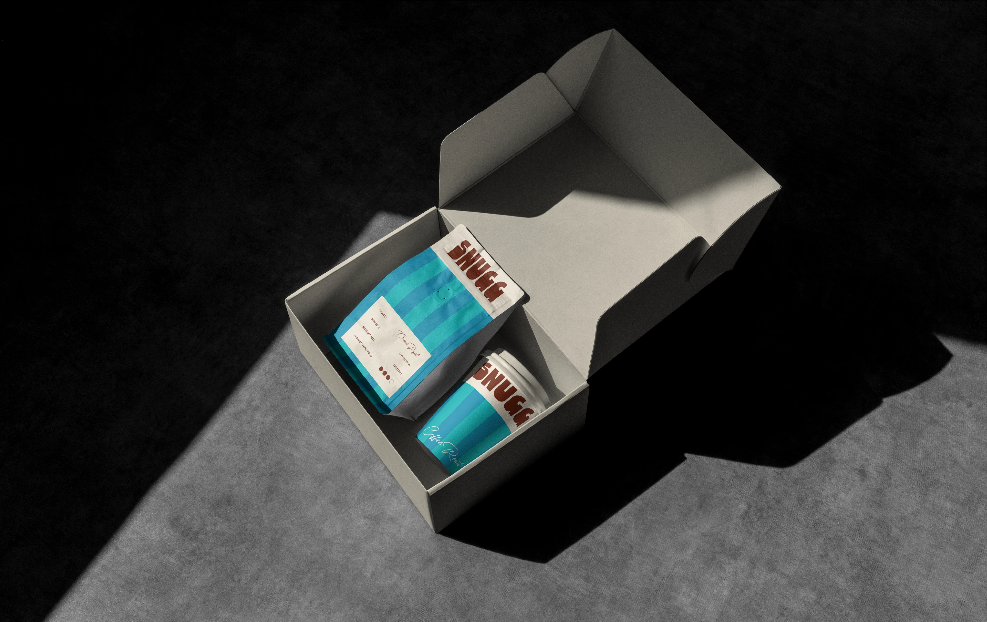
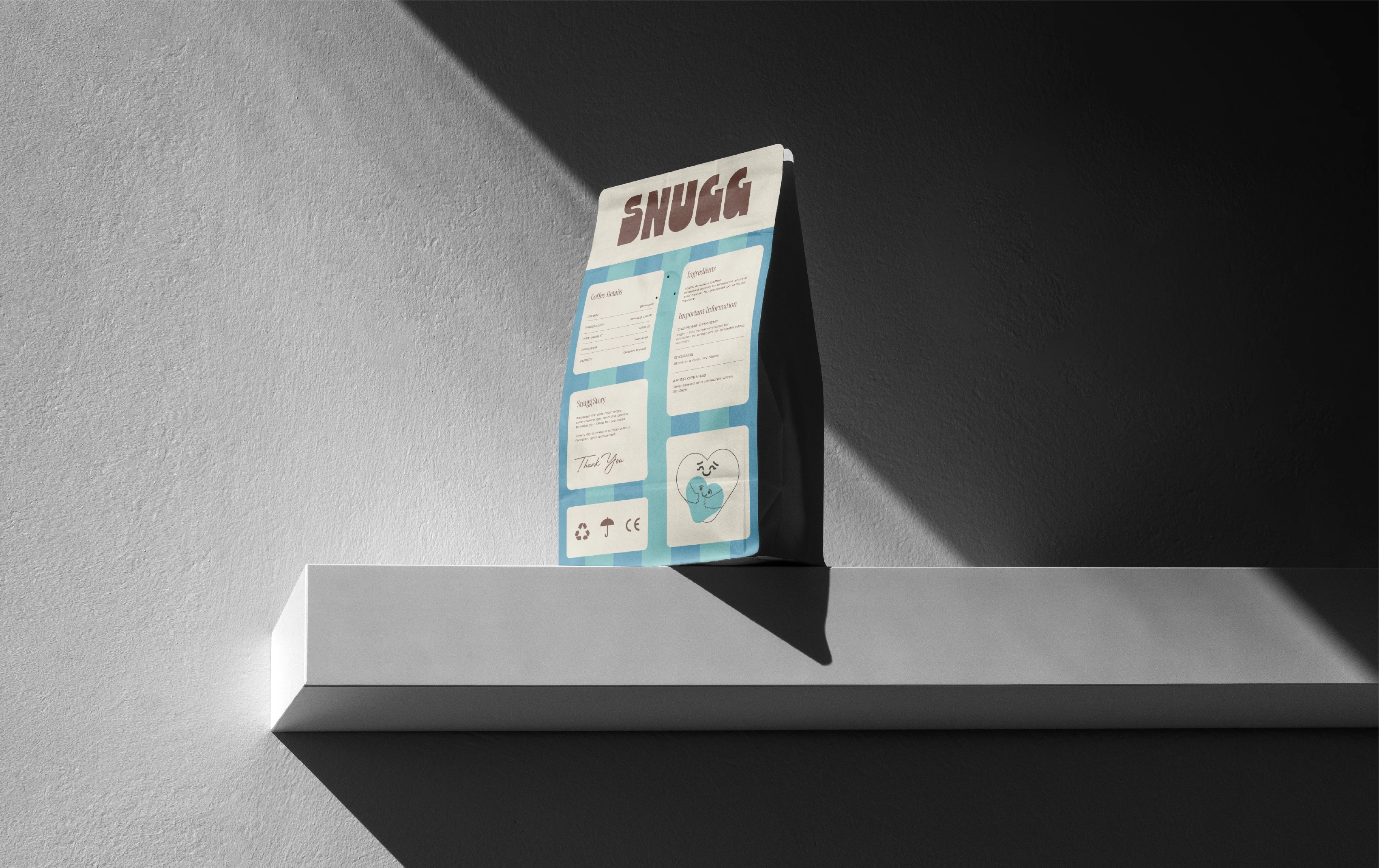
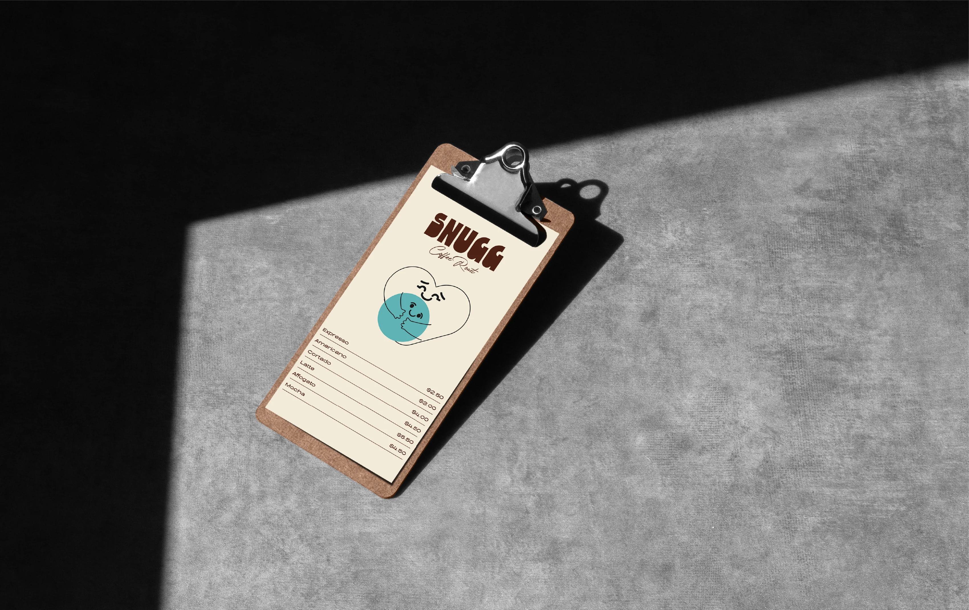
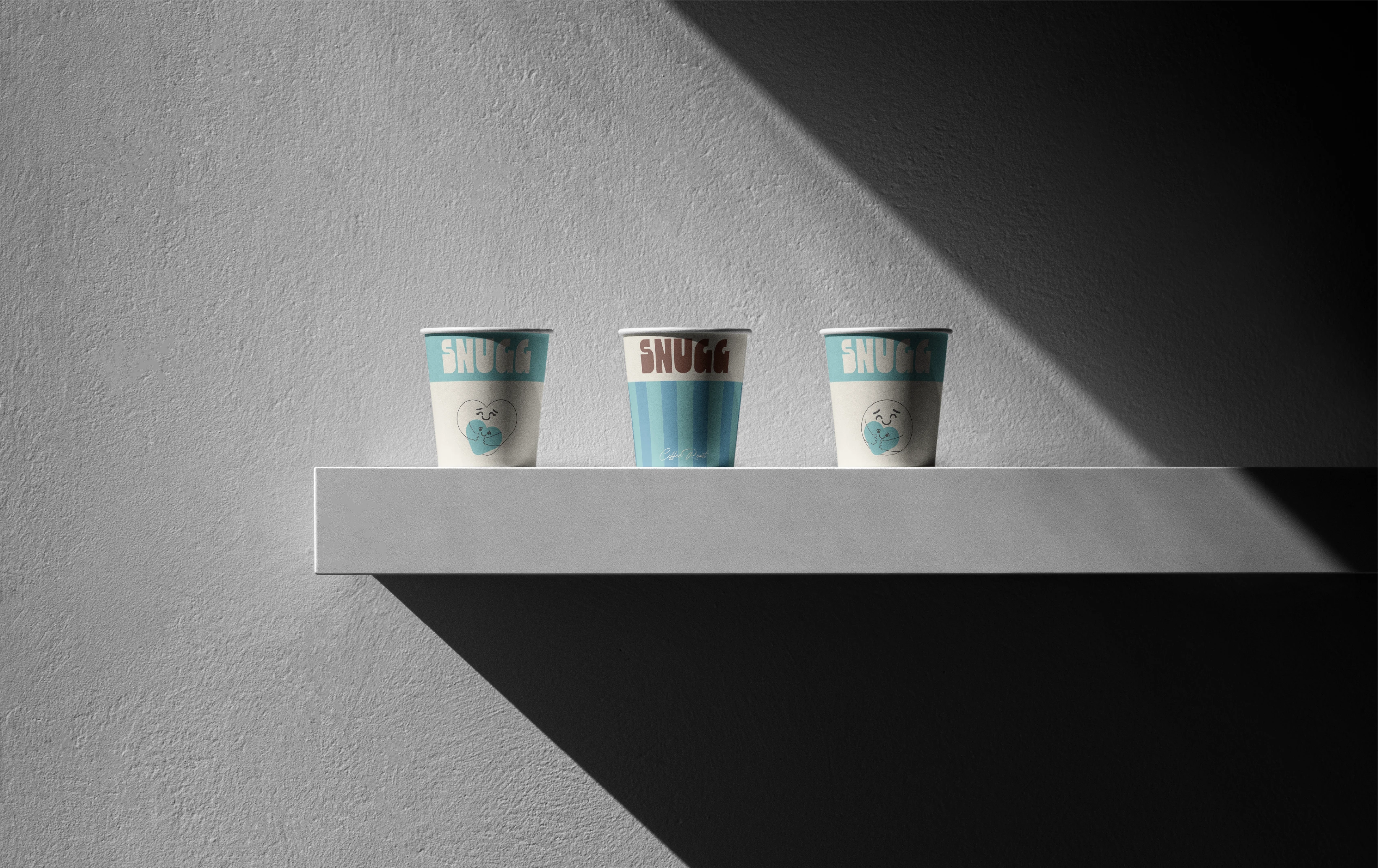
SNUGG Coffee Roast brings comfort through calm visuals, slow-morning energy, bold striped identity and a warm, thoughtful unboxing experience.

