Trifta: Gen Z resale fashion marketplace app

Hafiz Ahmad
1 collaborator


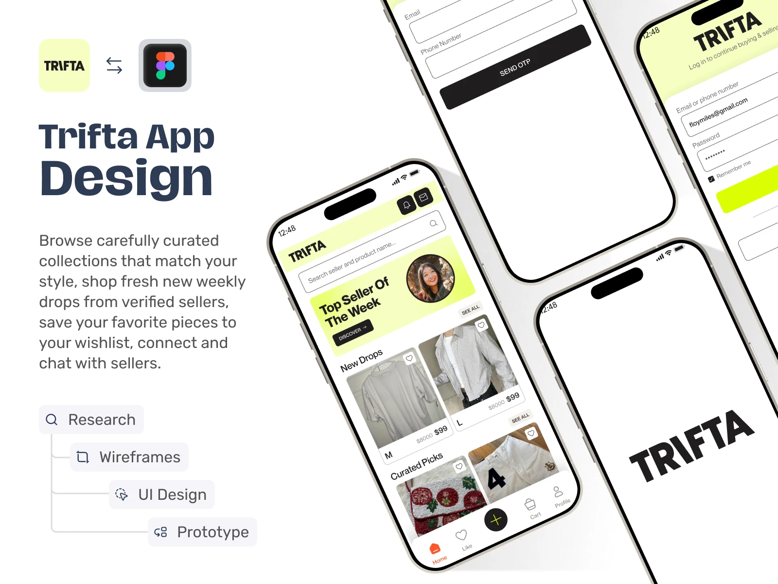
Experience Overview (Designed in Figma)
The Home and Search module of Trifta is designed to create a smooth product discovery experience for a C2C fashion marketplace. The interface focuses on visual browsing, quick access to listings, and minimal navigation friction to improve user engagement and shopping flow. Worked on it as a UI UX Designer.
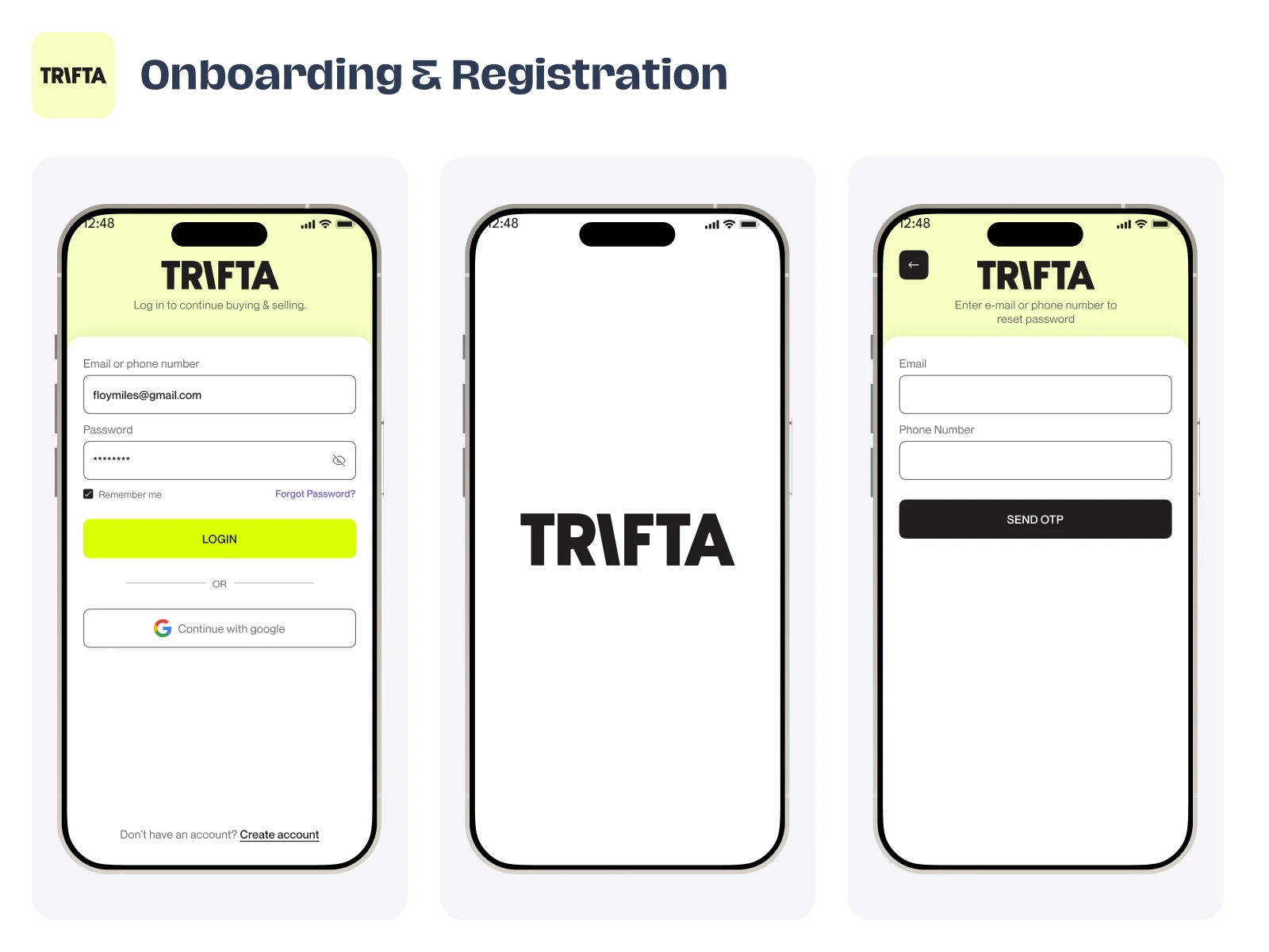
Login screens
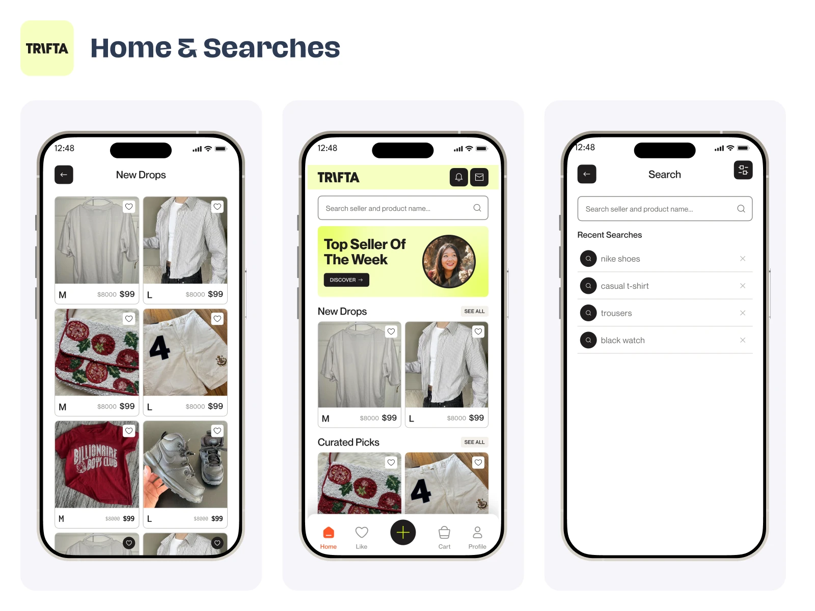
Main Home screens
Home Screen – Product Discovery
The Home screen is structured to highlight featured sellers, new drops, and curated collections. A clean grid layout, strong visual hierarchy, and clear pricing help users scan products quickly and make faster decisions. The mobile app design prioritizes visual content to enhance browsing behavior and increase interaction.
Information Hierarchy & Layout
The interface uses balanced spacing, card-based components, and consistent typography to maintain clarity across the screen. Section separation, such as “Top Seller”, “New Drops”, and curated categories, improves content organization and reduces cognitive load.
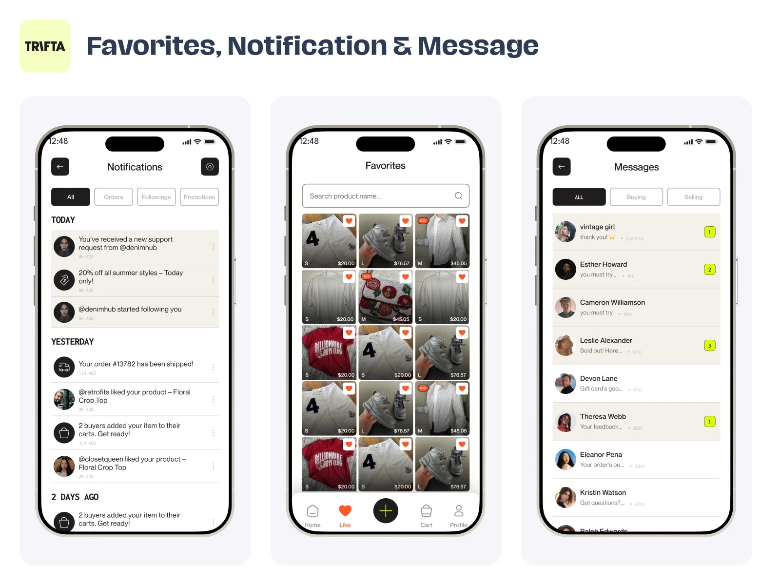
Favorites and messaging screens
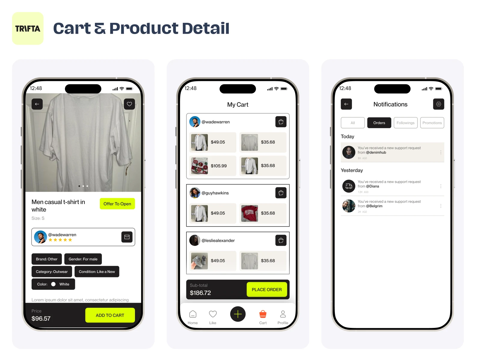
Product detail, Notifications flow
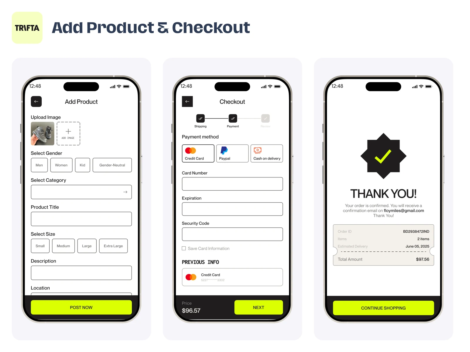
Add to cart, Payment flow
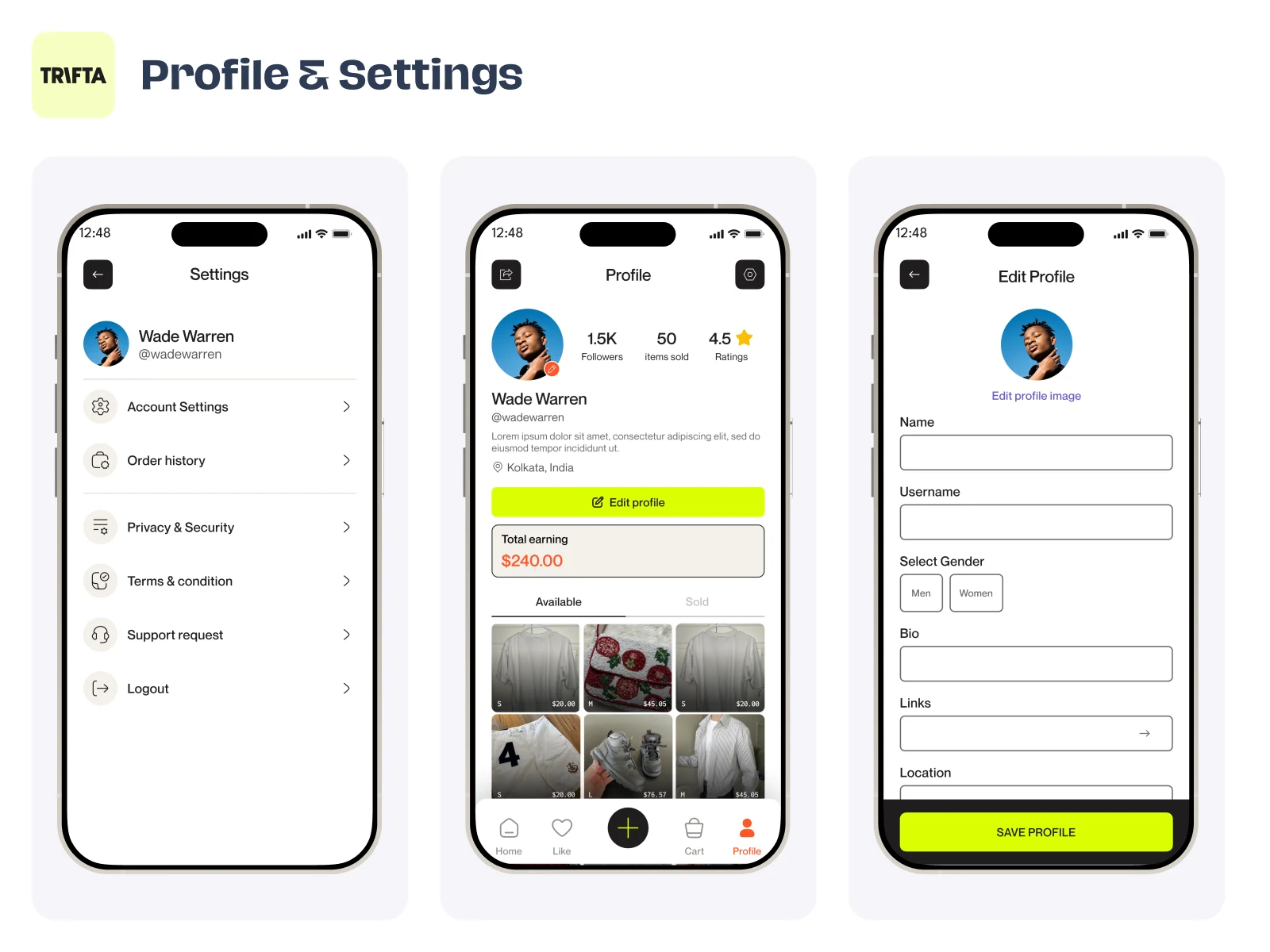
Profile and setting screens
Interaction & Usability
The bottom navigation provides quick access to key actions, including adding new listings and managing account activity. The overall interaction design focuses on intuitive navigation, smooth user flow, and a scalable mobile UI system.
CTA
If you're building a SaaS product or mobile app and need clean, scalable UX/UI, feel free to send an invite — I'd be happy to discuss your project.

Profile overview
Like this project
Posted Mar 23, 2026
Browse carefully curated collections that match your style, shop fresh new weekly drops from verified sellers, connect, and chat with sellers.
Likes
5
Views
35
Collaborators