cCarbon Website Redesign
Rodrigo Bondioli
cCarbon is a specialized firm in environmental commodities and climate finance analytics. Despite the high-level data and insights they provide, their old website felt outdated, text-heavy, and visually uninviting — more of a barrier than a gateway. The mission was to digitally reposition cCarbon as a modern, trusted, and forward-thinking leader in its niche.
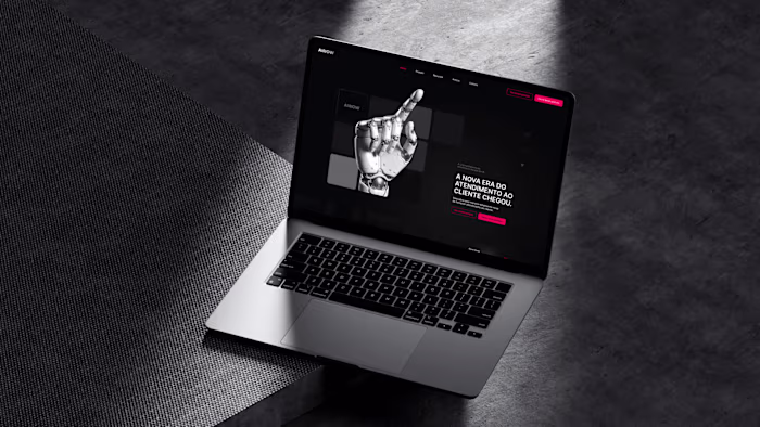
Site V1
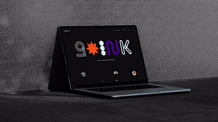
Site V2
THE CHALLENGE
The core challenge was to design a site that balances dense, technical content with a fresh, engaging, and elegant visual approach. Most competitors in this space fall into the trap of corporate blandness — long pages, no visual hierarchy, and zero appeal. My goal was to make content consumption feel intuitive and even enjoyable.
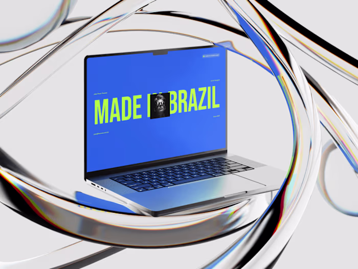
Site V1
THE SOLUTION
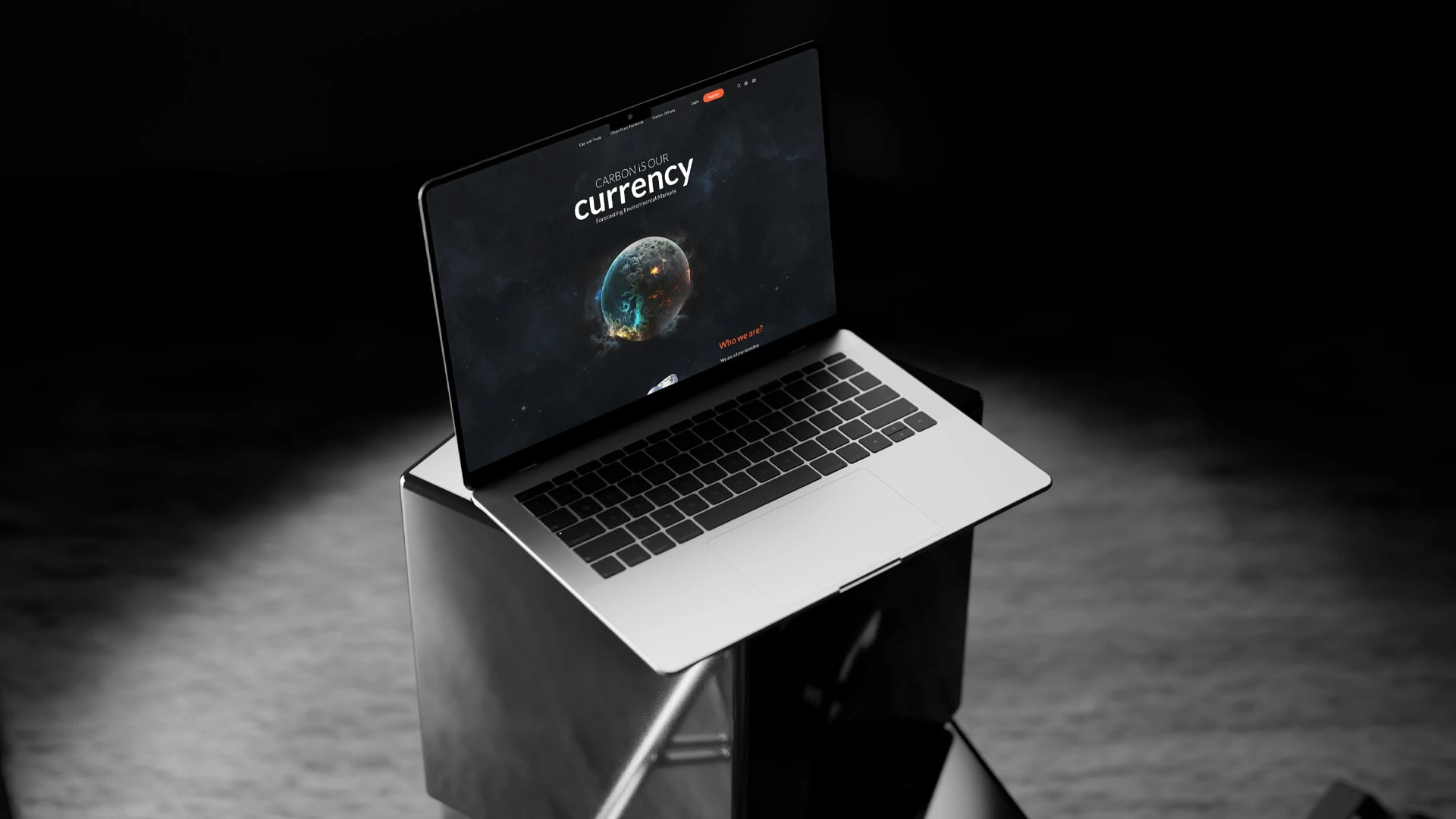
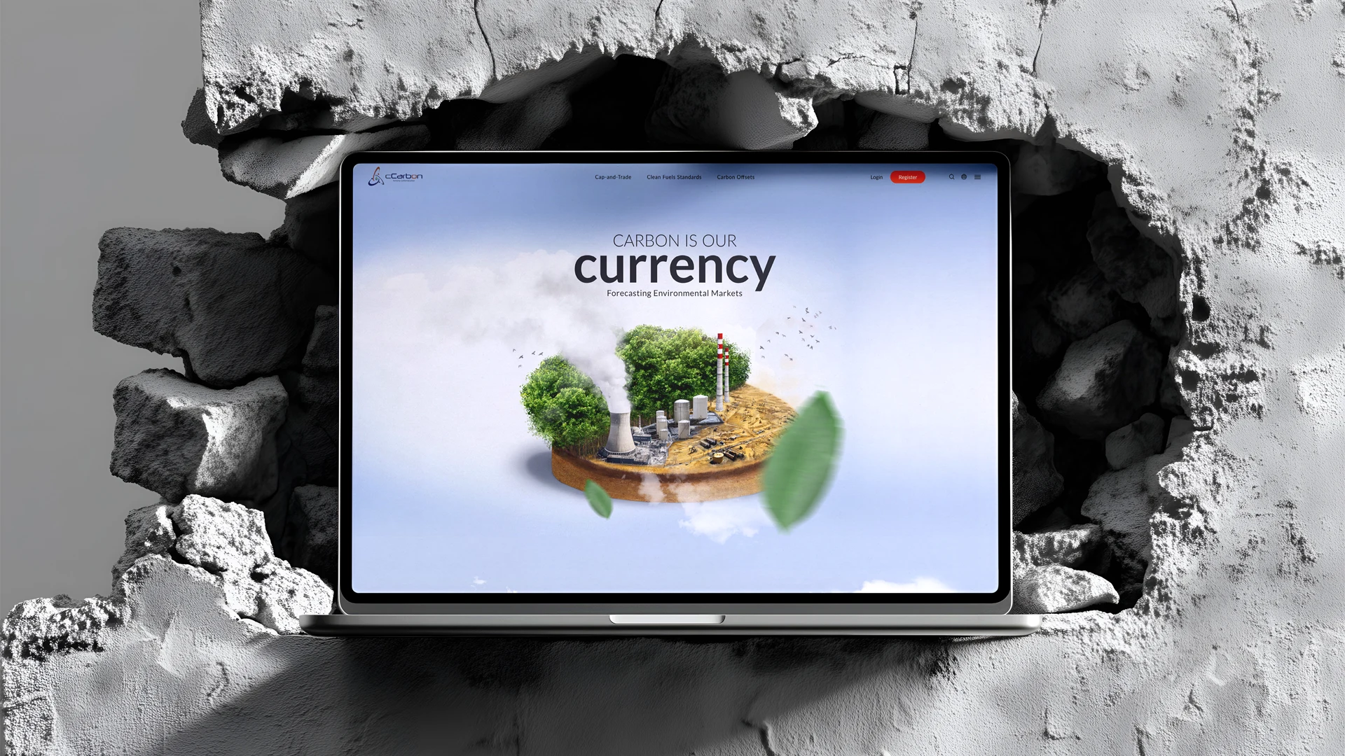
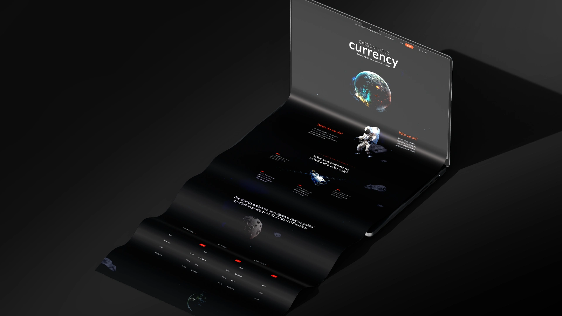
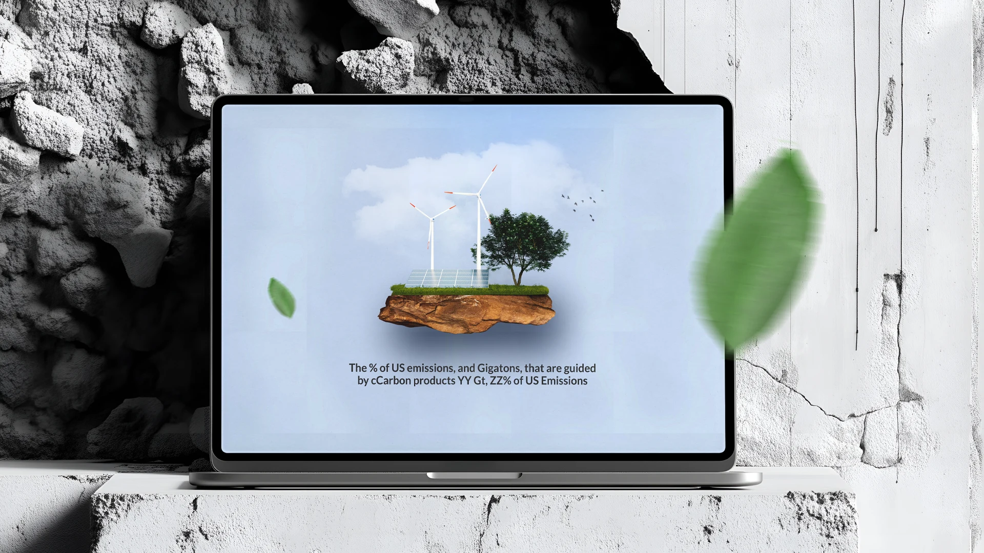
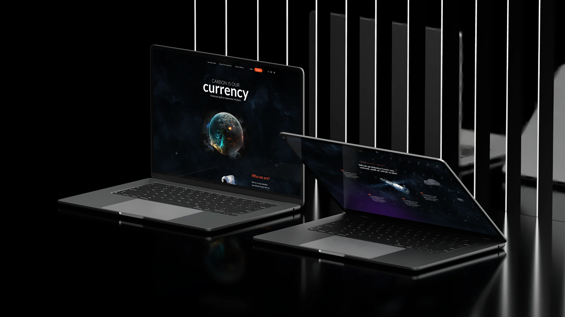
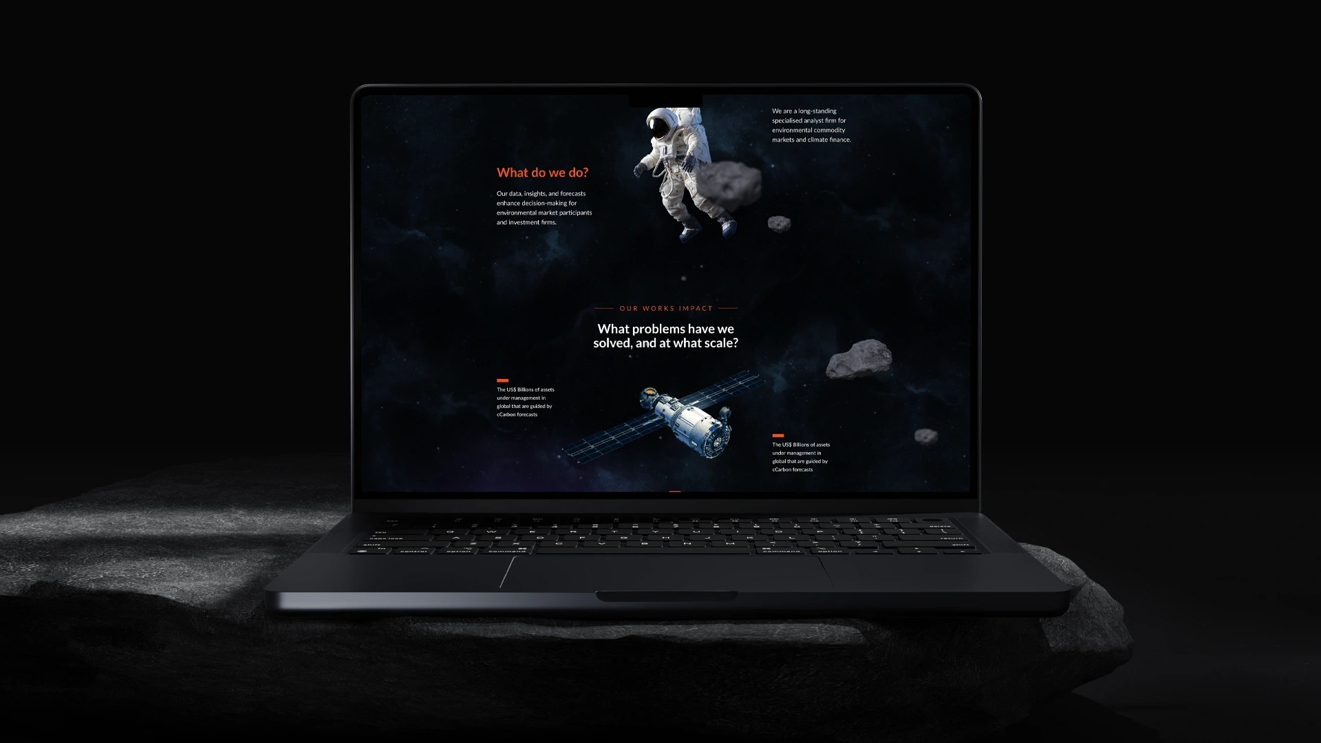
I developed two distinct visual directions — both built around the same principle: turning technical content into something intuitive, attractive, and premium. The first version embraces a clean, airy aesthetic with 3D natural elements to convey sustainability, clarity, and renewal. It’s ideal for audiences seeking transparency, accessibility, and environmental alignment. The second version is dark, bold, and space-themed — using visual metaphor to position cCarbon as a company that sees beyond the noise. A firm that navigates complexity like a satellite through data galaxies. This direction reinforces intellectual strength, innovation, and future-readiness.
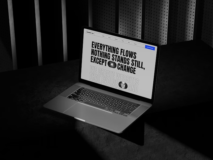
Site V2
Site V2
Thank you for visiting. Let’s create something amazing together.
Portfolio - https://rodrigobondioli.com
Like this project
Posted Nov 6, 2025
Redesigned cCarbon's website with two visual directions to enhance engagement and modernize their digital presence.
Likes
0
Views
5