
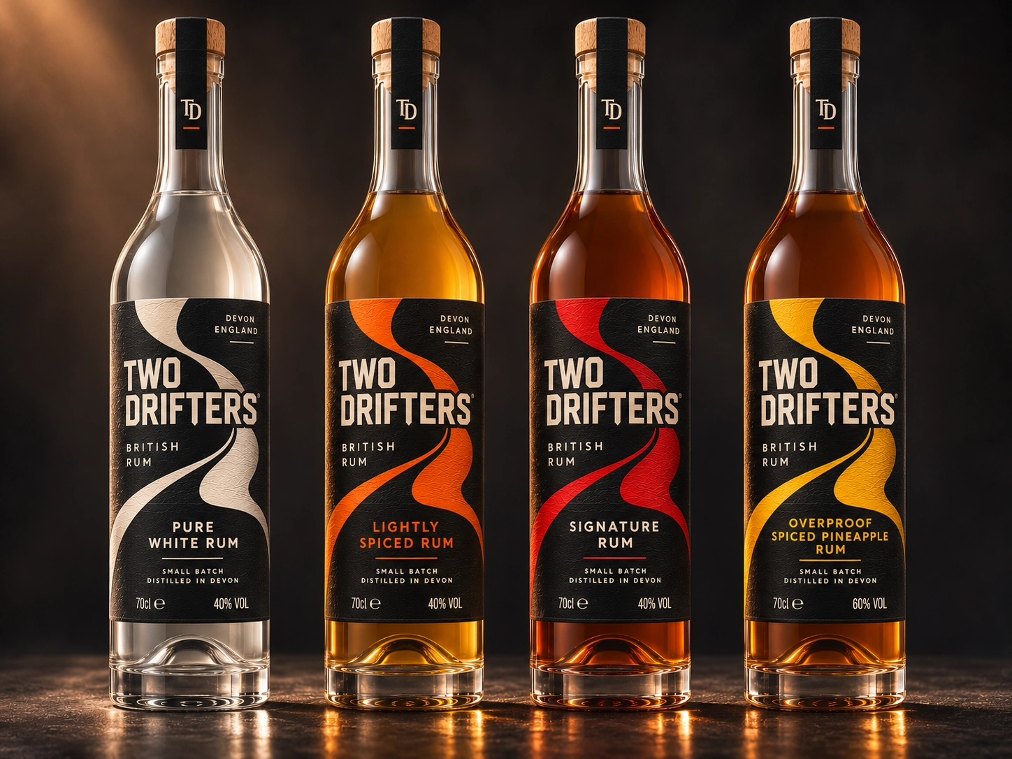
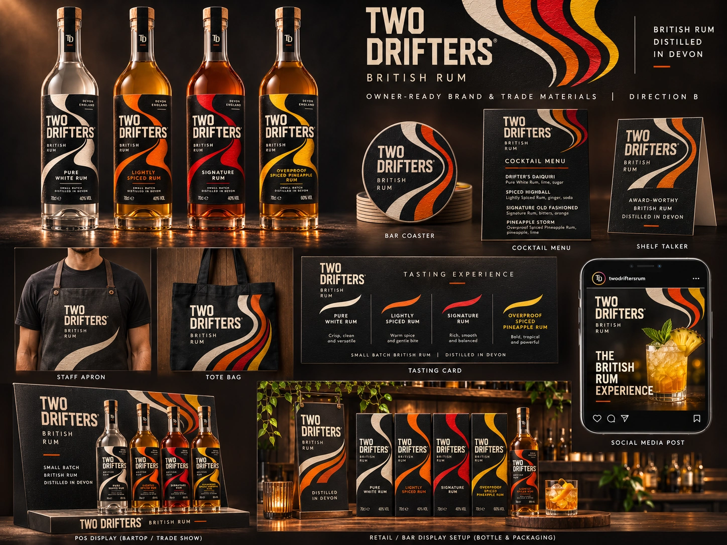
Picture a back bar anywhere in the UK. Forty bottles fighting for the eye, and four black labels with one bold ribbon of colour that a customer spots from across the room. That is the moment this rebrand is built for.
Two Drifters is a real family distillery making small batch British rum in Devon, England. Their rum is the real thing. We took their existing range and imagined what it could look like as a brand that wins the shelf.
The idea is one sweeping ribbon that drifts across every label, the way two drifters find their road. Each expression gets its own colour: cream for Pure White, orange for Lightly Spiced, red for Signature, gold for Overproof Spiced Pineapple. Same family, instantly told apart.
What the rebrand covers
The four-bottle range on a textured charcoal label with a cork closure and TD neck strip
Single-bottle gift box, four-bottle gift collection and a miniature tasting set
Branded shipping carton
Bar and trade kit: coasters, cocktail menu, shelf talker, tasting card, POS display and retail setup
Staff apron, tote bag and social media posts
The goal is simple. More hands reaching for the bottle in the shop, more bartenders pouring it, and a gift box people are proud to give.
This is an independent concept by VSN. It is not commissioned by or affiliated with Two Drifters Distillery, and their name and products belong to them.
Want your brand to win the shelf like this? Message us here on Contra.
0 likes · 0 views · Nov 17, 2026
Unofficial rebrand concept for a Devon rum distillery: four-bottle range, gift packs, bar and trade kit. Built to win the shelf.

