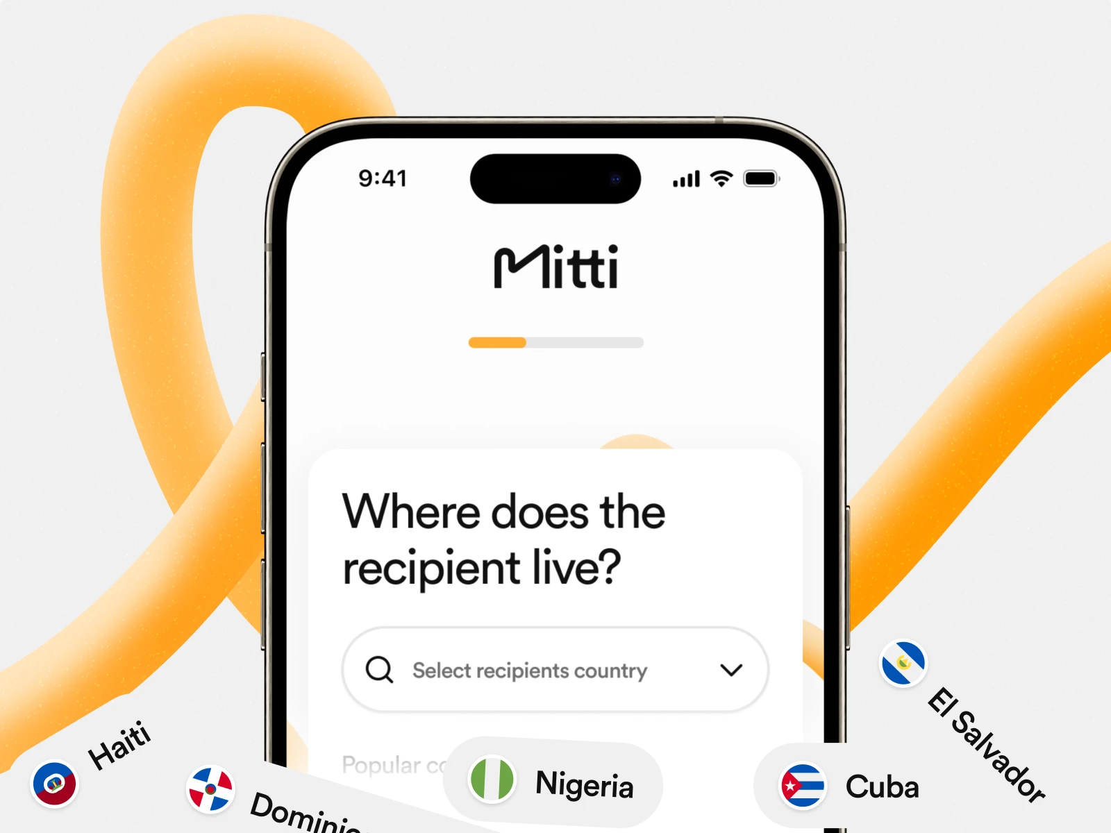
Mitti | A fast, secure, and global mobile top-up platform
Thomas Oldenburger
Mobile top-up platform enabling fast, secure, and seamless phone recharges worldwide.
Approach
Discovery & Research
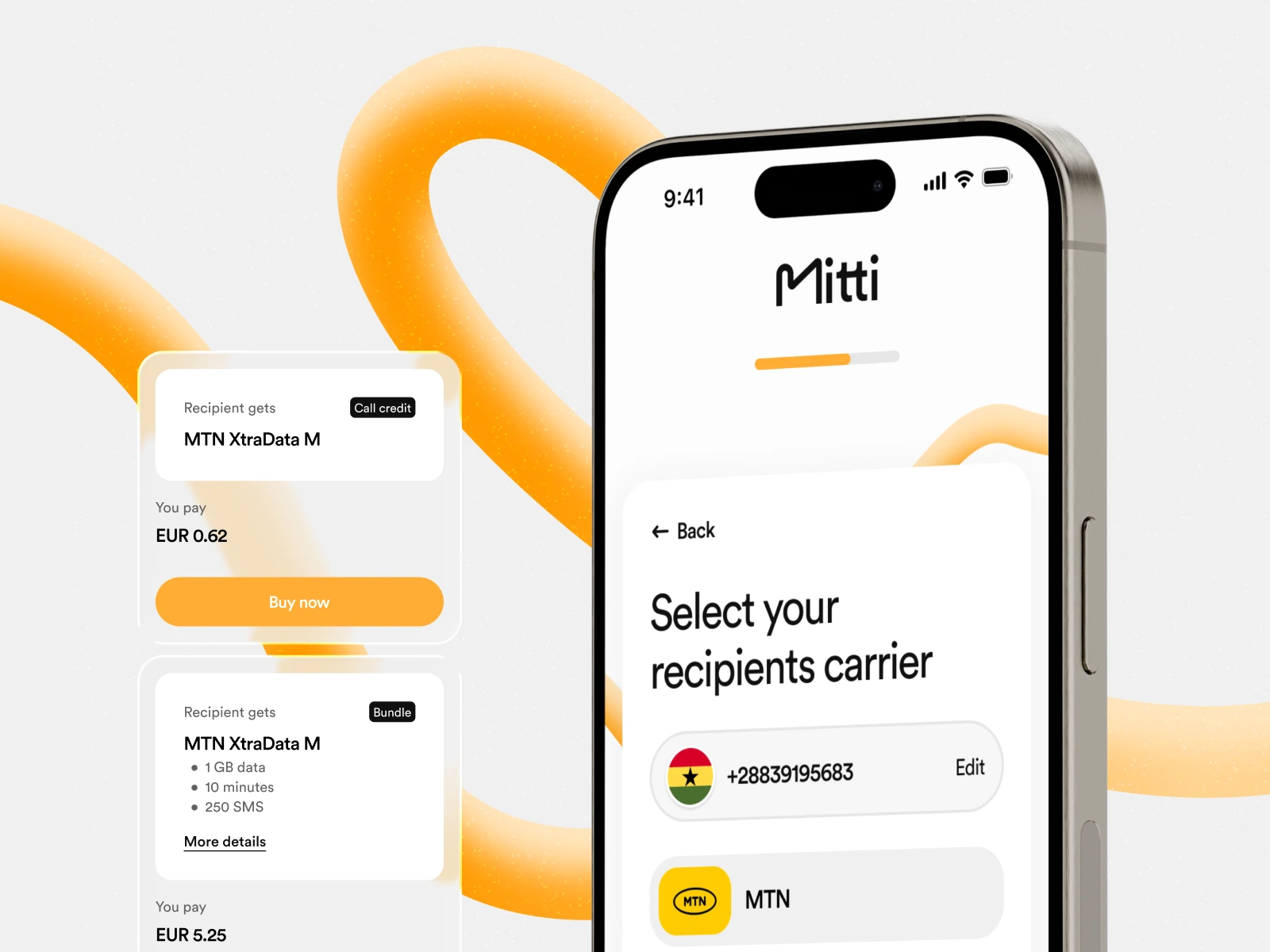
We began by mapping the entire top-up flow, from carrier selection to payment confirmation, identifying friction points in competitor experiences. The strategy focused on designing a universal interface. One that adapts easily to different markets, operators, and devices.
UX/UI Design
In Figma, we designed a clean and accessible interface that prioritizes clarity and speed. The visual design uses a minimalist structure with clear hierarchy, large input fields, and a frictionless step-by-step process for selecting a country, carrier, and payment method. Micro-interactions and dynamic states were added to guide users through verification and confirmation with confidence.
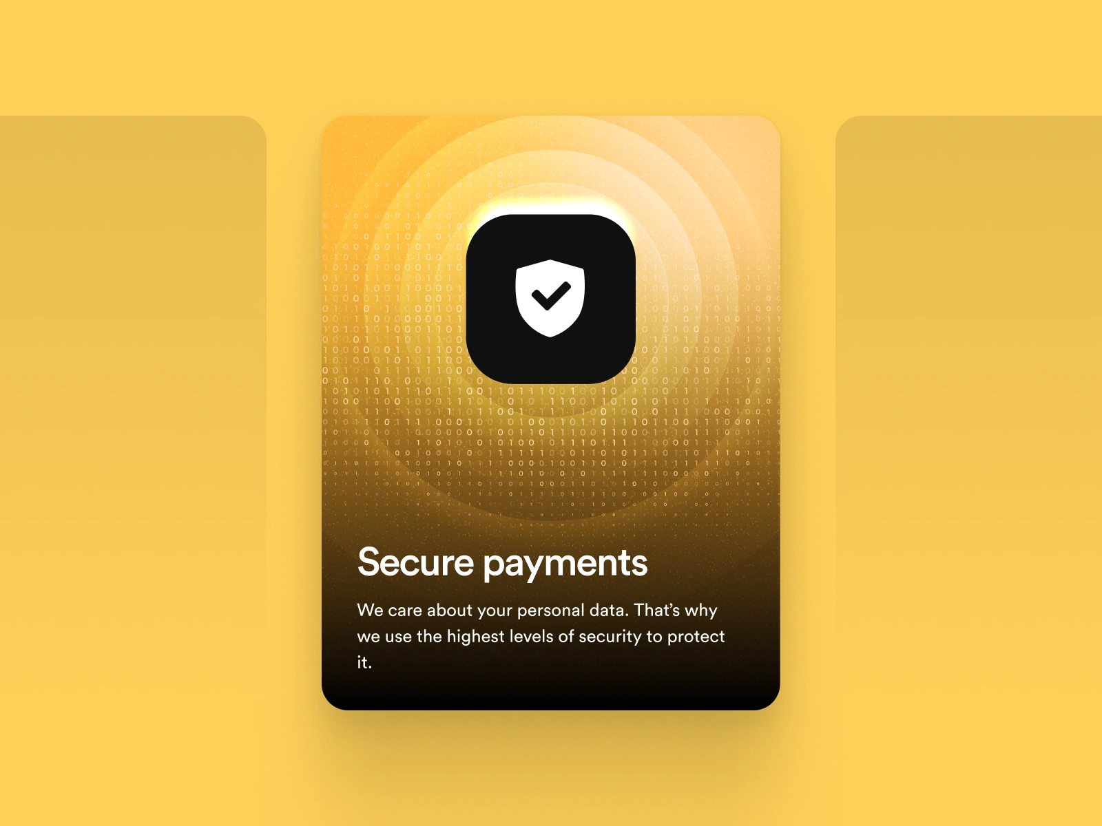
Payment Integration & Security
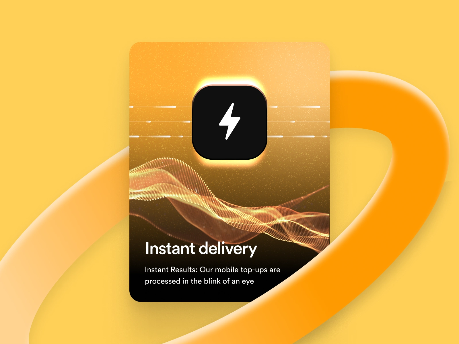
Secure payment gateways supporting multiple currencies and providers. The system integrates APIs for real-time recharge validation and transaction confirmation, ensuring every purchase is verified instantly.
Performance & Scalability
The platform was developed with scalability in mind, allowing new operators or countries to be added easily. Special attention was given to international usability. localizing pricing, currencies, and language while ensuring consistent branding and visual identity across regions.

Like this project
Posted Nov 3, 2025
Built a global mobile top-up platform enabling fast, secure, and seamless phone recharges worldwide with intuitive UX and reliable payment integration.