Ajna Design System

Deepali Pathe

03·Design System · Internal Tools · 2025
Ajna Design System.
Bringing structure, speed, and dark mode to internal tools, so every team stops reinventing the same button.
Design Systems Figma Variables Dark Mode Component Architecture Developer Handoff
ProjectAjna Design System
RoleProduct Designer
TypeInternal tools · System
Year2025
01The problem
Every team was designing the same button. Again. And again. And again.
Internal tools lacked visual consistency. Buttons, forms, layouts — every team was building them from scratch, wasting time and introducing inconsistencies that compounded across products. Developers spent hours in back-and-forth over specs that should have been self-evident. Designers wanted templates they could trust.
Research insights
01
Inconsistent visual patterns across tools.
02
Developers needed cleaner specs to reduce back-and-forth.
03
Designers wanted ready-made templates and variants to move faster.
Built for: Product & engineering teams · Designers · Developers
02My role
Not just designing components. Architecting decisions.
01Structured components using variants and variables.
02Applied Figma variable modes to enable one-click dark mode.
03Used auto layout + variables to ensure responsive behavior.
04Documented usage and worked closely with developers to ensure feasibility.
05Explored edge cases through real-world use and feedback loops.
03The system
Tokens, not opinions.
Every visual decision — color, spacing, type, borders — was encoded into tokens that scale across contexts and switch themes in one click.
8 variants
Buttons & Links
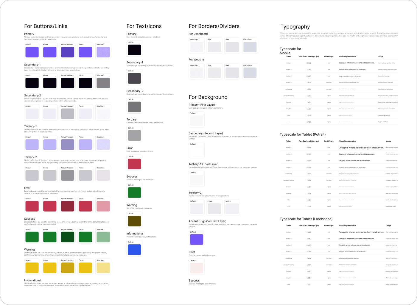
Primary, Secondary (1 & 2), Tertiary (1 & 2), Error, Success, Warning, Informational — each with Default, Hover, Active, Focus and Disabled states.
8 semantic colors
Text & Icons
Primary, Secondary (1 & 2), Tertiary, Error, Success, Warning, Informational — mapped to content hierarchy from headings to captions.
5 layers deep
Backgrounds
Primary → Secondary → Tertiary (1 & 2) → Accent. Each layer semantically named so nesting feels automatic, not manual.
4 weights
Borders & Dividers
Extra-light, Light, Dark, Extra-dark — separate tokens for dashboard vs. website contexts.
Components in use
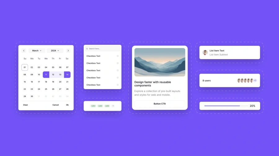
A snapshot of patterns assembled from the same tokens — date picker, search + checkbox list, label group, list item, avatar stack, progress bar, pagination and card.
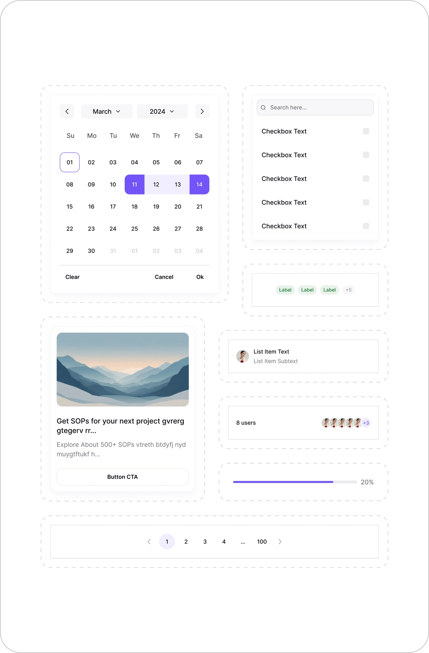
Components 8 patterns built on the same set of color, spacing and type tokens.
The full spec sheet
Button states, semantic text and background colors, border weights and the responsive typescale — all defined once and referenced everywhere.
Foundations Button states · semantic text & background colors · border weights · mobile and tablet typescales.
Responsive typescale
A harmonious scale across four breakpoints — every token named, sized and weighted for its exact purpose in the hierarchy.
Mobileh1: 32 / 40body: 14 / 20 · 10 tokens
Tablet Portraith1: 40 / 48body: 16 / 24 · 10 tokens
Tablet Landscapeh1: 40 / 48body: 16 / 24 · 10 tokens
Desktop Largeh1: 56 / 64body: 18 / 24 · 10 tokens
Spacing system
16 tokens from 2px to 80px — from icon-text micro-gaps to major section breaks.
Spacing-12px
Icon-text gaps, badge padding
Spacing-516px
Button padding, avatar spacing
Spacing-932px
Card internal spacing
Spacing-1680px
Major section breaks
04The craft
Dark mode wasn't a feature. It was a proof of architecture.
Modes One Figma variable mode change — every component switches instantly.
Variables → Modes
Figma variable modes meant dark mode wasn't a separate file or a duplication nightmare. One click. Every component. Every screen.
Layered Components
Clear override logic so designers could customize without breaking the system. Flexibility without chaos.
Constraints & trade-offs
Needed to work with existing design legacy where possible.
Prioritized depth over breadth — fewer components, better quality.
Scoped system to 2D only for faster adoption across teams.
05Impact
Numbers that moved.
40%
Faster design workflow for common flows
Fewer
Dev questions, clearer specs end-to-end
1-click
Dark mode toggle adopted across all tools
All
Starting point for every new internal product
06Reflection
The biggest win wasn't the dark mode toggle.
"Working on Ajna taught me the power of good structure. Small decisions in token naming or variable logic can impact teams weeks later."
The dark mode toggle was fun to build. But the biggest win was watching other designers move faster, with less friction. That's what a design system is actually for.
What stuck
Variables aren't just a Figma feature — they're a way of thinking about decisions that need to scale.
What I'd do differently
Start with developer feedback earlier. The best tokens are the ones engineers actually want to use.
Want to play with the system?
Like this project
Posted Aug 10, 2026
Architected a token-driven design system using Figma variables and components to standardize styles, enable dark mode and speed internal workflows.
Likes
0
Views
0