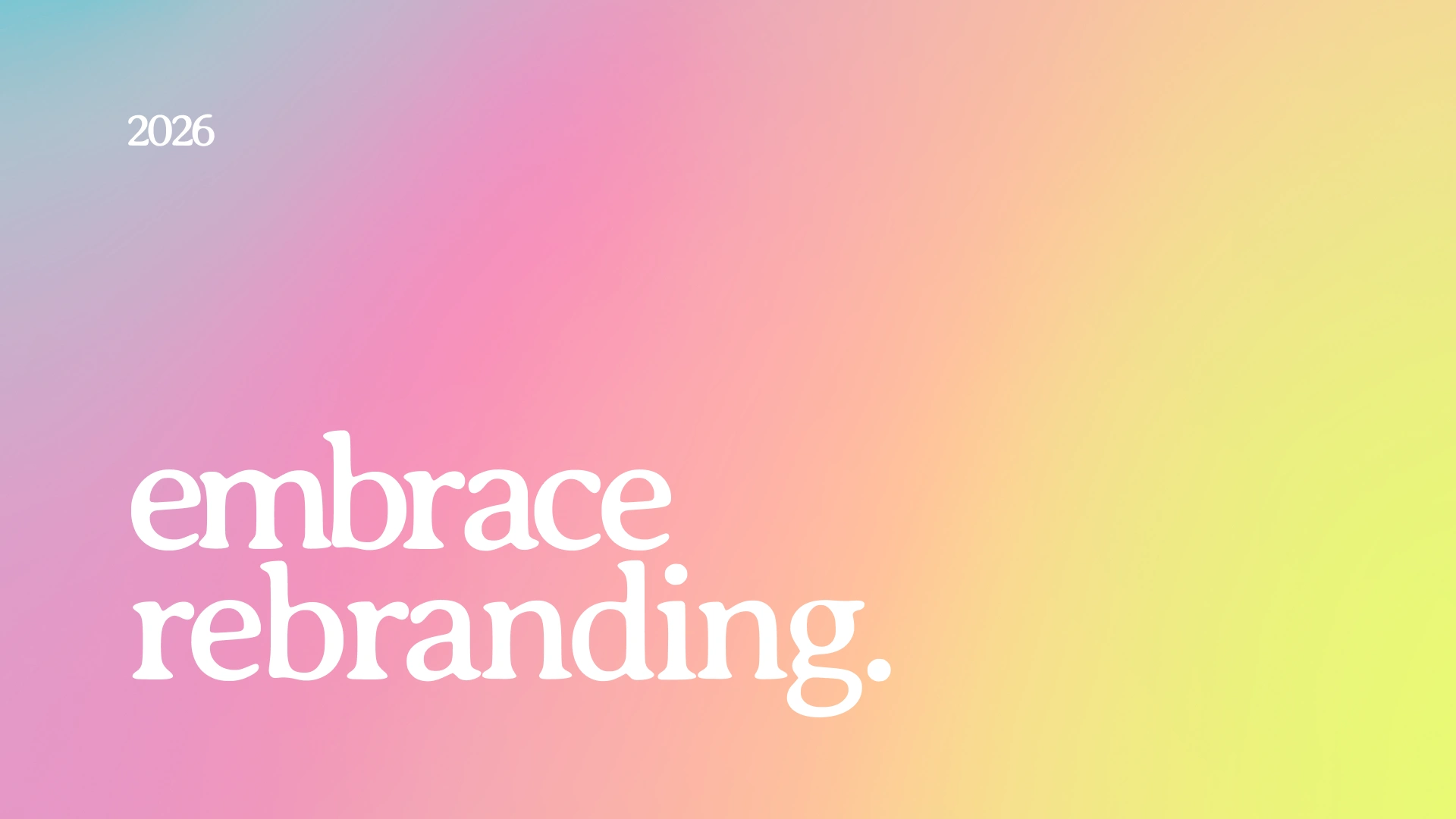
embrace - Branding & Identity
bowlkut ©
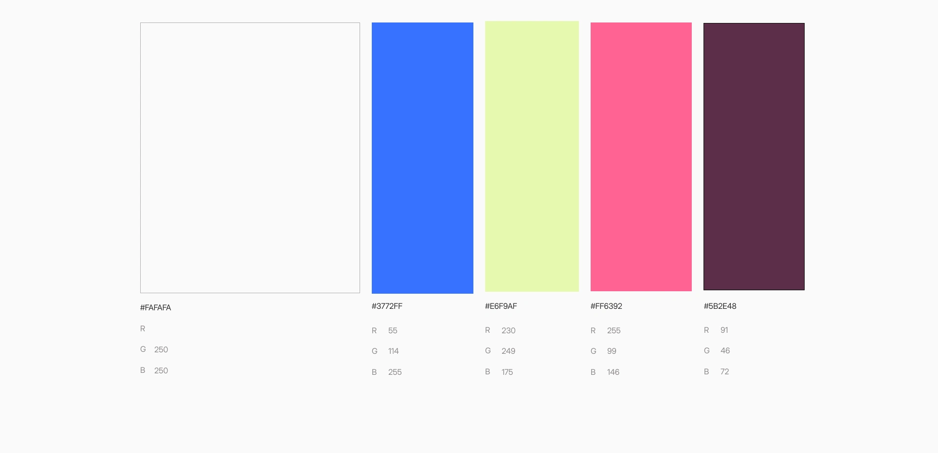
The new direction introduces clear conceptual grounding, tying form directly to the product’s emotional intent and long-term value. Both variants are built around care, continuity, and presence, signals that users intuitively associate with reliability and support.
This allows the brand to communicate its role at a glance, without explanation. As a result, the identity feels more deliberate, category-aware, and credible.
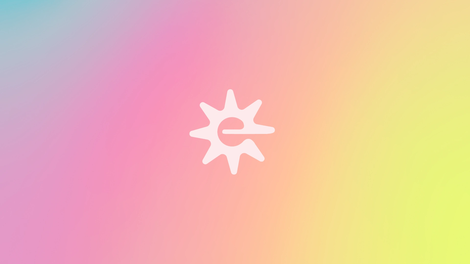
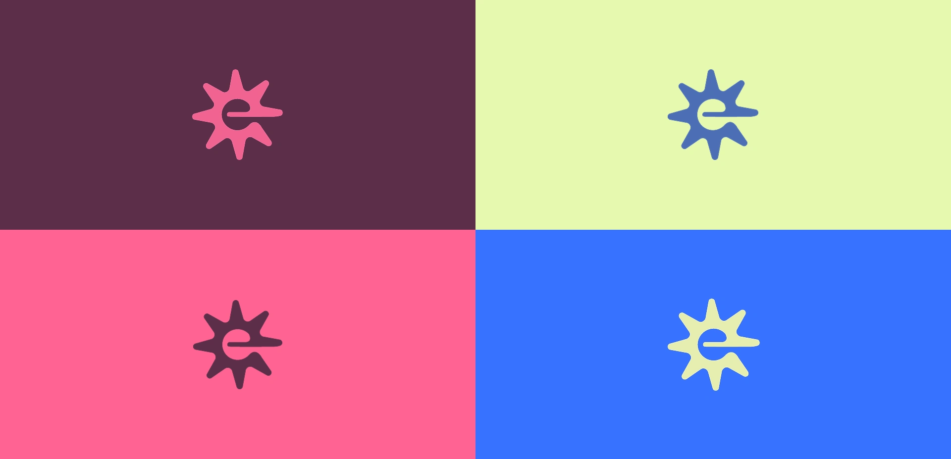
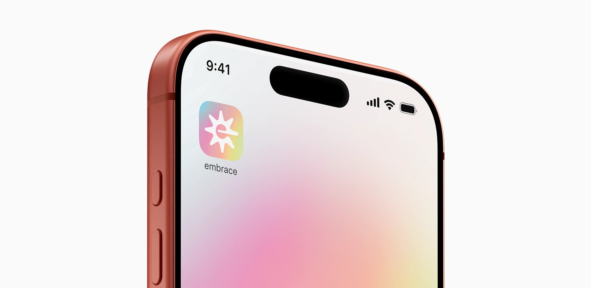
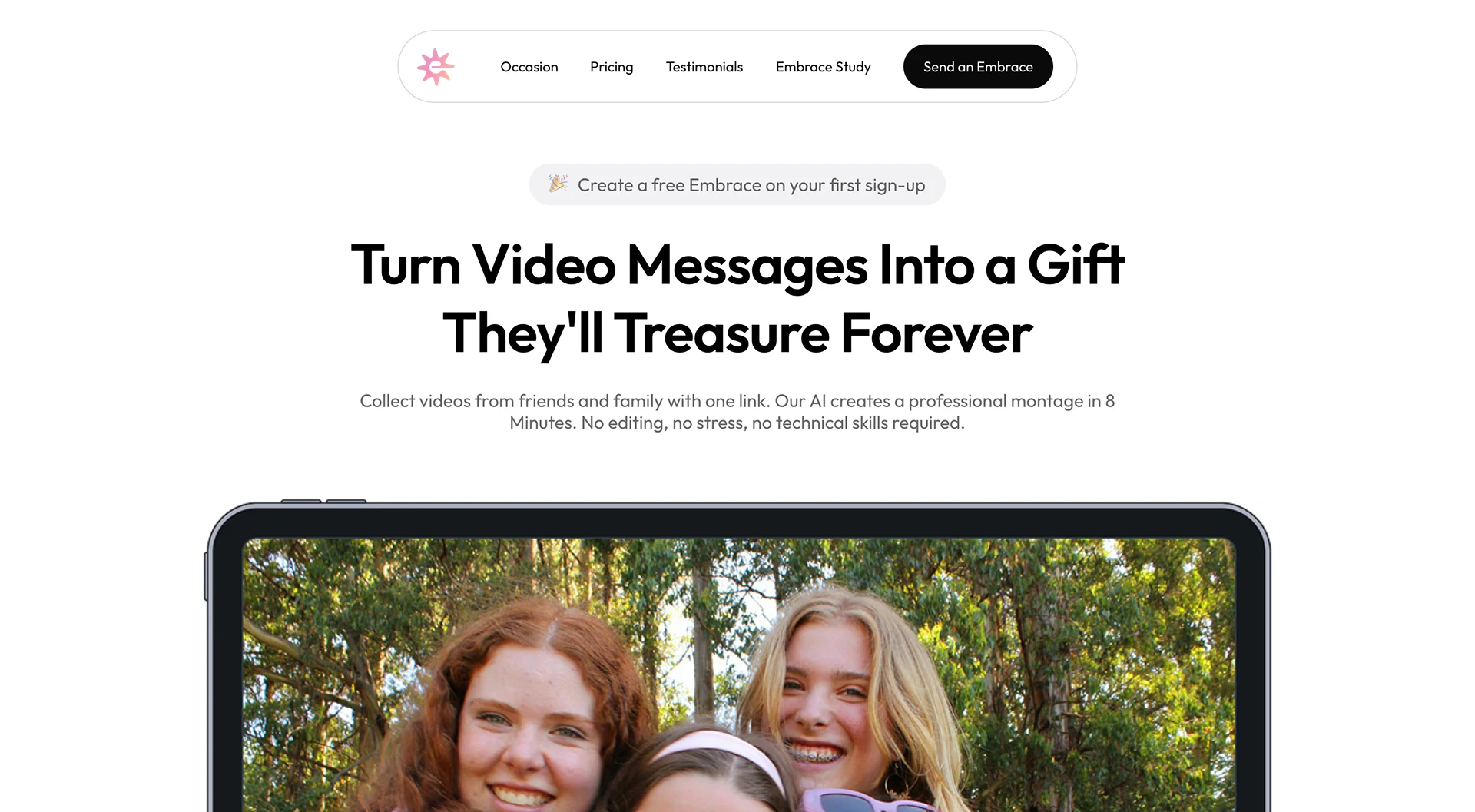
About the mark : The mark comprises of the letter ‘e’ visible inside beaming rays of the sun. The idea behind this mark was to embrace the warmth of the sun and represent it in a meaningful way. The overall mark features a symmetrical circular layout with soft expanding rays of sunshine beaming towards the horizon.
Why it works? :
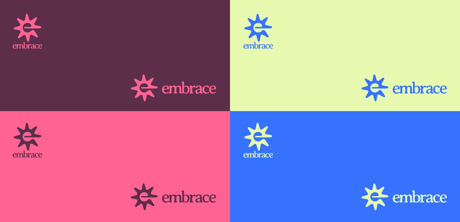
The logo works because it signals emotional safety and reliability. The sun-like form communicates warmth and presence at a glance. Embedding the letter e directly into the symbol grounds the mark in the brand name, making it feel intentional rather than abstract. Its soft geometry and balanced symmetry avoid aggression, which aligns with a product meant to support, not pressure, its users.
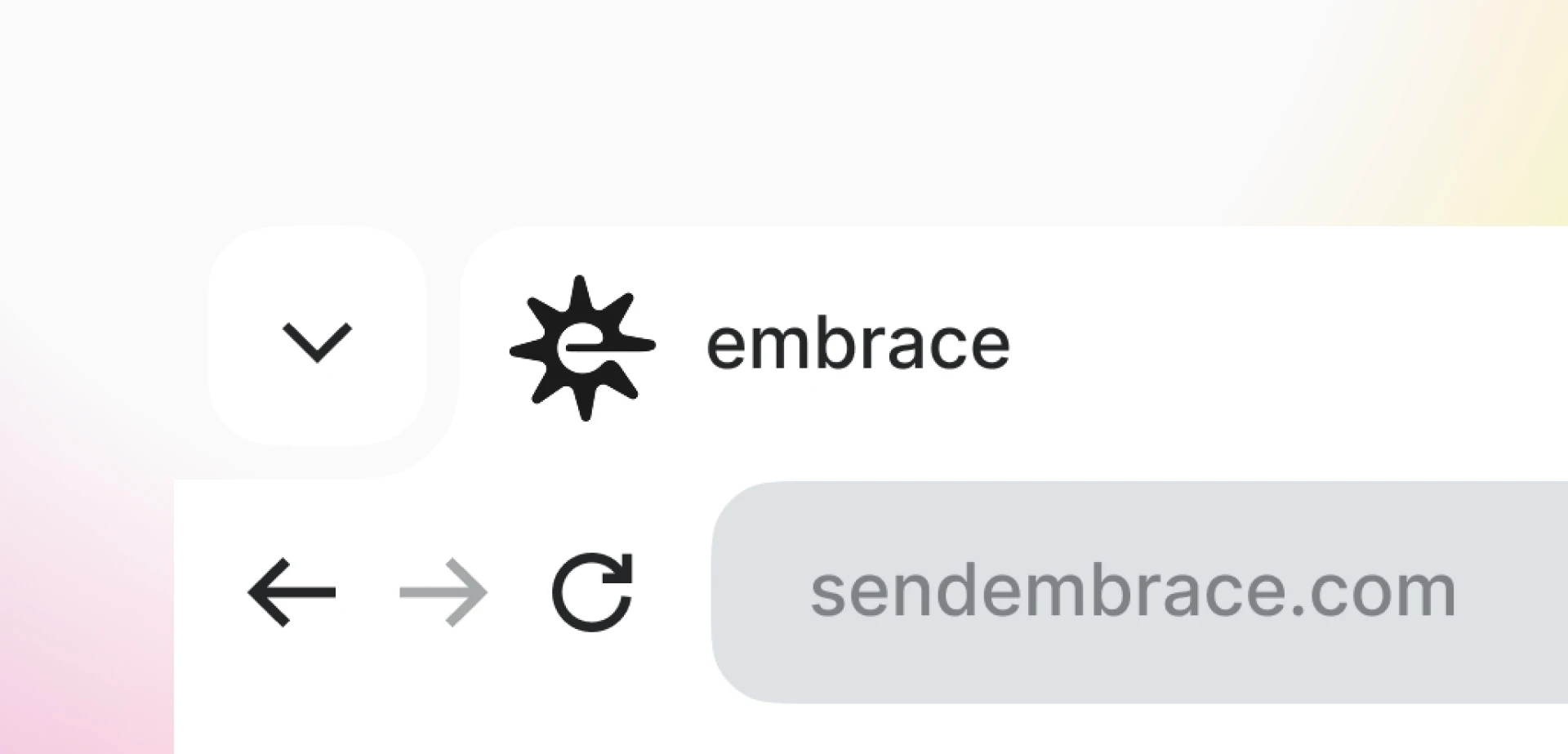
Most importantly, the mark remains clear, scalable, and neutral enough to live primarily inside a digital interface, where the brand is actually experienced.

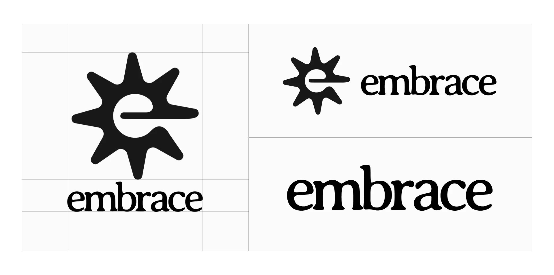
About the lettering : The wordmark is designed to feel human, calm, and dependable. Its soft, rounded letterforms reflect the brand’s focus on emotional clarity and support. The controlled weight and spacing ensure it remains legible. The result is a mark that feels considered and mature, centered on connection and reassurance.
Why it works? :
Together with the symbol, the wordmark humanizes the brand while maintaining the clarity and restraint expected in a SaaS product. It avoids the cold rigidity while still feeling intentional. Its slightly expressive letterforms complement the brand mark’s organic shape. It reinforces the brand’s emotional positioning without becoming decorative or playful.
Like this project
Posted Feb 23, 2026
The Embrace rebrand drops the vagueness. The new identity is built on symbols of care and continuity.
Likes
1
Views
4
Timeline
Jan 11, 2026 - Jan 24, 2026