Gmail Redesign
Overview 🔎
Email can tedious process for many people. I redesigned Gmail with added features so that their audience would be able to manage their inbox easier and faster, thus gaining peace of mind and more time for the things that matter to them.
Problem & Solution 🤝
Problem: What can be done to alleviate the stress of responding to emails?
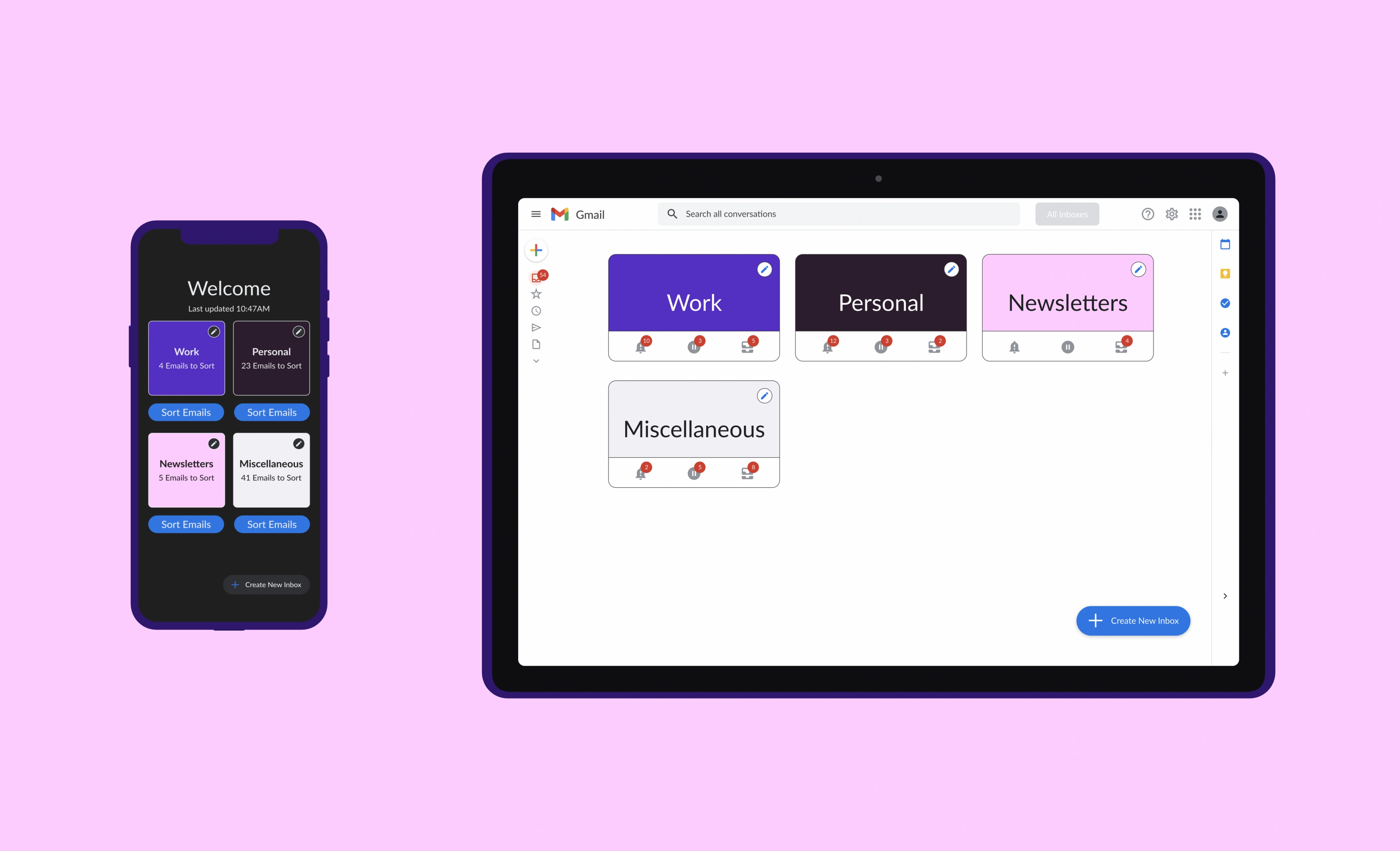
Solution: Allow users to quickly sort emails on the mobile app, and efficiently respond to emails by automating common actions (Rules), gathering relevant information (Contacts & Add Note), and bulk replying to similar emails altogether (Quick Reply) on the desktop website.
Goals/Requirements:
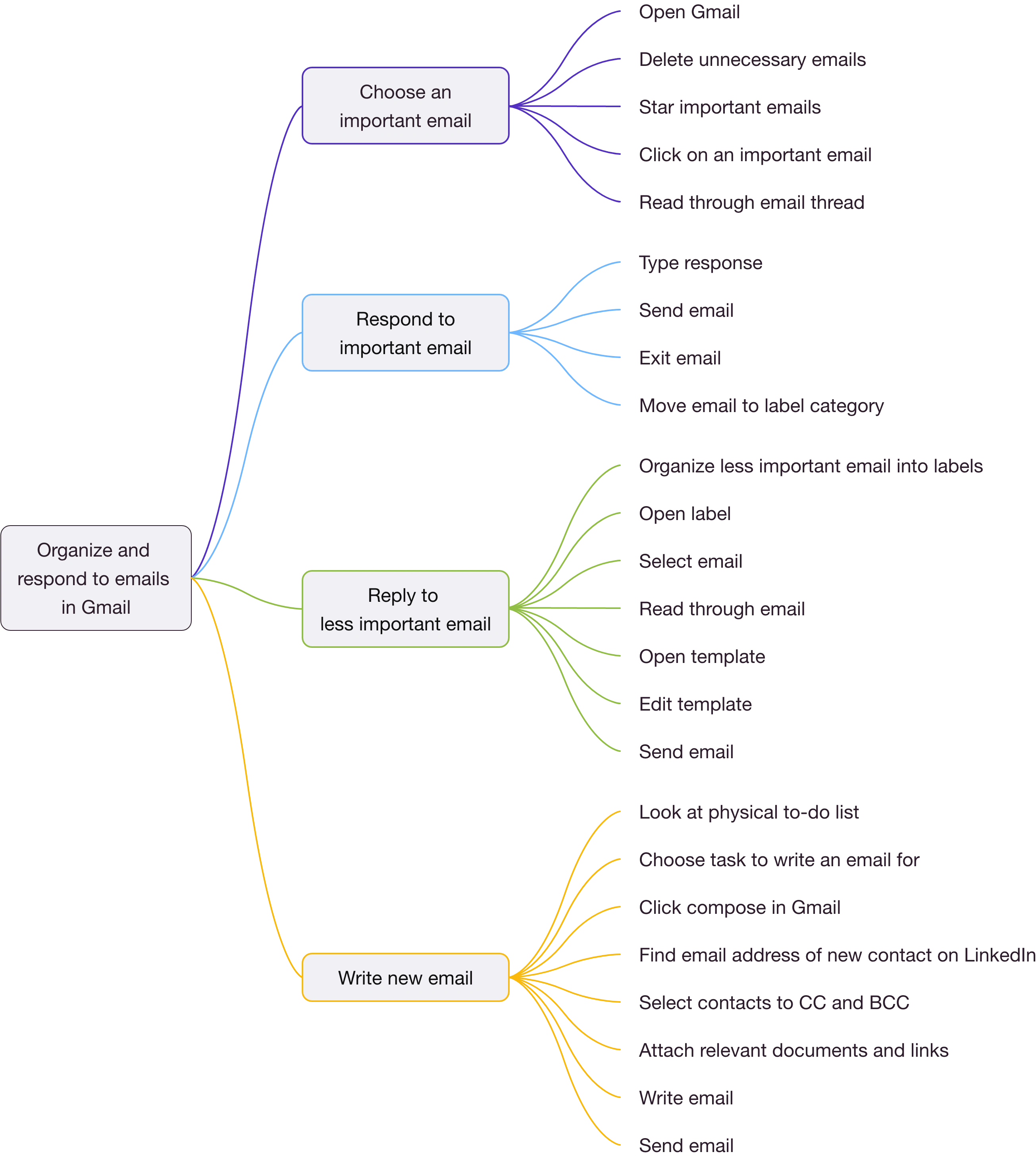
• Contextual Inquiry/Task Analysis - I conducted passive contextual inquiries to identify the average users’ baseline approach to getting through their inboxes. The typical steps they take are shown in this task analysis diagram:
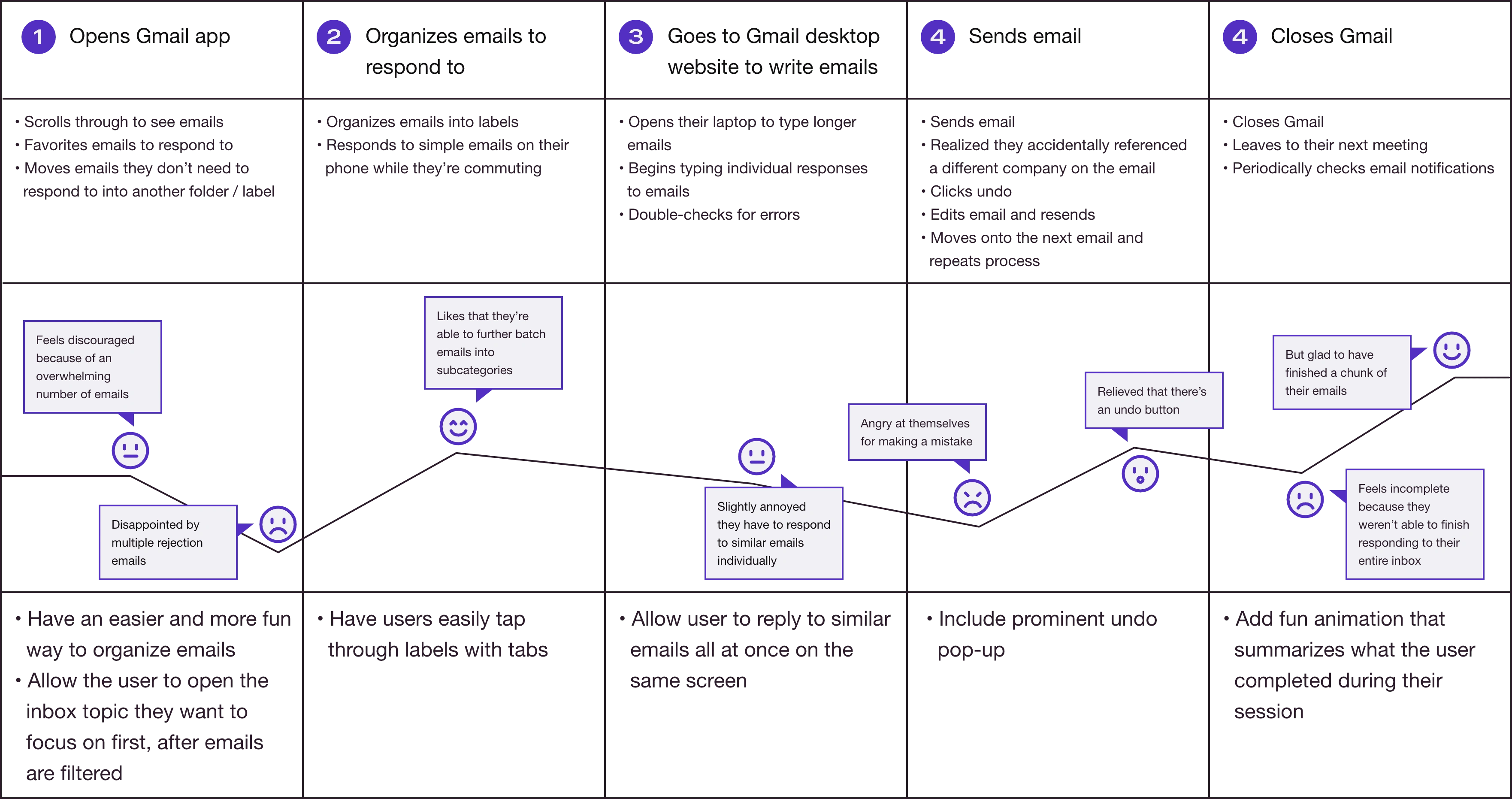
• Persona/User Journey Map: After viewing users' natural behavior, they discussed their pain points with Gmail, which I summarized into a persona and user journey map to serve as my target user.
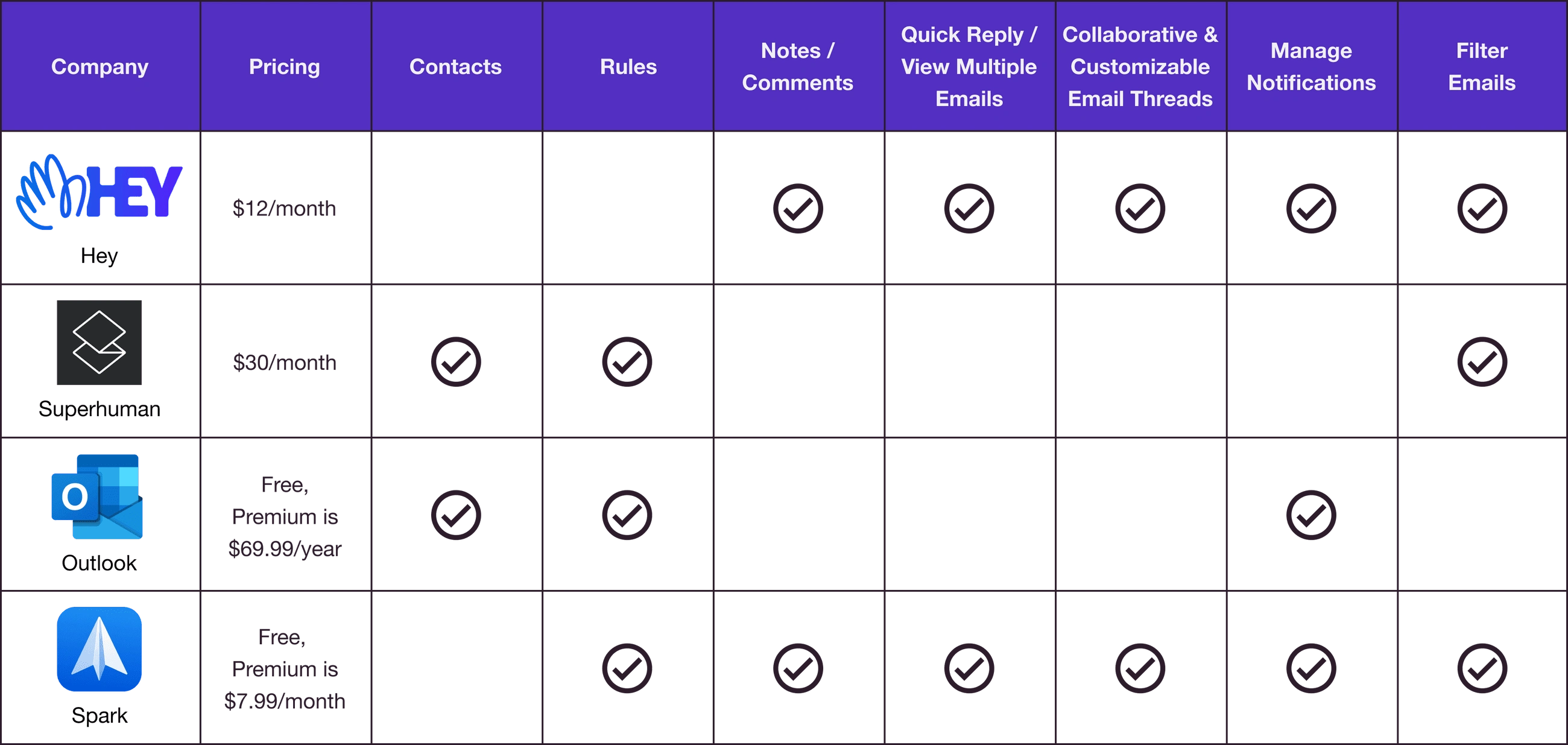
• Competitive Audit: Finally, I conducted a competitive audit to explore what other email services offer and produced a chart of interesting features for my own design.
Process 🛣
Information Architecture/Sitemap: I created sitemaps to break down how pages connect together based on use cases specific to mobile and desktop platforms.
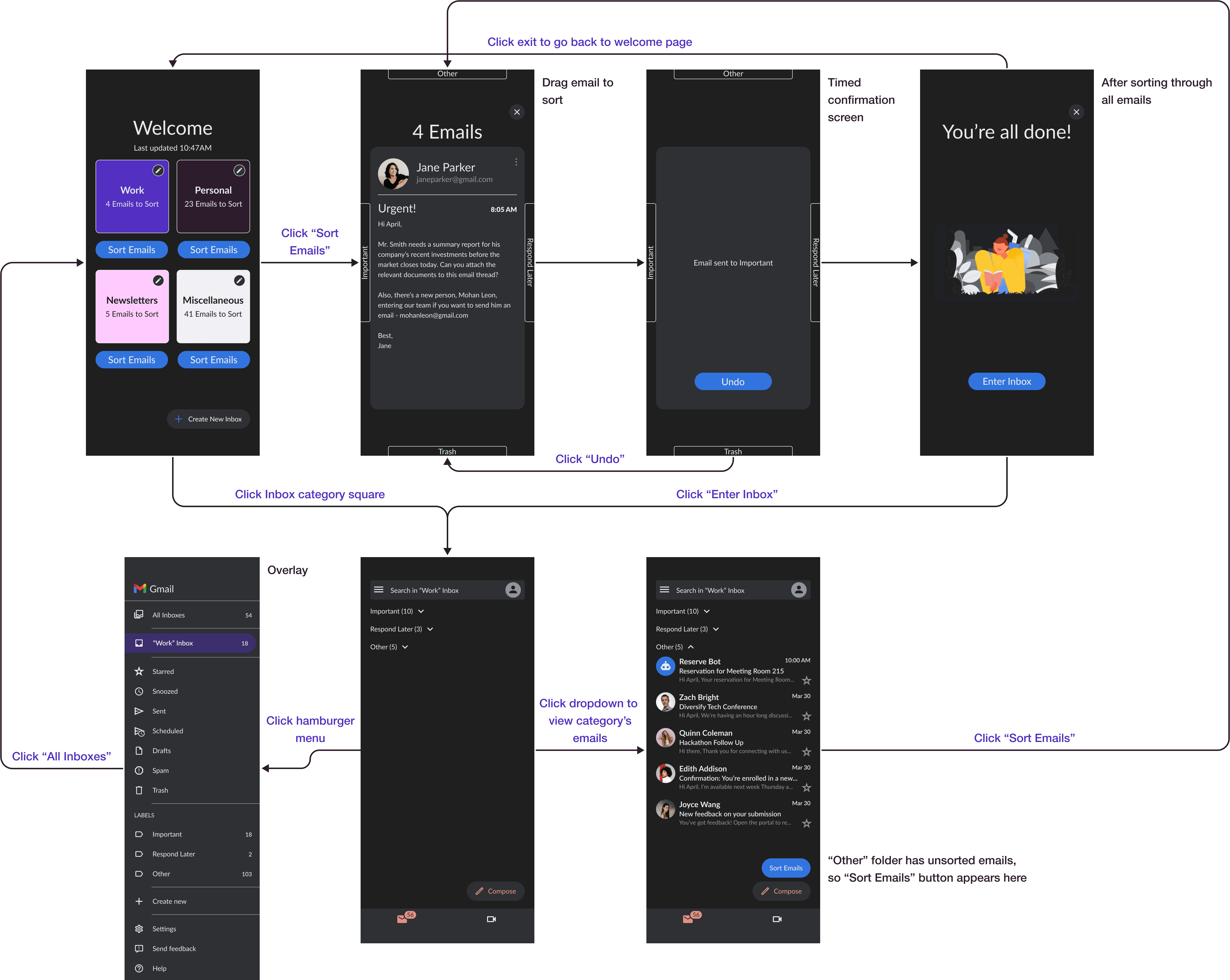
Based on the sitemaps, I also created wireflows to show the sequence that enables users to move through Gmail.
Results 🎁
Pattern Identification:
3 out of 5 participants had a hard time knowing what to do first with the sort feature, which means that for most users, it isn't immediately clear that they have to swipe to organize their emails.
4 out of 5 participants saw a use for sorting, which means that this feature is useful for the majority of my target users.
4 out of 5 participants had trouble finding the "Add Rule" feature, which means that this feature is difficult to find for almost all users.
2 out of 5 participants struggled with finding the "Notes" feature, which means not everyone was confident with navigating this section.
These insights were refined in the final prototype design:
Takeaways 📣
This project allowed me to iterate from low-fidelity digital wireframes to a high-fidelity prototype with each stage improving on the last. What was most important about this project was to add features that the user will actually use, which I was able to validate through user testing. I think having Gmail become more customizable and dynamic overall (which can already be seen under their “Settings”) will create the best flow for each user.
For a dedicated native app, I would look closer into Material Design and Human Interface Guidelines, especially with best navigation practices common for each operating system. Designing for Android typically uses a floating action button, whereas for iOS there are tabs at the bottom of the screen, so I'd make sure to modify the UI for each platform with future iterations.
For this redesign, I noticed I spent extra effort on the "Quick Reply" section because that’s what users were most impressed with and regarded as the most useful. Other features could've been designed more in-depth. For example, with the "Rules" feature, I could do further research on what actions users would want as their options. However, one user said they wouldn't use this feature very frequently. Additionally, with the "Contacts" feature, it could benefit from pulling information from social media platforms, but this requires relying on outside sources. From this, I would analyze post-launch metrics to decide which feature was the most impactful and then focus on that feature in future iterations.
Like this project
Posted Oct 25, 2022
A native app and desktop website with added features to better manage your inbox.
Likes
0
Views
4

