AI-Focused Newsletter Website Design for The Automated

Timothy Olukoya



THE CHALLENGE
The publication needed more than a basic newsletter landing page.
The website needed to feel like a credible media brand, communicate the value of the publication immediately, and create a clear path from first visit to subscription.
The main challenge was balancing several elements within a relatively simple newsletter experience:
Strong brand personality
Editorial credibility
AI-focused content
Featured media
Testimonials
Subscription conversion
Responsive usability
Clean information hierarchy
The final experience needed to feel premium, modern, intelligent, and trustworthy without becoming visually overwhelming.
THE GOAL
The objective was to create a Beehiiv website that could function as the publication's digital home while keeping the experience focused on one central idea:
Invest in Your AI Advantage
The design needed to help visitors understand:
What is this?
AI news and analysis.
Who is it for?
Founders, CEOs, and professionals who want to stay ahead.
Why should I care?
The publication turns the rapidly changing AI landscape into useful information and insights.
What should I do next?
Subscribe.
THE DESIGN DIRECTION
I created a dark, editorial-inspired interface using a deep navy and black visual foundation with high-contrast typography and a restrained accent color.
The visual language was intentionally designed to feel closer to a premium technology publication than a typical newsletter template.
Design principles
Bold typography
Large headlines establish hierarchy and communicate the publication's confidence.
Dark editorial aesthetic
The dark background creates a sophisticated technology-focused environment.
Focused CTAs
Subscription actions are visually prominent without competing with the content.
Structured content
Video, testimonials, navigation, and supporting information are separated into clear sections.
Responsive thinking
The design was structured to translate naturally across desktop and mobile experiences.
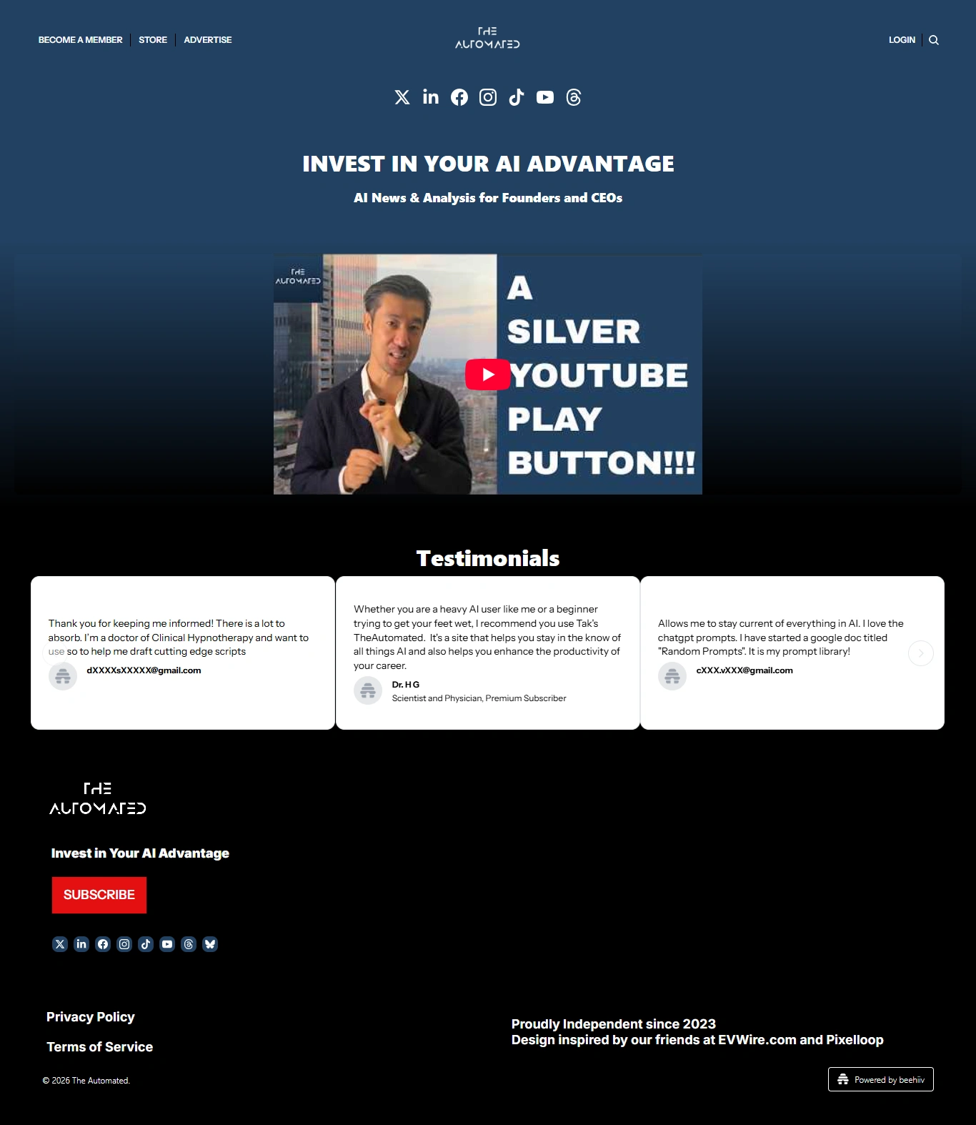
Full Beehiiv website design
HOMEPAGE EXPERIENCE
The homepage opens with the publication's positioning:
INVEST IN YOUR AI ADVANTAGE
followed by:
AI News & Analysis for Founders and CEOs
This immediately communicates the publication's value proposition before the visitor reaches the main content.
The interface then moves into featured media, allowing the publication to highlight video content and create a more dynamic entry point into the brand.
CONTENT & MEDIA
Rather than treating the website as a simple signup page, I structured it as a lightweight editorial experience.
The featured media section gives the publication a place to present important video content while reinforcing its visual identity.
This creates a stronger sense of content depth and authority for new visitors.
SOCIAL PROOF
Testimonials were positioned directly below the featured content.
The purpose was simple:
Let the audience validate the value of the publication.
Instead of relying entirely on promotional messaging, the site allows real subscriber experiences to reinforce the brand.
The testimonial cards were designed to remain highly readable against the dark interface while maintaining a clean visual rhythm across the page.
SUBSCRIPTION EXPERIENCE
The subscription CTA is one of the most important elements of the entire website.
I kept the conversion experience straightforward:
INVEST IN YOUR AI ADVANTAGE
SUBSCRIBE
The design avoids unnecessary friction and keeps the user's next action obvious.
RESPONSIVE DESIGN
The experience was designed with both desktop and mobile consumption in mind.
The desktop version uses the larger canvas to create a strong editorial presentation, while the mobile layout prioritizes:
Clear typography
Compact content hierarchy
Accessible navigation
Readable testimonials
Prominent subscription CTA
Comfortable spacing
The result is a consistent brand experience across screen sizes.
BEEHIIV IMPLEMENTATION
Beyond the visual design, I also helped bring the website together within Beehiiv, ensuring that the final presentation worked within the platform's publishing environment.
This included structuring the page sections, content presentation, subscription elements, navigation, testimonials, branding, and footer experience.
The goal was not simply to make a nice design.
It was to create something that could actually function as the publication's website.
THE RESULT
The final result is a modern, premium newsletter website that positions The Automated as a credible AI publication rather than simply another email newsletter.
The website combines:
Editorial design
with
newsletter conversion
and
brand identity
with
content discovery
The result is a digital experience that feels more like a modern AI media brand and gives visitors a clear reason to explore, trust, and subscribe.
KEY DELIVERABLES
Website Design
Custom homepage and newsletter website experience.
UI/UX
Information hierarchy, spacing, typography, CTA placement, and content flow.
Beehiiv Setup
Implementation and organization within the Beehiiv environment.
Responsive Design
Desktop and mobile-ready layout structure.
Content Sections
Featured media, testimonials, subscription CTA, navigation, and footer.
Visual Branding
Consistent use of typography, color, spacing, and editorial styling.
TOOLS & PLATFORM
Beehiiv
Web Design
UI/UX Design
Responsive Web Design
Like this project
Posted Sep 13, 2026
Designed a premium Beehiiv newsletter website designed to position The Automated as a modern AI media brand for founders and CEOs.