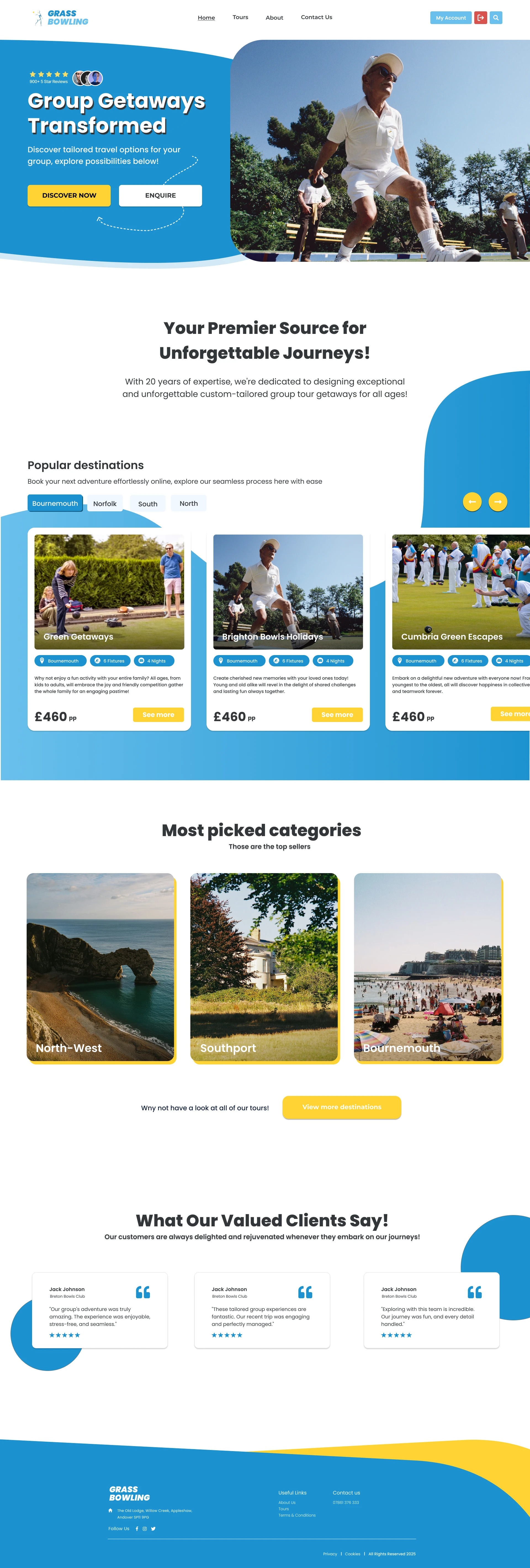
Grass Bowling Tours – Website Redesign Concept
Norbert Placheta
The Challenge
A desktop web concept for a company offering group grass bowling tours. The design goal was to modernize the brand’s online presence, while keeping it playful, trustworthy, and easy to navigate.
Hero Section
Key Elements:
Trust indicators: 900+ 5-star reviews & profile icons
Bold headline + supporting subtext
Playful dashed-line elements evoke travel
Filtering tabs improve content navigation
Product Section
UX Highlights:
Modular card layout for quick scanning
Tags (location, duration, fixtures) improve usability
High-contrast CTAs like “See more” guide user flow
Carousel arrows imply more browsing without overload
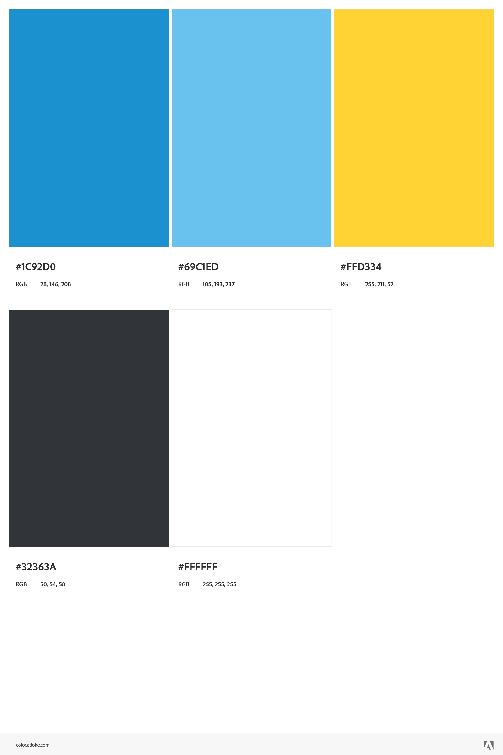
Colours
This project's design leverages a focused colour palette for clear purpose: primary blue (HSL 201, 76%, 46%) and lighter blue (HSL 200, 79%, 67%) define backgrounds and shapes, providing a stable foundation. A vibrant yellow (HSL 47, 100%, 60%) highlights all action buttons and CTAs for immediate user attention, while a dark grey (HSL 210, 7%, 21%) ensures readability for all text. White (HSL 0, 0%, 100%) provides essential contrast and clean design space.
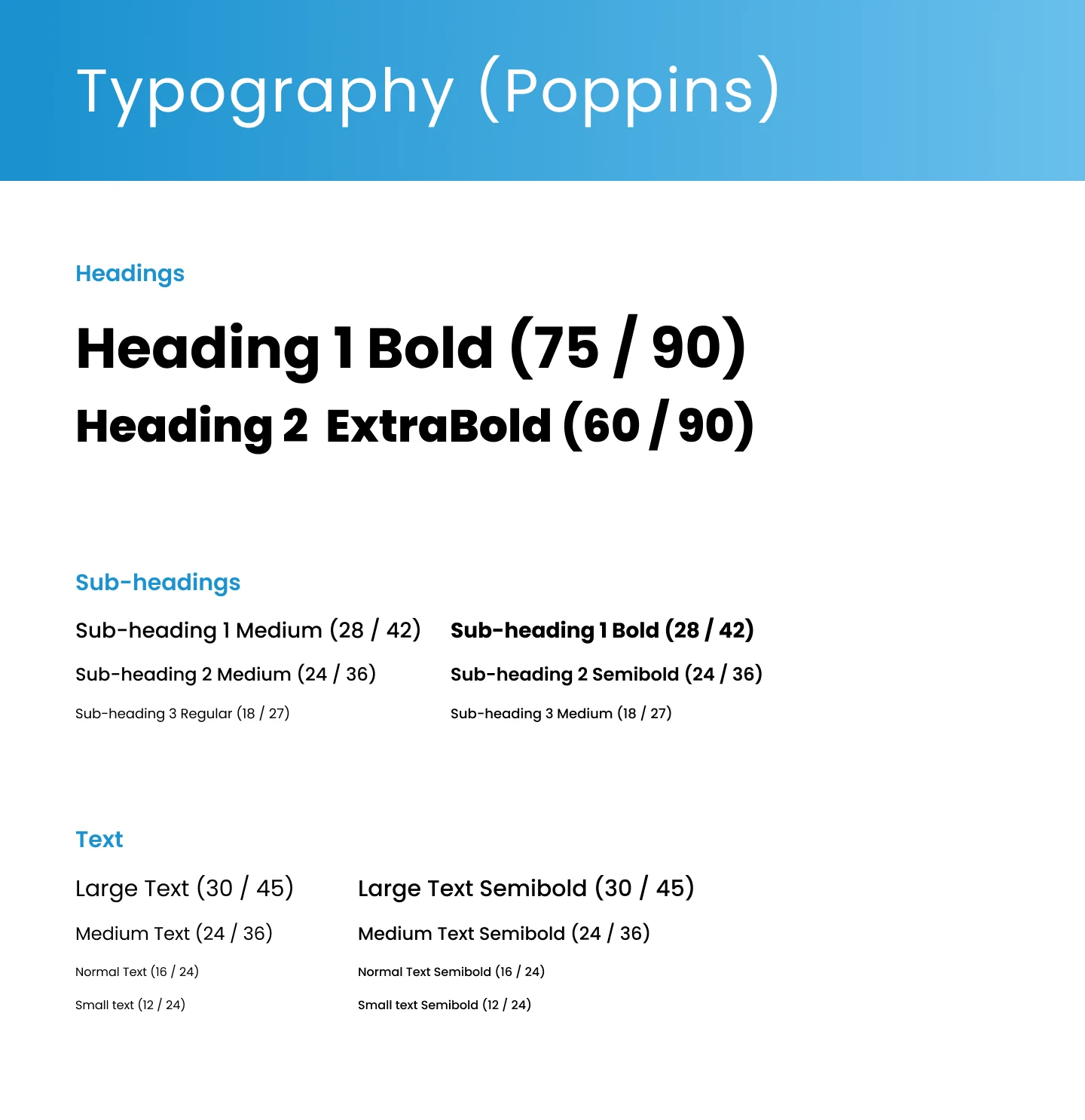
Typography
The design's typography relies solely on Poppins, a versatile geometric sans serif. Its various weights, from ExtraBold for primary headings to Regular for body text, and precise sizing establish a clear visual hierarchy, ensuring optimal readability and contributing to a clean, modern aesthetic.
Summary
This was a concept design for a real client, exploring how modern UI and playful visuals could reintroduce the brand to a wider, younger audience.
The design balances trust and clarity/exploration which is perfectly aligned with group travel needs.
Like this project
Posted Jul 17, 2025
Modernized web design concept for a group grass bowling tours company.
Likes
1
Views
7