Bar Shiru / Visual Identity & Branding
Visual identity for Miles Ahead Bar Group's Uptown Oakland Japanese Whisky Den
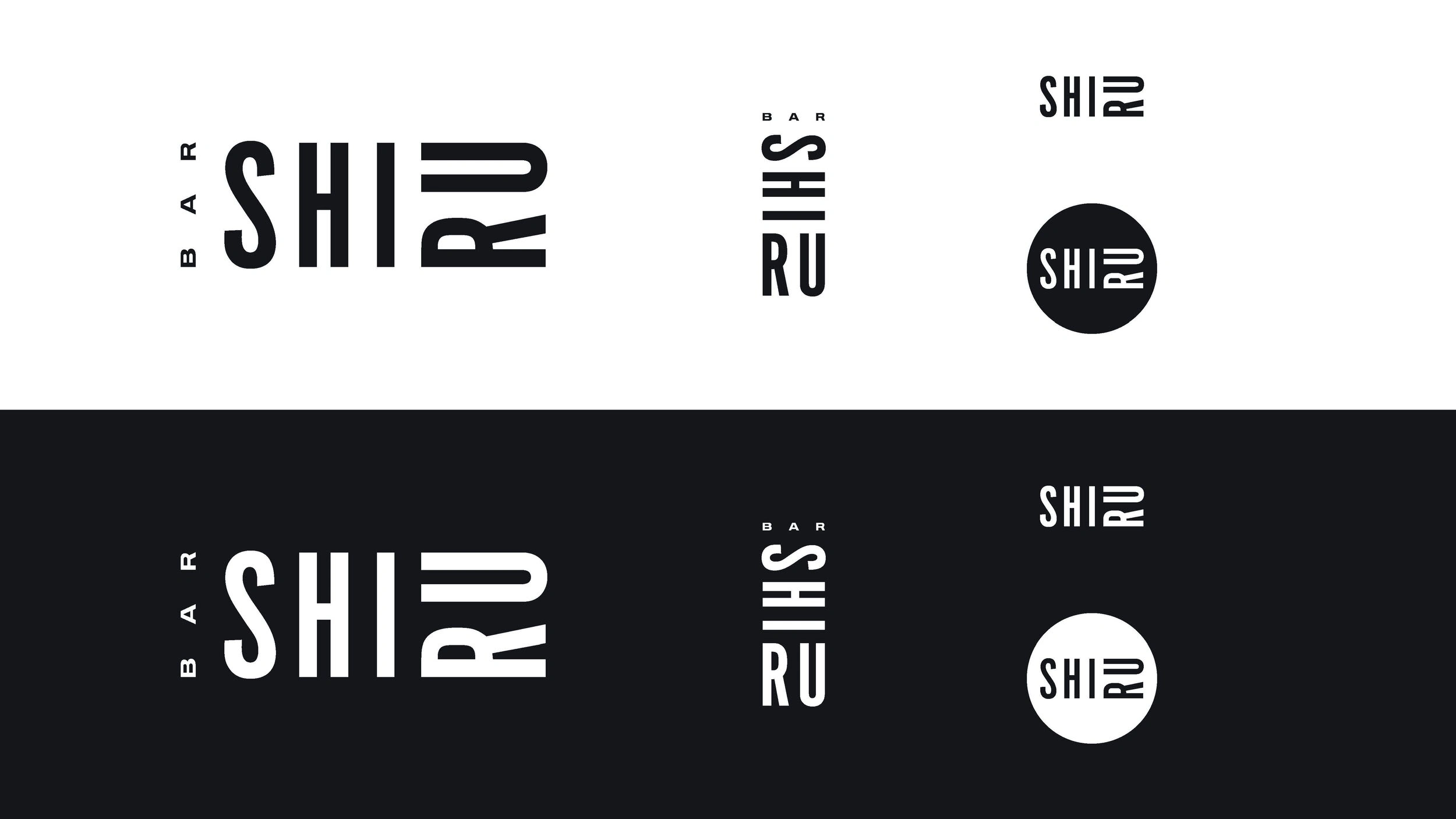
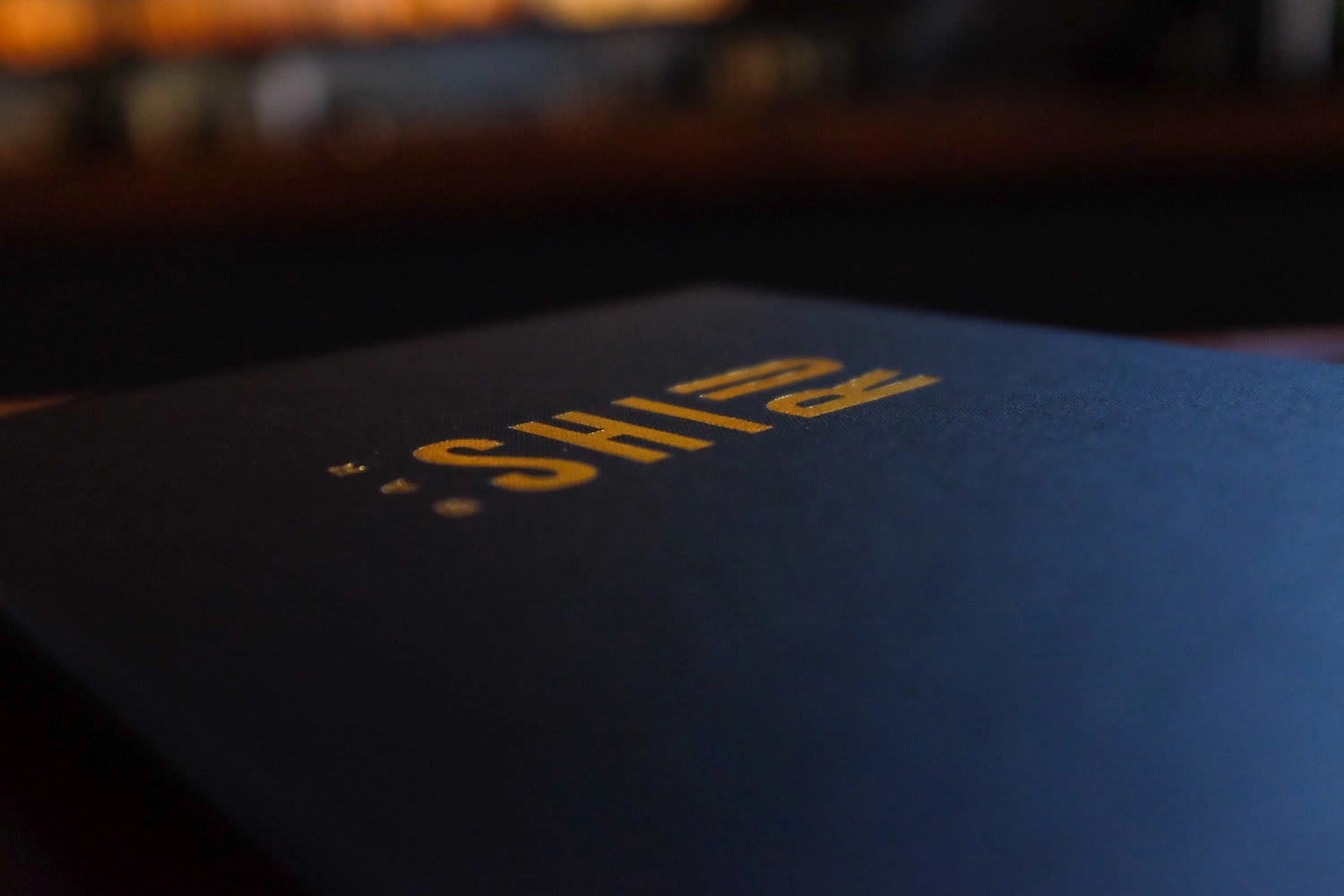
With the mark our aim was to deliver something concise, bold, and flexible that would couple both utility & style while celebrating the improvisational nature of Jazz as well as hinting at Japanese Artistic Heritage. Through custom typography modeled from The Blue Note Era and utilizing a mixed orientation layout- the mark serves to aid in pronunciation, Shi-Ru, while also remaining flexible in a vast array of scales, orientations, and usages.

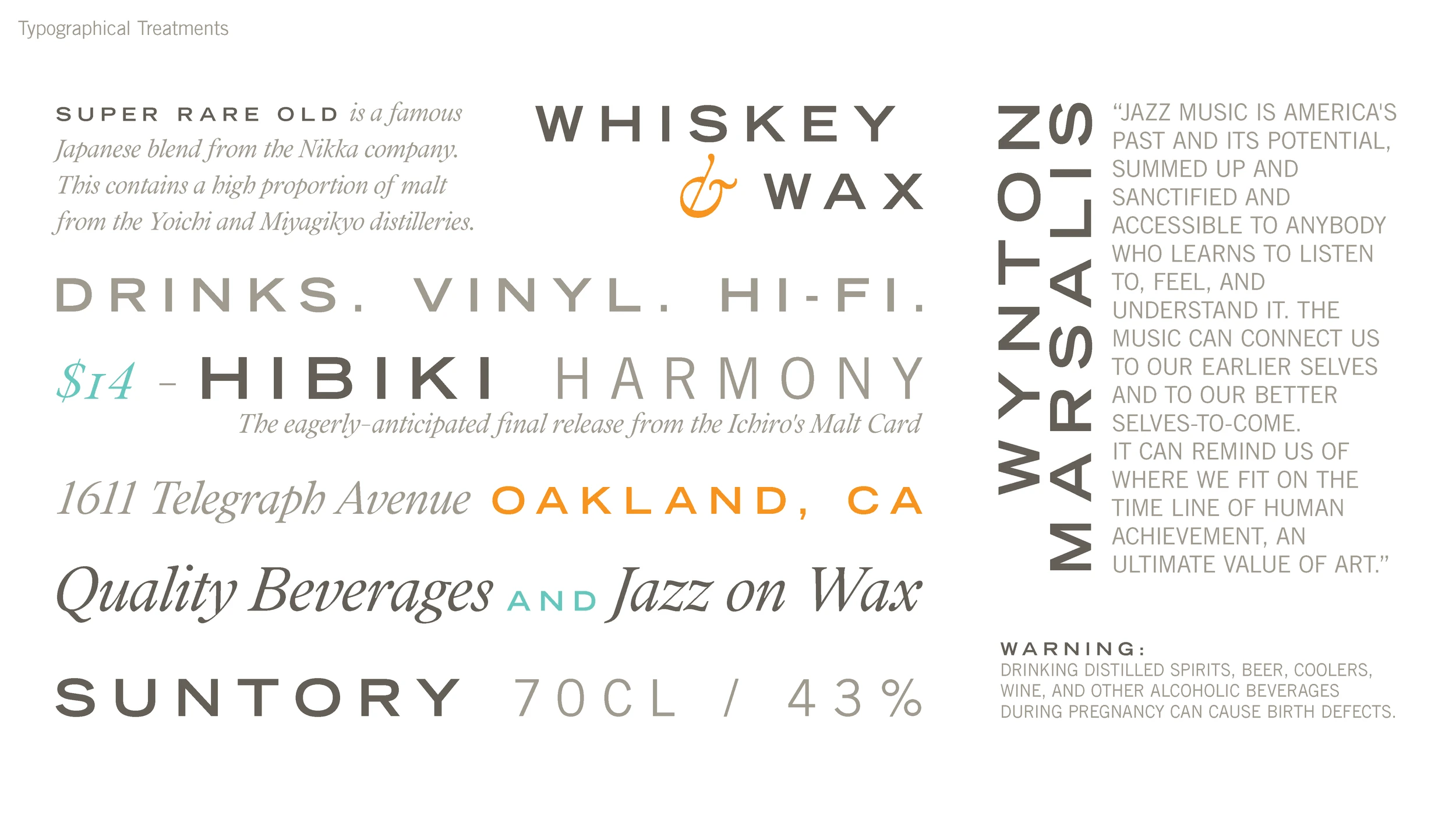
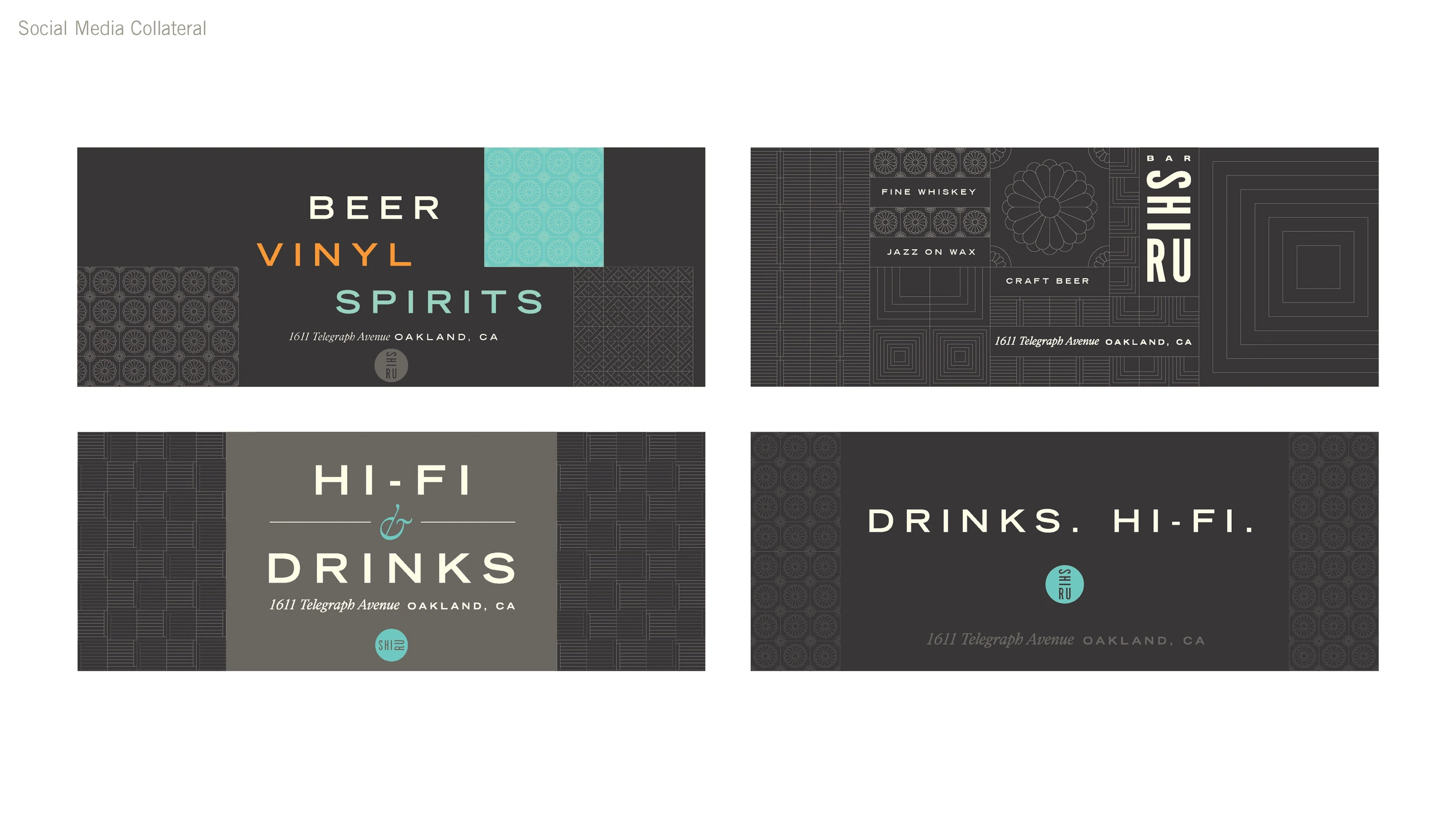

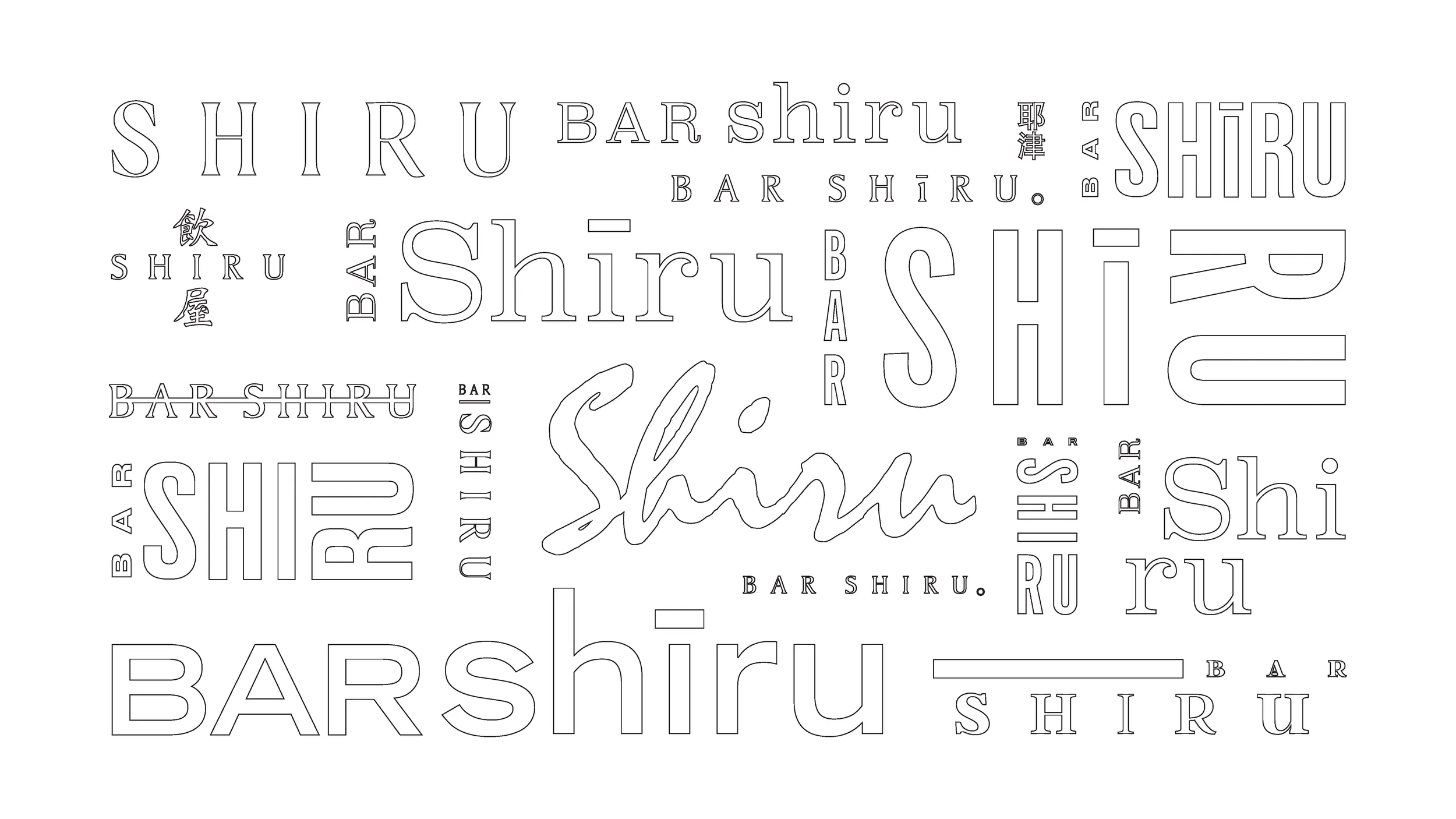
A selection of wordmarks from our design exploration
Like this project
Posted Oct 23, 2024
Visual identity & Art Direction for Miles Ahead Bar Group's Uptown Oakland Japanese Whisky Den
Likes
0
Views
3


