Vegan Okashi – Branding & Packaging Design
Saurav Vyas
__
Project Overview:
Vegan Okashi is a healthy snacking brand from Indonesia, inspired by the elegance of Japanese culture, the simplicity of vegan living, and the benefits of a balanced lifestyle. With cassava chips as their hero product, the brand blends authenticity, health, and a touch of cultural artistry to offer a guilt-free, flavourful experience.
__
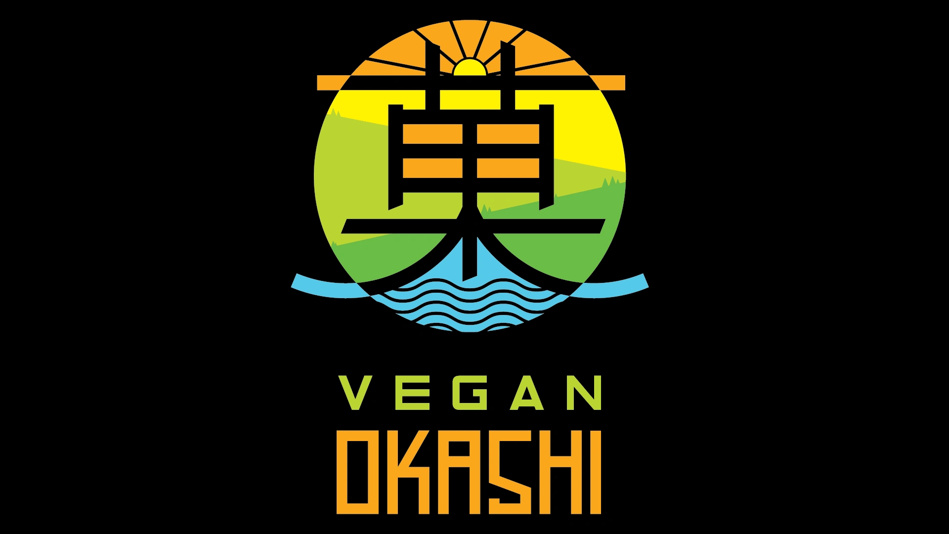
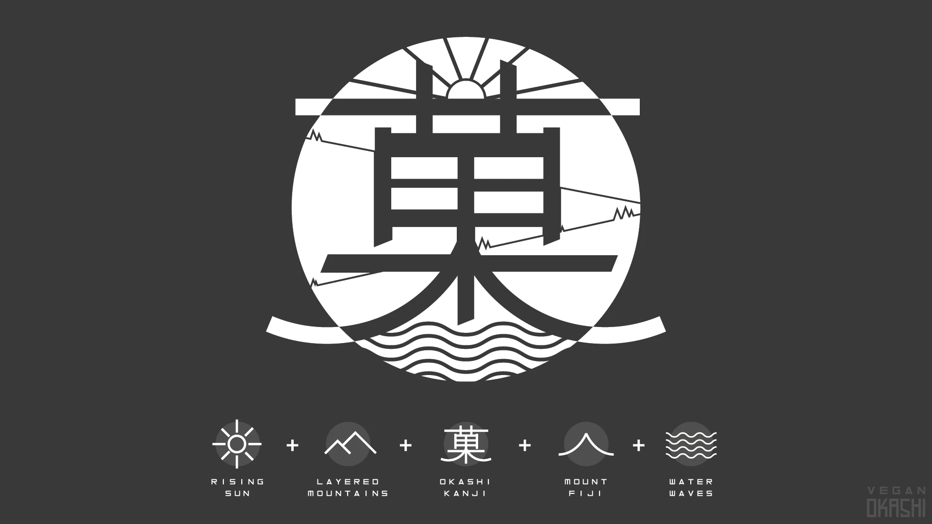
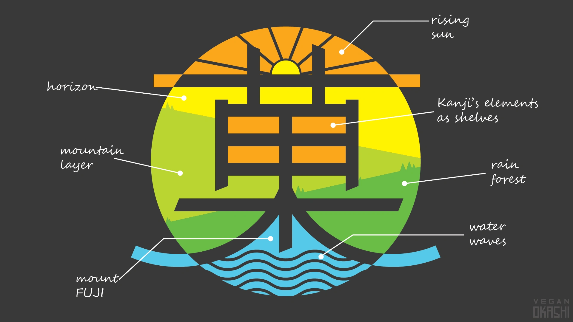
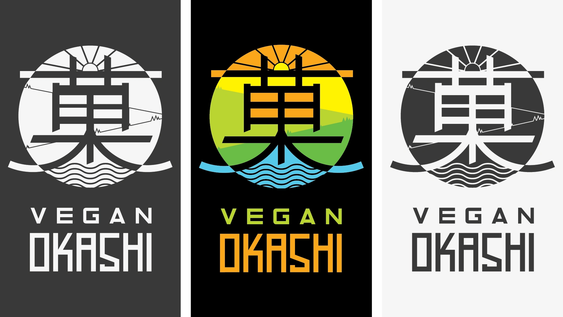
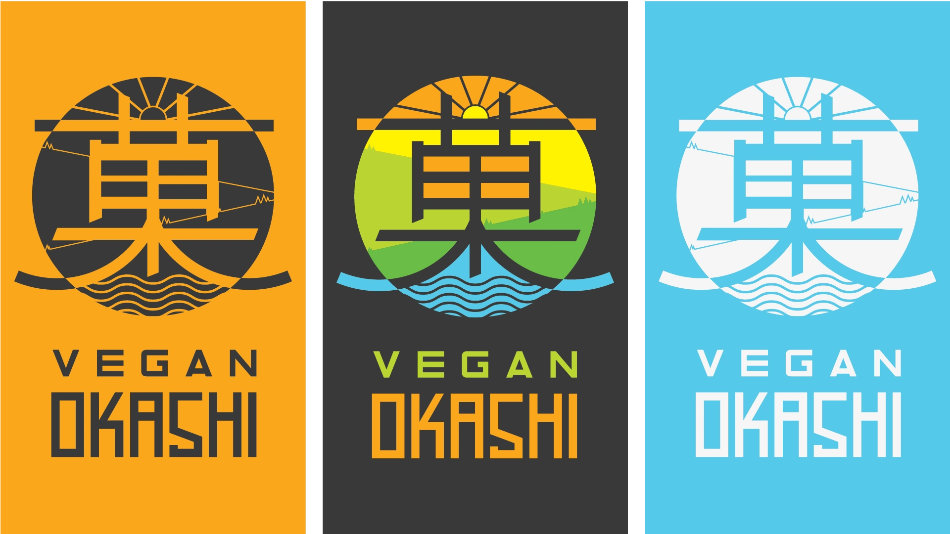
Logo Breakdown:
The Vegan Okashi logo draws inspiration from minimalist Japanese calligraphy and nature-inspired shapes.
-Primary Shape: A stylised representation of Layered mountains taken inspiration from Borneo Forest, Kanji of Okashi Word, Mount Fiji on the bottom, Sea Waves at bottom and Rising Sun on the Top to signify the product’s natural source.
-Symbolism: The clean lines represent purity and vegan integrity, while the organic curves reflect the fluidity of Japanese design aesthetics.
-Icon Element: An additional circular stamp motif, reminiscent of Japanese hanko seals, for premium branding and recognition.
__
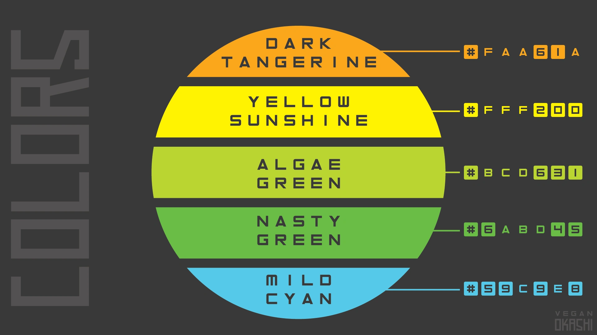
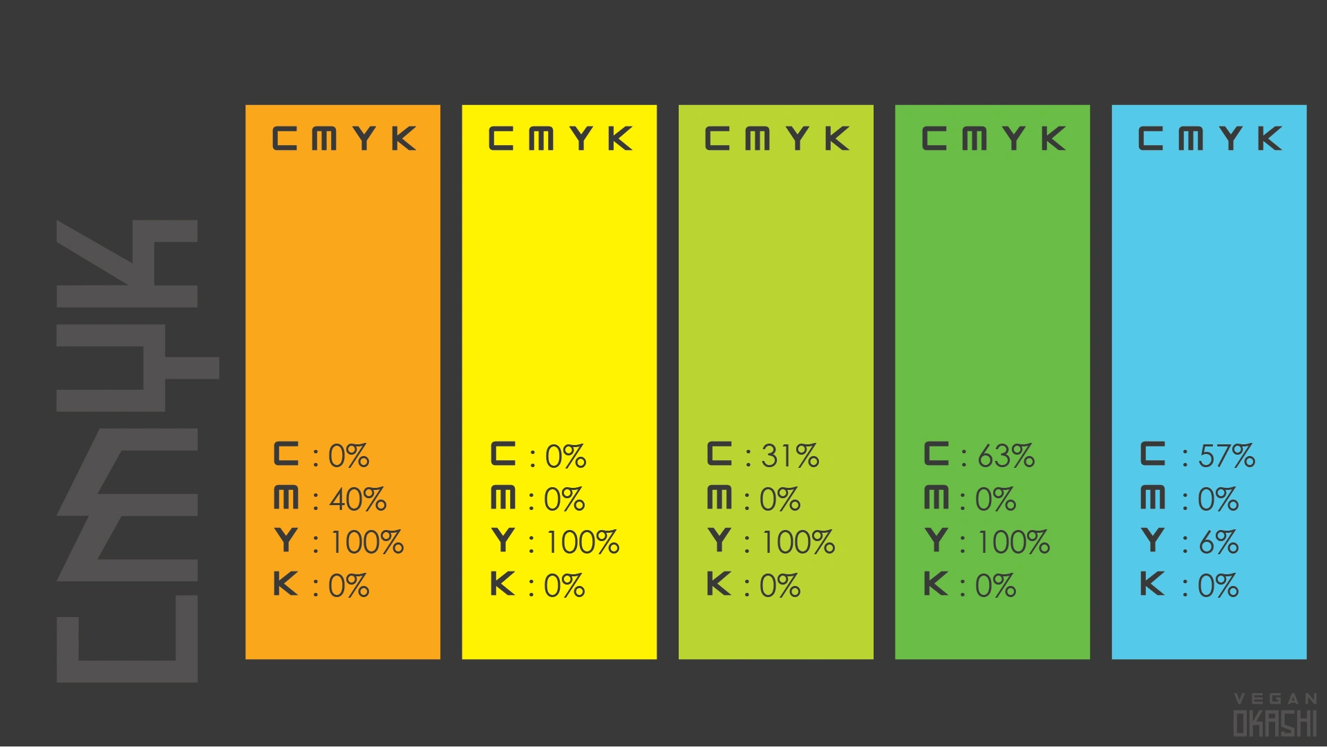
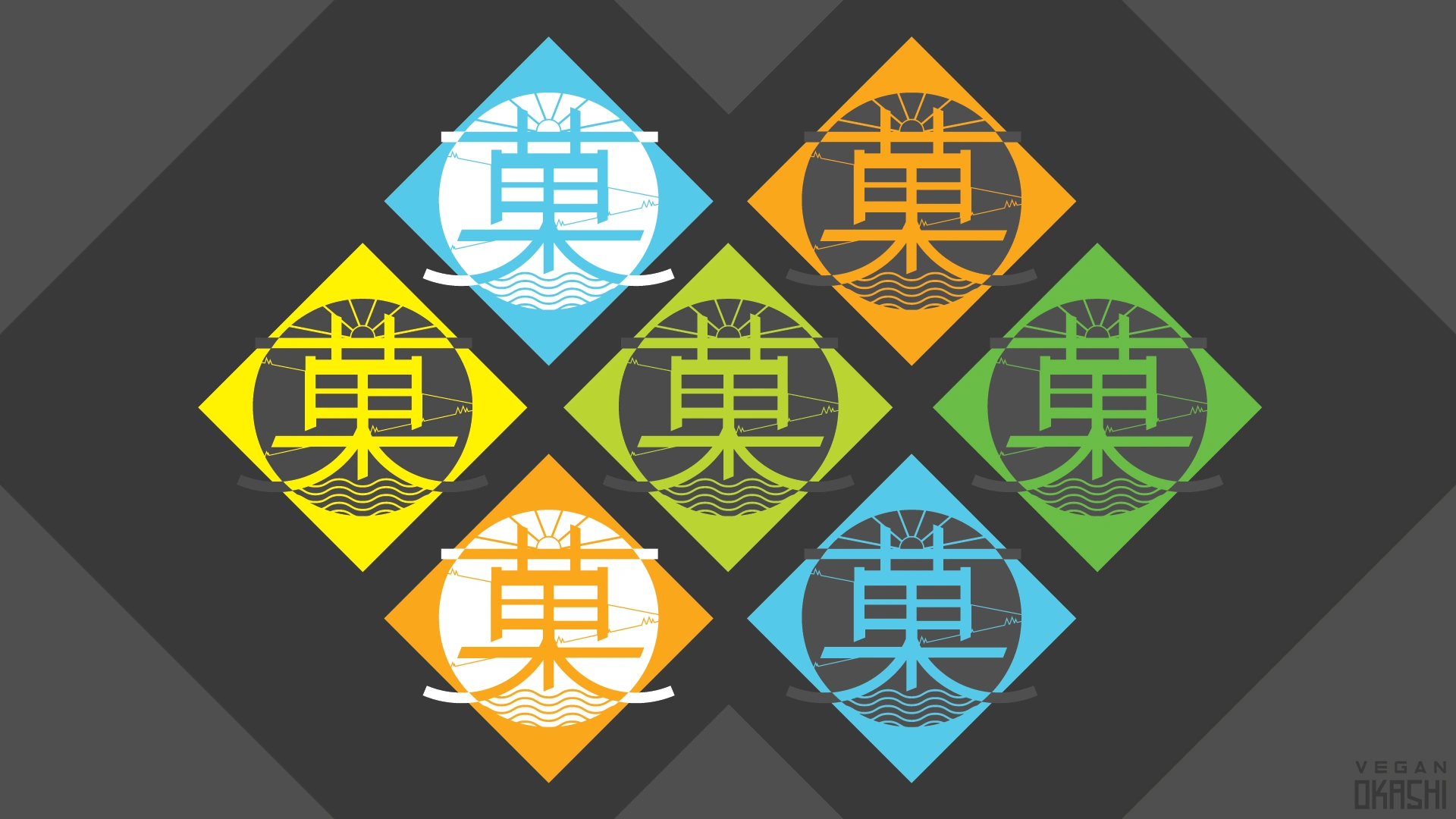
Color Harmony:
The brand palette is inspired by nature, Japanese minimalism, and the tropical warmth of Indonesia. This combination creates a calm yet vibrant aesthetic, connecting the product to health, freshness, and cultural elegance.
__
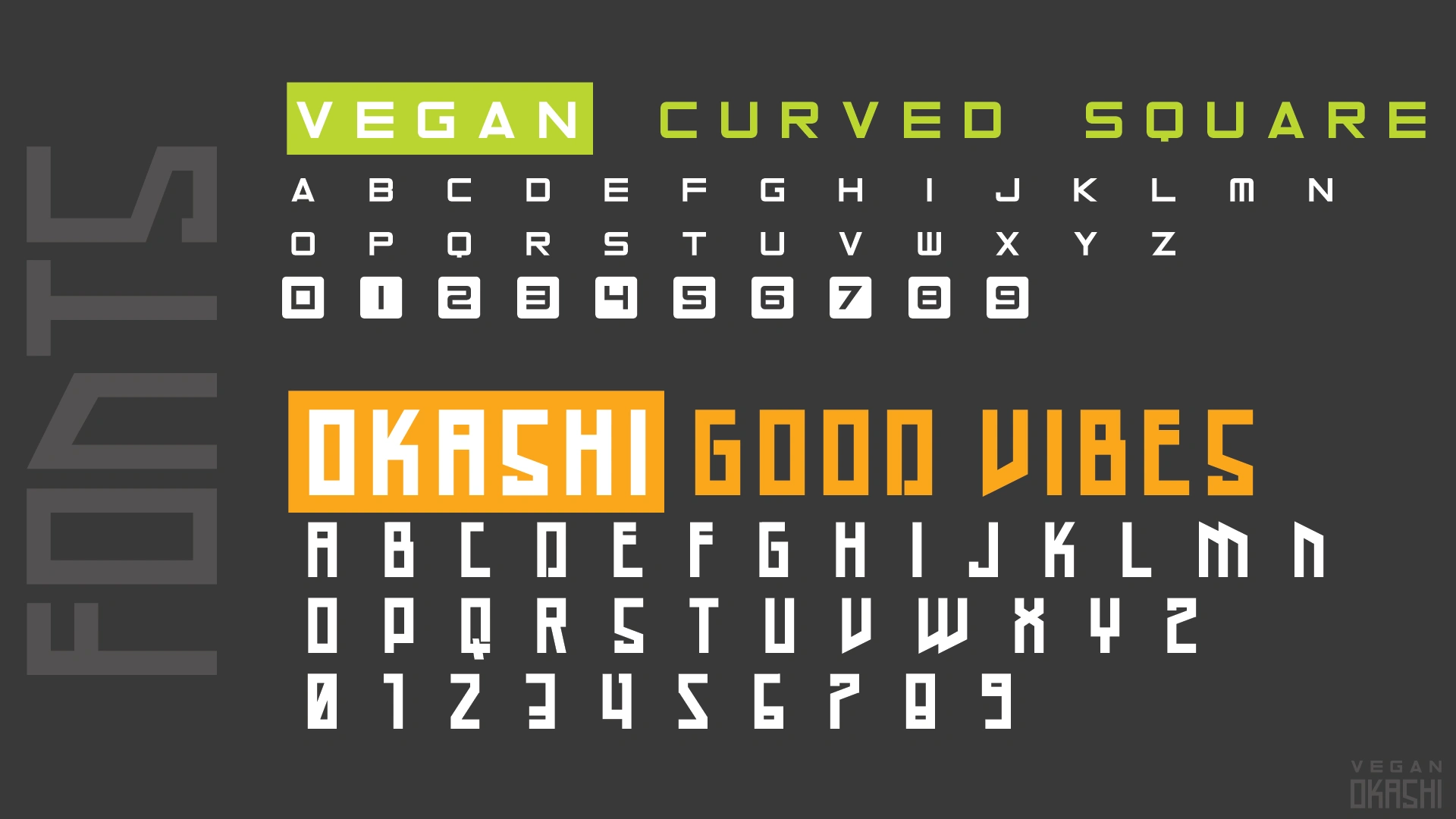
Fonts and Typography:
A modern, futuristic font called Curved Square paired with subtle Japanese anime-inspired funky font called Good Vibes to attract younger generation of otakus who are going towards the vegan snacking options.
__
How to Use the Colours:
-Primary colours should dominate key branding areas—packaging background, logo fills, and social media headers.
-Accent colours should be applied to highlight product flavours, seasonal editions, or key call-to-action areas.
-Neutral tones are ideal for text, secondary graphics, and balancing the overall design.
-Use colour gradients sparingly to evoke depth without overpowering the minimalist feel.
__
Logo representation using negative spacing and monochrome with main logo insight.
__
Logo representation using negative spacing and monochrome with main logo insight.
__
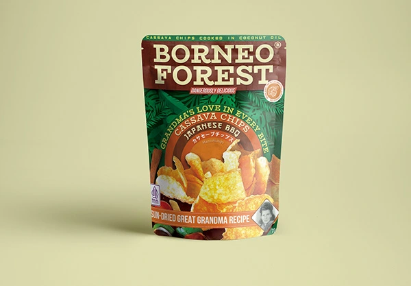
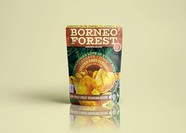
Packaging Design Review:
By combining primary colours with accent colours from the similar colour spectrum, we achieved a harmonious visual language that feels fresh, clean, and premium. The natural accents—such as cassava chips illustrations and subtle natural forest elements—enhance cultural authenticity while keeping the design playful and inviting. The final packaging captures the brand’s essence: wholesome, culturally rich, and irresistibly modern.
Like this project
Posted Aug 14, 2025
Vegan Okashi is a healthy snacking brand from Indonesia, inspired by the elegance of Japanese culture, the simplicity of veganism for a balanced lifestyle.