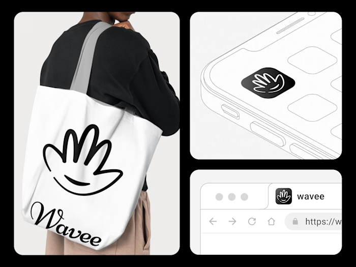
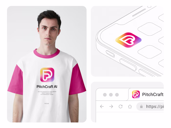
💫 Aero — The Symbol of Creative Motion Design isn’t just ho...
Ashikul Islam
💫 Aero — The Symbol of Creative Motion
Design isn’t just how it looks — it’s how it moves your brand forward.
For our agency, we wanted a mark that reflects constant evolution, collaboration, and bold creative energy. The result?
A symbol that captures motion and synergy — where every curve and intersection represents our team’s shared drive to design meaningful digital experiences.
🚀 Built for thinkers, dreamers, and doers — Aero moves with ideas.
📞 Book a Free Call : Click Here
📮 Let's Chat : ashik@aerobrand.agency
🌏 www.ashik.vision
#LogoDesign #BrandIdentity #CreativeAgency #DesignStudio #BrandDesign #MotionDesign #MinimalLogo #SymbolismInDesign #ContraChallenge #ShareYourWork
Like this project
Posted Oct 15, 2025
💫 Aero — The Symbol of Creative Motion Design isn’t just how it looks — it’s how it moves your brand forward. For our agency, we wanted a mark that reflects...
Likes
1
Views
3
Timeline
Jan 15, 2025 - Feb 1, 2025