Moreni Portfolio Development for Envato × Contra Challenge

Octavian Ciulei


Overview
Product: A personal portfolio designed as a scrollytelling product experience.
Focus: Product thinking across interfaces, automation systems, interactive prototypes, and NLP research.
Live product: garrulous-build-logic-flow.base44.app
Original constraint: 48 hours, solo build, submitted to the Envato × Contra Human by Design Challenge.
Tools: Base44, Make.com, Envato Elements, DaVinci Resolve.
Project timeline: Moreni began as a 48-hour challenge submission. It has since grown into a living portfolio; Synapse, Catalog, and PulseOS were added after the original submission to reflect the work I'm building now.
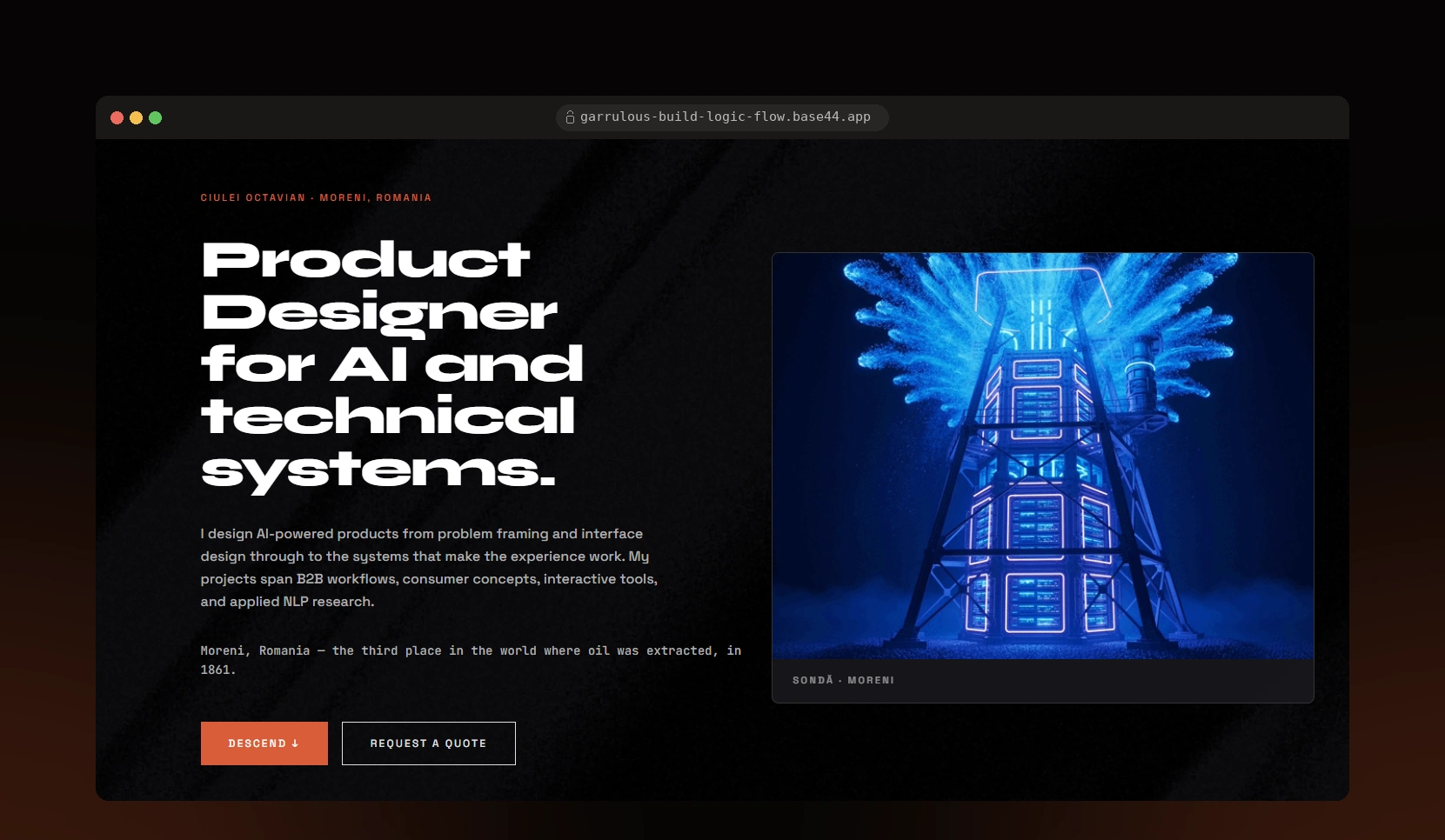
*Moreni portfolio homepage at 0m Surface, with an industrial drilling-rig visual and depth navigation.*
The Problem
Some of my strongest work happens beneath the interface: automation workflows, data processing, technical prototypes, and research systems that don't naturally become a polished screenshot.
I built Moreni to give that work a form people can explore. The site brings 6 distinct projects into one narrative, showing how my work moves between product interaction, system logic, experimentation, and implementation.
The Envato × Contra challenge gave the project a sharp 48-hour deadline. The result became more than a submission. It became the place where my work could live together as one body of product thinking.
Design Rationale
Moreni is designed for people who are curious about how I approach products, from the visible interaction layer to the logic and systems that support it.
The site lets visitors move through the work at their own pace. Some projects begin with an interface, others begin with a workflow problem or a research question. The structure makes room for all of them without flattening their differences.
Several projects had limited client-facing visual material before Moreni. The design challenge was to make those systems understandable and memorable while preserving their real complexity.
I haven't run structured usability testing on this version. The initial direction came from a practical need: I wanted one place where my work could be experienced as a coherent portfolio instead of a set of disconnected links.
Information Architecture
Moreni is organized as a descent from 0m to 1420m. A fixed depth gauge gives every project a stable location and helps visitors keep their place as they move through the page.
The structure comes from Moreni, Romania, where I grew up and where oil was commercially extracted from 1861. Geological depth became the organizing principle for the portfolio. Each stop acts as a layer in a cross-section of the work, with projects appearing deeper as their systems become more complex or interconnected.
A historical detail anchors the Contact section: Moreni's 1929 Sonda 160 well fire began at 1,460m. The Contact stop ends at 1,420m, leaving the 40m difference visible rather than forcing the site's structure into a perfect match.
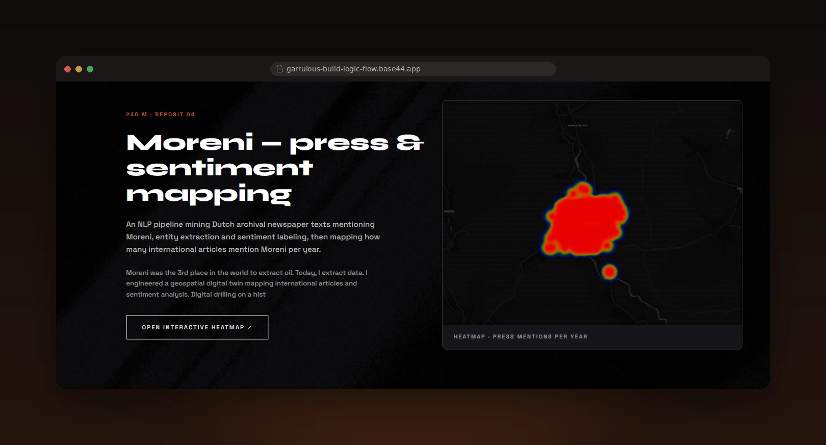
*International press and sentiment mapping at the 240m depth stop.*
Key Design Decisions
A progressive narrative
The page moves from surface-level orientation into deeper project detail. Visitors can first understand the overall range of work, then spend time with the projects that interest them.
Proportional project weight
Projects receive space based on their actual scope. Larger systems have room to explain their logic, while smaller experiments and prototypes remain visible as part of the wider body of work.
Spatial depth as navigation
The depth gauge works as both navigation and visual storytelling. It signals progress through the page while connecting every project to the Moreni setting.
The inquiry form as a working proof point
The Contact section uses the same Make.com automation pattern demonstrated earlier in the portfolio. The final interaction reflects the kind of systems shown throughout the page.
Project Execution
Synapse, 60m
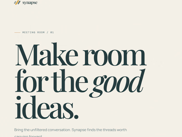
An AI task-delegation tool that turns raw meeting notes into clear next actions. Synapse identifies tasks, matches them to relevant skills, and flags scheduling or skill-gap conflicts for a human to resolve. The product focus is turning discussion into action without handing over judgment entirely to automation.
Catalog, 120m
A Figma concept prototype exploring a quieter, memory-led way for former classmates to reconnect. The experience moves away from noisy public-feed behavior and focuses on a more intentional interaction pattern. Catalog is a concept prototype centered on product flow and interface design. No production build is included.
PulseOS, 180m
A Rive prototype for livestreamers that moves between notifications, summaries, and alerts through a single state machine. The design challenge was to communicate changing information without fragmenting the livestream experience. The prototype explores motion, hierarchy, and state transitions as part of the product interface.
Moreni, 240m
An NLP research and visualization project built on archival newspaper coverage of Moreni. The system uses entity extraction, sentiment labeling, and a heatmap to show international press attention over time. It turns a large body of historical coverage into a geographic and emotional view of how the town appeared in the news.
Laska + Jarvis, 610m
Two independent systems shown together for contrast in scale and purpose. Laska is a concept workflow for a welding business: incoming job requests are classified by material and complexity, then routed into an automated client-confirmation flow. Jarvis is a conversational news aggregator that helps users trace where a piece of information came from.
NLP Research, 890m
A university research project exploring how prompt structure affects AI summaries of customer feedback across 20 test scenarios. The central finding was that prompts with explicit analytical criteria produced more useful outputs than style-first persona imitation, such as asking the model to respond like a food influencer. The strongest structured approach scored 5/5 on the project's accuracy criterion and 4/5 on actionability.
Method note: The evaluation used an AI-as-judge system trained, calibrated on project data.
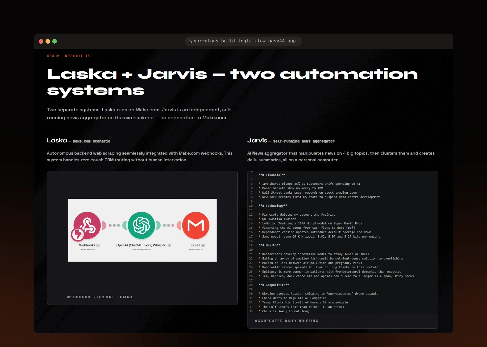
*Two independent automation systems at 610m, given space according to their scope.*
Visual System
Spatial depth is the core interaction. The page begins bright at the surface and progressively darkens as visitors move toward the Contact section, echoing the geological layers named at each stop.
Barend is used for editorial headlines, while Strive Monospace separates data labels, project depths, and system details. Grain, motion, and oil-inspired texture support the environment and give the interface a physical sense of depth.
A separate dark reading mode is available for visitors who prefer a darker interface. The mode supports reading comfort and visual preference. No formal accessibility audit has been run.
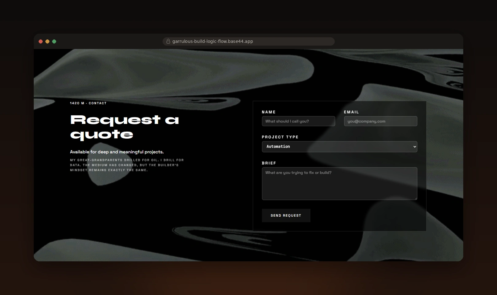
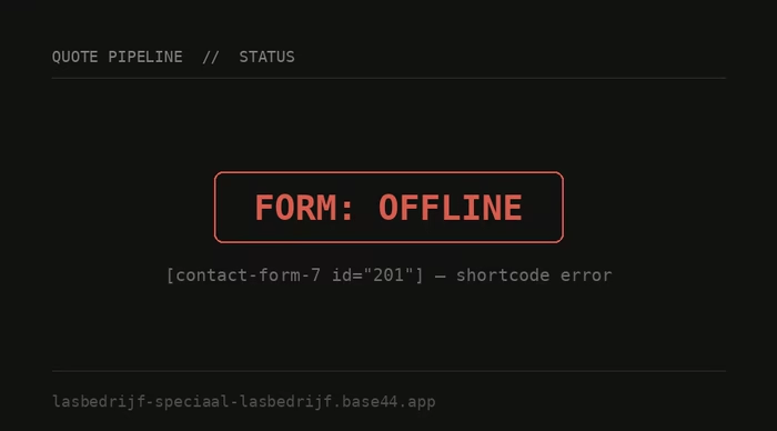
*Inquiry form at 1420m, connected to the same automation pattern demonstrated earlier in the portfolio.*
Results
Visibility: A related project post was featured on Contra and reached 1.5k+ views, my highest-performing Contra post to date.
Portfolio outcome: Moreni brings 6 projects into one navigable story, including automation systems and research work that previously had limited visual form. The project gives the work a shared context without making every project look or behave the same.
Working proof point: The inquiry form connects to the same Make.com automation pattern demonstrated earlier in the portfolio.
I don't yet have structured usability-test results, contact-form submissions, or conversion data. I use Moreni during conversations about my work as a live way to walk through projects, systems, and decisions.
What I'd Test Next
I'd test whether a first-time visitor can:
Understand the range of work represented in the portfolio.
Find a project that matches their interests.
Explain the purpose of a technical system without needing specialist knowledge.
Reach the inquiry flow with a clear sense of what they want to discuss.
The findings would guide future changes to project order, content hierarchy, navigation cues, and the placement of the inquiry form.
Like this project
Posted Aug 22, 2026
Built Moreni, a scroll-driven portfolio blending an oil-drilling metaphor with real product design, automation, and AI systems work.
Likes
1
Views
8
Timeline
Jul 14, 2026 - Jul 17, 2026