Anticafé / Coffee Shop + Coworking / Visual Identity
Mimi Mendoza
Anticafé
Coffee Shop + Coworking Space / Visual Identity
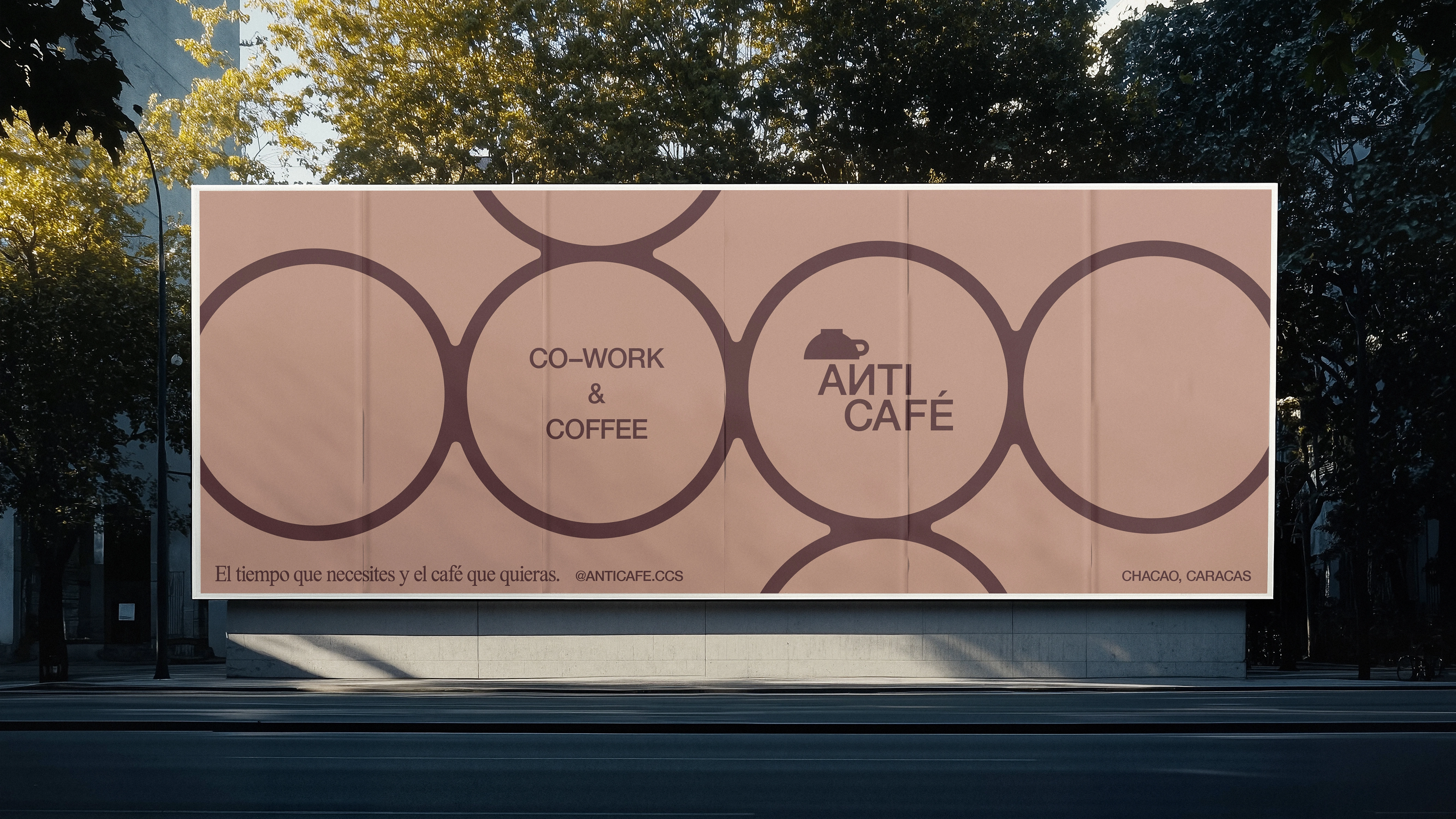
In a market that prioritizes consumption over convenience, Anticafé positions itself as a concept that celebrates and values users' precious time—offering them the benefits of working comfortably (for as long as they need) without the pressure to buy. We explored three key ideas in its identity: time, rhythm, and familiarity.Through 3-module patterns that allude to our 12-hour format and expressive motion graphics, we wanted the brand to represent the passage of time. Meanwhile, the brand's color palette directly references iconic coffee tones, such as Espresso, Teterito, Cappuccino, and Mocha, while incorporating an electric blue, the same one we've seen in internet URLs for years.

CARACAS / VENEZUELA / 2023
Verbal Identity: Bárbara Magallanes
@_mimivision
Let's work together – DM o email me at: mmimimendoza@gmail.com
Like this project
Posted Jan 14, 2026
Visual Identity for Anticafé in which we explored themes of time, patterns and familiarity.