Jonalyn McDonald: Elegant Brand Identity Design for a CPA Accoun
The Vision
Jonalyn McDonald sought a refined and professional brand identity to elevate her CPA practice. The goal was to create a brand that conveys trust, sophistication, and approachability, reflecting her commitment to delivering exceptional accounting services with a personal touch.
Strategic Foundation
Through our discovery process, I identified three key brand pillars to guide the design:
Trust & Professionalism: Establishing credibility and reliability in every client interaction
Elegant Simplicity: Showcasing a clean, minimalist design that aligns with Jonalyn’s refined approach
Warm Approachability: Creating a brand that feels welcoming and accessible, balanced with expertise
Visual Language
The brand identity for Jonalyn McDonald was crafted to embody both professionalism and a subtle warmth, appealing to clients who value quality and clarity in financial guidance.
Typography & Wordmark
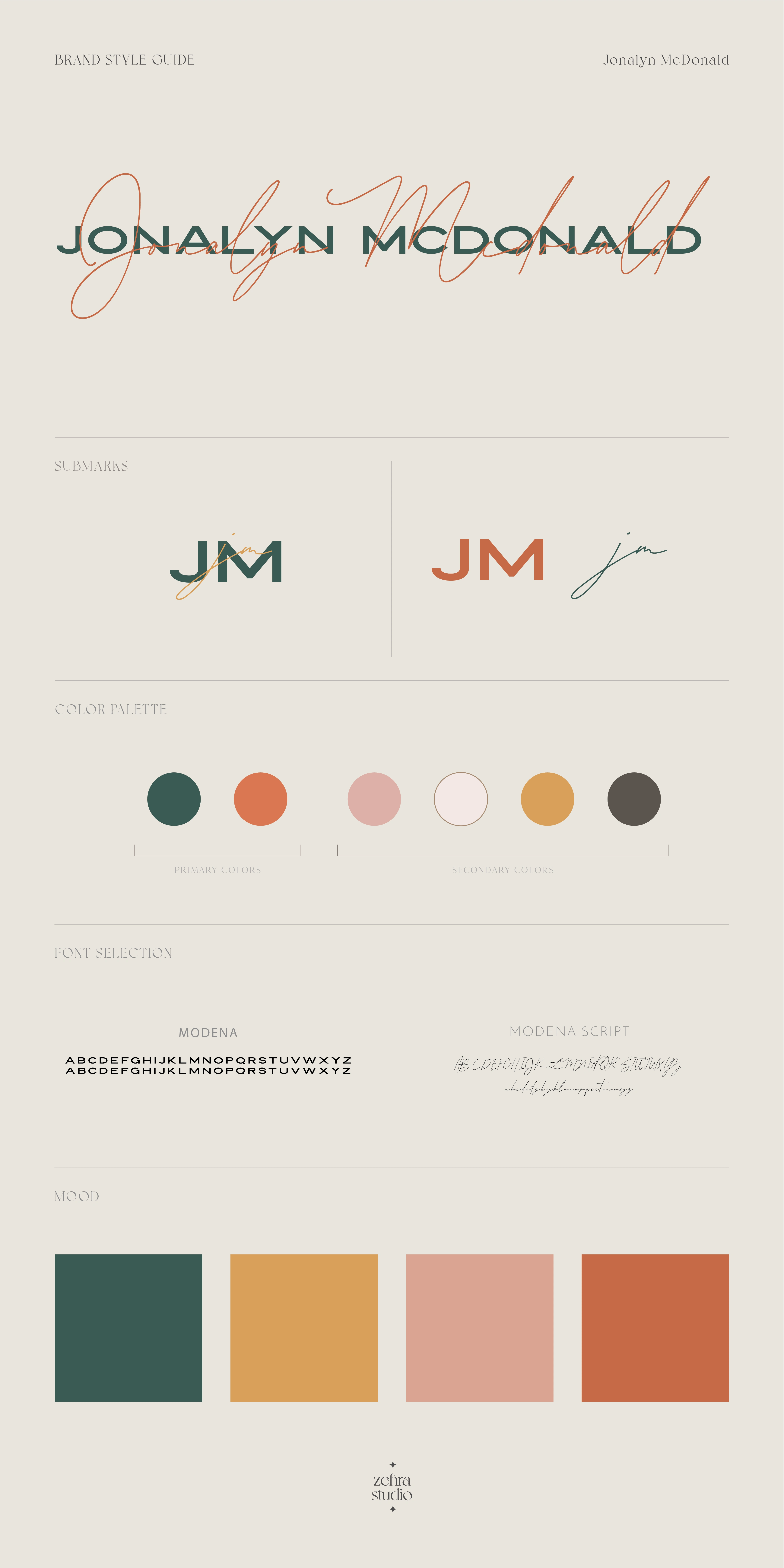
Primary Typeface: A modern serif font, Modena, that adds an air of sophistication and authority
Script Accent: Modena Script introduces a personalized, softer touch, reflecting Jonalyn's approachable nature
Balanced letterforms that reflect both precision and elegance
Color Palette
The color palette blends deep, grounding tones with warm, inviting hues:
Forest Green: Representing stability, reliability, and trust
Terracotta: Adding warmth and a sense of connection
Soft Pink and Cream: Enhancing approachability with a gentle, welcoming feel
Mustard Yellow: Adding a touch of modernity and vibrancy without overpowering
Visual Elements
Submarks: Clean and versatile submark variations with initials (JM) and signature elements for brand flexibility
Organic Shapes: Simple, fluid shapes that introduce a soft contrast to the structured design, adding a human touch
Intentional White Space: Creating a sense of clarity, allowing each element to breathe and maintain focus
Brand Implementation
The brand system extends seamlessly across various touchpoints, maintaining a cohesive identity that is both memorable and professional.
Stationery & Business Cards: Minimalist designs that convey a refined elegance, leaving a lasting impression
Website & Digital Presence: A user-friendly online experience that reflects the brand’s clarity and ease of access to services
Client Documents & Reports: Professionally branded templates that reinforce the brand's consistent quality and attention to detail
Impact
The resulting brand identity for Jonalyn McDonald:
Establishes her presence as a trustworthy and elegant CPA accountant
Attracts clients who appreciate a polished, professional approach to accounting
Creates a cohesive, approachable brand experience, making financial services feel accessible and client-focused
Through strategic design choices and an emphasis on elegance and clarity, I developed a brand that highlights Jonalyn McDonald's expertise while ensuring clients feel valued and supported.

Like this project
Posted Jul 7, 2021
Elegant brand identity for CPA Jonalyn McDonald, blending trust, professionalism, and warmth to create a welcoming and refined client experience.
Likes
1
Views
77


