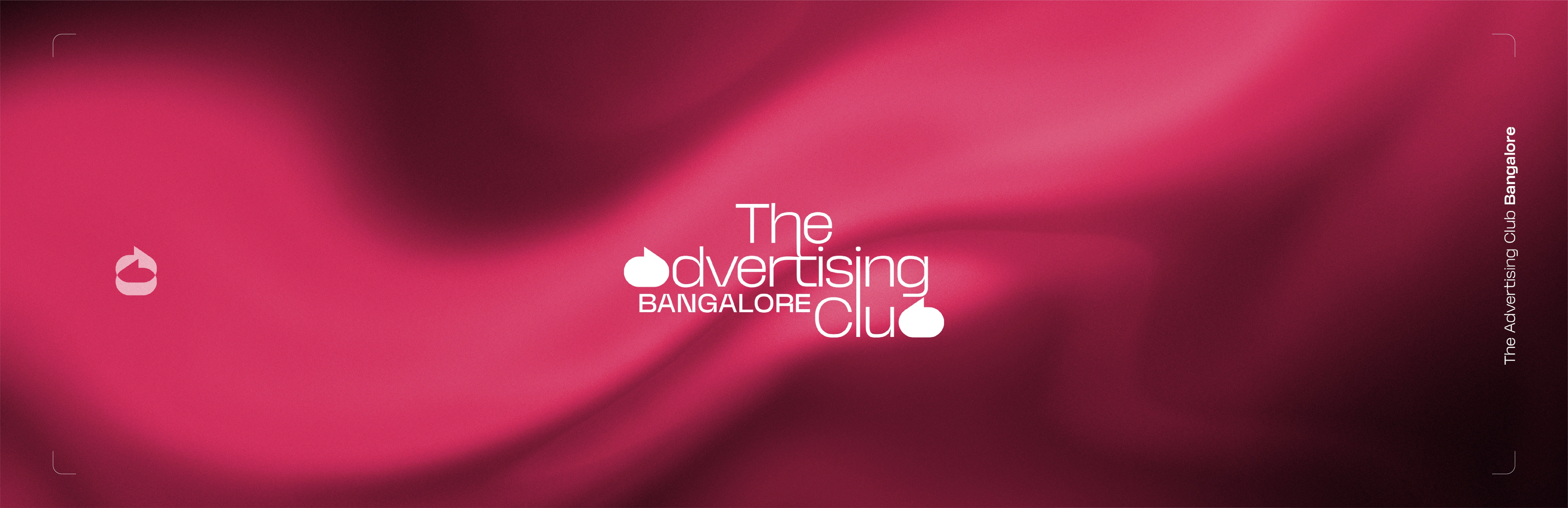
The Advertising Club Bangalore | Rebranding
Rohan Sharma

For over four decades, The Advertising Club Bangalore has shaped the city’s advertising community. Today, it renews its voice and platforms to engage the next generation of creative talent.
The objective was to reposition The Advertising Club Bangalore as more than an industry body, evolving it into a contemporary creative platform that feels relevant to the next generation while respecting its legacy within the advertising community.
The strategy focused on developing a visual language that encourages visibility, participation, and dialogue across the creative ecosystem. By simplifying the identity and introducing a more expressive communication system, the brand positions TACB as a platform where ideas circulate, conversations grow, and the industry stays connected.
Advertising lives through conversation. Ideas travel through discussion, debate, and word of mouth.
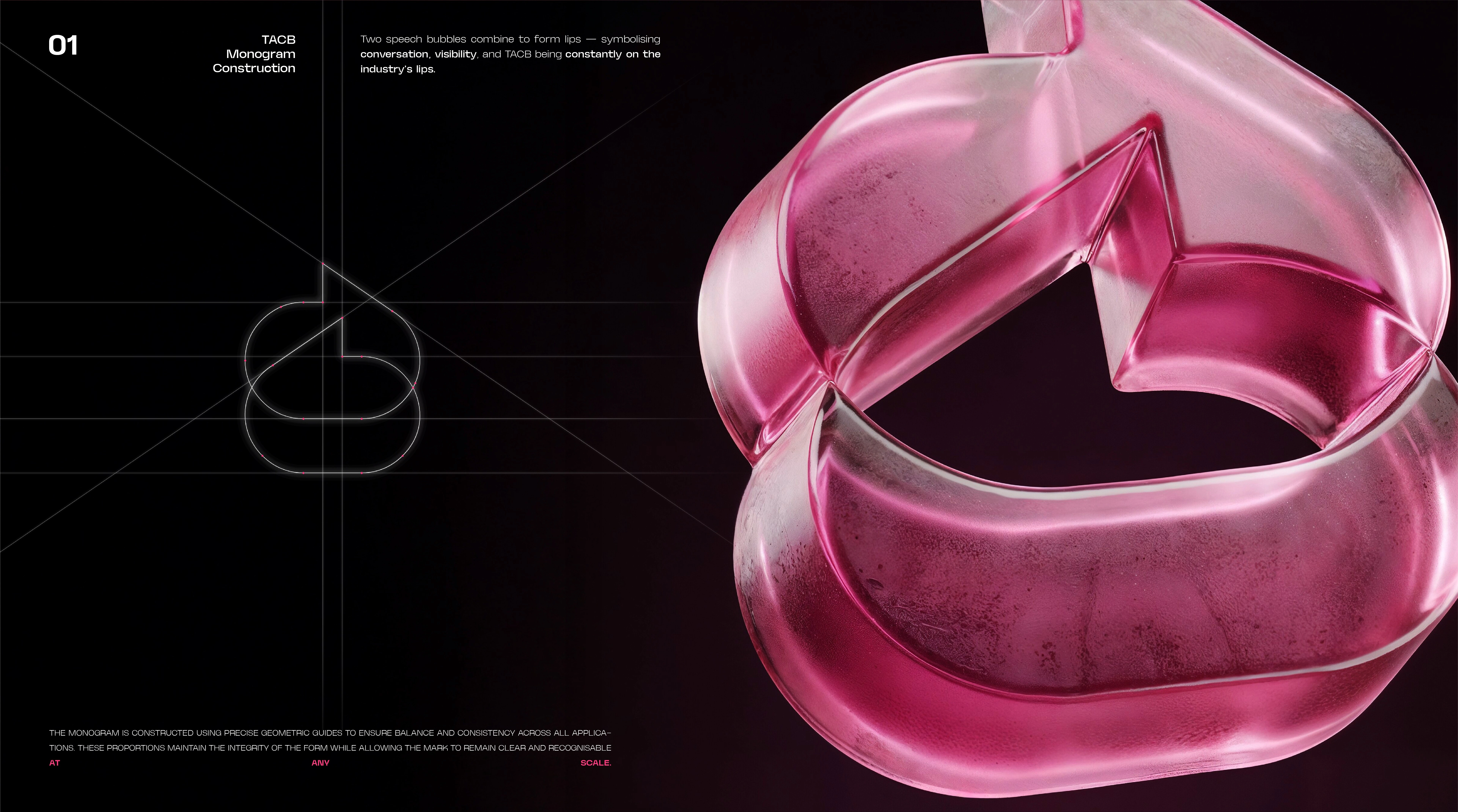
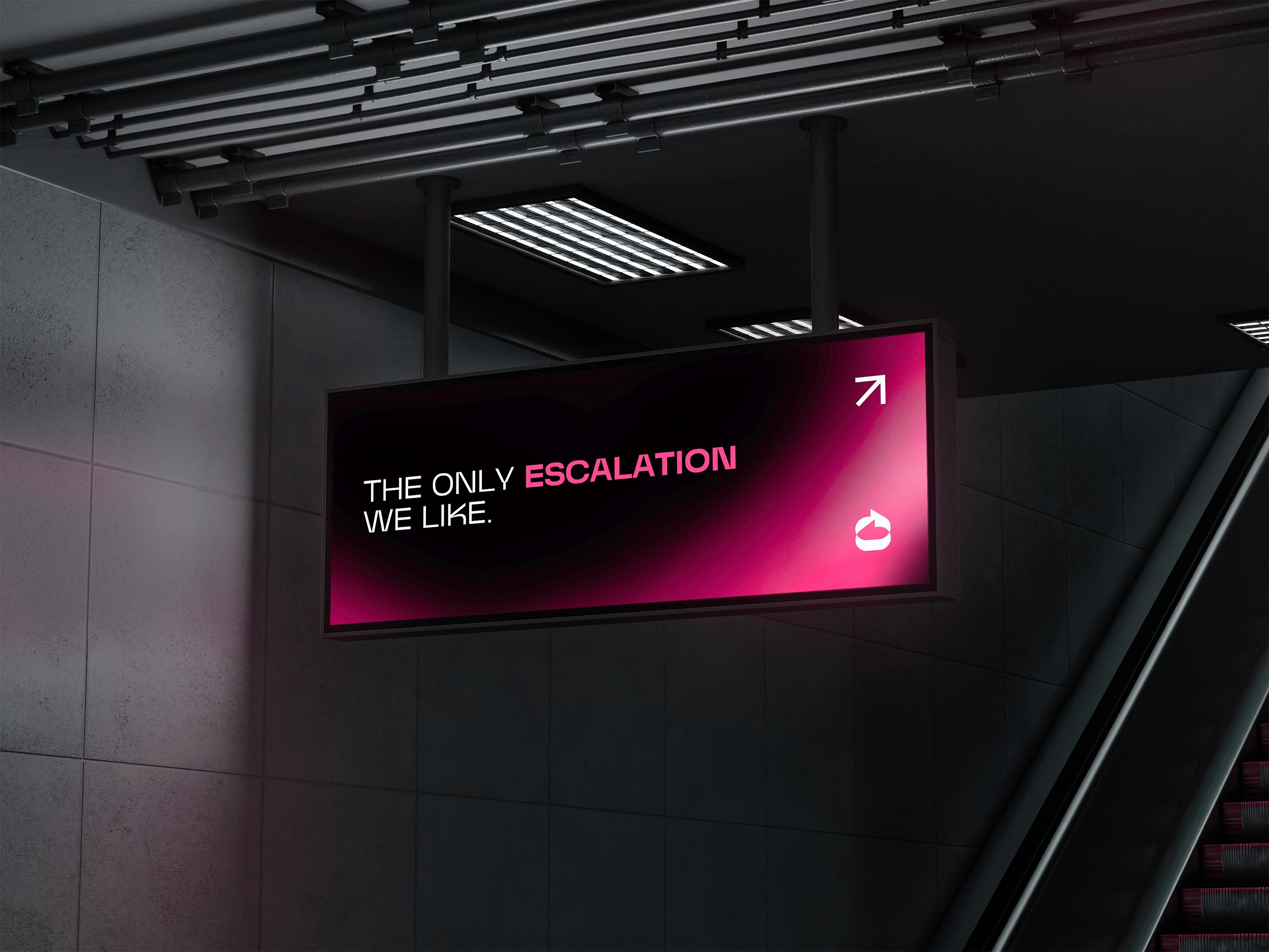
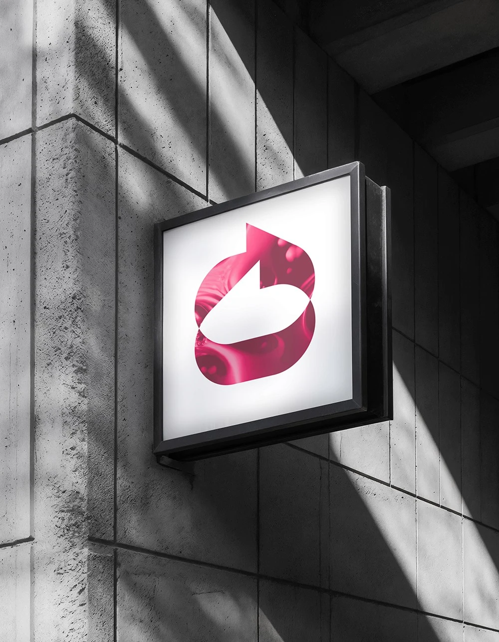
The concept builds on this behaviour. The identity uses speech bubbles as a core metaphor, representing dialogue within the creative community. When combined, these shapes form a set of lips — a visual expression of the club being constantly spoken about, shared, and discussed within the industry.
A brand built around the idea that the most powerful ideas are the ones people can’t stop talking about.
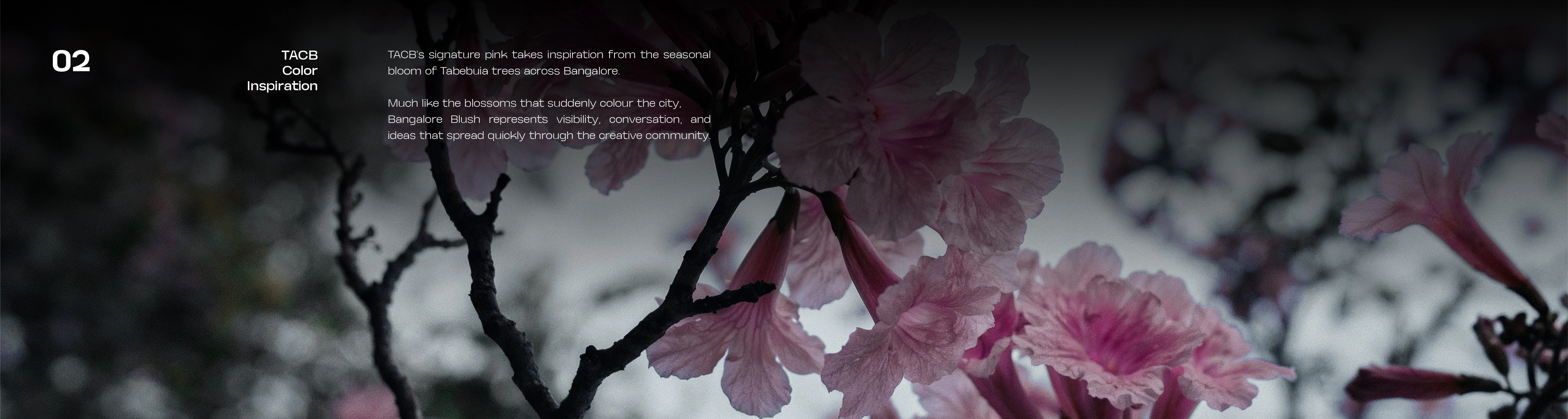
Colour palette inspired by the seasonal Banglore tabebuia bloom.
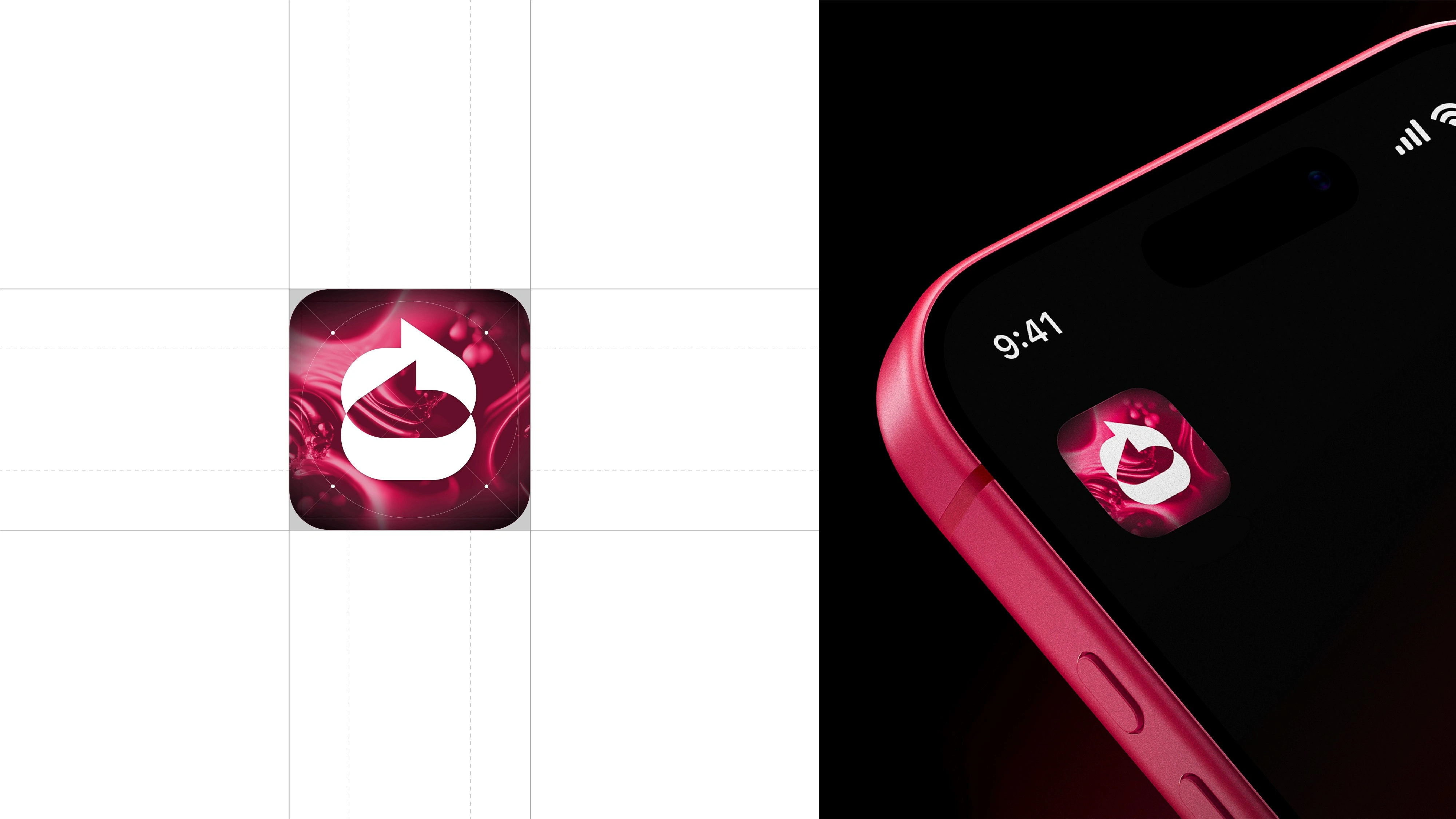
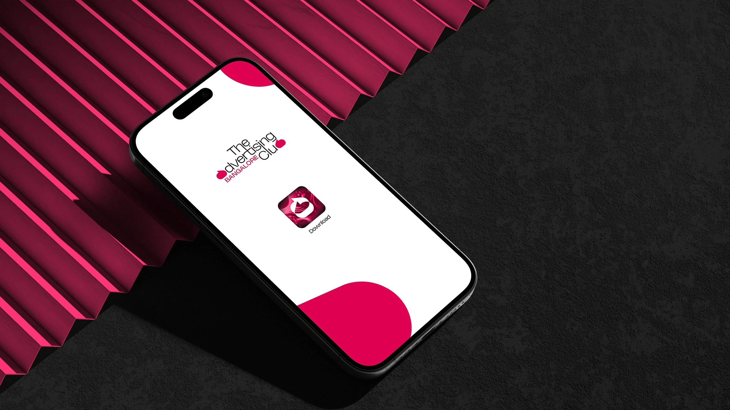
App icon
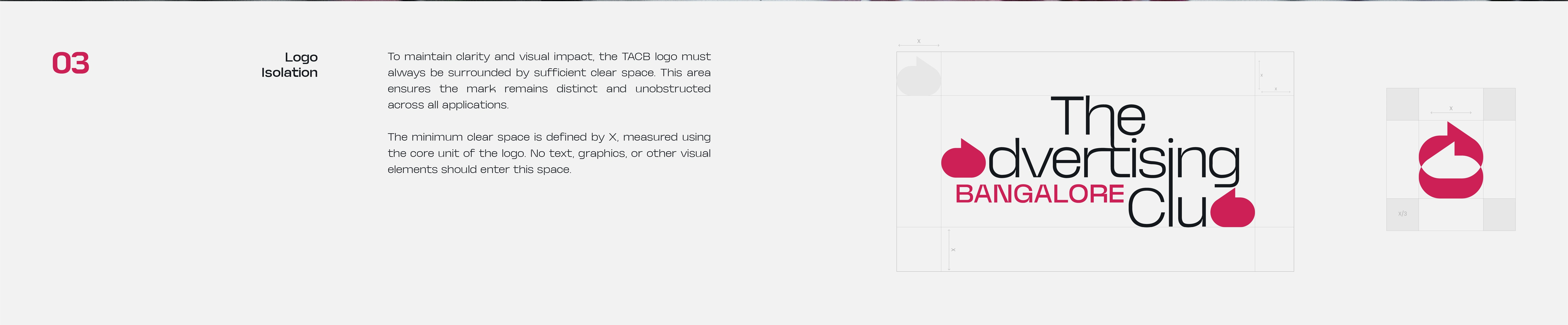
Logo Construction
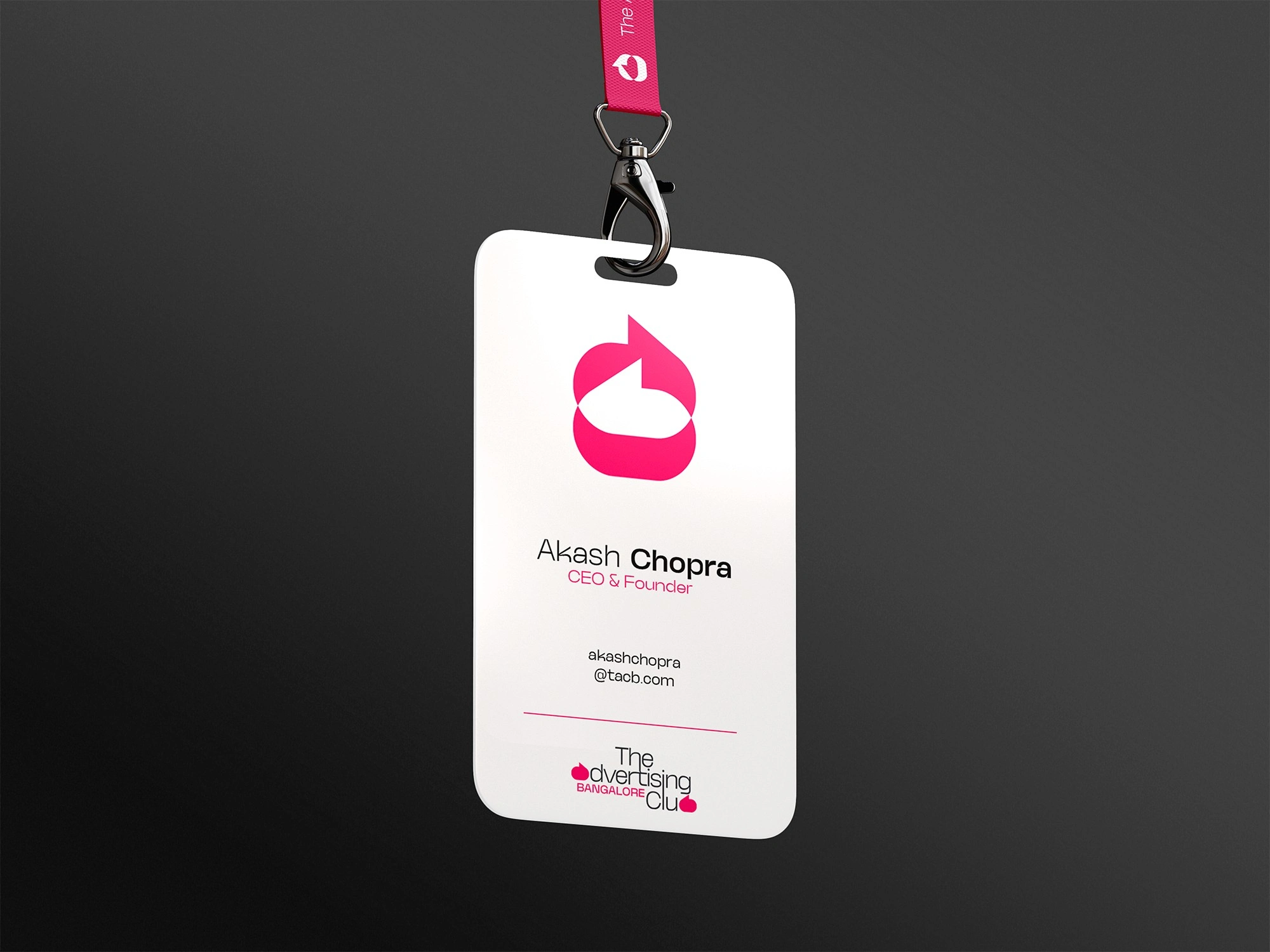
The identity system revolves around a bold speech bubble motif that anchors the brand’s visual language. The primary wordmark integrates two speech bubbles within the typography, reinforcing the idea of conversation and visibility.
The monogram distills these forms further. Two speech bubbles merge to form a simplified lip shape, symbolising the club’s presence at the tip of the industry’s tongue.
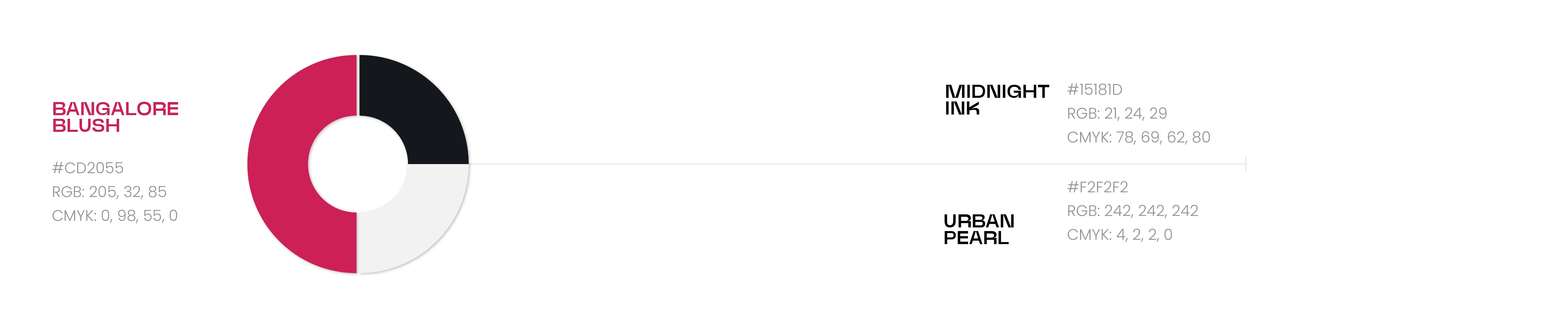
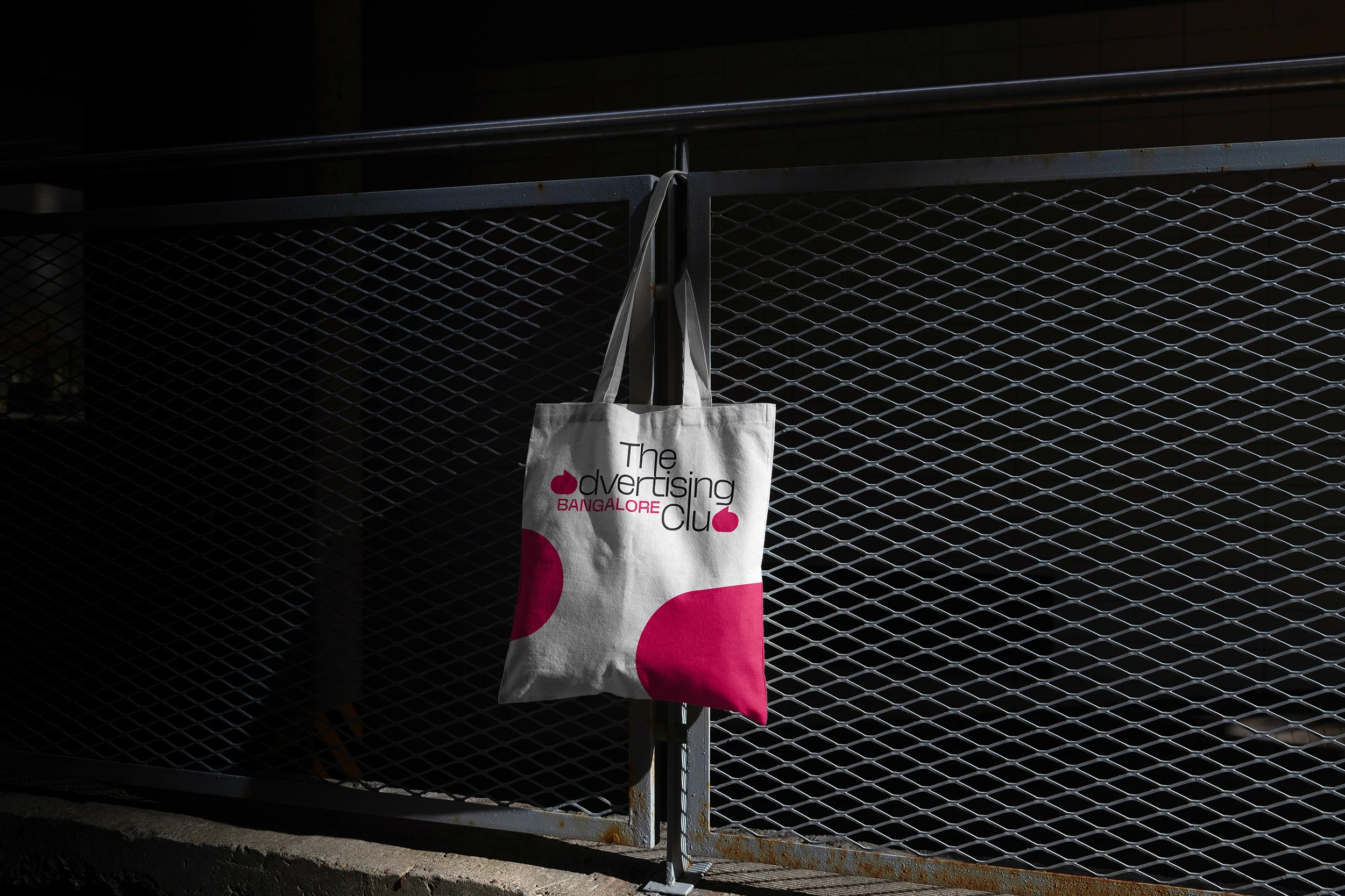
The colour Bangalore Blush, inspired by the seasonal bloom of Tabebuia trees across the city, introduces vibrancy and cultural grounding. The system pairs expressive colour with clean typography and striking imagery to create a visual language that feels modern, confident, and unmistakably visible.
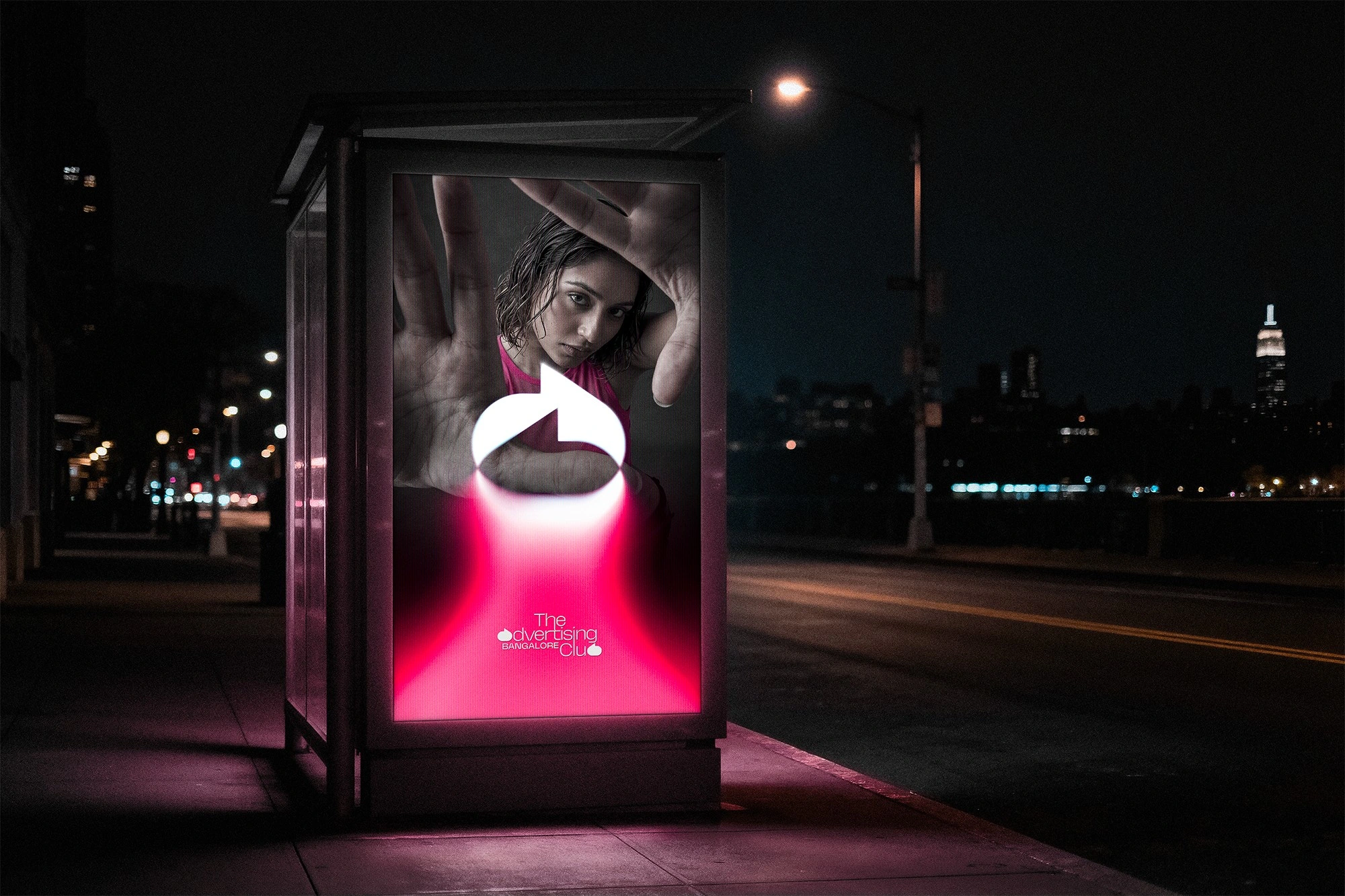
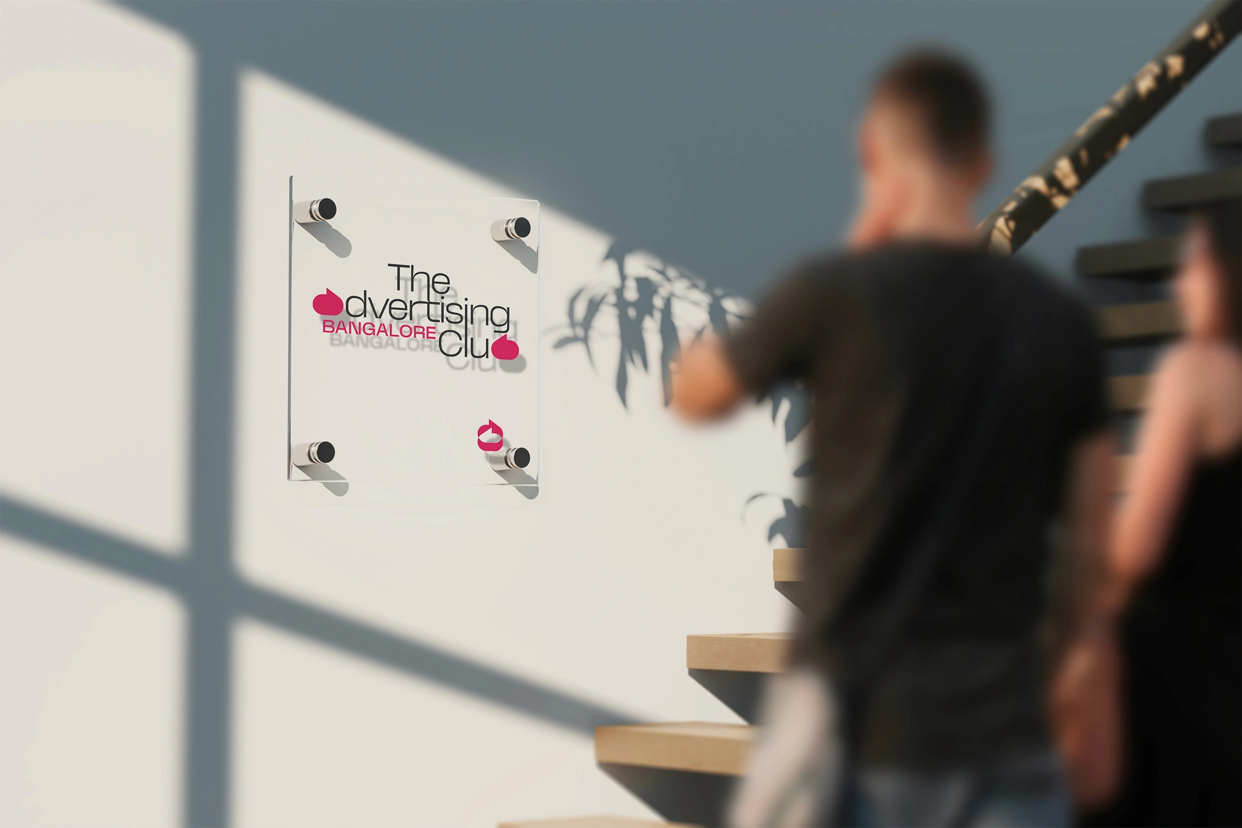
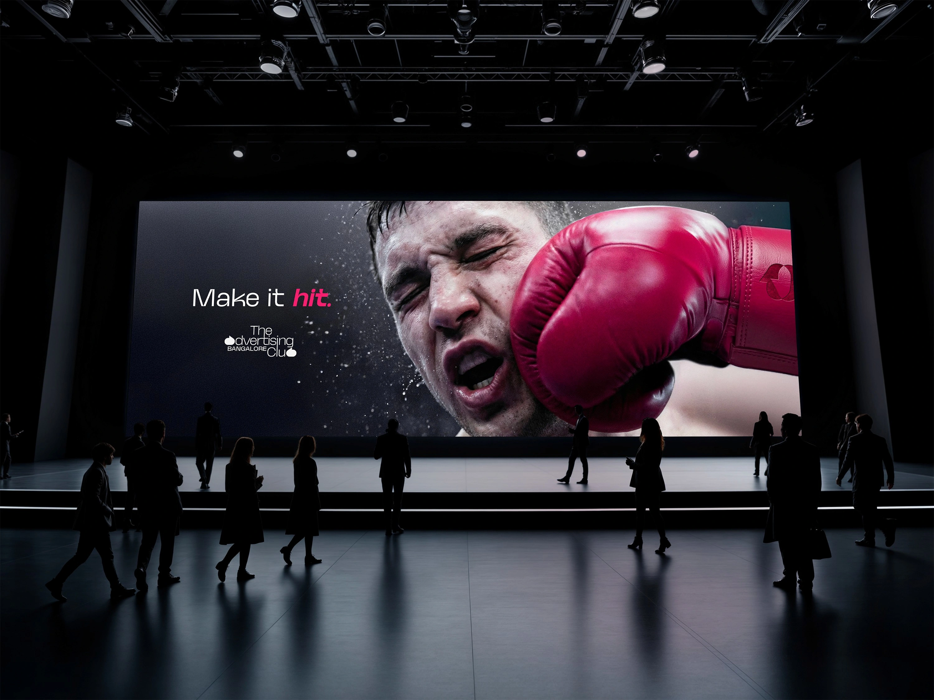
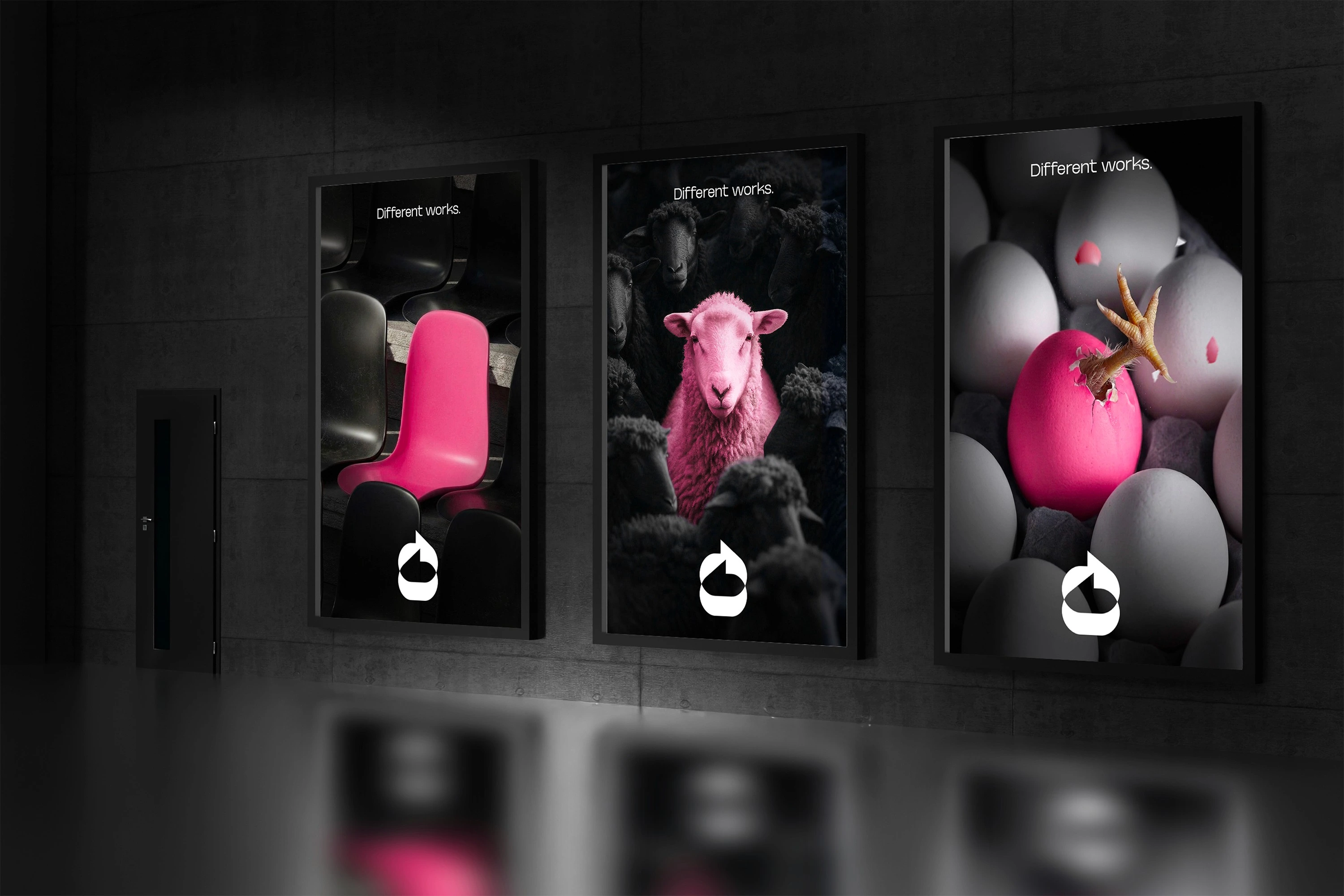
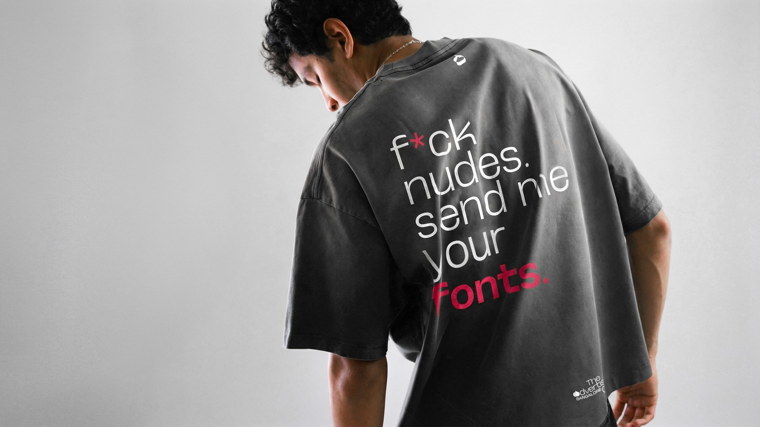
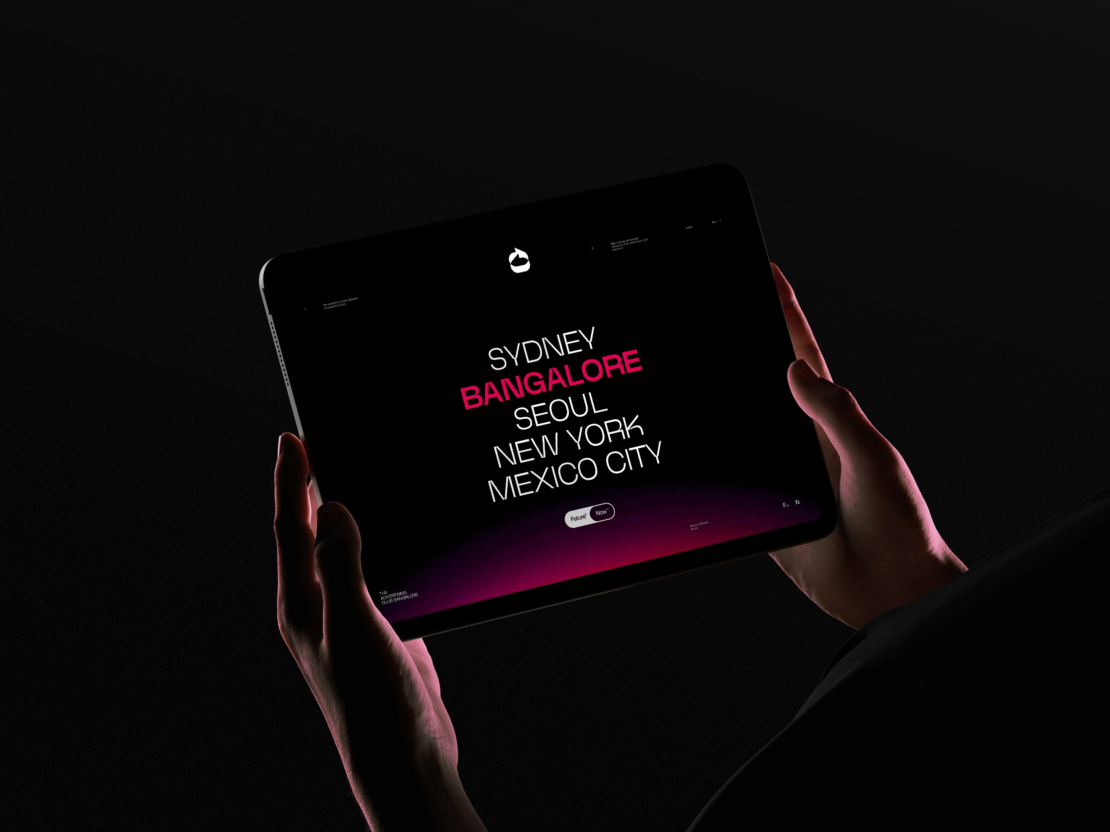
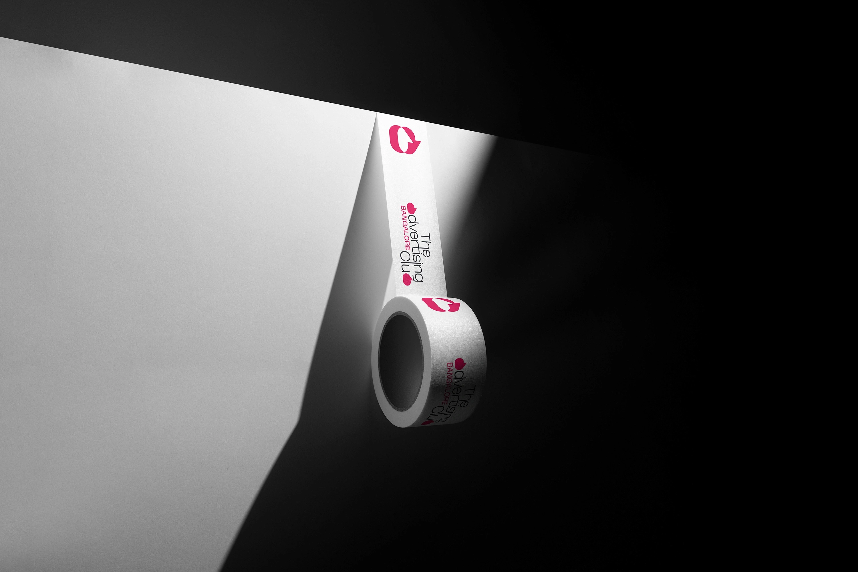
The identity was designed to perform across digital platforms, events, communication material, and public-facing applications. From social campaigns and outdoor signage to spatial graphics and merchandise, the system maintains clarity and recognisability.
Every touchpoint reinforces the same principle: a club that celebrates ideas, sparks conversation, and continues to shape the creative culture of Bangalore.

Like this project
Posted Apr 22, 2026
Repositioned The Advertising Club Bangalore as a modern creative platform using a new visual identity.