Wise Winds Branding
Betty K


Project Overview
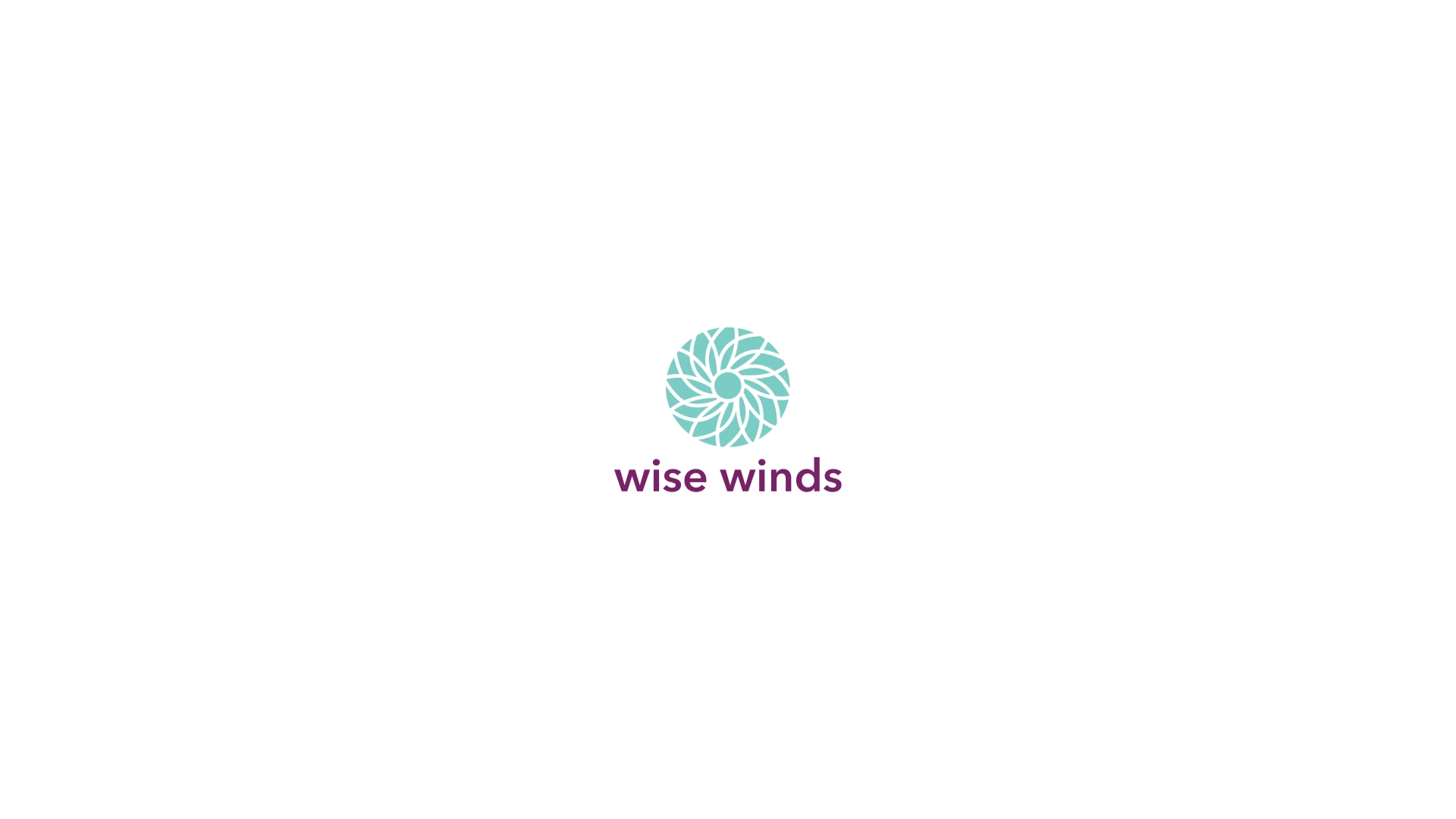
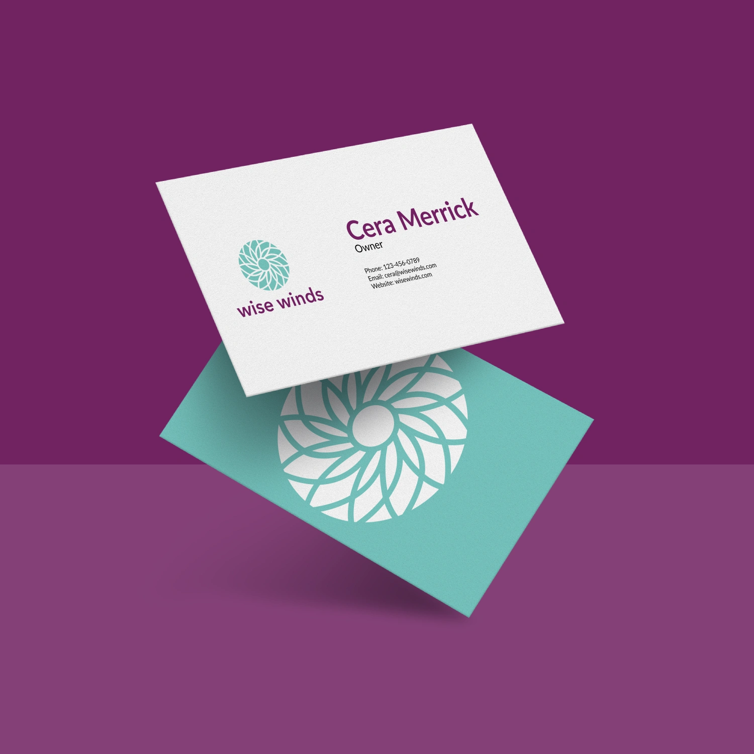
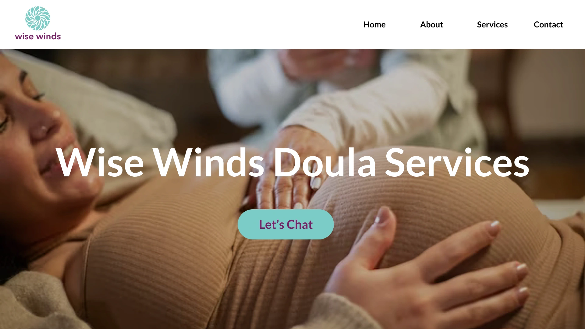
Wise Winds is run by an abortion and pregnancy doula who also is a clinical herbalist in California. The owner of Wise Winds needed a branding identity to establish themselves as a professional and their target audience are ages 20 to early 40's. One of the ideal things the owner mentioned when speaking to me was to have their herbalist background somehow embedded into the branding design.
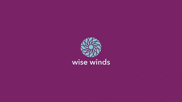
My solution (inspired by the owner's herbalist background and of course movement because of wind being in the name) was to have a flower look like it's spinning. A lot of herbs grow flowers and that is what inspired me to go towards a flower shape. I decided to go for a geometric art look for this logo to simplify the look so it truly can live in both digital and print media but also the inspiration photos I got from the client were all geometric shapes.

Design Process
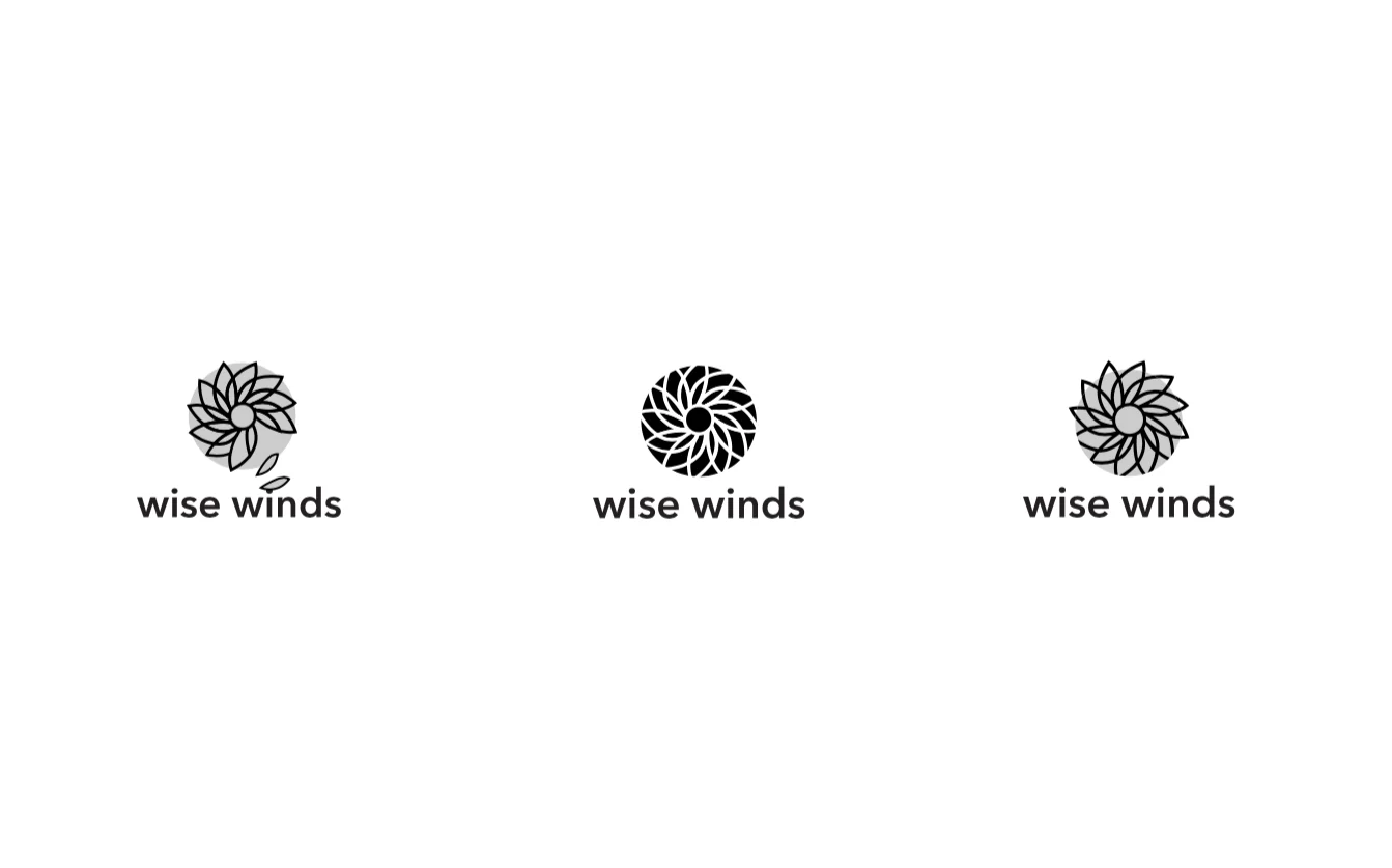
When designing this logo, I did several concepts of a flower moving or spinning and one with petals falling off. Eventually I landed on the one in the middle of having the flower inside the circle vs a more in-depth look to it.
Like this project
Posted May 20, 2026