Creative Agency Website Framer

Ahmad S. Afandi
Web Designer
UI Designer
Framer Designer
Figma
Framer
An Eye-Catching, Bold Design for Creative Portfolios
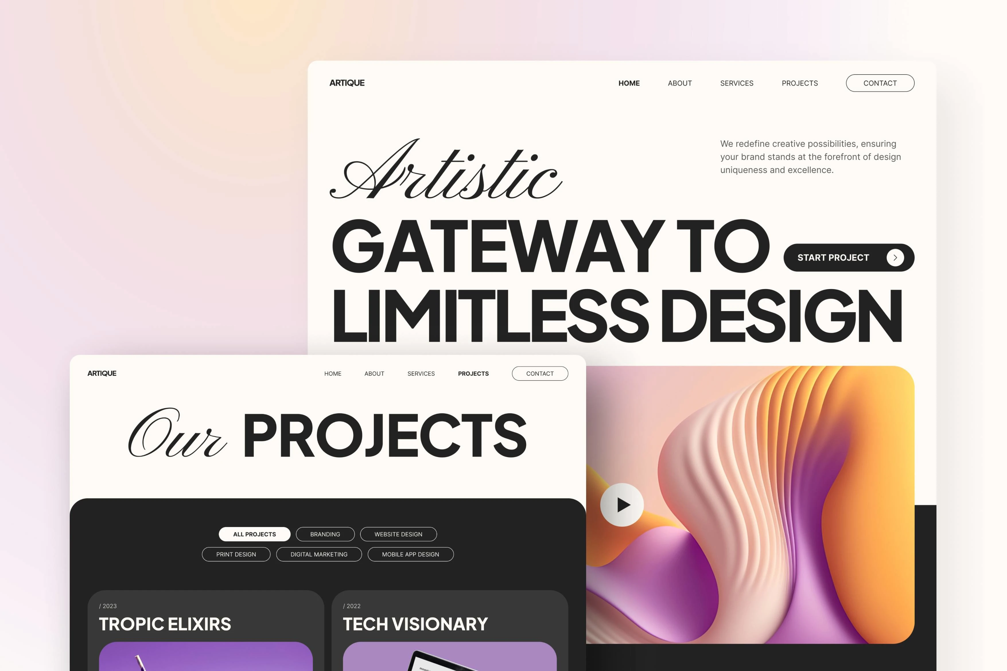
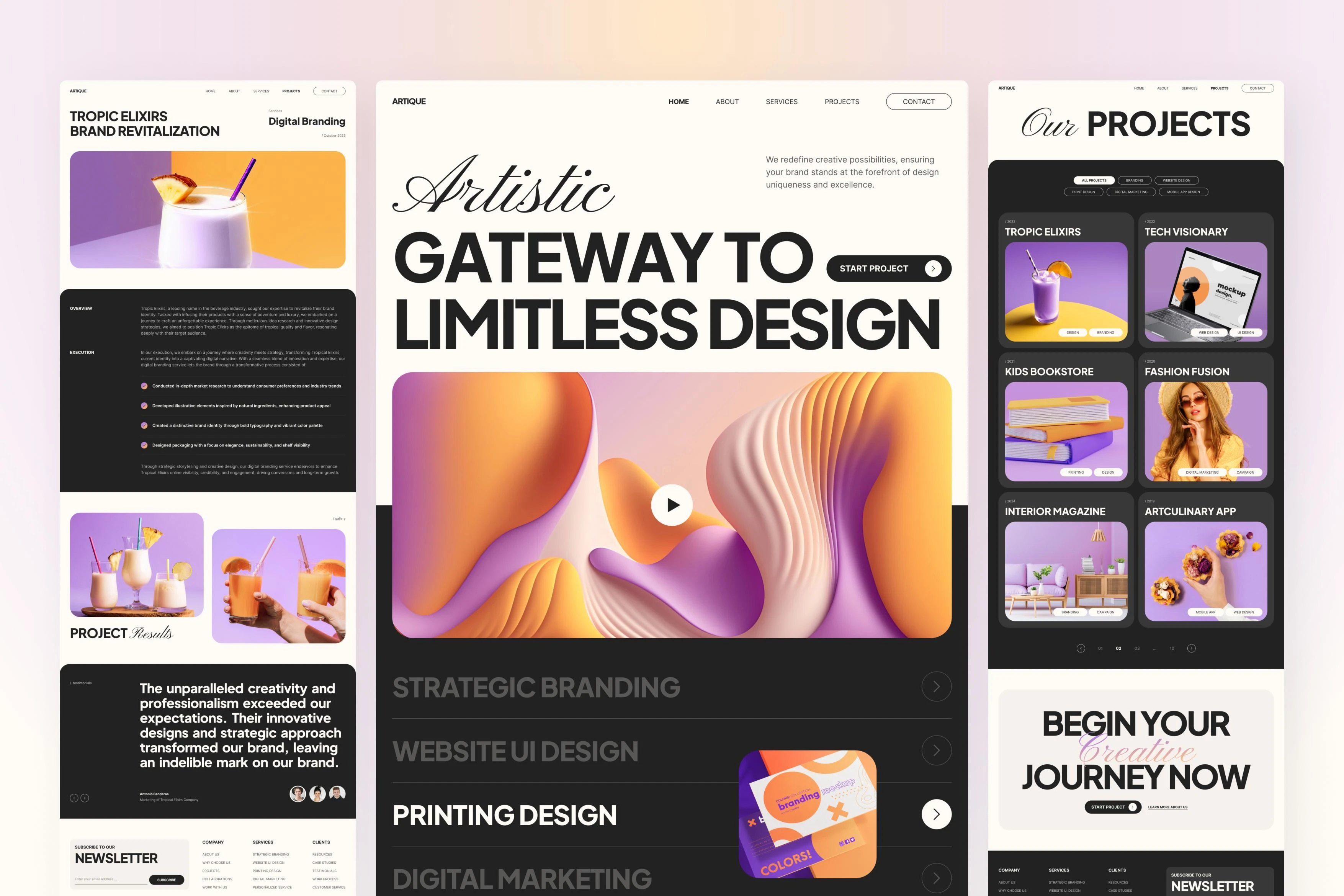
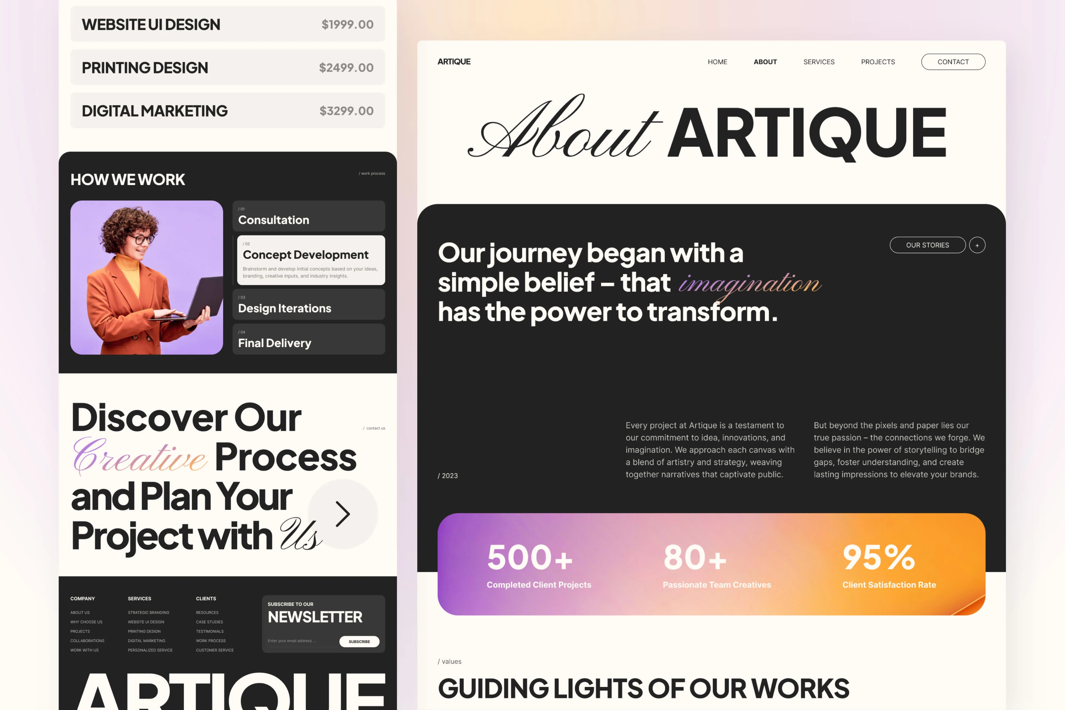
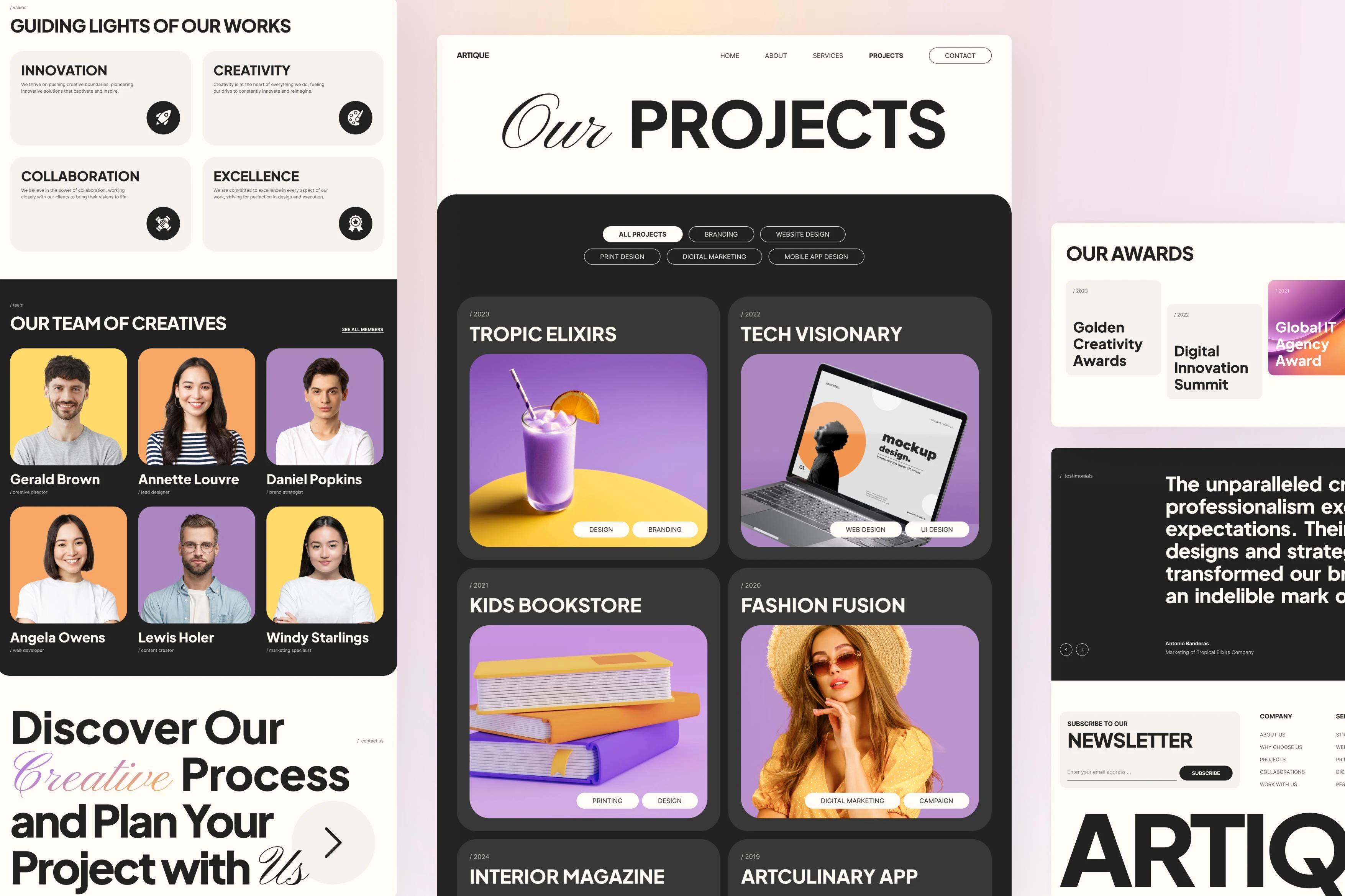
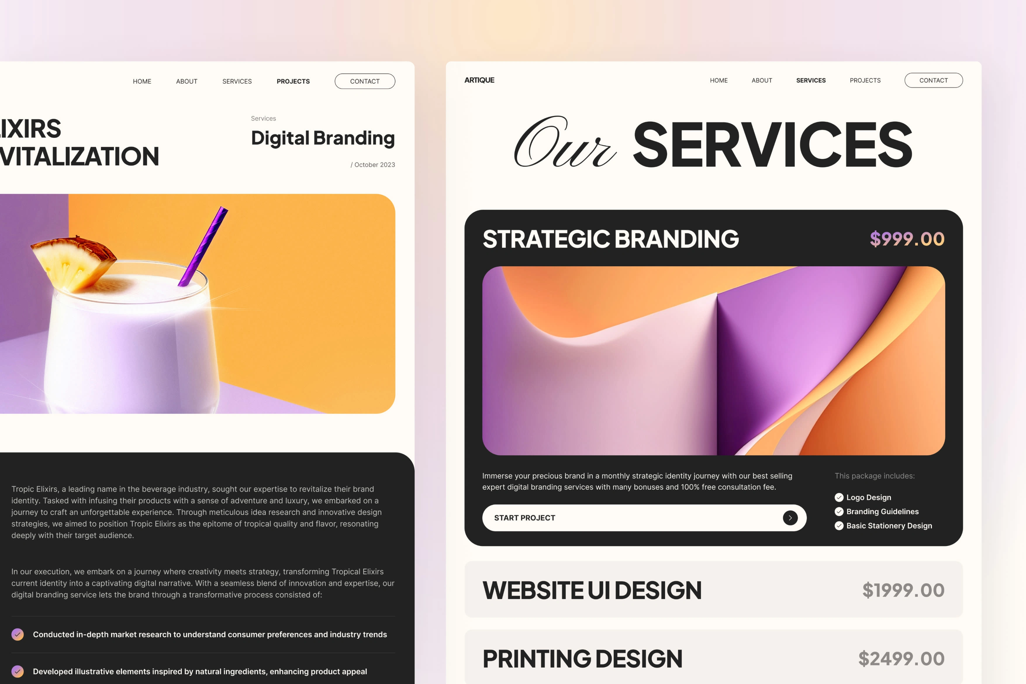
This design exploration for Artique was crafted to elevate the digital presence of creative agencies, providing a striking, portfolio-focused layout. With six screens—homepage, about, projects, project details, packages/services, and contact—the design captures the agency’s artistic essence. The combination of elegant serif and modern sans serif fonts, along with a vivid color palette of purple, orange, beige, and black, showcases boldness and creativity, making it an ideal choice for those who want to make a strong visual impact.
Live preview
Challenges:
Balancing bold visual elements with usability, ensuring the layout highlights agency projects without overwhelming the user.
Incorporating contrasting fonts and colors to enhance readability while maintaining a cohesive, stylish aesthetic.
Selecting photo assets, and ensuring they went smoothly with the overall design concept
Results:
The final design presents an engaging, visually rich experience that’s both memorable and functional. The bold typography and striking color palette create a strong identity, while the structured layout makes navigation intuitive. Artique’s design serves as a powerful portfolio, allowing creative agencies to showcase their work and attract clients with a sophisticated, attention-grabbing online presence.
Live preview


