Built with Framer
Visari Financial - Financial Advisory Firm Framer Site
Brandon Del Rosario
Visari Financial — Financial Advisory Firm Framer Website
A bold, dark-themed digital home for a financial services brand built to feel premium, confident, and unmistakably modern — designed to earn trust with a next-generation client base.
Background
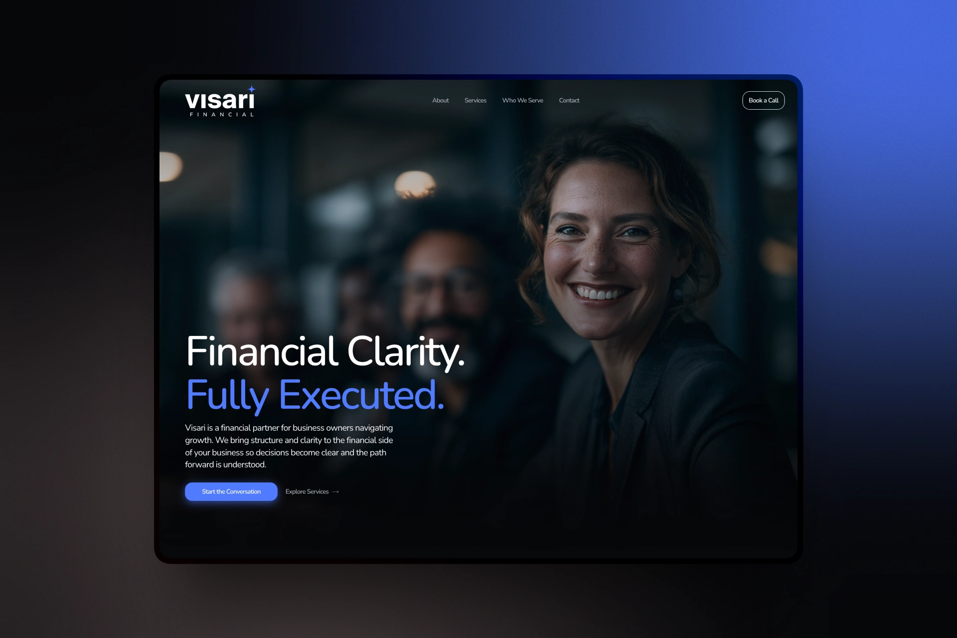
Visari Financial's founder, Mia Stein, needed a site that broke from the traditional financial services playbook — the light backgrounds, conservative navy-and-white palettes, and stock-photo handshakes that dominate the industry. She wanted a platform that signaled sophistication and forward-thinking expertise from the first scroll, appealing to a client base that expects the same design quality from their financial partner as they do from any premium consumer brand.
The challenge was balancing that boldness with the trust and credibility financial services absolutely require. A wealth platform can't just look cool — it has to feel secure, competent, and legitimate, even while breaking visual conventions.

An editorial-style About section with layered photography and highlighted keywords that reinforce Visari's core promise of clarity and structure.
Solution
I built the site around a dark theme with Nunito typography, giving it a distinctive, premium feel that stands apart from typical financial sites without sacrificing readability or trust. Framer animations were layered in to add a sense of motion and polish — subtle enough to feel intentional rather than gimmicky, reinforcing the sense that Visari is a modern, technically capable operation.
The build went through multiple design directions before landing on the final aesthetic, and I ran a full pre-launch design audit against Mia and her team's detailed feedback to make sure every section — messaging, spacing, animation timing, content hierarchy — was refined before launch.
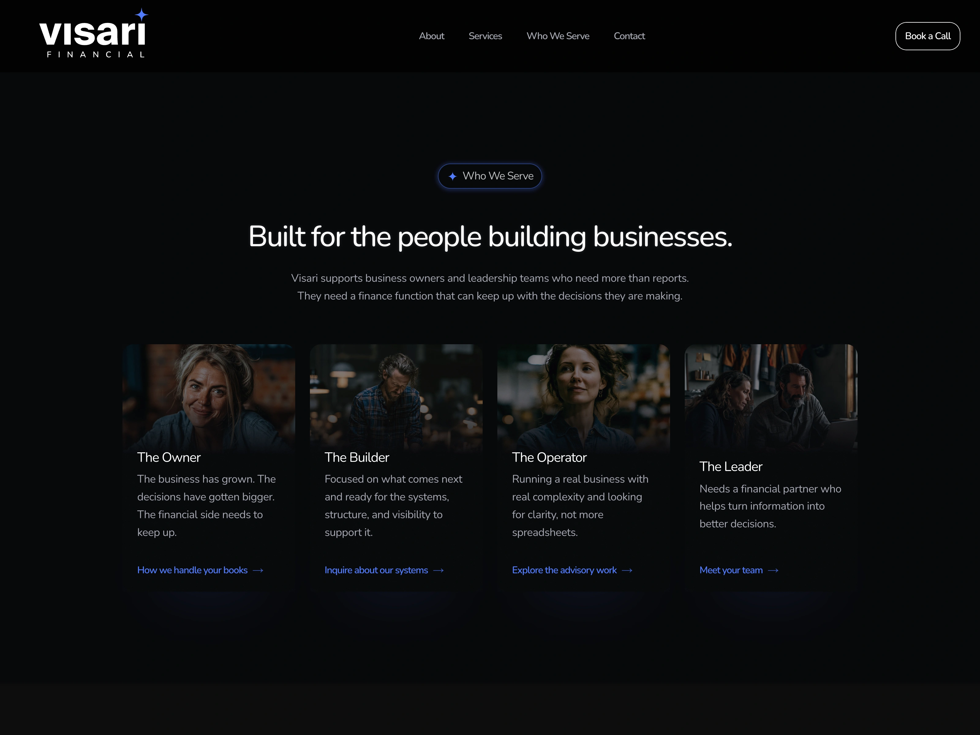
A persona-driven breakdown of Visari's ideal clients, using real photography to make each audience segment feel specific and human rather than abstract.
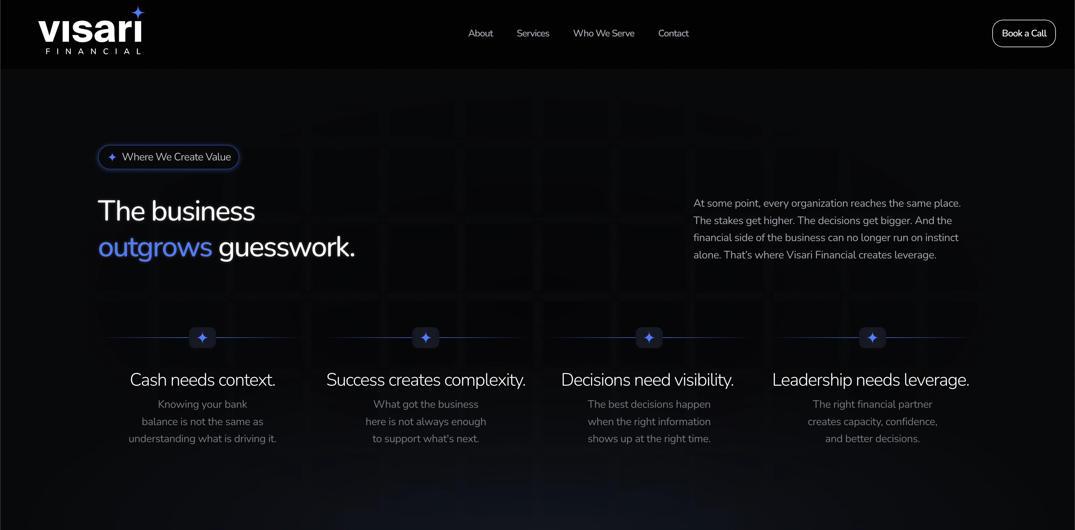
A four-point value framework laying out exactly where growing businesses hit friction — and where Visari steps in to create leverage.
Design + Structure
The site structure guides visitors from an immediate impression of sophistication into a clear understanding of Visari's services and approach, closing with a direct path to engagement. Key design elements:
Dark theme for a premium, modern financial aesthetic
Nunito typography for a friendly-but-credible voice, avoiding the coldness of typical serif-heavy finance sites
Framer animations to add motion and polish without undermining trust or performance
Iterative refinement through several rounds of feedback with the founder to get details exactly right
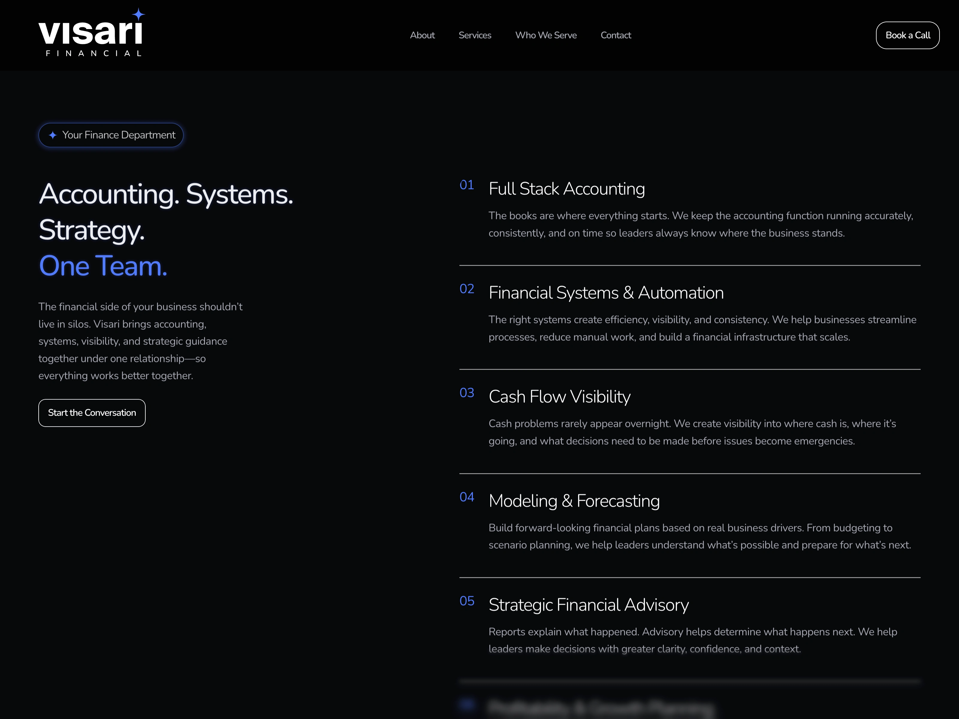
A numbered services breakdown that turns a complex range of financial offerings — accounting, systems, forecasting, advisory — into a clear, scannable list.
Outcome
The final Visari Financial site delivers a wealth platform experience that feels current and premium rather than stiff and traditional — built to resonate with a client base that expects more from their financial partner's digital presence. The site has been delivered and is live for the Visari team, including founder Mia Stein and team member Steph, giving them a platform built to support their growth.
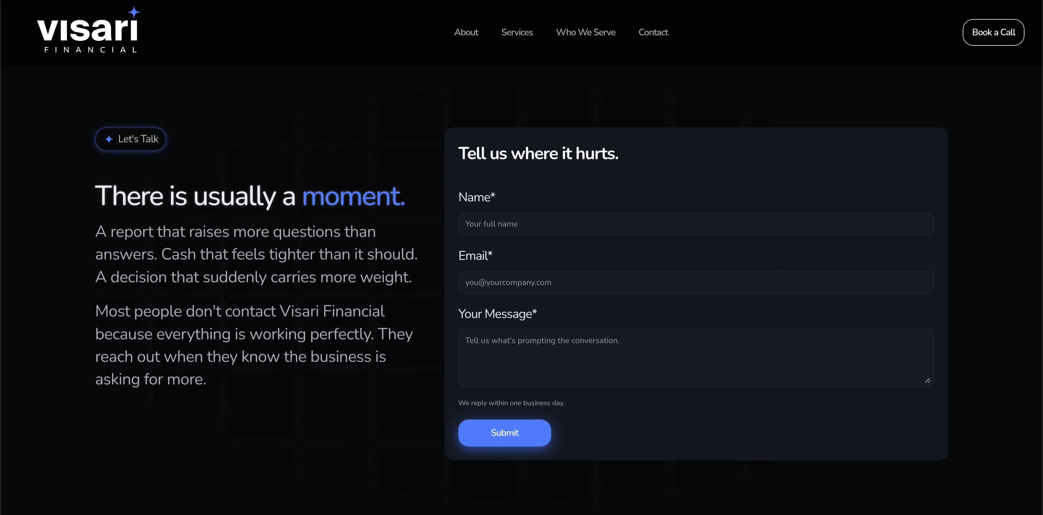
A contact section that speaks directly to the moment a client decides to reach out, paired with a clean, low-friction inquiry form.
Like this project
Posted Jul 4, 2026
Bold, dark-themed Framer site for a financial advisory firm for business owners — built with subtle animation to turn business owners' guesswork into clarity.
Likes
0
Views
8
Timeline
May 1, 2026 - Jul 1, 2026