Health Supplement Brand Packaging Design
Soveet Gupta
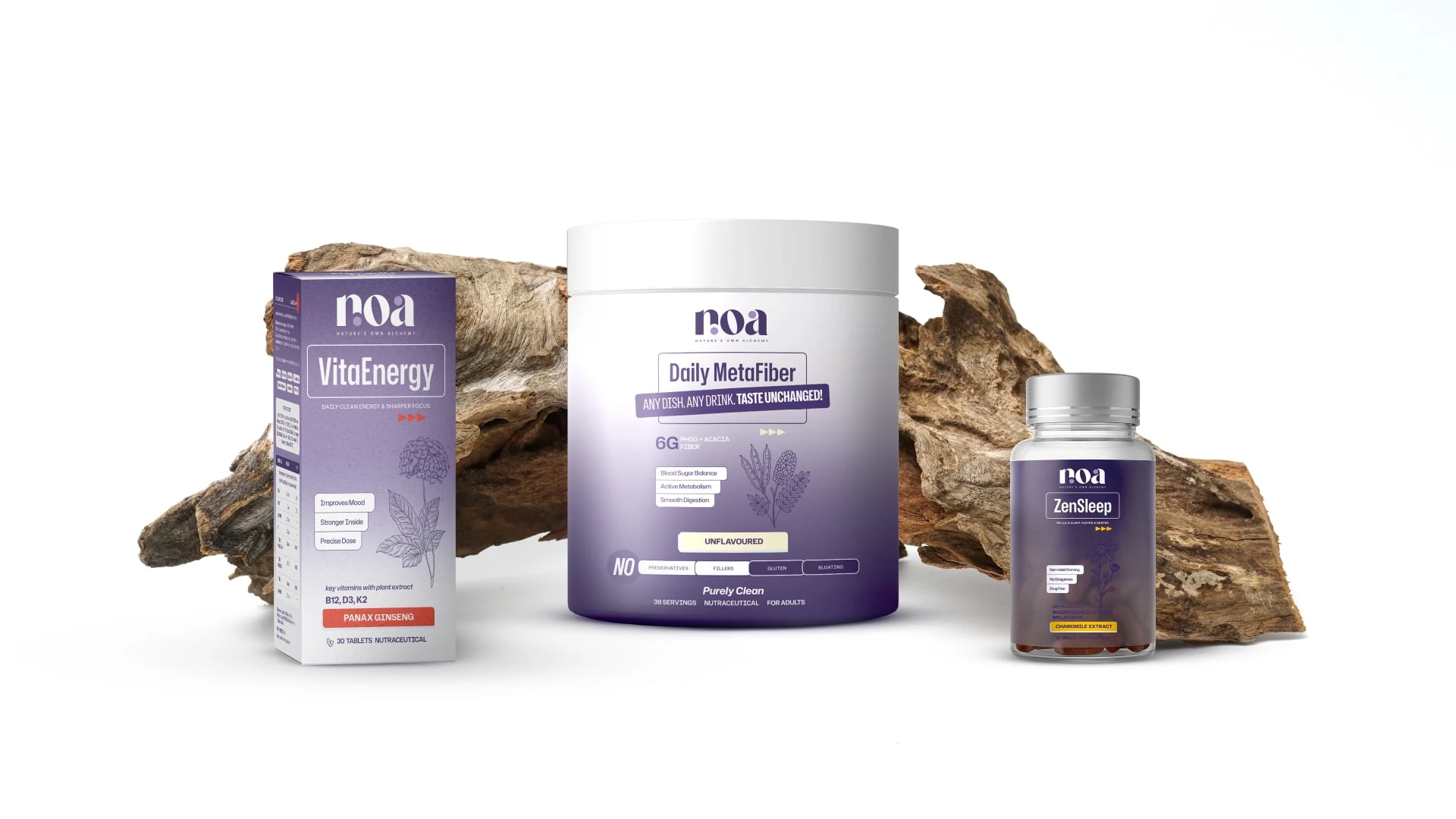
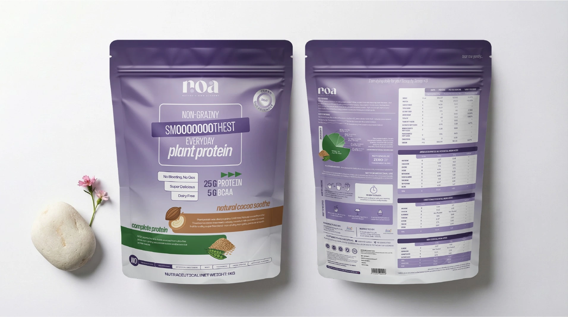
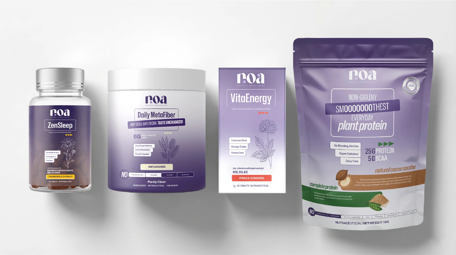
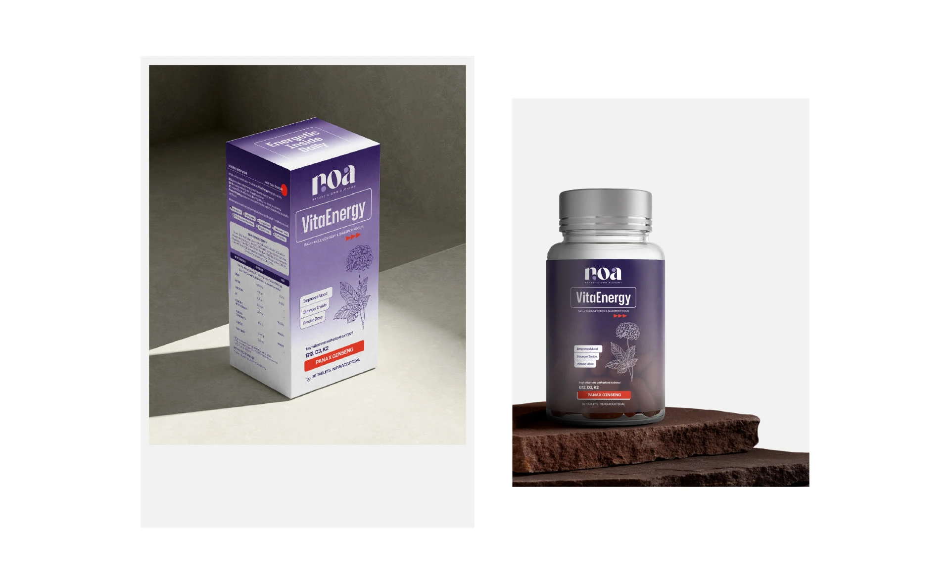
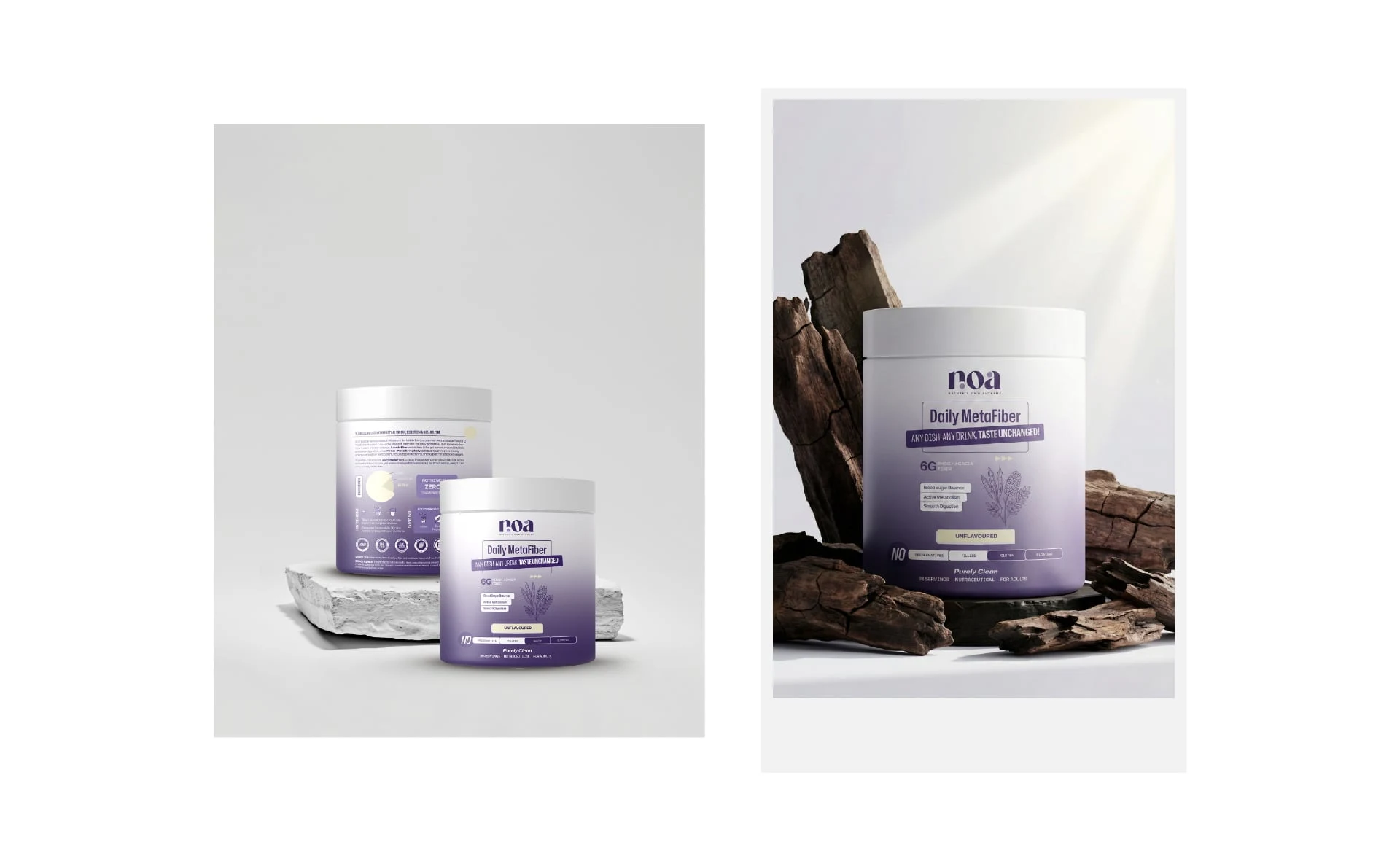
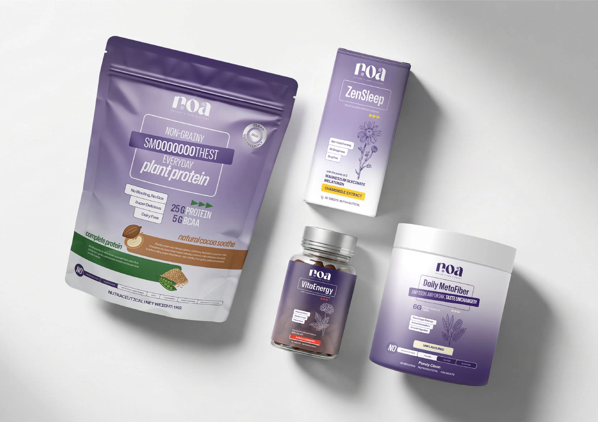
NOA is a premium health supplement brand designed to simplify decision-making in a crowded wellness market. The packaging focuses on clarity, trust, and shelf impact, ensuring customers understand the product benefits at a single glance.
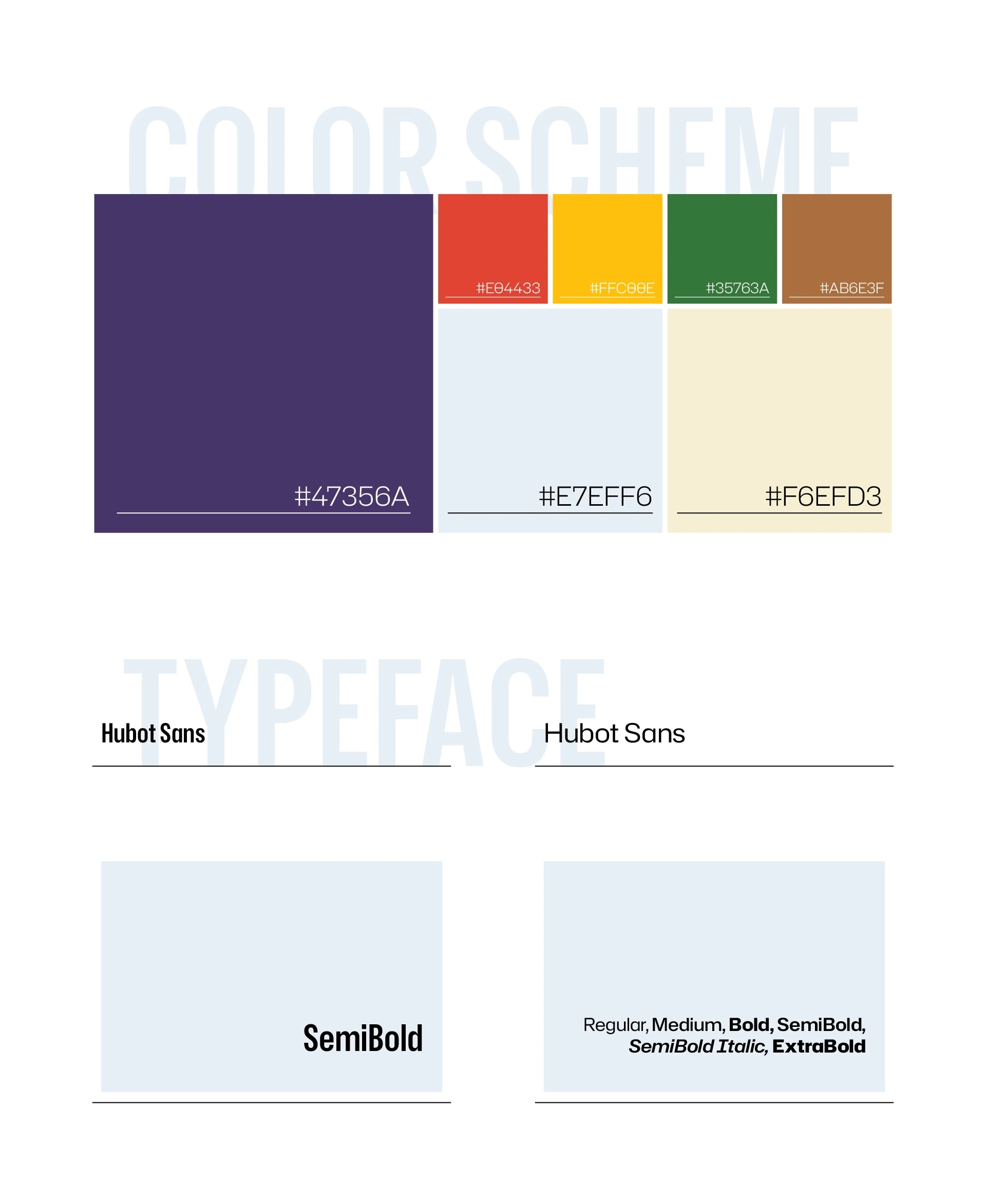
Each SKU follows a unified color palette to maintain strong brand consistency while clearly differentiating the products. Key ingredients and core benefits are highlighted prominently on the front, reducing confusion and answering common customer questions instantly.
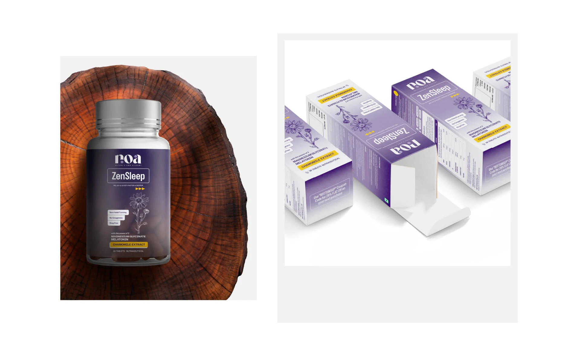
Bold, clean typography and a structured layout improve readability and credibility, while the premium visual language enhances shelf presence. The result is packaging that doesn’t just look good-it communicates clearly, builds trust, and supports higher conversions at the point of sale.
Like this project
Posted Jan 21, 2026
For NOA, all 3 SKUs have the same purple palette for brand consistency, showing key details at a glance with a customer-first, sales-driven packaging approach.